Kids Packaging Design With Oh Flossy
Oh Flossy play make up boxes

Oh Flossy Mini Make-up Boxes


When Oh Flossy decided to take on a full brand transformation they put the packaging at the top of their list. Their existing play make-up boxes had been designed a few years ago and didn't match the new brand identity that the company had recently launched - also designed in this studio, and featured in my portfolio

The revamping of the existing packaging came with a clear brief to create attractive and engaging designs that capture the attention of children as well as their parents. The project goals were well-defined:

  1. Increasing visibility

    The new boxes should make Oh Flossy products stand out on the shelves and catch the attention of children and parents. Better visibility could also help increase brand awareness and make their products more memorable.

  2. Improving perceived value

    Oh Flossy wanted to move into more premium and sophisticated packaging to better present their high-quality products, making them more desirable.

  3. Enhancing brand identity

    The new packaging designs should be consistent with the new brand's identity, and help reinforce brand recognition, differentiating their products from competitors and communicating the brand's unique attributes.

  4. Improving customer experience

    The new box design would also make the product safer to transport, ensuring the goods were kept well-protected during shipping, easier to use for children and also easier to clean, making them reusable for many years to come. This would also impact customer satisfaction and brand loyalty.

Oh Flossy magnetic closure boxes were a game-changer. The range features 5 make-up boxes in gorgeous pastel colours to match their brand palette. 

 
Oh Flossy natural play make-up sets

Oh Flossy natural play make-up sets

The boxes were illustrated with hand-drawn patterns featuring different themes: make-up, sweets, sparkles, and costumes. Although each box has a different colour and theme, we achieved a coherent look and feel across all the designs by creating a base pattern of colourful sprinkles, white hearts and golden stars that was repeated on each box.


a look at the Pattern design process

 
Oh Flossy based pattern of sprinkles, hearts and stars

A | Base pattern design

Sweet Treats pattern design for Oh Flossy play make-up box

B | Sweet treats pattern illustrations

Oh Flossy Sweet treats box design

C | Final design combining base pattern and illustrations


The designs were finished off with a fine gold foil print over and an elegant matt embossed texture. Oh Flossy fans can collect the 5 boxes and use them as keepsakes for years, or match their designs with other products in their collection.

After the make-up sets launch, the pattern became a recurring design element in Oh Flossy packaging and stationery, and it would soon make its appearance on many other products of their collection. Here are just a few examples.

 
Vintage Estate Posters: The Study Of The Old Techniques.
Peet Vintage Estate Poster

Lightwood Estate Poster designed for Peet.


When Australian property developer - Peet - approached my studio last year to commission a collection of vintage estate posters, I knew the most beautiful project had just landed on my desk, and that I was about to embark on a fascinating journey into the advertising and marketing techniques of the past

The company has a long history of producing estate posters to promote its properties and developments, particularly in Western Australia. However, the use of estate posters began to decline in the latter half of the 20th century, as new forms of advertising and marketing emerged. By the 1980s and 1990s, estate posters had largely been replaced by more modern forms of advertising, such as billboards, brochures, and online listings.

In recent years, estate posters have experienced a resurgence in popularity, as collectors and enthusiasts have rediscovered their artistic and historical value. With this renewed interest in vintage estate posters, a number of companies in Australia have also begun producing new posters in the vintage style.

Peet wanted to honour its heritage, by producing this collection of estate posters featuring modern properties and developments but designed to evoke the style and charm of vintage estate posters from the past.

This design job required hours of research and archival searching to get myself familiarised with the visual language used by the old illustrators, from composition to colour and typography. The initial sketches and layout were hand-drawn, however, the design execution was made in Photoshop and Illustrator, to take advantage of modern printing techniques.

 
Vintage Estate Posters designed for Peet

Vintage Estate Posters designed for Peet


The high-quality illustrations of the properties and surrounding landscapes, along with stylized typography and copy harken back to the golden age of estate posters, offering a fresh take on a classic art form and providing a unique way to celebrate Australia's cultural heritage and natural beauty.

The typographic work features bold lettering and creative layouts, and constitutes an integral part of the design, used to draw the viewer's attention to key features or messages.

Colours are also bold and vibrant to create a sense of energy and excitement. Many vintage estate posters featured a limited colour palette, with a few dominant hues of red, green, blue or orange used to create a cohesive and visually striking design.

Overall, this collection of vintage estate posters designed for Peet honours the company's cultural heritage and offers a fascinating glimpse into its history and development.

 
Heritage Estate Poster Design
Vintage Estate Posters Close up
Cake Designer Print Marketing: Piece of Cake
 

In a world dominated by digital marketing, print jobs often provide a respite to designers. Flyers, brochures, and posters allow us to focus on more intricate layouts, compositions and typographic choices

And when these print jobs also involve chocolates, flowers and delicious cakes, we, designers, find ourselves in some design heaven.

Cake designer Picket Fence engaged my studio to produce a set of print marketing pieces to promote their business in more traditional outlets. Print collateral can be held, touched, and shared. This tactile experience creates a sense of credibility and permanence, allowing for a more personal connection with the audience.

There was no need for professional photography for this marketing set. Instead, we used illustrations for flavour posters and images of delicious ingredients, such as chocolates or raspberries, for service flyers. I also photographed paper textures, watercolour splashes, and floral motifs to add detail and enhance the overall aesthetic.

The design needed to feel elegant and feminine, to appeal to a clientele of brides, new mums and party organisers mainly. I used a soft colour palette, delicate typography, and graceful imagery to evoke a sense of beauty, love, and celebration.

When promoting your business, keep in mind that print materials are often perceived as more trustworthy compared to digital ads. Digital marketing can be seen as intrusive or less reliable due to concerns like online scams and fake news. Well-designed print materials can establish credibility and build trust among consumers, as well as offer a less crowded space, with less competition to promote your business.

Flyers and posters are versatile and low-cost options for traditional marketing. They can be distributed in strategic locations or displayed in public areas. Add some product samples to the marketing mix and they will leave a memorable long-lasting impression on your audience.

Plus, as mentioned above, a print job can also make a designer's day.

 
Cake Designer Trifold DL Flyer
Cake Designer Trifold Flyer
Cake Flavours menu
Adept Financial Services Rebranding
 

Adept Financial Services started their new brand identity journey with Grafika Studio in 2020. They wanted to expand their service portfolio and position themselves as a boutique accounting firm for medium size businesses in the Engineering, Building & Construction and Medical Service industries

To achieve this goal they were looking at transforming their existing brand identity and becoming a more modern brand with a fresh and vibrant visual communication style.

Grafika Studio participated in all aspects of defining the brand strategy and implementing a fully-fledged branding and website.

As a firm believer in the power of personalised customer service, the Adept team wanted to work with a new generation of professionals who valued the power of strategic partnerships to grow their business:

"We want to create an engaging experience that goes beyond the standard business support. We want to help clients to achieve results and grow their business through strategic advice" - they said.

The initial brief indicated that the logo should retain the existing triangular logomark - which had been with the company since 2011 - but convey the notion of positive transformation and business growth. So I focused on the typeface and the colours to convey these ideas.

 
Adept Financial Services New Logo
 

I selected a new font for the logotype, bolder and slanted to create a sense of movement. I also changed the uppercase original font style with a lowercase for a more approachable look.

The slanted font style also allowed me to align the typography with the angles of the logo mark.

The strapline was changed from bookkeeping to financial services, as the company expanded their service offerings.

The old brand identity colour was green. I replaced the main colour with navy blue, a more suitable choice for professional business services, as it's often associated with authority, professionalism, and trustworthiness.

However, navy blue is also often considered to be a “conservative” colour, while the company was after a more approachable and friendly look and feel. For this reason, navy blue was used here to add depth and sophistication to the brand but splashed with vibrant hues of red, purple and yellow.


Finally, the brand was complemented with gradients usually displayed inside triangular shapes, to match the logo and reinforce the idea of transformation and expansion.

How To Write A Great About Page

Your About Us page is one of the most important pages on your website. If you take a look at your statistics, I’m pretty sure you’ll find your About page within the 3 most popular content of your site.

Your About page is where your business takes a human shape and reveals a personal story, aspirations, and dreams. It’s where you can create an emotional connection with your visitors by showing that behind your brand there is a real person just like them.

But you must refrain from the temptation to your make it just about yourself.

Picture yourself going on a date with someone who can only talk about him/herself. You wouldn’t want to see that person again.

So how should you approach your visitors on your About page? Well, let’s start from the beginning, who visits your About page and why?


Why do people visit your About page

People visit your About page because they want to know if they like you, can trust you, and decide whether you would make a great team working together.

Why would you go on a date in the first place? Same, because you want to know if you like the guy and whether you could potentially have a relationship together.

So if they are already visiting your About page it's because they are probably considering working with you. Take this opportunity to tell them why they should choose you over everyone else out there.

One of the main challenges small businesses have to face to get clients is building trust among their market. People don’t know you, don’t know whether they can trust you and let’s be honest, there are a lot of weeds out there, so people are right to mistrust.

But they’ve seen your portfolio, and your catalogue or have read your blog and like what you do, so they surf your website looking for signs of trust. The first place where they go to look for these signs is your About page.

Understanding what inspires trust in your visitors is the first step to writing a compelling about page.

Then, the style, tone, language and design of your About page should be determined by the type of people you want to target, and how you want to make them feel when visiting your site: inspired? Understood? Empowered?


Anatomy of a great About page

Every great About page has the following elements:

1.    Opening statement

This is the headline of your business. It should highlight your distinctiveness, the main value that you can provide to your clients, and what your company stands for.

It’s a hook to capture the attention of your visitors, incite curiosity and make them want to know more.

For example, one of my clients State 28 use the following opening statement:

Strategic approach, innovative outcomes

Interior environments should enhance the lives of their inhabitants. Creating spaces that make people smile is our passion


Another example by designer Breanna Rose of Rowan Made:

This is Rowan Made,
A small design studio with a knack for simplicity + story telling

2. Introduction

This is a short paragraph to briefly answer the main 5W questions that your potential clients always want to know about you.

  • Who you are – they want to know if you are a small or medium size company, a family operated business, etc.

  • What you do – they want to know your specialisation

  • Where you are located – they want to know your physical proximity, as this can be highly value for many potential clients.

  • Since When you’ve been doing this – they want to know your experience and years in the job

  • Who your services are aimed at – they want to know if they belong here.

Another great example, Julia Kostreva says in her About page:

Julia Kostreva is an art director and designer in California with a love for art and culture.
In 2013 Julia founded this creative studio and shop - a place for work and play


3.    Your WHY

This is the most important part of your About page: your WHY.  Why do you do what you do? What’s your vision? How do you want to make a positive impact in people’s lives?

In the words of Simon Sinek:

People don’t buy what you do; they buy why you do it. And what you do simply proves what you believe
— Simon Sinek, Start With Why


This section is an opportunity to explain what problems you solve and what benefits you can provide. Describe your capabilities and why you’re uniquely qualified to offer this service.

You can also do this by incorporating your company mission or tapping into people’s beliefs by sharing your core values.


4.    Provide social proof

Third party endorsements are a great tool to build credibility.

Demonstrate that it’s not just that you are saying it, there are a lot of people out there who love what you do. My favourite ways to demonstrate social proof are:

  1. A list of big brands that have already worked with you

  2. A list of links to media features

  3. Awards

  4. A rate (ie, 5 stars, etc) by industry experts

  5. A huge amount of social media followers

I personality don’t like to use testimonials here. They need some context and should always go with your projects or products.


5.    Your bio

Ok, now you can talk about you, but don’t go on too long, just explain the professional journey that brought you here today. Be short and sweet. Make it as visual as possible by adding photos of yourself, a timeline or other visual resources.

Your life story, qualification and career achievements will bolster your credibility and credentials.

This is also a great opportunity to create a personal connection with your readers. Think about the aspects of your story that they can relate with, such as humble beginnings, career mum’s struggles, etc.

You can take a look at mine here.


Do’s and dont’s for a great About page

Do include a photo of you – headshots or photos of you in your workplace are great in this section. .
Don’t use stock photos – they are impersonal and don’t bring any value to your About page.
Do invest in high-quality photographs - hire a professional photographer to do this job.
Don’t write in the third person - be conversational and use a friendly tone to make you more likable.
Do include ways to connect – such as email and links to your social media pages.
Do link with internal content - invite visitors to see examples of your work in your portfolio, take a closer look at your services offer or read your blog.
Do use a professional but casual tone - it will make you approachable
Don’t forget to update it regularly.

Inside A Designer's Website: ColourCube Interiors
ColourCube home page. Website designed by Rosa Spencer - Grafika Studio

ColourCube home page. Website designed by Rosa Spencer - Grafika Studio

I had recently shared with you this logo design and branding for Perth interior designer ColourCube Interiors. But what I hadn't shared yet was the stunning website I designed for this business too. To be completely honest, it's not hard to create a beautiful website when you already have great graphic material to work with.

ColourCube had a beautiful portfolio of homes professionally styled and photographed by Perth-based photographer Claire McFerran of Gathering Light, so I just had to create a clean and stylish layout to let the images shine.

I didn't want to limit myself to a theme or template features, so no website builder was used here. I coded this website from scratch in Dreamweaver to be able to customise every minimal detail.

Colour-cube-interiors-home-page

The internal pages have a interior shot in one side of the screen and text in the other side. This simple layout is been designed to focus to attention in the images without any distractions from graphic elements, colours, animations, etc. The two column layout is repeated in most internal pages to achieve visual consistency and easy navigation.

The typography combines a hand-written style text for page titles, with a classic serif Vidaloka for headlines and a stylish sans serif Josefin Sans for sub-headlines and body text.

About page of ColourCube Interiors website

About page of ColourCube Interiors website

The internal pages keep the social media icons over the image so that visitors can easily connect with the business in social media.

DESIGNER'S TIP: keep social media icons as a fixed section in one side of the screen to improve social media engagement. Visitors can click on them and follow the business in social media at any time of their journey through your site.

One of the client's projects featured a beautiful bedroom with some teal blue accents. I found this colour so perfect for links, buttons and other clickable elements in the website. Below is the Contact page with one of the beautiful bedroom images.

Contact page of ColourCube Interiors website

Contact page of ColourCube Interiors website

The big amount of white space across the website was intentionally used to create a sense of calm and tranquility, inviting visitors to stay and enjoy the gorgeous portfolio for as long as they like.

Portfolio page of ColourCube Interiors website

Portfolio page of ColourCube Interiors website

This beautiful website is the perfect example of one of my core values: Simplicity. Good design doesn't need to be complicated. Simple is beautiful. Minimal and effective designs are my mantra (you can read my business value in my About page)


Common branding mistakes start-ups make
Living 3D brand identity designed by Grafika Studio

Living 3D brand identity designed by Grafika Studio

Every new business needs a new brand. It’s one of the first things that we put on our list of to-do’s when we just get started. But many new businesses get branded too soon.

Branding your business requires having a clear idea of who you are, what you want to be and how you are different to many others in your industry.  

Your brand is something that you want to get right from the beginning, as branding mistakes can cost a lot of money to your business down the track.

Take some time to set the foundations of your business model and avoid these common mistakes that many start-ups typically make (and I include myself here)


Mistake #1 | Not knowing who your ideal client is

Although you could potentially help anyone in your market, your business will be a better fit for some people rather than others.

Your brand must be relevant to your potential clients and create an emotional connection with them. Knowing who they are and what aspirations, challenges and needs they have can help you create a brand that will easily connect with your market, grab their attention and create a positive perception of your business in their minds.

Attracting the wrong type of clients can lead to client’s complaints, frustrations, bad publicity and online negative reviews that can seriously damage your brand image.

In this other post I also shared some tips and hints to find your ideal niche.


Mistake #2 | Lack of focus

Many start-ups think if they niche down their service offer they may lose business opportunities. Try to sell anything to anyone and you will end up selling nothing to no one.

You cannot be an expert on everything. You should only offer those services that you know best and for a type of client that you have worked before.

A focus or specialisation will give you the confidence to explain to your potential clients what qualifies you to help them with their problem better that many others in your industry, and how many people you have already helped with a similar problem.

This focus will also bring clarity to your brand, establishing a clear differentiation between who you are and how you can help your clients best.


Mistake #3 | Imitating other businesses

Looking at what others do and try to do the same is natural when you just get started. We want to demonstrate that we can be as good as them. However, in business being ‘as good as’ is not enough, you have to be better or be different.

Researching your competition is a necessary step to start a new business and build a new brand. But don’t compromise your authenticity by building a brand identity that follows trends or imitates others.

The market is full of professionals like you – or products like yours -, and it’s very difficult to get noticed. People want to know how they should choose your over everyone else.


Mistake #4 | Failing to find a differentiation

Your differentiation will give people a legitimate reason to choose you over other similar businesses in your industry.

There are no two identical businesses, so you must explore and find what makes you unique and different. Understanding your own distinctness is the first step to build a memorable brand that stands out the crowd.

As I explained in this other post on Lessons Learnt From My First Year In Business finding my own differentiation was one of the hardest things for me.


Mistake #5 | Not having a clear mission and vision

Branding is the art of aligning who you are, who you want to be and who people perceive you to be. Your mission defines who you are and what you do. Your vision determines who you want to be in the future.

A meaningful brand is not a brand that just looks pretty; it’s a brand with a strong personality and a clear purpose. Without personality, your brand is superficial, without purpose, you're bound to get lost along the way.

Having a clear brand vision and mission will help you identify where your business is headed, as well as what you need to prioritise to get there and what you have to say no to.


Mistake #6 |  Thinking your brand is just a logo

The worse thing about this belief is that many startups don’t see justified to spend more than a few dollars in their brand. They think all they need is just a logo - and that a clipart logo will do the job -, but a brand is much more than that.

Everything that your clients see from you speaks volumes about how much you care about your business and how much you've invested in it. That includes yourself, how you look and how you act. You're an extension of your brand.

In this other post on personal branding I shared 10 easy steps to craft your personal brand.


Mistake #7 | Not choosing the right professional to build your brands

Many clients come to me with a logo that a friend has designed for them, and I can usually tell straight away when it's been the case. If your logo looks amateurish, then so will your business.

Many of these logos don’t follow basic design principles, such a proportion and balance, are very difficult to scale down - as they have too many details – and don’t properly reflex the business essence.

Your brand must communicate confidence and professionalism, and inspire trust. A well-designed brand is the result of many hours of research and work, plus a lot of rounds of revision and feedback by the client.

I shared my own process for designing an effective logo in this other post.


Mistake #8 | Not investing in branding

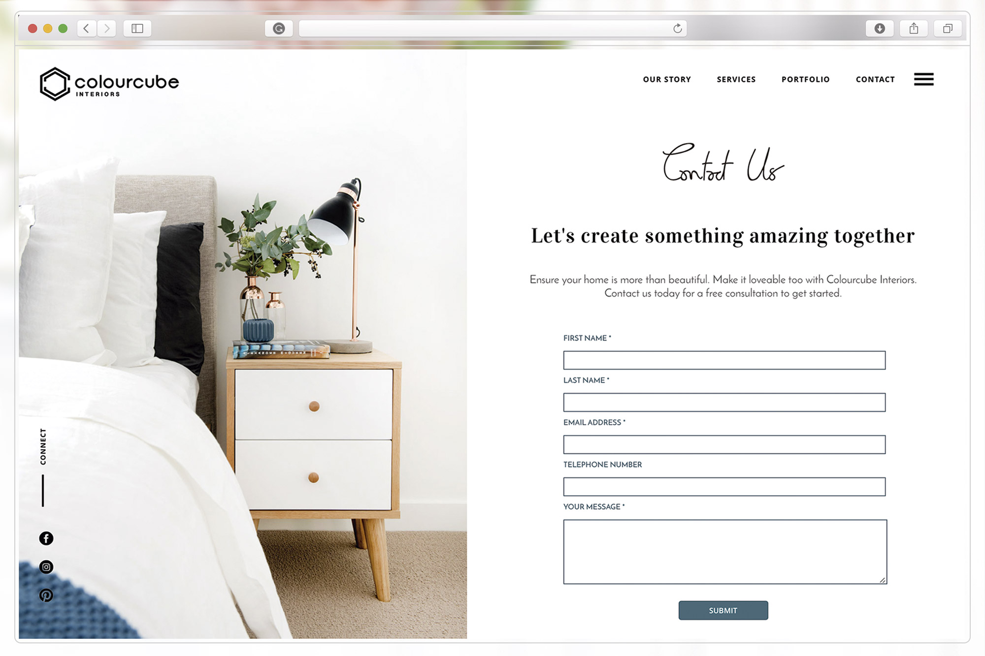
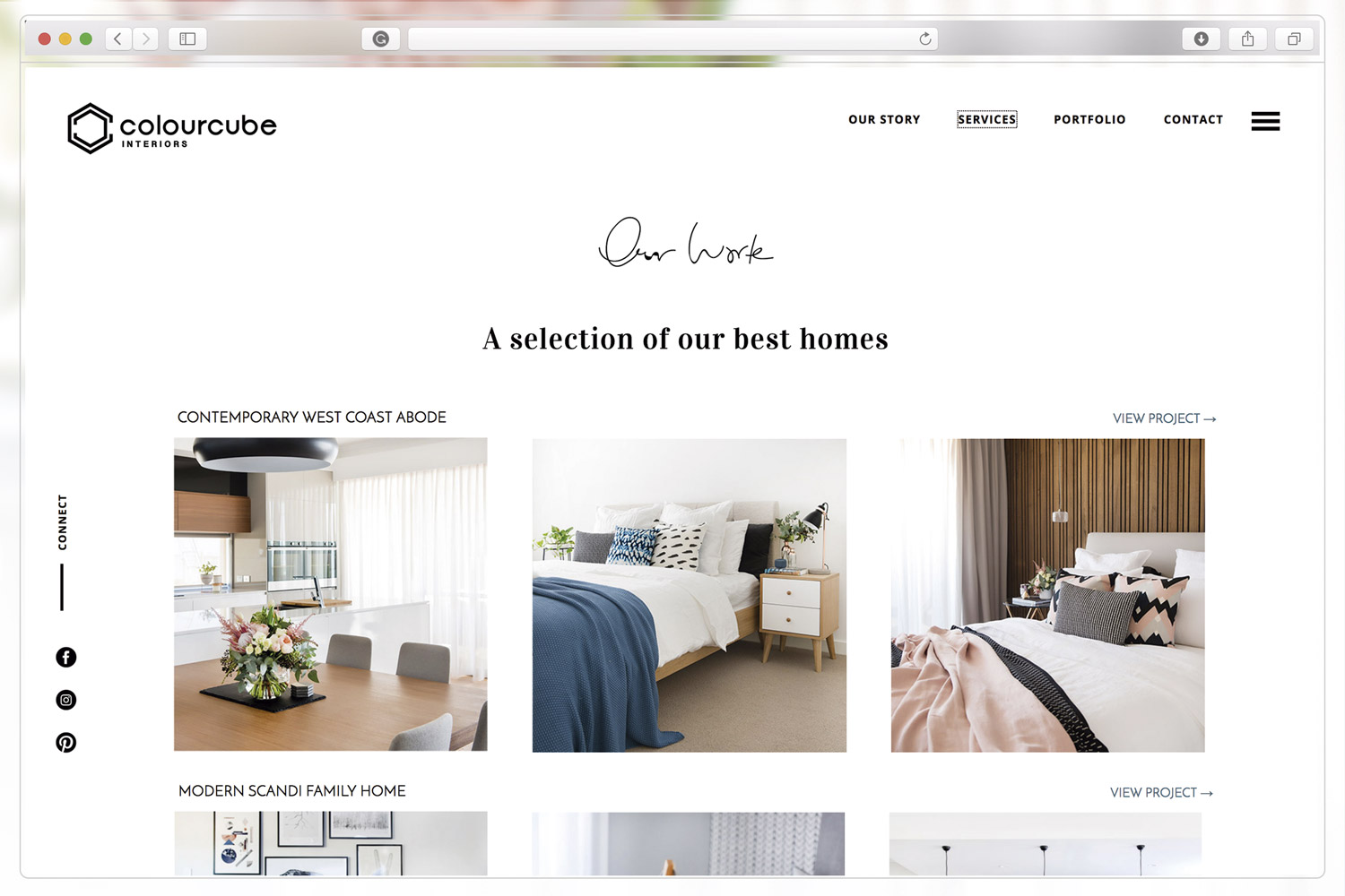
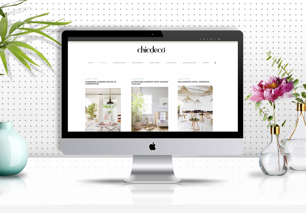
Having a well-design brand is not the end of the road in your brand journey. You also need to brand your communications. Business cards, email signatures, website, social media platforms, etc, anything will give you an opportunity to make a positive impression in your potential and actual clients, and create an excellent perception of your business.

Make sure all your brand elements are well coordinated across every channel and your message is clear and consistent. Invest in professional photos, quality printing and a professional designer to make your brand true reflection of your business quality standards.


Ready to brand your business?

Before developing a new brand I always take my clients through a brand discovery process to ensure both, my client and I have a clear idea of the business vision, mission and direction, their target market and their distinctiveness. This is a necessary step to build a memorable brand to represent their businesses for years to come.

The process is slower than what many clients initially thought it would be, but the time and money invested in building a professional brand is well-worth to avoid more expensive problems in future.


Step By Step Guide To Design Your Website Like A Pro

The big amount of DIY website builders available today makes the website design process look too easy. Anyone with no design skills or tools can drag and drop elements into a web page, play with the layout and change basic styles.

However, designing a website is much more than just uploading images and content onto a server. It involves an entire visual communication process aimed to create an emotional connection with your audience, communicate your business purpose and achieve its ultimate goals.

Today I'm sharing my website design process. I won't go into the technical details of building a website to just focus on the steps that a professional web designer will typically take to design a website. Are you ready to design your own website like a Pro?


Step 1 | Define Your Intention

A good website design doesn’t start by choosing a template, deciding on the colour scheme or finding pretty images. It starts by clearly defining the website ultimate purpose.

There are three essential questions that you need to ask yourself before you start designing your website:

  • How should your visitors feel when they visit your site?

Do you what them to get inspired? Empowered? Curious? And why?

  • What do they need to know about your business?

How to book? How much will your services cost? What’s included in the service?

  • What would you like them to do on your website?

Make a purchase? Make an appointment? Visit your brick and mortar store? How are you going to make them take action?

Knowing the answers to these questions will help you decide what content, colours, graphic elements, etc your website needs.


Step 2 | Map Out Sections and Sub-sections

Now it's time to plan how you are going to structure your website by drawing a ‘tree diagram’. You can do this on a whiteboard, a spreadsheet program (such as Excel or Google Drive Spreadsheets), a word processor, etc.

This diagram will show the hierarchy of the website and how the various pages and sections relate to each other.

Tree diagram with information architecture and website structure by Grafika Studio

A well-thought site structure not only means a great user experience, but it will also give you better chances to rank higher in search engines.


Step 3 | Write compelling content

Once you have a clear structure of pages, develop content for each of them separately. Don’t worry about formatting just yet, write down anything that you think your visitors and potential clients want to know about your business, products or services.

Research your competitors' websites to see the key messages in their websites and how the information has been presented. Do this not to copy them but to put together something better that will stand out your competition.

Remember that writing for the Web is completely different than writing for print. Too much information is overwhelming and will make your visitors feel intimidate and leave without reading your message.

Find more tips on how to write a compelling website content in my previous post on Why My Website Is Not Converting.


Step 4 | Sketch The Layout With Wireframes

Now you know how many pages your website will have and what content you need to fit in each of them, it’s time to decide how the information is going to be presented on each page. You can do this with the help of wireframes.

A wireframe is a black and white representation of every webpage on your site, usually using boxes and buttons to show where each piece of information will be displayed.

The best way to do your wireframes is by hand sketching in a gridded sheet. Divide your grid horizontally into header, content and footer, and vertically into 2 or 3 columns to fit the content, with right and left margin and separation space between the columns.

Not only it’s important how you present the information, but also where you place it. Information positioned in the upper half of a webpage and visible without scrolling down the page is what we call above the fold. Everything else is below the fold.

If visitors have to scroll down to find important details on your website, chances are that they leave without even noticing them.

Analyse your web copy and extract one key idea per page only. This idea must be positioned at the top of the webpage (above the fold). Further information and details can be placed after.

Home page wireframe for a website project by Grafika Studio

Home page wireframe for a website project by Grafika Studio

Step 5 | Mock-up Your Website Design

Your wireframes can now be translated into visuals. This is a very important step for any website designer to communicate his ideas and present them to the client. It's also time to make some styling decisions, such as colours, image style, typography, etc.

To create a mock up of your website you will need the help of Photoshop, and therefore a bit of knowledge on this software.

Your website mock-ups will help you visualise how images look against your brand colours, typography and other graphic elements. It can also be helpful to design buttons, boxes and any other graphic element to establish a consistent visual language across your site.


Step 6 | Build Your Website

The website design process reaches here the end of the line. Now it's time to select your website builder (WordPress, Shopify, SquareSpace, etc) and find a suitable template or theme to build your website. A web developer can help you adapt your template to your design and customise your CSS to style up your website.


Wrap up

At the end of the day, it doesn't matter if you are using Helvetica or Open Sans on your website, or blush pink or iced blue, what really matters is that your website delivers a clear message on who you are, what you do and why people are going to love your products or working with you. This compelling message can only be achieved with a lot of planning and a good understanding of visual communications and UI (user interface) design.

Need a hand with your website project?

I'm your designer! Get in touch and request a quote for your project.


New In Portfolio: Rebel Road Brand Identity
Brand mood board for Rebel Road, by Grafika Studio

Brand mood board for Rebel Road, by Grafika Studio

One of the biggest advantages of being a visual communication designer in today's digital world is that you can work with clients from any corner of the planet. It was Instagram who brought Jenn of Rebel Road - based in the UK - and me together somehow (yes, designers can actually find clients in Instagram every now and then).

Rebel Road is a career coaching business, and Jenn was after a beautiful brand identity that inspired people to make positive changes in their lives.


The inspiration

The brief was to create a smart and stylish brand, with a professional look and feel and a bit of fun and rebellion.

When we put together the brand mood board (image above) Jenn loved green, so we chose a dark shade of emerald green as primary colour to achieve a professional, fresh look and feel. Then I added a hint of dust pink and watermelon to balance the cold primary colour with warmer tones. To create a sense of lux, copper or gold foil details would be used in printed materials.

I suggested to also incorporate brush strokes and hand-writing lettering to break the formality, add personality and character, and wavy patterns to create a sense of movement and dynamism.


The logo

We explored different concepts during the logo design process, but none of them seemed to carried a strong meaning that inspired expansion, excitement and positive changes.

And then we came up with the concept of circles. Circles represent movement, positive changes, new starts... and this one was a meaningful concept for a career coaching brand.

So the final logo is a hand-drawn circle with the brand name on it.

We also try to incorporate Jenn's name in the mix as a watermark, below the mark, or cutting the mark from the right side. In any case, we wanted to suggest that Jenn was behind the brand, as she had built a reputation as industry expert for more than a decade and many people already knew her name.

rebel-road-logo-design

The colour palette

The brand colours were also intentionally selected to carry the brand messages:

  • Green - shooting and calming, inspires balance, stability and possibilities (all good attributes for a career coaching business). A dark shade of any cold colour also makes a brand feel professional and trustful.

  • Red - stimulating and dynamic, inspires activation, passion, excitement and expansion.

rebel-road-colour-palette


The patterns

It was important to continue using curves and circles to reinforce the ideas of 'change' and 'movement', as well as to connect with a young market/audience. So I designed a pattern with a mix of curvy shapes in different colours that flow across the canvas and dotted circular shapes.

Rebel Road business cards designed by Grafika Studio

Rebel Road business cards designed by Grafika Studio

I love the visual impact of this brand identity, its dynamism and its elegant look. But above all I love the fact that every single element, colour, and style has been chosen to carry the brand message: making a positive change in people's lives.

I'm currently designing Rebel Road new website but you can see this entire brand, with its business stationary and marketing collateral, featured in my portfolio.


New In Portfolio: Monument Advisory Brand Identity
Monument Advisory business cards, by Grafika Studio

Monument Advisory business cards, by Grafika Studio

I love working with professional service businesses as they take me back to my years working as brand manager for EY. When the director of Perth-based financial advising company, Monument Advisory, approached to me in September last year to design their brand identity I immediately felt excited about this new project.

The brand was aimed to a high-end market, and needed a corporate professional and smart look and feel... No problem, elegant and stylish design is my specialty!

 
Monument-Advisory-logo-design
 

I designed a mighty and solid logo that suggested confidence and professionalism, combining an M, for Monument, and A, for Advisory in the same mark. Then we selected a sans serif font to give the brand a modern and clean look.

Monument-Advisory-logo-specs

To break the formality of corporate logos with straight lines, I intentionally broke the symmetry in the logo to make it look a bit more casual, but still professional.

One of the requirements in the brief was to combine two colours in the logo, blue and silver, so that we could add a foil finish when printing the business stationary and marketing collateral. So I reserved the triangular area inside the logo and the word 'Advisory' to add a subtle touch of silver foil.

Below, Monument Advisory logo from the Illustrator drawings to the final print with embedded silver foil.


logo-design-01
logo-design-02
logo-design-03

The logo was also designed to bleed in printing materials, when used only with the mark and without the typography below, as it was used in the email signatures (below)

e-signature

The business stationary combines white paper with dark blue elements and a touch of silver foil wherever was possible to incorporate. The result is a clean and smart brand identity with a luxurious touch of silver.

Monument-advisory-business-stationary
Monument Advisory business stationary, by Grafika Studio

Monument Advisory business stationary, by Grafika Studio


Photo Tutorial: Brightening Up Your Images
Photo credit Grafika Studio

Photo credit Grafika Studio

The Internet is becoming more aesthetic every day. Beautiful and well-styled images are your best shot to create an emotional connection with your audience through visual content, and make people fall in love with what you do and how you do it.

That's why we spend so much time sharing photos of our day-to-day work in social media, behind the scenes shots, sneak peeks of new products and a lot more, especially on Instagram or our blogs. Getting these shots right can make your business stand out.

I'm not a professional photographer, so all I've got to get good shots is my iPhone. But as much as I tried, I never got a shot with the perfect light exposure inside my home. Lucky, I got a not-so secret weapon to fix all my lighting issues: Photoshop*

Correcting light and colour with Photoshop is very easy. You just need to know a few quick tips to make the right image corrections. Today, I'm sharing my most common tips in this 3-step tutorial so that you can take your photos from 'meeeeh' to 'yay!' in just 10 minutes.

* NOTE: If you don't want to buy the software (AUD $11.99/mo) you can download the free app for small devices. This tutorial can only be done from the full version of Photoshop, tough.

Ok, so let's get started. I got this photo today by placing the fruit jelly box on top of a white cardboard and on a table next to the window. As you can see the light here is still 'meeehh'. Let's fix that.

Original photo from iPhone

Original photo from iPhone

Step 1 | Light correction

I open my photo in Photoshop and go to Image > Adjustment > Levels. With this tool I can make whites look whiter (rather than ugly greys) and blacks blacker. You usually know when whites and blacks are right by placing the controls just under the beginning of the curve in both sides.

Play with Levels to intensify whites and blacks

Play with Levels to intensify whites and blacks

You can also use the Dodge and Burn tools, in the Tools window (left side of the screen) to correct the light in specific points of the image.


STEP 2 | Lighting Mask

With just these quick adjustments the light is now looking a lot better and colours start to brighten up. However the image didn't have a uniform light (I just had my window as a light source). As a consequence of this, the light is too bright from one of the corners, making some jellies look too pale.

After correcting the lighting, there is part of the image that is now overexposed

After correcting the lighting, there is part of the image that is now overexposed

Solution: duplicate the image layer in Photoshop and apply a mask (see image below). Then go to the Gradient Tool in the Tools window (left side of the screen) and select the black and white gradient. Apply the gradient to the layer mask in the direction of the natural light, in this case from the top left corner to the right bottom side.

By doing this you just made half of the image transparent (hide the layers below to see the transparency). Now you can adjust separately the light in this over-exposed corner by playing again with the levels, as you did in Step 1.

Create a layer mask to correct light in just one part of the image

Create a layer mask to correct light in just one part of the image

Step 3 | Bending Layers

Finally, from your Layers tab, select your lighting mask layer and click on the bending mode drop-down menu (just on top of your layer list and next to the layer Opacity). It should be set to Normal. Change to Soft Light.

And voila! you just got a perfect lighting for your image!

Light is brighter and colours are more vibrant

Light is brighter and colours are more vibrant


New In Portfolio: ColourCube Interiors
Mood board for ColourCube Interiors new brand, by Grafika Studio

Mood board for ColourCube Interiors new brand, by Grafika Studio

It's always so exciting to share with you a new brand identity project. The one I'm sharing today was made last month for interior designer super-star Kristie Hill and her fast-growing business ColourCube Interiors.

For her logo concept I played with geometric shapes, such as cubes or hexagons, and the double CC for 'Colour + Cube'. We wanted to achieve a simple and minimal logo to give the brand a contemporary edge, and to make it easy to identify and remember. The logo below made the final cut.


For her brand we wanted to create a clean but yet visually interesting identity with a lot of focus on textures and a feel of luxury. A concrete background gives the business stationary a textural feel, while touches of rose-gold add that sense of luxury.

The grey and rose palette was completed with a sage green to add an organic feel.

To create some contrast between the straight lines of the mark and the typography we chose a rounded sans serif font family.

Colour-Cube-Brand-specs

An entire set of business stationary is still under development but business cards are already printed and looking amazing! Her website will be online soon and I'll also share the project here in my blog.

ColourCube Interiors business cards with concrete textures and rose-gold foil finish.

ColourCube Interiors business cards with concrete textures and rose-gold foil finish.