Grafika Projects: State 28 rebranding
Project: Rebranding, Business Stationary, Web Design and Development
Date: Launched in September, 2015

State 28 New Brand and Website designed by Grafika Studio
State 28 is an interior design company based in Perth, WA, with a strong focus on commercial design and office spaces. I'm very passionate of interior design, and I was thrilled to be chosen as their designer to re-brand their business and build a brand new website.
The new brand was completed in August and the new website launched in September this year. Today I'm sharing a bit of the logo conceptualisation process for this client, as this is a great example of how a simple icon can be full of meaning and significance, becoming the heart and soul of a brand.
The concept
I started working with Miriam, State 28 Director, and her team around June this year. Over the first couple of weeks I spent time getting to know the company personality, vision and values, as well as understanding how they wanted to be perceived by their clients and prospects.
They wanted a modern, fun and elegant new brand. My first ideas revolved around vibrant colours and curved lines to reflect the fun side of the company personality. But as many of their clients were corporate organisations I thought we should also look for a minimal and geometric style to connect with that market and communicate professionalism and reliability.
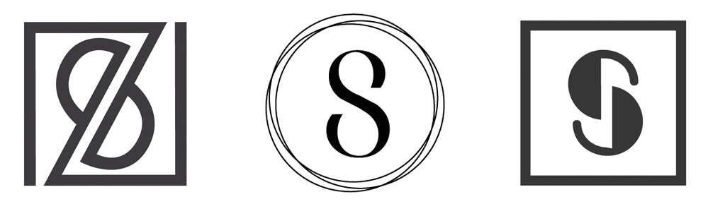
I came up with a few concepts first, no luck (see below). I sketched for hours, did lot and lot of visual research, and came up with a few more concepts. Still no luck.
After two rounds of concepts, I went back to their office and met with the team again to get a deeper understanding on the business personality, vision and core values.
In this second meeting I got to know more about each individual behind the scenes of State 28. I learned interesting things about them, like that Miriam had spent many years living in Texas, the State 28, and hereby, the company name.
Back at home, a map of Texas gave me a final clue: why not creating a logo that speaks about that emotional connection with Texas? The company director certainly had a strong connection with this place, and this could be a great concept to play with.

I created a more abstract idea of the map of Texas that had that geometrical and minimal look that I was going for.
They loved the concept! So, did I. Not only it was a meaningful concept for the company owner, but also talked about its origin and history.
The brand mood board
To create this mood board I used some images of their recent projects mixed with some bi-dimensional and tri-dimensional patterns, curved and straight lines and contrasts.
The colour scheme has a base of black and white to communicate sophistication. To give the brand a fresh look I added shades of silvery blues and some metallic finishes.
A bright aqua blue achieves a relaxed mood in line with the team personality, breaking the formality of the black and silver blue.
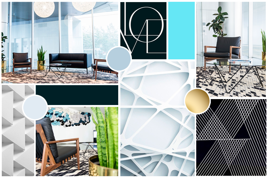
State 28 Interiors brand mood board
The typography
A sans serif font style was the perfect match for the straight lines of the geometric logo. We love the Epitet family with plenty of styles to choose from (regular, light, bold, ultra-light, italic, etc).
By increasing the tracking (the space between characters) I added a sense of sophistication to the final logo design.

State 28 team suggested to combine the Epitet family with a hand-writing font (Bad Script) to break the formality of the straight lines. We loved the final result.

Icons and patterns
The brand identity was completed with a set of outline icons for the website to match the hand-writing font style.

The logo triangles also inspired the patterns for their business stationary, which is currently under development.

To see how this new brand came together online, you can visit their website at www.state28interiors.com.au.