Posts in Projects
Kids Packaging Design With Oh Flossy
Oh Flossy play make up boxes

Oh Flossy Mini Make-up Boxes


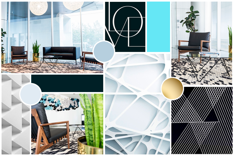
When Oh Flossy decided to take on a full brand transformation they put the packaging at the top of their list. Their existing play make-up boxes had been designed a few years ago and didn't match the new brand identity that the company had recently launched - also designed in this studio, and featured in my portfolio

The revamping of the existing packaging came with a clear brief to create attractive and engaging designs that capture the attention of children as well as their parents. The project goals were well-defined:

  1. Increasing visibility

    The new boxes should make Oh Flossy products stand out on the shelves and catch the attention of children and parents. Better visibility could also help increase brand awareness and make their products more memorable.

  2. Improving perceived value

    Oh Flossy wanted to move into more premium and sophisticated packaging to better present their high-quality products, making them more desirable.

  3. Enhancing brand identity

    The new packaging designs should be consistent with the new brand's identity, and help reinforce brand recognition, differentiating their products from competitors and communicating the brand's unique attributes.

  4. Improving customer experience

    The new box design would also make the product safer to transport, ensuring the goods were kept well-protected during shipping, easier to use for children and also easier to clean, making them reusable for many years to come. This would also impact customer satisfaction and brand loyalty.

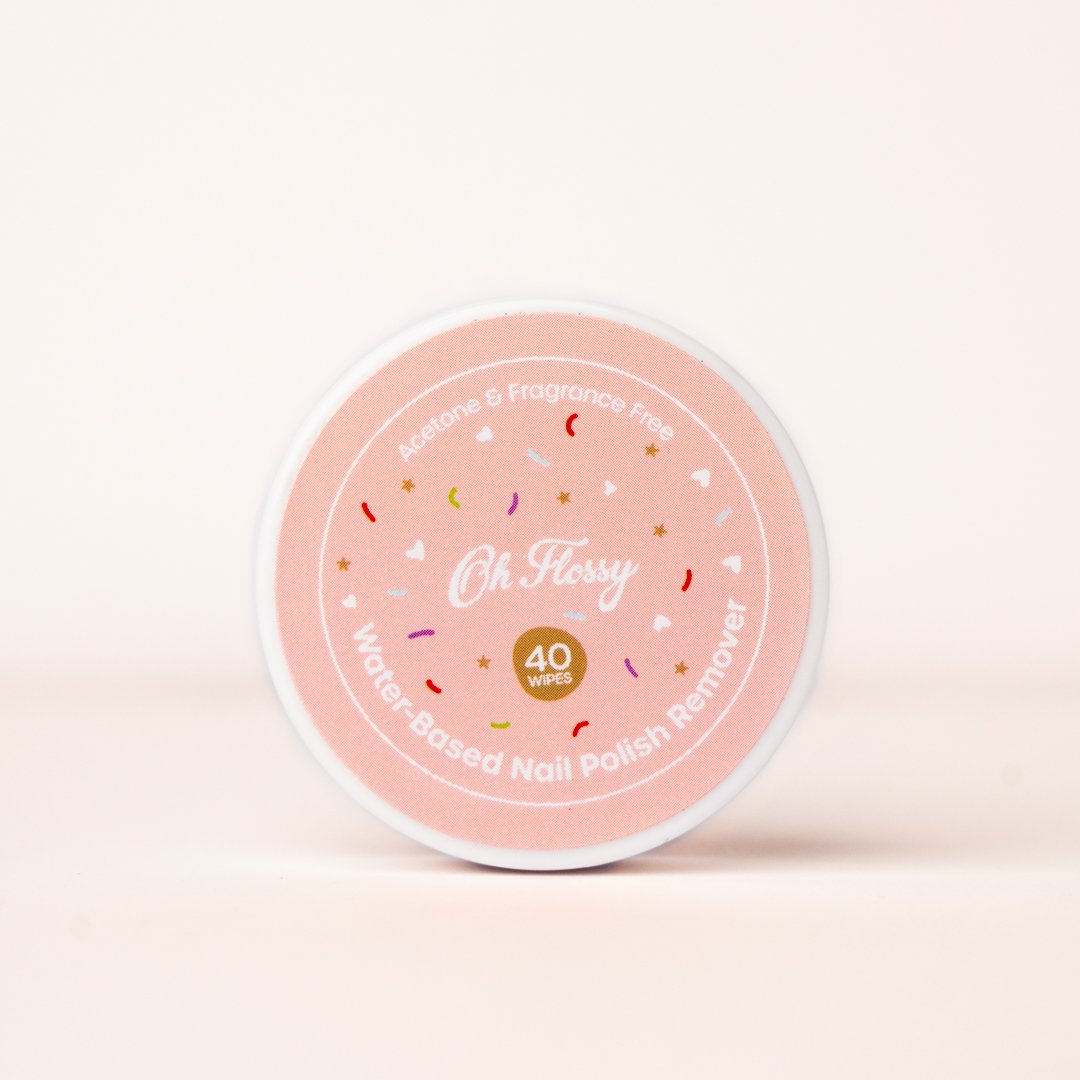
Oh Flossy magnetic closure boxes were a game-changer. The range features 5 make-up boxes in gorgeous pastel colours to match their brand palette. 

 
Oh Flossy natural play make-up sets

Oh Flossy natural play make-up sets

The boxes were illustrated with hand-drawn patterns featuring different themes: make-up, sweets, sparkles, and costumes. Although each box has a different colour and theme, we achieved a coherent look and feel across all the designs by creating a base pattern of colourful sprinkles, white hearts and golden stars that was repeated on each box.


a look at the Pattern design process

 
Oh Flossy based pattern of sprinkles, hearts and stars

A | Base pattern design

Sweet Treats pattern design for Oh Flossy play make-up box

B | Sweet treats pattern illustrations

Oh Flossy Sweet treats box design

C | Final design combining base pattern and illustrations


The designs were finished off with a fine gold foil print over and an elegant matt embossed texture. Oh Flossy fans can collect the 5 boxes and use them as keepsakes for years, or match their designs with other products in their collection.

After the make-up sets launch, the pattern became a recurring design element in Oh Flossy packaging and stationery, and it would soon make its appearance on many other products of their collection. Here are just a few examples.

 
Vintage Estate Posters: The Study Of The Old Techniques.
Peet Vintage Estate Poster

Lightwood Estate Poster designed for Peet.


When Australian property developer - Peet - approached my studio last year to commission a collection of vintage estate posters, I knew the most beautiful project had just landed on my desk, and that I was about to embark on a fascinating journey into the advertising and marketing techniques of the past

The company has a long history of producing estate posters to promote its properties and developments, particularly in Western Australia. However, the use of estate posters began to decline in the latter half of the 20th century, as new forms of advertising and marketing emerged. By the 1980s and 1990s, estate posters had largely been replaced by more modern forms of advertising, such as billboards, brochures, and online listings.

In recent years, estate posters have experienced a resurgence in popularity, as collectors and enthusiasts have rediscovered their artistic and historical value. With this renewed interest in vintage estate posters, a number of companies in Australia have also begun producing new posters in the vintage style.

Peet wanted to honour its heritage, by producing this collection of estate posters featuring modern properties and developments but designed to evoke the style and charm of vintage estate posters from the past.

This design job required hours of research and archival searching to get myself familiarised with the visual language used by the old illustrators, from composition to colour and typography. The initial sketches and layout were hand-drawn, however, the design execution was made in Photoshop and Illustrator, to take advantage of modern printing techniques.

 
Vintage Estate Posters designed for Peet

Vintage Estate Posters designed for Peet


The high-quality illustrations of the properties and surrounding landscapes, along with stylized typography and copy harken back to the golden age of estate posters, offering a fresh take on a classic art form and providing a unique way to celebrate Australia's cultural heritage and natural beauty.

The typographic work features bold lettering and creative layouts, and constitutes an integral part of the design, used to draw the viewer's attention to key features or messages.

Colours are also bold and vibrant to create a sense of energy and excitement. Many vintage estate posters featured a limited colour palette, with a few dominant hues of red, green, blue or orange used to create a cohesive and visually striking design.

Overall, this collection of vintage estate posters designed for Peet honours the company's cultural heritage and offers a fascinating glimpse into its history and development.

 
Heritage Estate Poster Design
Vintage Estate Posters Close up
Cake Designer Print Marketing: Piece of Cake
 

In a world dominated by digital marketing, print jobs often provide a respite to designers. Flyers, brochures, and posters allow us to focus on more intricate layouts, compositions and typographic choices

And when these print jobs also involve chocolates, flowers and delicious cakes, we, designers, find ourselves in some design heaven.

Cake designer Picket Fence engaged my studio to produce a set of print marketing pieces to promote their business in more traditional outlets. Print collateral can be held, touched, and shared. This tactile experience creates a sense of credibility and permanence, allowing for a more personal connection with the audience.

There was no need for professional photography for this marketing set. Instead, we used illustrations for flavour posters and images of delicious ingredients, such as chocolates or raspberries, for service flyers. I also photographed paper textures, watercolour splashes, and floral motifs to add detail and enhance the overall aesthetic.

The design needed to feel elegant and feminine, to appeal to a clientele of brides, new mums and party organisers mainly. I used a soft colour palette, delicate typography, and graceful imagery to evoke a sense of beauty, love, and celebration.

When promoting your business, keep in mind that print materials are often perceived as more trustworthy compared to digital ads. Digital marketing can be seen as intrusive or less reliable due to concerns like online scams and fake news. Well-designed print materials can establish credibility and build trust among consumers, as well as offer a less crowded space, with less competition to promote your business.

Flyers and posters are versatile and low-cost options for traditional marketing. They can be distributed in strategic locations or displayed in public areas. Add some product samples to the marketing mix and they will leave a memorable long-lasting impression on your audience.

Plus, as mentioned above, a print job can also make a designer's day.

 
Cake Designer Trifold DL Flyer
Cake Designer Trifold Flyer
Cake Flavours menu
Adept Financial Services Rebranding
 

Adept Financial Services started their new brand identity journey with Grafika Studio in 2020. They wanted to expand their service portfolio and position themselves as a boutique accounting firm for medium size businesses in the Engineering, Building & Construction and Medical Service industries

To achieve this goal they were looking at transforming their existing brand identity and becoming a more modern brand with a fresh and vibrant visual communication style.

Grafika Studio participated in all aspects of defining the brand strategy and implementing a fully-fledged branding and website.

As a firm believer in the power of personalised customer service, the Adept team wanted to work with a new generation of professionals who valued the power of strategic partnerships to grow their business:

"We want to create an engaging experience that goes beyond the standard business support. We want to help clients to achieve results and grow their business through strategic advice" - they said.

The initial brief indicated that the logo should retain the existing triangular logomark - which had been with the company since 2011 - but convey the notion of positive transformation and business growth. So I focused on the typeface and the colours to convey these ideas.

 
Adept Financial Services New Logo
 

I selected a new font for the logotype, bolder and slanted to create a sense of movement. I also changed the uppercase original font style with a lowercase for a more approachable look.

The slanted font style also allowed me to align the typography with the angles of the logo mark.

The strapline was changed from bookkeeping to financial services, as the company expanded their service offerings.

The old brand identity colour was green. I replaced the main colour with navy blue, a more suitable choice for professional business services, as it's often associated with authority, professionalism, and trustworthiness.

However, navy blue is also often considered to be a “conservative” colour, while the company was after a more approachable and friendly look and feel. For this reason, navy blue was used here to add depth and sophistication to the brand but splashed with vibrant hues of red, purple and yellow.


Finally, the brand was complemented with gradients usually displayed inside triangular shapes, to match the logo and reinforce the idea of transformation and expansion.

Inside A Designer's Website: ColourCube Interiors
ColourCube home page. Website designed by Rosa Spencer - Grafika Studio

ColourCube home page. Website designed by Rosa Spencer - Grafika Studio

I had recently shared with you this logo design and branding for Perth interior designer ColourCube Interiors. But what I hadn't shared yet was the stunning website I designed for this business too. To be completely honest, it's not hard to create a beautiful website when you already have great graphic material to work with.

ColourCube had a beautiful portfolio of homes professionally styled and photographed by Perth-based photographer Claire McFerran of Gathering Light, so I just had to create a clean and stylish layout to let the images shine.

I didn't want to limit myself to a theme or template features, so no website builder was used here. I coded this website from scratch in Dreamweaver to be able to customise every minimal detail.

Colour-cube-interiors-home-page

The internal pages have a interior shot in one side of the screen and text in the other side. This simple layout is been designed to focus to attention in the images without any distractions from graphic elements, colours, animations, etc. The two column layout is repeated in most internal pages to achieve visual consistency and easy navigation.

The typography combines a hand-written style text for page titles, with a classic serif Vidaloka for headlines and a stylish sans serif Josefin Sans for sub-headlines and body text.

About page of ColourCube Interiors website

About page of ColourCube Interiors website

The internal pages keep the social media icons over the image so that visitors can easily connect with the business in social media.

DESIGNER'S TIP: keep social media icons as a fixed section in one side of the screen to improve social media engagement. Visitors can click on them and follow the business in social media at any time of their journey through your site.

One of the client's projects featured a beautiful bedroom with some teal blue accents. I found this colour so perfect for links, buttons and other clickable elements in the website. Below is the Contact page with one of the beautiful bedroom images.

Contact page of ColourCube Interiors website

Contact page of ColourCube Interiors website

The big amount of white space across the website was intentionally used to create a sense of calm and tranquility, inviting visitors to stay and enjoy the gorgeous portfolio for as long as they like.

Portfolio page of ColourCube Interiors website

Portfolio page of ColourCube Interiors website

This beautiful website is the perfect example of one of my core values: Simplicity. Good design doesn't need to be complicated. Simple is beautiful. Minimal and effective designs are my mantra (you can read my business value in my About page)


New In Portfolio: Rebel Road Brand Identity
Brand mood board for Rebel Road, by Grafika Studio

Brand mood board for Rebel Road, by Grafika Studio

One of the biggest advantages of being a visual communication designer in today's digital world is that you can work with clients from any corner of the planet. It was Instagram who brought Jenn of Rebel Road - based in the UK - and me together somehow (yes, designers can actually find clients in Instagram every now and then).

Rebel Road is a career coaching business, and Jenn was after a beautiful brand identity that inspired people to make positive changes in their lives.


The inspiration

The brief was to create a smart and stylish brand, with a professional look and feel and a bit of fun and rebellion.

When we put together the brand mood board (image above) Jenn loved green, so we chose a dark shade of emerald green as primary colour to achieve a professional, fresh look and feel. Then I added a hint of dust pink and watermelon to balance the cold primary colour with warmer tones. To create a sense of lux, copper or gold foil details would be used in printed materials.

I suggested to also incorporate brush strokes and hand-writing lettering to break the formality, add personality and character, and wavy patterns to create a sense of movement and dynamism.


The logo

We explored different concepts during the logo design process, but none of them seemed to carried a strong meaning that inspired expansion, excitement and positive changes.

And then we came up with the concept of circles. Circles represent movement, positive changes, new starts... and this one was a meaningful concept for a career coaching brand.

So the final logo is a hand-drawn circle with the brand name on it.

We also try to incorporate Jenn's name in the mix as a watermark, below the mark, or cutting the mark from the right side. In any case, we wanted to suggest that Jenn was behind the brand, as she had built a reputation as industry expert for more than a decade and many people already knew her name.

rebel-road-logo-design

The colour palette

The brand colours were also intentionally selected to carry the brand messages:

  • Green - shooting and calming, inspires balance, stability and possibilities (all good attributes for a career coaching business). A dark shade of any cold colour also makes a brand feel professional and trustful.

  • Red - stimulating and dynamic, inspires activation, passion, excitement and expansion.

rebel-road-colour-palette


The patterns

It was important to continue using curves and circles to reinforce the ideas of 'change' and 'movement', as well as to connect with a young market/audience. So I designed a pattern with a mix of curvy shapes in different colours that flow across the canvas and dotted circular shapes.

Rebel Road business cards designed by Grafika Studio

Rebel Road business cards designed by Grafika Studio

I love the visual impact of this brand identity, its dynamism and its elegant look. But above all I love the fact that every single element, colour, and style has been chosen to carry the brand message: making a positive change in people's lives.

I'm currently designing Rebel Road new website but you can see this entire brand, with its business stationary and marketing collateral, featured in my portfolio.


New In Portfolio: Monument Advisory Brand Identity
Monument Advisory business cards, by Grafika Studio

Monument Advisory business cards, by Grafika Studio

I love working with professional service businesses as they take me back to my years working as brand manager for EY. When the director of Perth-based financial advising company, Monument Advisory, approached to me in September last year to design their brand identity I immediately felt excited about this new project.

The brand was aimed to a high-end market, and needed a corporate professional and smart look and feel... No problem, elegant and stylish design is my specialty!

 
Monument-Advisory-logo-design
 

I designed a mighty and solid logo that suggested confidence and professionalism, combining an M, for Monument, and A, for Advisory in the same mark. Then we selected a sans serif font to give the brand a modern and clean look.

Monument-Advisory-logo-specs

To break the formality of corporate logos with straight lines, I intentionally broke the symmetry in the logo to make it look a bit more casual, but still professional.

One of the requirements in the brief was to combine two colours in the logo, blue and silver, so that we could add a foil finish when printing the business stationary and marketing collateral. So I reserved the triangular area inside the logo and the word 'Advisory' to add a subtle touch of silver foil.

Below, Monument Advisory logo from the Illustrator drawings to the final print with embedded silver foil.


logo-design-01
logo-design-02
logo-design-03

The logo was also designed to bleed in printing materials, when used only with the mark and without the typography below, as it was used in the email signatures (below)

e-signature

The business stationary combines white paper with dark blue elements and a touch of silver foil wherever was possible to incorporate. The result is a clean and smart brand identity with a luxurious touch of silver.

Monument-advisory-business-stationary
Monument Advisory business stationary, by Grafika Studio

Monument Advisory business stationary, by Grafika Studio


New In Portfolio: ColourCube Interiors
Mood board for ColourCube Interiors new brand, by Grafika Studio

Mood board for ColourCube Interiors new brand, by Grafika Studio

It's always so exciting to share with you a new brand identity project. The one I'm sharing today was made last month for interior designer super-star Kristie Hill and her fast-growing business ColourCube Interiors.

For her logo concept I played with geometric shapes, such as cubes or hexagons, and the double CC for 'Colour + Cube'. We wanted to achieve a simple and minimal logo to give the brand a contemporary edge, and to make it easy to identify and remember. The logo below made the final cut.


For her brand we wanted to create a clean but yet visually interesting identity with a lot of focus on textures and a feel of luxury. A concrete background gives the business stationary a textural feel, while touches of rose-gold add that sense of luxury.

The grey and rose palette was completed with a sage green to add an organic feel.

To create some contrast between the straight lines of the mark and the typography we chose a rounded sans serif font family.

Colour-Cube-Brand-specs

An entire set of business stationary is still under development but business cards are already printed and looking amazing! Her website will be online soon and I'll also share the project here in my blog.

ColourCube Interiors business cards with concrete textures and rose-gold foil finish.

ColourCube Interiors business cards with concrete textures and rose-gold foil finish.


Grafika Projects: State 28 rebranding
Client: State 28
Project: Rebranding, Business Stationary, Web Design and Development
Date: Launched in September, 2015
State 28 New Brand and Website designed by Grafika Studio

State 28 New Brand and Website designed by Grafika Studio

State 28 is an interior design company based in Perth, WA, with a strong focus on commercial design and office spaces. I'm very passionate of interior design, and I was thrilled to be chosen as their designer to re-brand their business and build a brand new website.

The new brand was completed in August and the new website launched in September this year. Today I'm sharing a bit of the logo conceptualisation process for this client, as this is a great example of how a simple icon can be full of meaning and significance, becoming the heart and soul of a brand.


The concept

I started working with Miriam, State 28 Director, and her team around June this year. Over the first couple of weeks I spent time getting to know the company personality, vision and values, as well as understanding how they wanted to be perceived by their clients and prospects.

They wanted a modern, fun and elegant new brand. My first ideas revolved around vibrant colours and curved lines to reflect the fun side of the company personality. But as many of their clients were corporate organisations I thought we should also look for a minimal and geometric style to connect with that market and communicate professionalism and reliability.

I came up with a few concepts first, no luck (see below). I sketched for hours, did lot and lot of visual research, and came up with a few more concepts. Still no luck.


After two rounds of concepts, I went back to their office and met with the team again to get a deeper understanding on the business personality, vision and core values.

In this second meeting I got to know more about each individual behind the scenes of State 28. I learned interesting things about them, like that Miriam had spent many years living in Texas, the State 28, and hereby, the company name.

Back at home, a map of Texas gave me a final clue: why not creating a logo that speaks about that emotional connection with Texas? The company director certainly had a strong connection with this place, and this could be a great concept to play with.

I created a more abstract idea of the map of Texas that had that geometrical and minimal look that I was going for.

They loved the concept! So, did I. Not only it was a meaningful concept for the company owner, but also talked about its origin and history.


The brand mood board

To create this mood board I used some images of their recent projects mixed with some bi-dimensional and tri-dimensional patterns, curved and straight lines and contrasts.

The colour scheme has a base of black and white to communicate sophistication. To give the brand a fresh look I added shades of silvery blues and some metallic finishes.

A bright aqua blue achieves a relaxed mood in line with the team personality, breaking the formality of the black and silver blue.

State 28 Interiors brand mood board

State 28 Interiors brand mood board


The typography

A sans serif font style was the perfect match for the straight lines of the geometric logo. We love the Epitet family with plenty of styles to choose from (regular, light, bold, ultra-light, italic, etc).

By increasing the tracking (the space between characters) I added a sense of sophistication to the final logo design.


State 28 team suggested to combine the Epitet family with a hand-writing font (Bad Script) to break the formality of the straight lines. We loved the final result.


Icons and patterns

The brand identity was completed with a set of outline icons for the website to match the hand-writing font style.

The logo triangles also inspired the patterns for their business stationary, which is currently under development.

To see how this new brand came together online, you can visit their website at www.state28interiors.com.au.


Grafika Projects: Pre-made Brand & Business Stationary Sets
brand-business-stationary-set

This week Grafika Studio is launching a new collection of pre-made brand & stationary sets for small businesses and new start-ups. It’s what I’ve called prêt-à-porter  - or ready-to-wear - design.

Let’s imagine that you are getting married and are looking for wedding dresses. You have two options: one, get a bespoke wedding dress completely tailored to you, or two, get a prêt-à-porter design and make small alterations to fit your body shape and height.

Although, a bespoke design is probably the dream of many brides, it’s also a much more expensive option than the ready-to-wear design.

In the graphic and web design industry, a bespoke brand design requires many hours of research, conceptualisation and design, as well as many revisions and changes by the client. It’s the result of a long implementation process and a close collaboration between client and designer. It isn’t often an affordable solution for small businesses with limited budgets.

Another limitation is that in the early stages a new business doesn’t usually have a mature brand aesthetic, which makes it difficult to translate into a visual language.

As Grafika Studio was born with the vision of helping small businesses and new start-ups build professional brand systems, and aware of their budget restrains, I designed this solution that allows my clients to build sleek and professional brand systems with a minimum investment.


Benefits of pre-designed brand systems

Although a pre-made brand may not be an ideal solution for a business with a few years of experience in their market and a clear business personality, they can be an excellent solution for many start-ups, and here are some reasons:

  • Personalised design – Every set, though pre-made, is customised with the client’s business name and contact information, as well as colour scheme and fonts, making it more unique.
  • Cohesive brand - Each element has been designed to work as one cohesive piece, to create a strong brand presence and identity at the fraction of the cost of a full brand design.
  • Limited availability – every brand and stationary set will only be sold a maximum of 5 times.
  • Quick turnaround - customisations are done within 2 business days. After that, my clients get a complete professional brand and stationary set to get your business started in a simple and stress-free design process.
  • Full control of your brand – Once the customisation has been done, clients receive the editable files for future changes or brand extensions.
brand-business-stationary-set

The pre-designed business stationary set above is the first design of my collection still in progress. It includes all the essential items that any small business may need to get started: logo, business cards, letterheads, envelope seals, with compliment slips, thank you cards and notepads.

This set is now available at my shop! Visit its listing here for further information and purchases.


Why My Website Is Not Converting

One common question that many clients and potential clients frequently ask is “why my website is not converting visitors into customers/clients?”

The conversion problem has a lot to do with your message, the way in which you deliver it through your website and its impact on your audience.

In today’s post I explain some of the most common reasons why many websites don’t convert properly and how to fix those issues by using the example of one of my latest website projects: WA Mortgage Advice Website.

why-my-wEbsitE-is-not-convErting

Too much copywriting, too difficult to read

Your website must offer relevant information about your business. But too much information is overwhelming and will make visitors feel intimidate and leave without reading your webpage.

Writing for the web is completely different than writing an essay or a paper. Website copy must be scannable, actionable and shareable.

  • Scannable means that your visitors understand your key messages by just glancing at your web page.
  • Actionable means that your content encourages people to take action.
  • Shareable means that your visitors find your content useful and will share it so that others can also benefit from it.

For example…

My latest project is a mortgage broking website. The financial industry has a complex language with a lot of jargon. A clear and easy-to-read copywriting was an essential part of this website project:

WA-Mortgage-Advice-home-page

For more tips on how to write for the Internet also read this article from Enchanting Marketing: Writing For The Web Vs Print .


Important information hidden below the fold

Not only it’s important how you present the information, but also where you place it. Information positioned in the upper half of a web page and so visible without scrolling down the page is what we call above the fold. Everything else is below the fold.

If visitors have to scroll down to find important details in your website, chances are that they leave without even noticing them.

Analyse your web copy and extract one key idea per page only. That idea must be positioned at the top of the web page. Further information and details can be placed after.

What are those key ideas?

  • Your unique selling proposition
  • Your key benefits
  • Call to actions like ‘book’, ‘enquire’, ‘call’, ‘download’…
  • Contact details

Tip: banners and header images should not take more than half of the screen; otherwise they will be hiding important ideas below them and below the fold.


Lack of credibility

Your website may not be encouraging trust among your visitors. Some reasons may be:

  • Visually unappealing design - it’s all about creating a good first impression. A clean and well organized website design speaks about your professionalism and how much you care and invest in your business and clients.

Avoid too many colours, graphic elements or call to actions that can cause distractions and make your visitors get lost.

  • Lack of contact information – for many people who search for a product/service in the Internet, location convenience is important. For many others working with people who are accessible and easy to reach when they need them is essential.

Your business address, direct phone numbers and email addresses or even an online chat app can help you gain credibility and trust among your audience.

  • Lack of social proof – social media followers, reviews and client testimonials can help you build credibility in the Internet. Focus your marketing efforts on connecting to people through social media and getting feedbacks from clients and industry experts.


Lack of direction

When visitors land in your website, they don’t know what they have to do. You have to show them the path, indicate what comes next and what they should do while visiting your site. How? With call to actions. 

A call to action is an invitation to interact with your site by:

  • Signing up for a newsletter
  • Downloading information
  • Making appointments/bookings
  • Getting a quote
  • Etc…

The more they interact with your website the better will get to know your business.

call-to-action-examples


Lack of attraction and engagement

Relationships are key for any business success, and especially to sell services. Visitors who are in need of your services want to know you first before hiring you.

How do you build a relationship in the Internet? Engaging your visitors through social media, newsletter sign-up forms, blog and comments and everything else that allows you to keep conversations and communicate with your visitors after leaving your site.

In this other post I explain how to grow your business by building relationships.

Tip: proof you’re willing to help not just to sell, but by answering questions in social media and blog posts, and offering free tips, free first consultations, etc.


Wrong message, wrong keywords

Another common reason of poor conversion is often the message itself. Being too generic, trying to appeal a broad audience or offering too many services can confuse the audience or make them leave your website with the feel that you are just ‘another one’.

But being too generic and too broad also has another consequence: poor keyword strategy. If your keywords are too wide, you may be leading a lot of traffic to your site, but only a small percentage of those visitors are actually potential clients.

To avoid this you must:

  • Find what makes you different and unique and highlight this differentiation in your home page, above the fold.
  • Be specific, target a niche and narrow your offer to only those services that you know best.
  • Focus on long tail keywords that are more specific and have less competition in search engines.

For example, if my client, a mortgage broking business, focused on generic keywords like ‘mortgage’, there is so much competition already for that word that chances are that he will never get noticed. Instead we focused on long tail keywords like ‘First home loan advice’.

Wrap-Up

In conclusion, conversion rates have a lot to do with your website copywriting. Learning to write for the Internet can improve significantly your leads and opportunities obtained through your website.


Designing An Effective Logo

A logo always seems like an easy thing to do for any designer. However, although a good logo may be simple in its construction, it’s not in it's concept. Behind every professional logo there are many hours of research, sketching and testing. Understanding the process behind a logo design can help small business owners to know:

  • what makes a good logo and what doesn’t
  • what to expect from your designer when they design a logo for your business

I’ve been recently working on a logo design for a new business in Perth, WA Mortgage Advice (website coming soon) and I thought this work could be a perfect opportunity to take you through my logo design process.

My logo design process has five stages:

1.    Discovery

The first step of any design work is getting as much information as possible about the client’s business. This information can be obtained through a conversation with the client, through a design brief questionnaire and by researching their market.

By way of example, my latest client is a mortgage broking business, a completely unfamiliar professional field for me. Learning as much as possible about my client’s business was my first mission. To do this I first held a one-to-one meeting with my client.

During the meeting I gave my client a list of descriptive words to select the three that best describe the business personality and core values. My client used words like trust, knowledge and honesty that would give me some clues of what design elements I should consider to visually describe this business.

I get the information I need from a few carefully crafted questions in my design brief questionnaire. This questionnaire helps structure my meetings and formalise the information gathered in a document. When I cannot meet the client face-to-face, I send the questionnaire by email. I could skip the meeting if necessary, but I cannot skip the design brief questionnaire.

A good brief cannot just rely on the information obtained from the client; you also need to research their market. This is always a good chance for me to do visual research, reviewing logo designs of my client’s competitors and seeing how their brands look.  
 

2.    Sketching

During this phase I sketch dozens and dozens of logos. I start conceptualising the business in a few simple ideas, then I play with the business name or the acronyms, and mix ideas and concepts with letters and shapes.

logo-sketching

When someone talks about “mortgage broking” you immediately think of homes, banks, and approval processes. But my client highlighted ideas like offering guidance and giving clarity, security and confidence to people to make lifetime decisions. Listening and understanding clients to give this advice was one of the core values of this business, what gave me the idea of using speech bubbles in one of my logo designs.


3.    Designing

After a few hours sketching concepts, I eventually picked the three best concepts that I came up with and drew them in Illustrator. Why only three concepts after sketching dozens of them? Because something I learned about clients is that the more ideas you present the more difficult is for them to make decisions.

At this stage I don’t add colours or anything else just yet. I present the logos to the client in black and white to focus on the concept rather than on the style.

Here are the three concepts presented to this particular client:


4.    Polishing

This is my favourite part: the client picked the concept, so now I could go back to Illustrator and refine my logo design. I measured every distance; made every size proportional and every angle identical.

wa-mortgage-advice-logo.jpg


5.    Development

Now that the logo is finalised I can complete the entire visual identity with colours, fonts, logo variations, etc. To do these final selections I can go back to my design brief and use the descriptors that the client gave me.

wa-mortgage-advice-logo-variations.png


For WA Mortgage Advice I picked a light orange as the primary colour. The client highlighted the importance to communicate a very genuine intention of helping people in the best professional way. According to studies on the emotional meaning of colours, orange is the most suitable colour to communicate friendliness and client care. Orange also would give the brand a modern, young and energetic edge.


wa-mortgage-advice-logo.jpg
 

During the development phase it's important to test the logo in different media. To do this I create a few mock-ups of business stationary, advertising or other marketing materials that the client may produce in the future. This way I can see how the logo will look and whether it's necessary to make any final changes.

wa-mortgage-advice-business-cards.jpg

The objective of my design process is to ensure my logos always meet the five principles of any logo design: simplicity, memorability, versatility, timelessness and appropriation.

Now, that you know the different steps involve in a professional logo design and what makes an effective logo, you can put your own logo under test.


Is your logo right for your business?

1. Is your logo simple?

Good logos are uncomplicated. The more detail a logo has, the more information the viewer has to process and retain. Simplicity will make a logo easy to recognise and to remember.

As explained in stage 3 (Sketching) I design my logos just with a pencil first, in black and white, to ensure effectiveness in its simplest form. Colour should be left to the end of the design process.

2. Is your logo memorable?

A good logo is easy to describe. What's difficult to describe, is also difficult to remember. Recognition brings familiarity, which assists in building trust and loyalty in your brand.

3. Is your logo versatile?

As I mentioned in stage 5 (Development) a well-design logo will translate well across different mediums. When printed in small sizes, a complex design will lose detail, making it harder to recognise. A good logo must be simple in order to reproduce well on small scales, such as favicons.

For this reason, logos should be always designed in vector format, that is Adobe Illustrator, never Photoshop.

4. Is your logo timeless?

An effective logo should endure the test of time. A good logo designer doesn’t follow any design trend. Trends come and go and ultimately turn into cliches.

5. Is your logo appropriate?

A good logo design will be relevant to your industry, clientele and target market. Even though your logo doesn’t have to describe what your company does, it has to reflect your business essence and values (as I illustrated in stage 3, Sketching).  


Sources: