
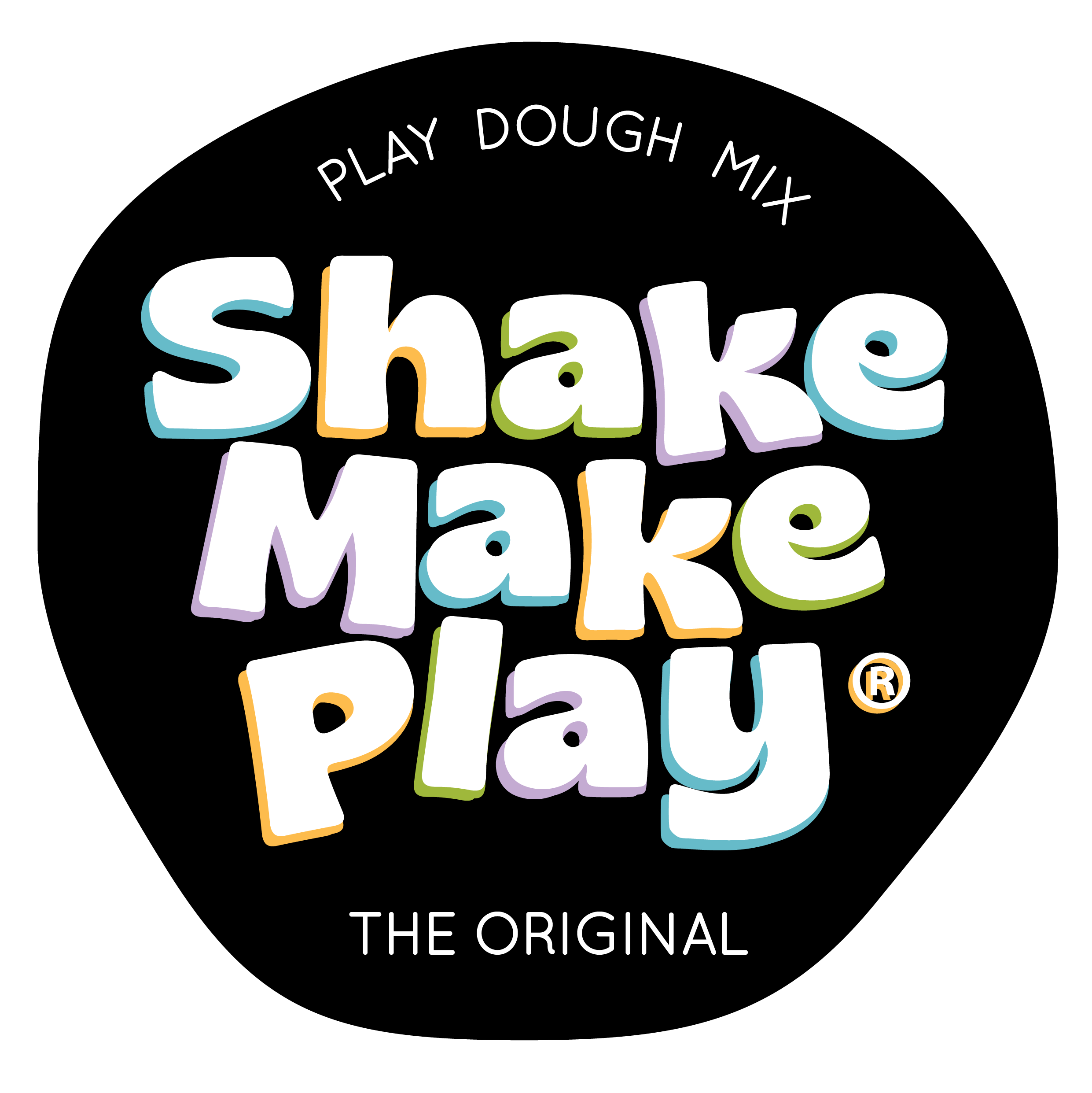
Shake Make Play
Play Dough Mix in a Jar
Brand identity • Creative Direction • Packaging
Creating a brand made for little hands and big imaginations
There's something incredibly rewarding about creating a brand for a business that's built around joy, creativity and play.
When I was invited to develop the brand identity for Shake Make Play, I immediately loved the concept. Their products are beautifully simple: natural play dough mixes that families can make at home, available in a range of colours and delicious scents. But behind that simplicity was an opportunity to build a brand that would capture the magic of childhood while giving parents confidence in the quality of what they were buying.
From the beginning, the goal was to create an identity that felt playful without becoming overly childish. It needed to appeal to children through colour and personality, while speaking to parents through a clean, thoughtful and trustworthy design.

The name Shake Make Play naturally inspired a sense of movement and interaction. It perfectly describes the experience of using the product: shake the ingredients together, make the dough, then let the creativity begin.
The logo was designed to reflect that energy. Rounded forms, approachable typography and vibrant colours work together to create a brand that feels fun, friendly and full of imagination. At the same time, the identity maintains a polished, professional feel that positions the business as a premium handmade product rather than just another children's craft activity.

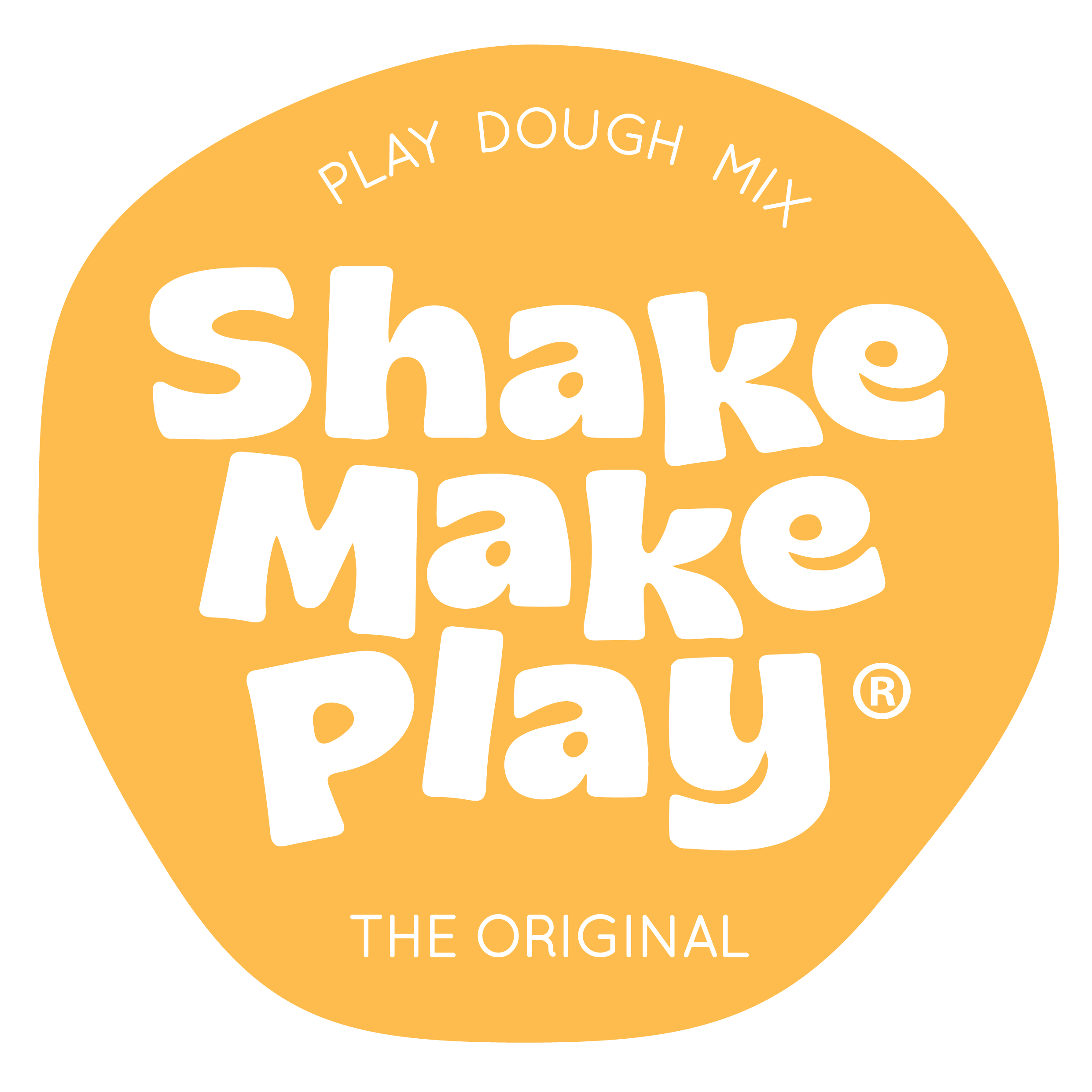
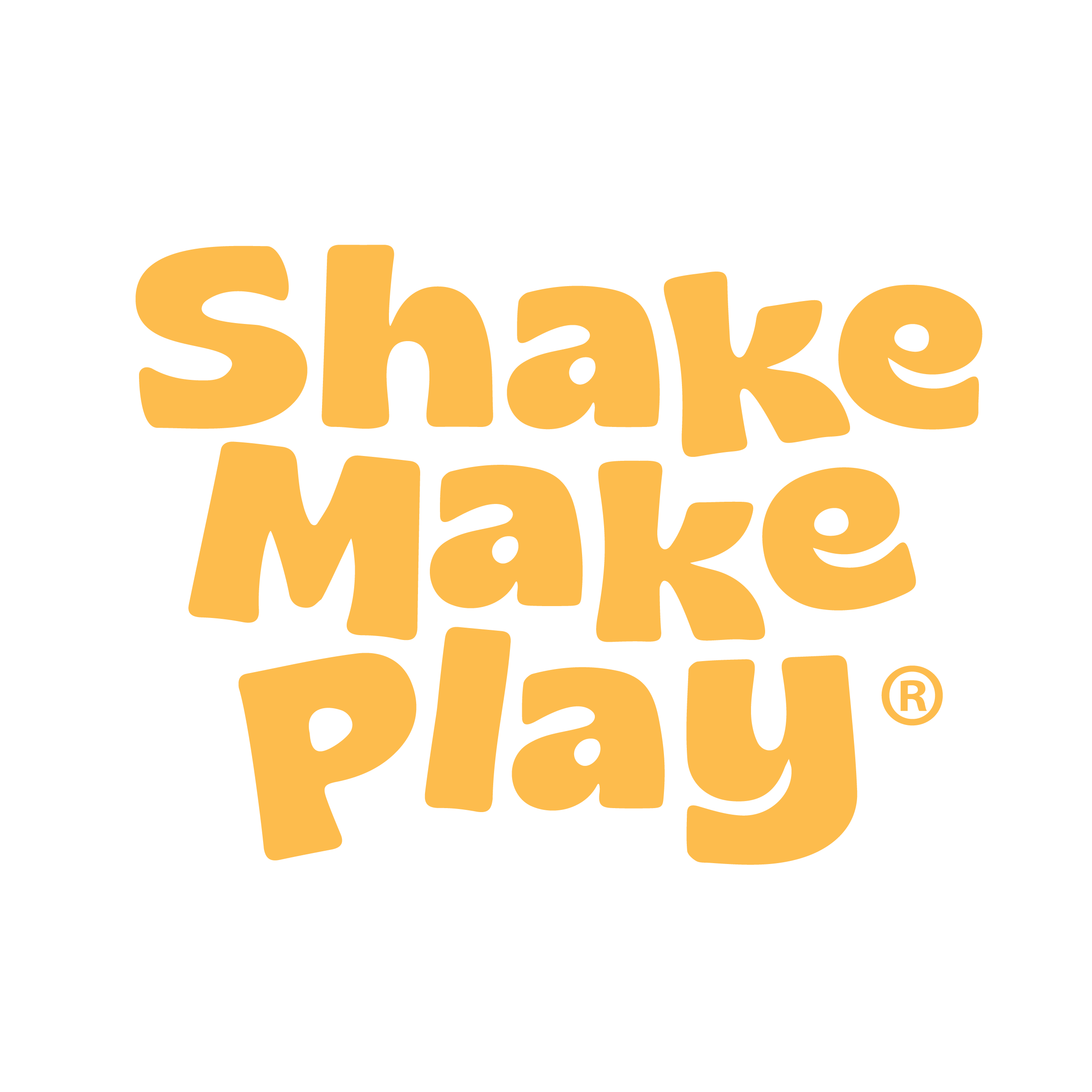
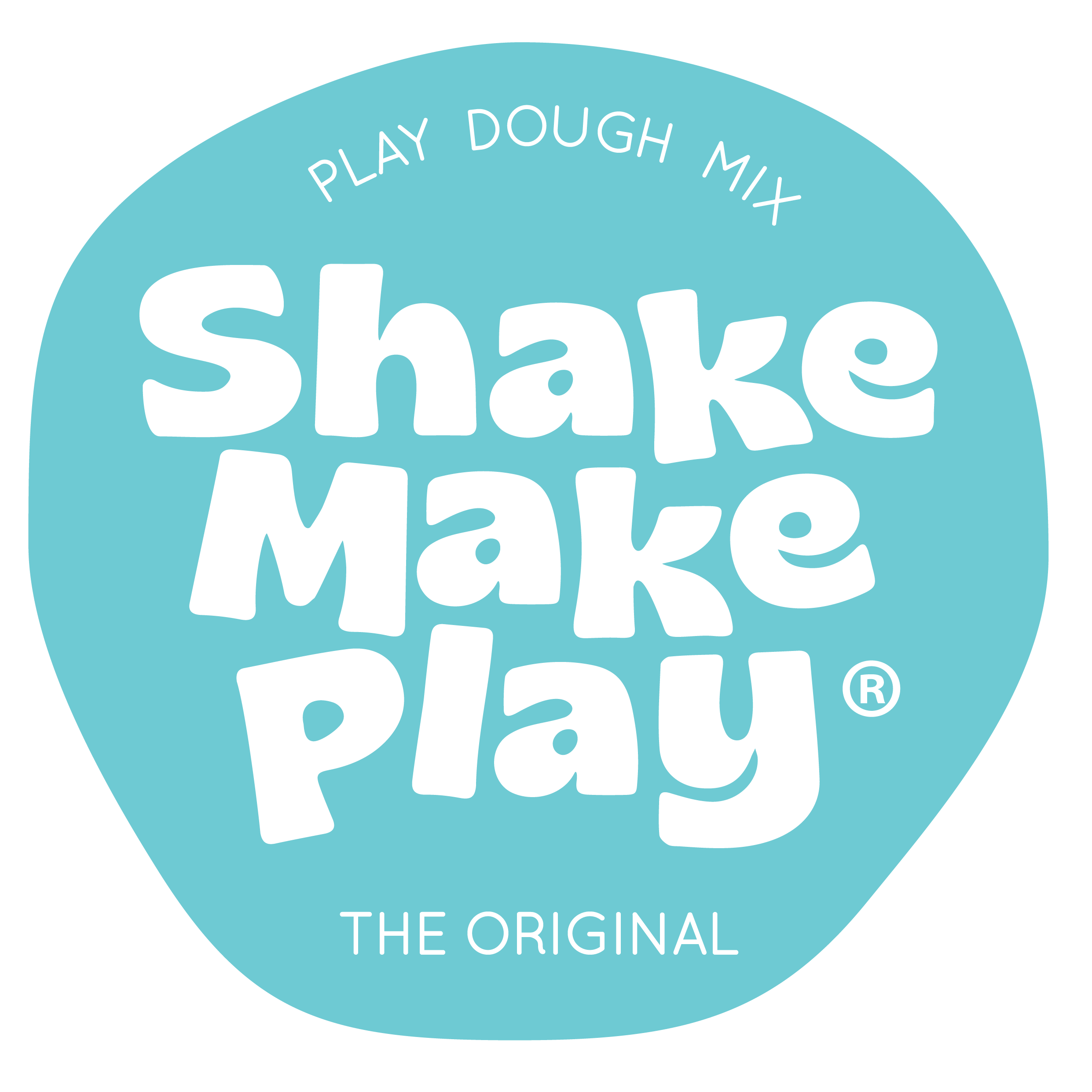
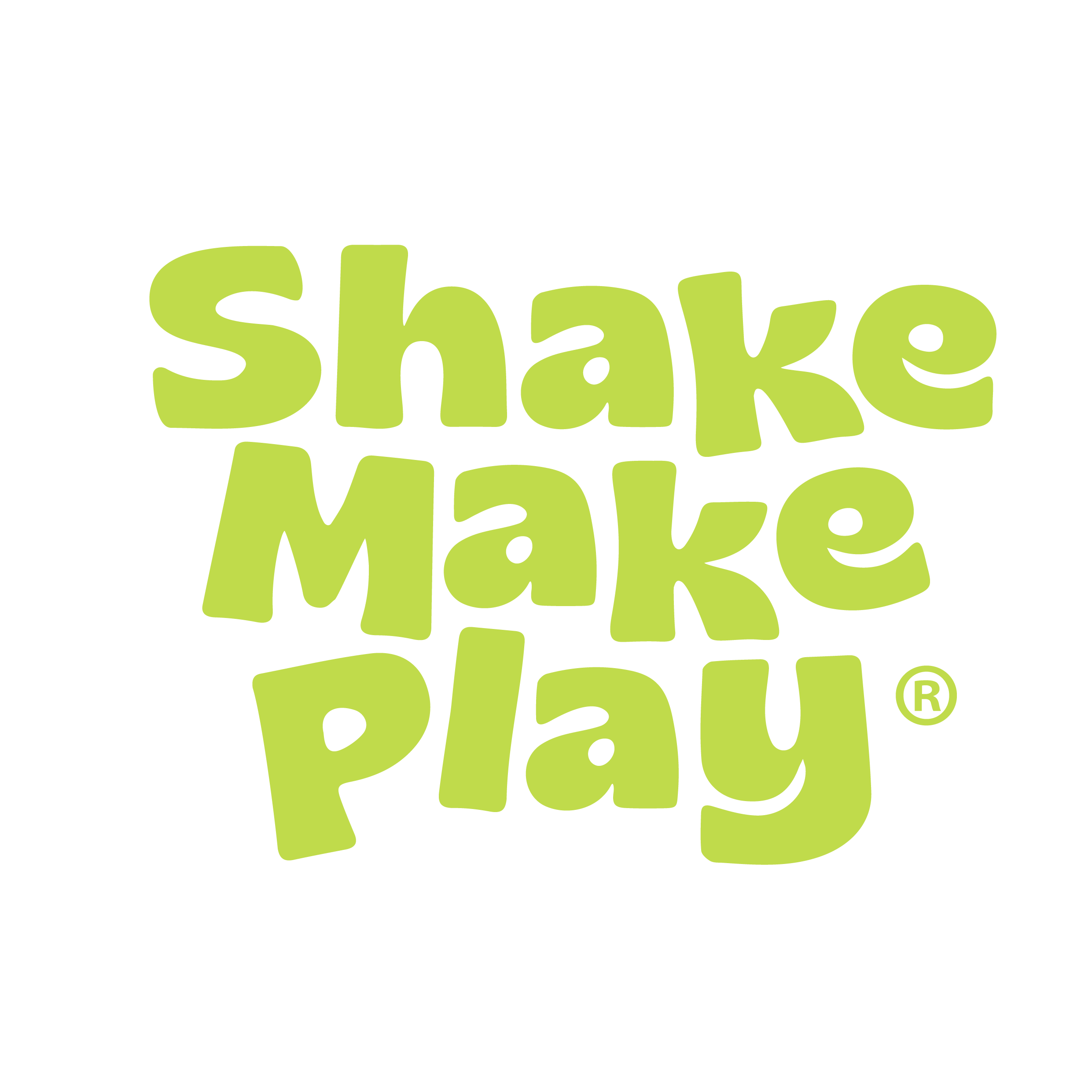
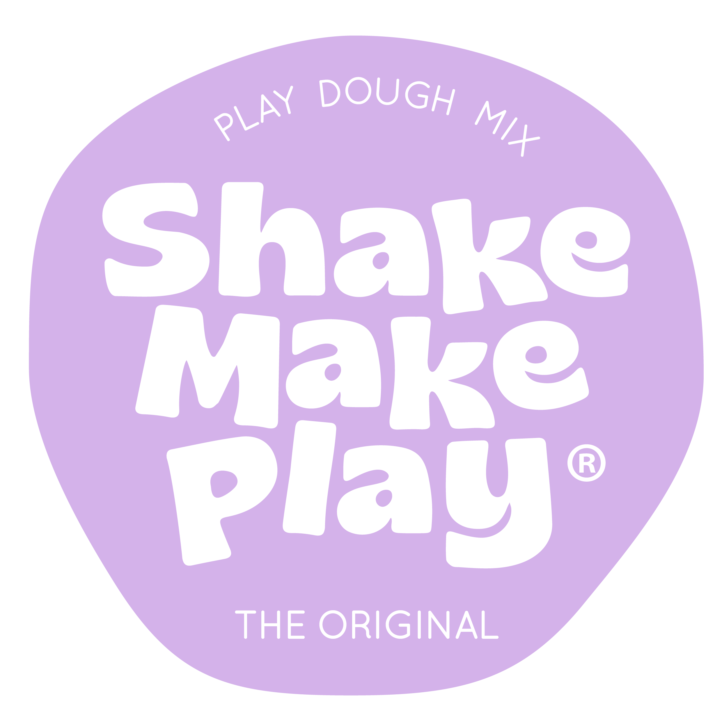
Shake Make Play logo set
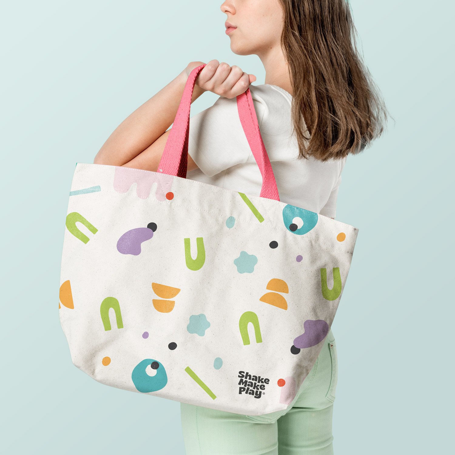
Beyond the logo, I developed a cohesive visual identity that could carry consistently across every customer touchpoint.
Every design decision—from typography and colour palette through to packaging layout—was made to infuse joy, fun and playfulness to the design. We printed multicolour organic shapes in leterpress to give a tactile feel to the business stationery. Curvy text layouts and colour achived a very vibrant identity full of movement and fun.


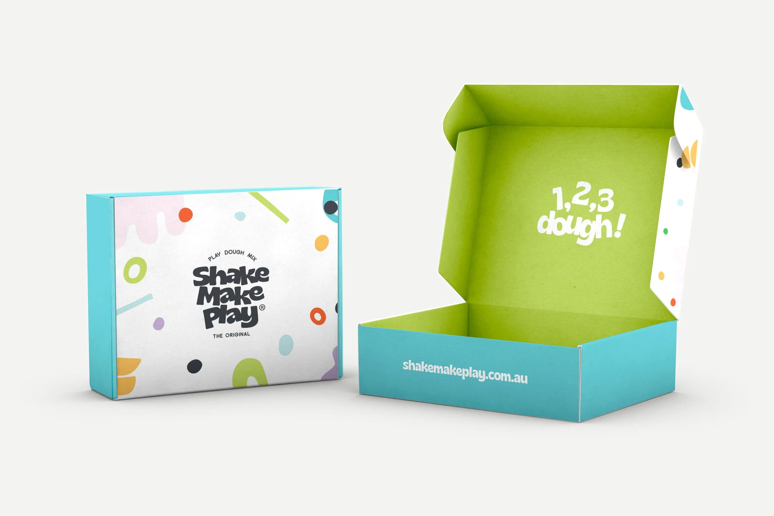
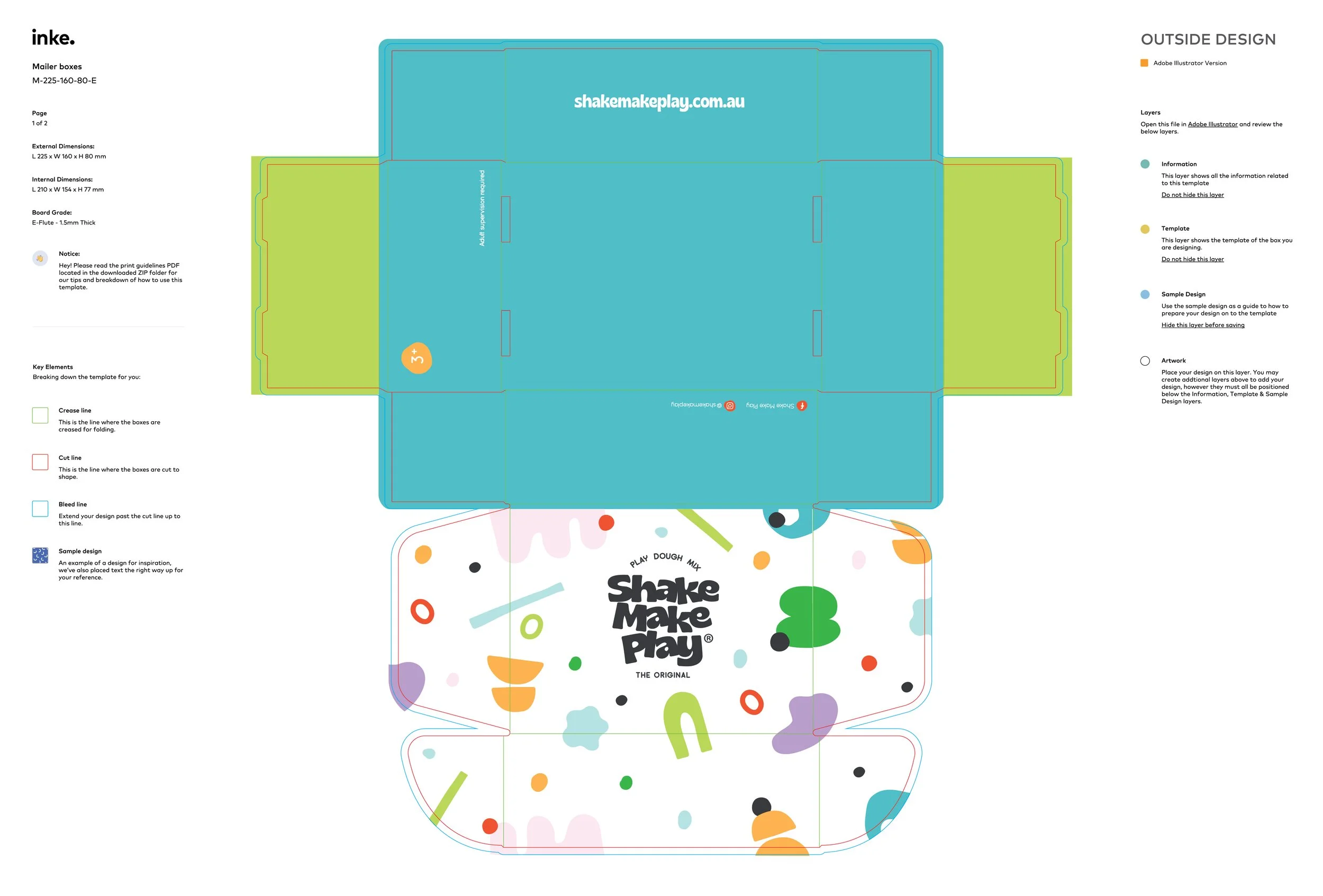
Because the products themselves are naturally bright and sensory, the packaging was designed to complement rather than compete with what's inside. The result is a clean, playful system that lets the colours become part of the brand experience.
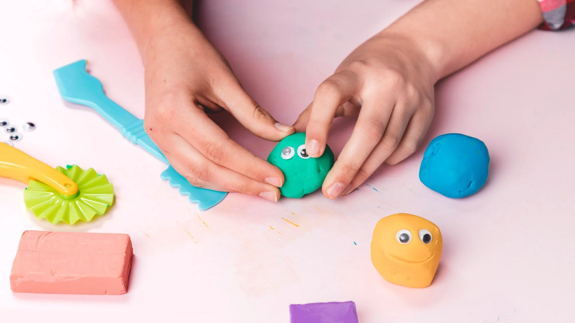
Each individual play dough mix is presented in its own jar, allowing every colour and scent to have its own vibrant personality while remaining unmistakably part of the Shake Make Play family.
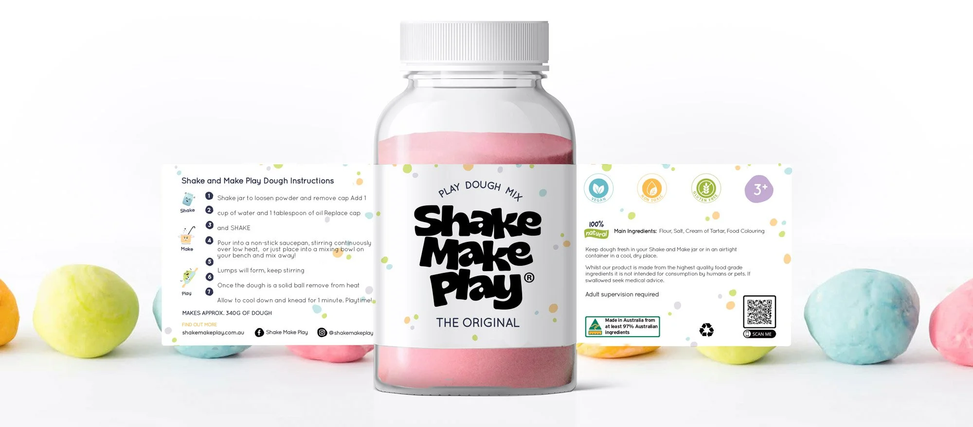
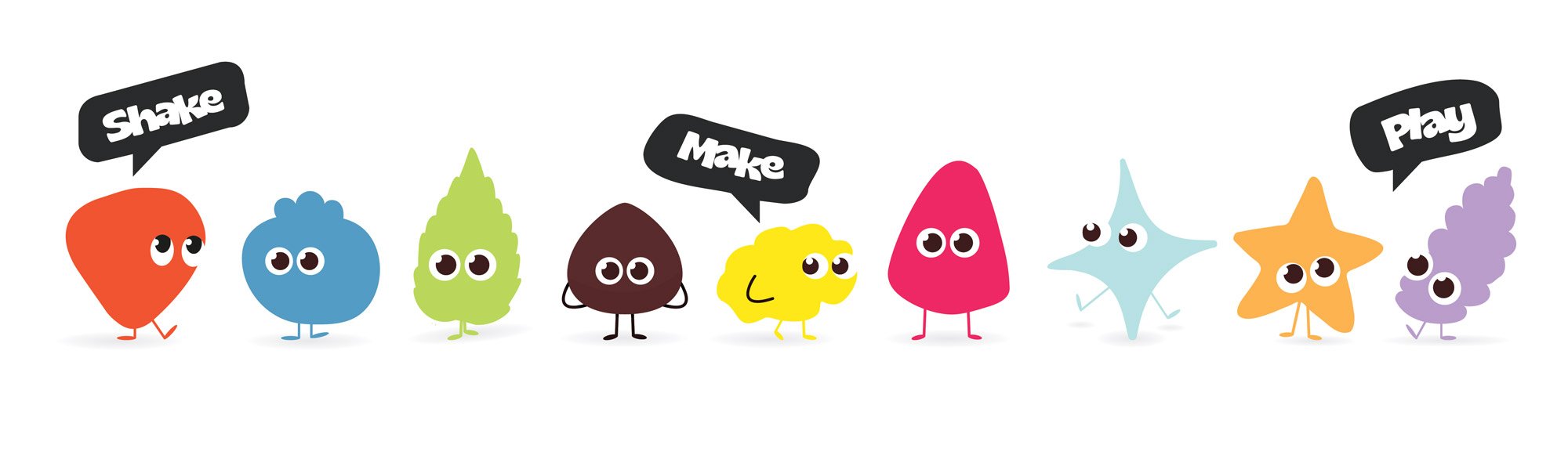
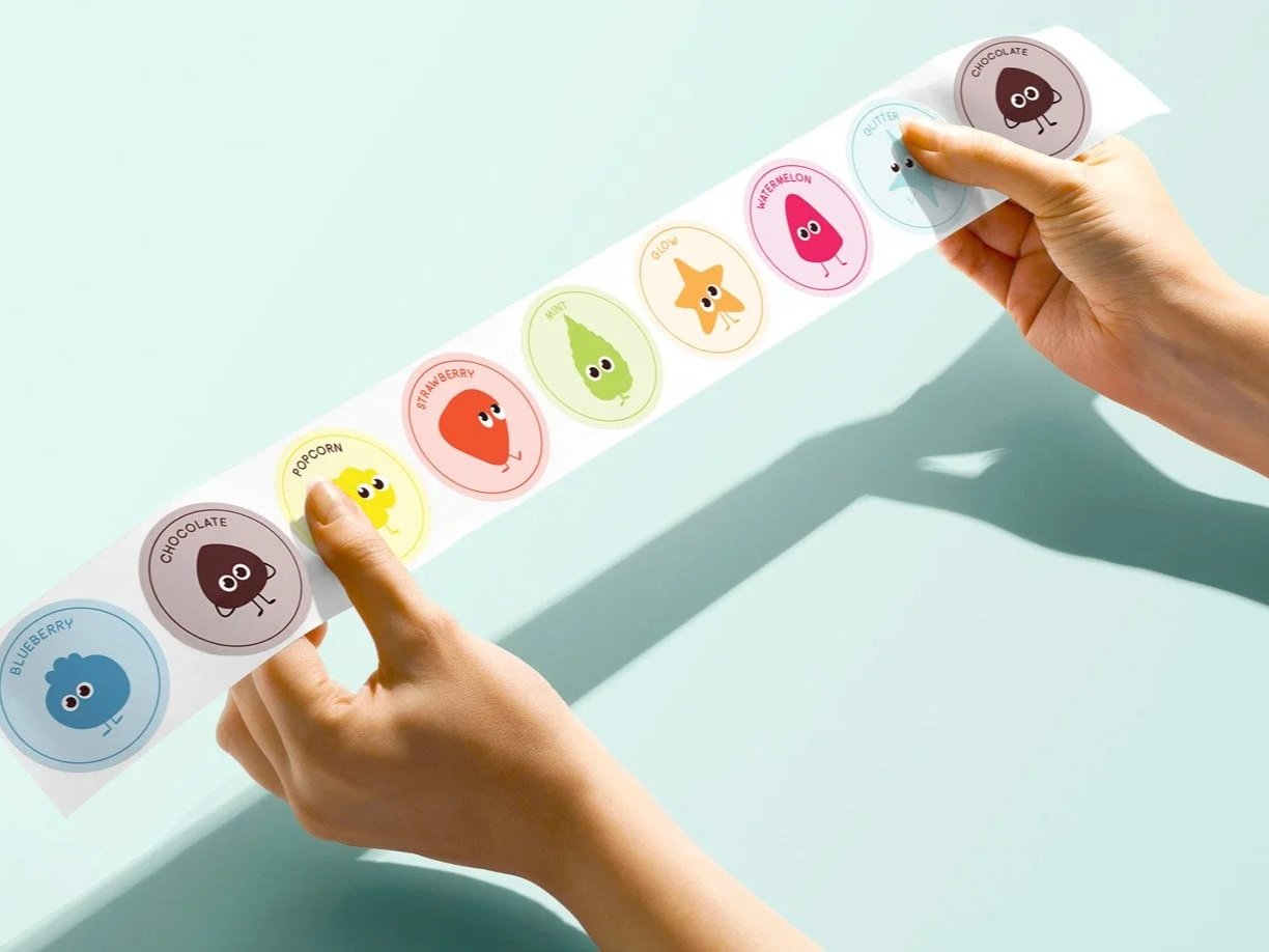
To help little ones identify the scent of each bottle without reading labels we create a set of characters, each of them to make the colour and scent of each jar. Keeping the character simple in their design give the brand identity a very modern look and feel.
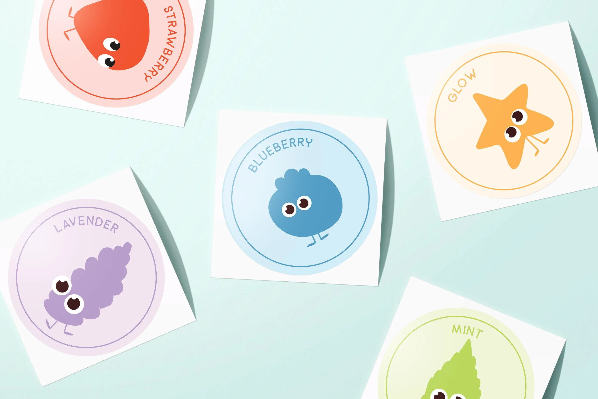
Lid stickers
Because the products themselves are naturally bright and sensory, the packaging was designed to complement rather than compete with what's inside. The result is a clean, playful system that lets the colours become part of the brand experience.
“Over here at Shake Make Play we are definitely obsessed with watching our brand come to life! Thanks Rosa (@ Grafika Studio) for your amazing work.”