
Adept Financial Services Rebranding

Adept Financial Services started their new brand identity journey with Grafika Studio in 2020. They wanted to expand their service portfolio and position themselves as a boutique accounting firm for medium size businesses in the Engineering, Building & Construction and Medical Service industries
To achieve this goal they were looking at transforming their existing brand identity and becoming a more modern brand with a fresh and vibrant visual communication style.
Grafika Studio participated in all aspects of defining the brand strategy and implementing a fully-fledged branding and website.
As a firm believer in the power of personalised customer service, the Adept team wanted to work with a new generation of professionals who valued the power of strategic partnerships to grow their business:
"We want to create an engaging experience that goes beyond the standard business support. We want to help clients to achieve results and grow their business through strategic advice" - they said.
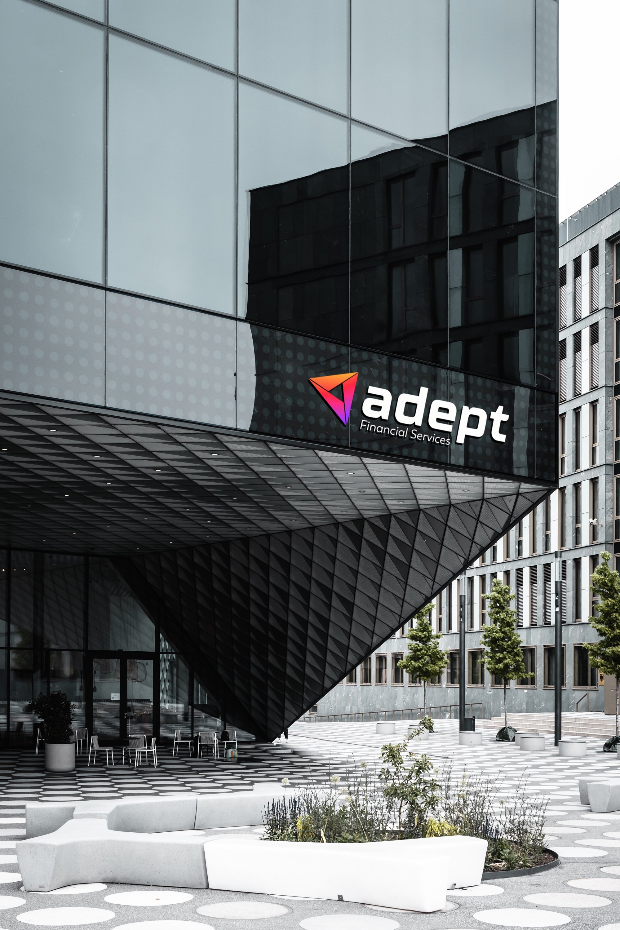
The initial brief indicated that the logo should retain the existing triangular logomark - which had been with the company since 2011 - but convey the notion of positive transformation and business growth. So I focused on the typeface and the colours to convey these ideas.

I selected a new font for the logotype, bolder and slanted to create a sense of movement. I also changed the uppercase original font style with a lowercase for a more approachable look.
The slanted font style also allowed me to align the typography with the angles of the logo mark.
The strapline was changed from bookkeeping to financial services, as the company expanded their service offerings.
The old brand identity colour was green. I replaced the main colour with navy blue, a more suitable choice for professional business services, as it's often associated with authority, professionalism, and trustworthiness.
However, navy blue is also often considered to be a “conservative” colour, while the company was after a more approachable and friendly look and feel. For this reason, navy blue was used here to add depth and sophistication to the brand but splashed with vibrant hues of red, purple and yellow.

Finally, the brand was complemented with gradients usually displayed inside triangular shapes, to match the logo and reinforce the idea of transformation and expansion.