New In Portfolio: Rebel Road Brand Identity

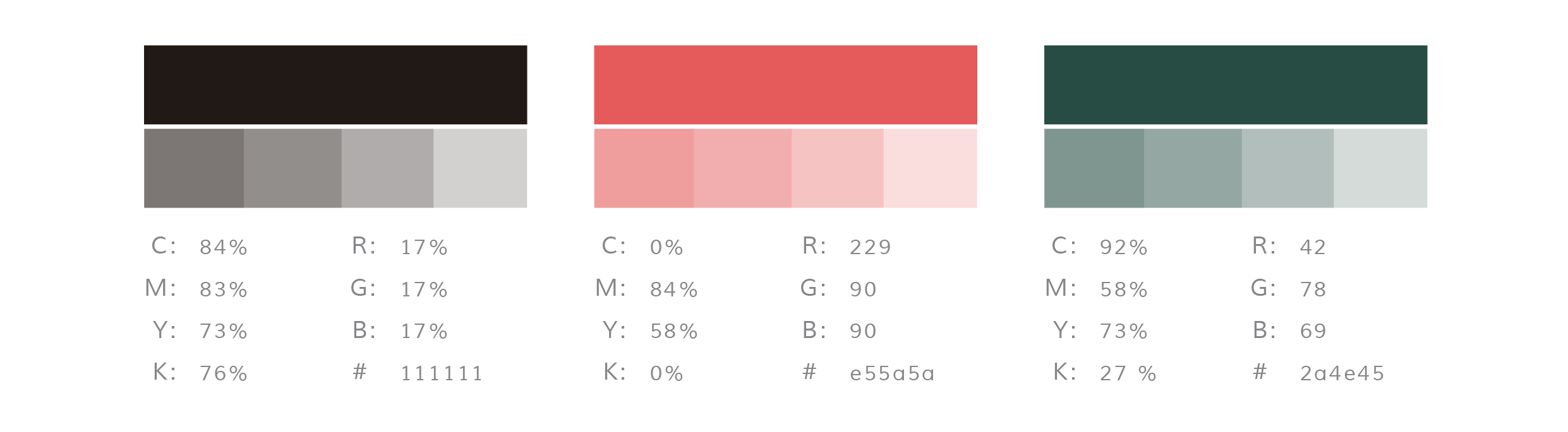
Brand mood board for Rebel Road, by Grafika Studio
One of the biggest advantages of being a visual communication designer in today's digital world is that you can work with clients from any corner of the planet. It was Instagram who brought Jenn of Rebel Road - based in the UK - and me together somehow (yes, designers can actually find clients in Instagram every now and then).
Rebel Road is a career coaching business, and Jenn was after a beautiful brand identity that inspired people to make positive changes in their lives.
The inspiration
The brief was to create a smart and stylish brand, with a professional look and feel and a bit of fun and rebellion.
When we put together the brand mood board (image above) Jenn loved green, so we chose a dark shade of emerald green as primary colour to achieve a professional, fresh look and feel. Then I added a hint of dust pink and watermelon to balance the cold primary colour with warmer tones. To create a sense of lux, copper or gold foil details would be used in printed materials.
I suggested to also incorporate brush strokes and hand-writing lettering to break the formality, add personality and character, and wavy patterns to create a sense of movement and dynamism.
The logo
We explored different concepts during the logo design process, but none of them seemed to carried a strong meaning that inspired expansion, excitement and positive changes.
And then we came up with the concept of circles. Circles represent movement, positive changes, new starts... and this one was a meaningful concept for a career coaching brand.
So the final logo is a hand-drawn circle with the brand name on it.

We also try to incorporate Jenn's name in the mix as a watermark, below the mark, or cutting the mark from the right side. In any case, we wanted to suggest that Jenn was behind the brand, as she had built a reputation as industry expert for more than a decade and many people already knew her name.
The colour palette
The brand colours were also intentionally selected to carry the brand messages:
Green - shooting and calming, inspires balance, stability and possibilities (all good attributes for a career coaching business). A dark shade of any cold colour also makes a brand feel professional and trustful.
Red - stimulating and dynamic, inspires activation, passion, excitement and expansion.
The patterns
It was important to continue using curves and circles to reinforce the ideas of 'change' and 'movement', as well as to connect with a young market/audience. So I designed a pattern with a mix of curvy shapes in different colours that flow across the canvas and dotted circular shapes.

Rebel Road business cards designed by Grafika Studio
I love the visual impact of this brand identity, its dynamism and its elegant look. But above all I love the fact that every single element, colour, and style has been chosen to carry the brand message: making a positive change in people's lives.
I'm currently designing Rebel Road new website but you can see this entire brand, with its business stationary and marketing collateral, featured in my portfolio.


The revamping of the Oh Flossy play make-up boxes came with a clear brief to create attractive and engaging packaging designs to capture the attention of children as well as their parents. The project goals were well-defined and the result would delight customers and pour great reviews.