
Inside A Designer's Website: ColourCube Interiors

ColourCube home page. Website designed by Rosa Spencer - Grafika Studio
I had recently shared with you this logo design and branding for Perth interior designer ColourCube Interiors. But what I hadn't shared yet was the stunning website I designed for this business too. To be completely honest, it's not hard to create a beautiful website when you already have great graphic material to work with.
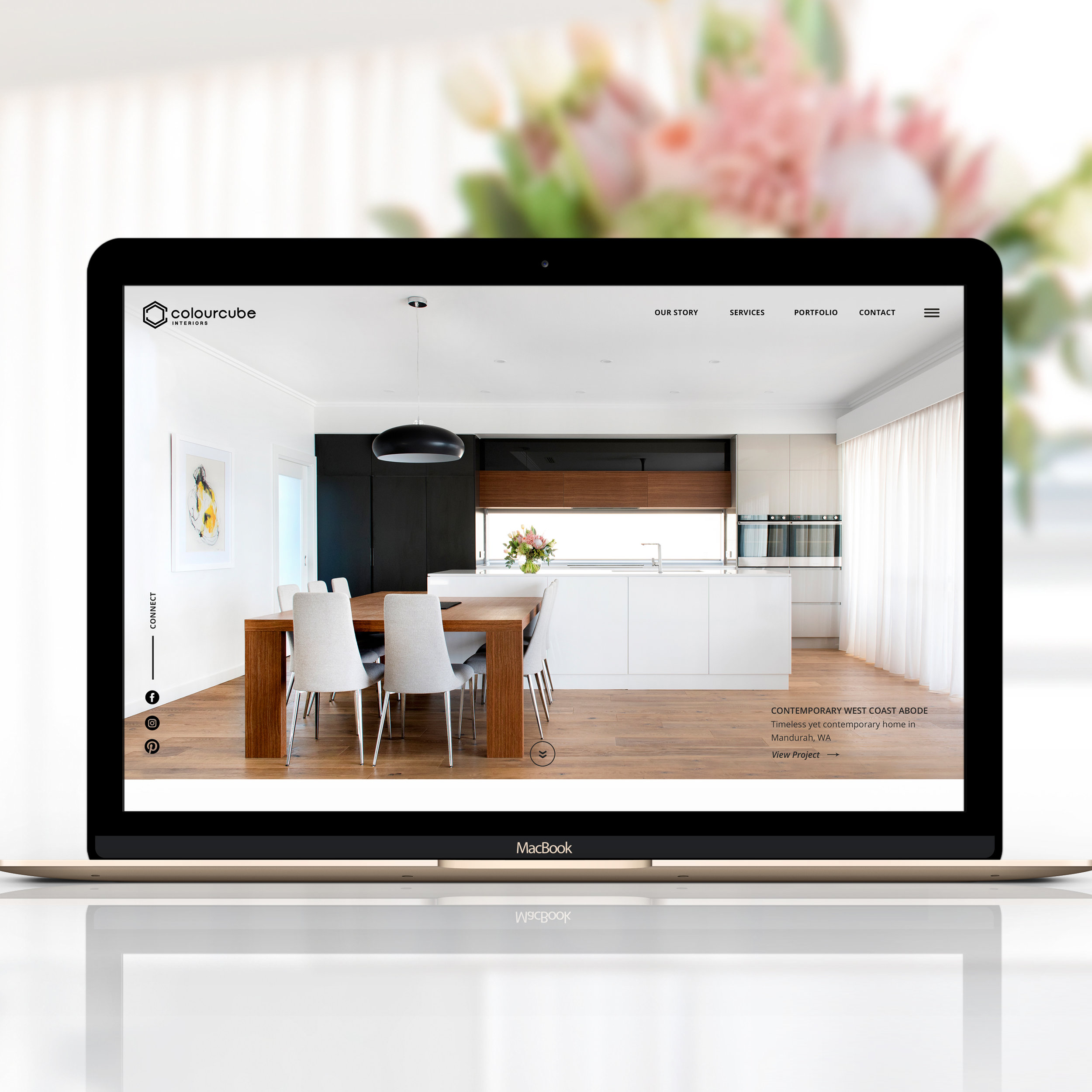
ColourCube had a beautiful portfolio of homes professionally styled and photographed by Perth-based photographer Claire McFerran of Gathering Light, so I just had to create a clean and stylish layout to let the images shine.
I didn't want to limit myself to a theme or template features, so no website builder was used here. I coded this website from scratch in Dreamweaver to be able to customise every minimal detail.

The internal pages have a interior shot in one side of the screen and text in the other side. This simple layout is been designed to focus to attention in the images without any distractions from graphic elements, colours, animations, etc. The two column layout is repeated in most internal pages to achieve visual consistency and easy navigation.
The typography combines a hand-written style text for page titles, with a classic serif Vidaloka for headlines and a stylish sans serif Josefin Sans for sub-headlines and body text.

About page of ColourCube Interiors website
The internal pages keep the social media icons over the image so that visitors can easily connect with the business in social media.
|
DESIGNER'S TIP: keep social media icons as a fixed section in one side of the screen to improve social media engagement. Visitors can click on them and follow the business in social media at any time of their journey through your site.
|
|---|
One of the client's projects featured a beautiful bedroom with some teal blue accents. I found this colour so perfect for links, buttons and other clickable elements in the website. Below is the Contact page with one of the beautiful bedroom images.
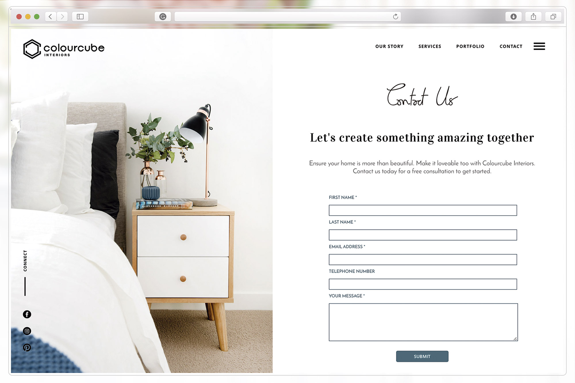
Contact page of ColourCube Interiors website
The big amount of white space across the website was intentionally used to create a sense of calm and tranquility, inviting visitors to stay and enjoy the gorgeous portfolio for as long as they like.
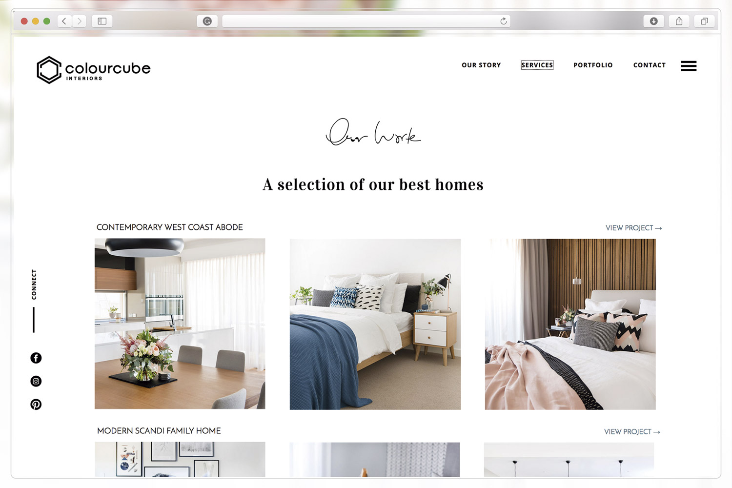
Portfolio page of ColourCube Interiors website
This beautiful website is the perfect example of one of my core values: Simplicity. Good design doesn't need to be complicated. Simple is beautiful. Minimal and effective designs are my mantra (you can read my business value in my About page)


The revamping of the Oh Flossy play make-up boxes came with a clear brief to create attractive and engaging packaging designs to capture the attention of children as well as their parents. The project goals were well-defined and the result would delight customers and pour great reviews.