Posts tagged Website Design
Inside A Designer's Website: ColourCube Interiors
ColourCube home page. Website designed by Rosa Spencer - Grafika Studio

ColourCube home page. Website designed by Rosa Spencer - Grafika Studio

I had recently shared with you this logo design and branding for Perth interior designer ColourCube Interiors. But what I hadn't shared yet was the stunning website I designed for this business too. To be completely honest, it's not hard to create a beautiful website when you already have great graphic material to work with.

ColourCube had a beautiful portfolio of homes professionally styled and photographed by Perth-based photographer Claire McFerran of Gathering Light, so I just had to create a clean and stylish layout to let the images shine.

I didn't want to limit myself to a theme or template features, so no website builder was used here. I coded this website from scratch in Dreamweaver to be able to customise every minimal detail.

Colour-cube-interiors-home-page

The internal pages have a interior shot in one side of the screen and text in the other side. This simple layout is been designed to focus to attention in the images without any distractions from graphic elements, colours, animations, etc. The two column layout is repeated in most internal pages to achieve visual consistency and easy navigation.

The typography combines a hand-written style text for page titles, with a classic serif Vidaloka for headlines and a stylish sans serif Josefin Sans for sub-headlines and body text.

About page of ColourCube Interiors website

About page of ColourCube Interiors website

The internal pages keep the social media icons over the image so that visitors can easily connect with the business in social media.

DESIGNER'S TIP: keep social media icons as a fixed section in one side of the screen to improve social media engagement. Visitors can click on them and follow the business in social media at any time of their journey through your site.

One of the client's projects featured a beautiful bedroom with some teal blue accents. I found this colour so perfect for links, buttons and other clickable elements in the website. Below is the Contact page with one of the beautiful bedroom images.

Contact page of ColourCube Interiors website

Contact page of ColourCube Interiors website

The big amount of white space across the website was intentionally used to create a sense of calm and tranquility, inviting visitors to stay and enjoy the gorgeous portfolio for as long as they like.

Portfolio page of ColourCube Interiors website

Portfolio page of ColourCube Interiors website

This beautiful website is the perfect example of one of my core values: Simplicity. Good design doesn't need to be complicated. Simple is beautiful. Minimal and effective designs are my mantra (you can read my business value in my About page)


Step By Step Guide To Design Your Website Like A Pro

The big amount of DIY website builders available today makes the website design process look too easy. Anyone with no design skills or tools can drag and drop elements into a web page, play with the layout and change basic styles.

However, designing a website is much more than just uploading images and content onto a server. It involves an entire visual communication process aimed to create an emotional connection with your audience, communicate your business purpose and achieve its ultimate goals.

Today I'm sharing my website design process. I won't go into the technical details of building a website to just focus on the steps that a professional web designer will typically take to design a website. Are you ready to design your own website like a Pro?


Step 1 | Define Your Intention

A good website design doesn’t start by choosing a template, deciding on the colour scheme or finding pretty images. It starts by clearly defining the website ultimate purpose.

There are three essential questions that you need to ask yourself before you start designing your website:

  • How should your visitors feel when they visit your site?

Do you what them to get inspired? Empowered? Curious? And why?

  • What do they need to know about your business?

How to book? How much will your services cost? What’s included in the service?

  • What would you like them to do on your website?

Make a purchase? Make an appointment? Visit your brick and mortar store? How are you going to make them take action?

Knowing the answers to these questions will help you decide what content, colours, graphic elements, etc your website needs.


Step 2 | Map Out Sections and Sub-sections

Now it's time to plan how you are going to structure your website by drawing a ‘tree diagram’. You can do this on a whiteboard, a spreadsheet program (such as Excel or Google Drive Spreadsheets), a word processor, etc.

This diagram will show the hierarchy of the website and how the various pages and sections relate to each other.

Tree diagram with information architecture and website structure by Grafika Studio

A well-thought site structure not only means a great user experience, but it will also give you better chances to rank higher in search engines.


Step 3 | Write compelling content

Once you have a clear structure of pages, develop content for each of them separately. Don’t worry about formatting just yet, write down anything that you think your visitors and potential clients want to know about your business, products or services.

Research your competitors' websites to see the key messages in their websites and how the information has been presented. Do this not to copy them but to put together something better that will stand out your competition.

Remember that writing for the Web is completely different than writing for print. Too much information is overwhelming and will make your visitors feel intimidate and leave without reading your message.

Find more tips on how to write a compelling website content in my previous post on Why My Website Is Not Converting.


Step 4 | Sketch The Layout With Wireframes

Now you know how many pages your website will have and what content you need to fit in each of them, it’s time to decide how the information is going to be presented on each page. You can do this with the help of wireframes.

A wireframe is a black and white representation of every webpage on your site, usually using boxes and buttons to show where each piece of information will be displayed.

The best way to do your wireframes is by hand sketching in a gridded sheet. Divide your grid horizontally into header, content and footer, and vertically into 2 or 3 columns to fit the content, with right and left margin and separation space between the columns.

Not only it’s important how you present the information, but also where you place it. Information positioned in the upper half of a webpage and visible without scrolling down the page is what we call above the fold. Everything else is below the fold.

If visitors have to scroll down to find important details on your website, chances are that they leave without even noticing them.

Analyse your web copy and extract one key idea per page only. This idea must be positioned at the top of the webpage (above the fold). Further information and details can be placed after.

Home page wireframe for a website project by Grafika Studio

Home page wireframe for a website project by Grafika Studio

Step 5 | Mock-up Your Website Design

Your wireframes can now be translated into visuals. This is a very important step for any website designer to communicate his ideas and present them to the client. It's also time to make some styling decisions, such as colours, image style, typography, etc.

To create a mock up of your website you will need the help of Photoshop, and therefore a bit of knowledge on this software.

Your website mock-ups will help you visualise how images look against your brand colours, typography and other graphic elements. It can also be helpful to design buttons, boxes and any other graphic element to establish a consistent visual language across your site.


Step 6 | Build Your Website

The website design process reaches here the end of the line. Now it's time to select your website builder (WordPress, Shopify, SquareSpace, etc) and find a suitable template or theme to build your website. A web developer can help you adapt your template to your design and customise your CSS to style up your website.


Wrap up

At the end of the day, it doesn't matter if you are using Helvetica or Open Sans on your website, or blush pink or iced blue, what really matters is that your website delivers a clear message on who you are, what you do and why people are going to love your products or working with you. This compelling message can only be achieved with a lot of planning and a good understanding of visual communications and UI (user interface) design.

Need a hand with your website project?

I'm your designer! Get in touch and request a quote for your project.


The Journey From The First Visit To The First Sale: Converting Visitors Into Customers

The single fact of having a website won’t bring customers or clients to your door. Not even if you have a lot of traffic. The process to get a new client is usually slow and requires creating familiarity and some love in people’s hearts.

While some first-time visitors may be ready to make a purchase straight away, research has shown that the average visitor will have to engage with your brand, at least, seven times before they‘re ready to make the decision to purchase.

If you have a website, you need a plan to make your first-time visitors come back again and again and again… until they become buyers or paying clients. The journey taken by visitors until they become buyers is called the conversion funnel.

Website-conversion-funnel

The conversion funnel can differ from website to website, depending on the nature of the business, but it usually has four steps - plus two extra ones for repeat businesses or sales:

 Awareness Acquisition Retention Conversion Loyalty Advocacy


1. Awareness

Strangers become visitors

The first step in this journey is getting people to visit your website. No visitors means no chances to introduce your business and offering to others who may be interested in buying from you or working with you in future.

There are five ways to lead traffic to your website:

  1. Direct - people who find your website in your business stationary, off-line marketing collateral, or any other piece of printed material, and type the website address directly into the browser.
  2. Organic - people who find your website in the organic results (non-paid) of search engines.
  3. Paid - people who find your website in the paid results of search engines and advertising or paid links in third-party websites.
  4. Social - people who find your website through social media forums, chats, hashtags, etc.
  5. Referral - people who find your website in online media outlets, blogs or any other third party website that’s talking about your brand and includes a “non-paid” in-bound link to your website.

However, traffic is not always equal to sales. Many visitors may be just browsing the Internet, and visiting your website among another 20 competitor’s websites. Chances are that they forget your name as soon as they leave your website.


2.    Acquisition

Visitors become prospects

Every great relationship starts with a first date. Imagine one of your friends knows someone who thinks he or she could be a good match for you. You follow your friend’s advice and decide to go on a blind date. You’ll go to this first date with three goals in mind:

  1. Getting to know each other, your personalities, your interests, your hobbies, etc.
  2. Causing a great first impression and inspire trust.
  3. Getting her/his phone number to stay in touch

That’s exactly how your first visits work.

When visitors land in your website for the first time, you must set a good first impression and gain their trust. Good design and compelling content are your main tools here. In this other previous post, I shared some do's and dont's to make your website trustworthy.

After a positive first impression comes interest. Your visitors will be interested in knowing more about you and what your business has to offer. Your About page, Service or Product pages, portfolio or lookbook and other tools like videos, downloadable brochures, etc, will provide more information on who you are, what you do and how you can make a positive impact on their lives.  

Finally, if your visitors like your business and are interested in your offer, they may want to stay in touch. Make sure your website has links to your social media pages and opt-in forms to collect their email details.


3.    Retention

Prospects become leads

Your first date is over. It went well and you got your date’s phone number! She or he has even accepted your Facebook friend request. What’s next? You both want to see each other again!

Once your prospects have left your website you want to make sure they come back again. If they have connected through social media or email, you can now send them links to interesting content on your website that keep them hooked.

Now content marketing is key.

There are many ways to deliver your content: blog posts, newsletters, podcasts, webinars, etc. In this other post, I give you 8 ideas to produce highly engaging content.

Good content engages people and opens a communication channel with them, who may leave a comment on your blog, like or share a post in social media, attend a free webinar, etc.

The spark is there!

The problem with getting people’s email addresses though is that everyone has way too much in their inbox. It usually takes a bit more than a simple “Sign-up today” call to action to convince someone to give you an email address. You’ll have to give them a good reason for it, like accessing exclusive content, free downloads, etc.

To find out more about how to convert prospects into leads also read this other post, by Trent Dyrsmid, Founder at Groove Digital Marketing.


4.    Conversion

Leads become customers

Your visitor loves your brand and is now in need of your products or services, therefore, he or she is ready to hire you or purchase from you.

In e-commerce websites, the end of the journey is typically the purchase. In service websites, it may be to request a quote or proposal, book an obligation free consultation, make a booking or appointment, or enquire about your services by email or phone. That means that there is, at least, one more step to complete the conversion process.


5.    Loyalty

First-time buyers become repeat buyers

Someone has bought your product or hired your services, now is your opportunity to impress your clients with an outstanding service. Why? Because every satisfied customer or client will:

  • Hire you or buy from you again in future.
  • Recommend you to others

It’s also a lot easier to sell a new product or service to an existing client than taking any new visitor through the entire conversion funnel until he/she becomes a buyer.


6.    Advocacy

Customers become referrers

Many people won’t search in search engines, read review sites or blog posts if they already have a friend or family member who has made a recommendation to them. These “recommended” visitors are probably ready to hire your services or purchase your products on their first visit to your website.

The conversion funnel is not needed here. They become customers immediately because they trust someone’s advice, who is already one of your existing clients.


Your turn

Now you know the journey from your first visit to your first sale, you can implement this strategy directly into your website. Download my conversion funnel guide, with tool checklist and action plan, and lead the journey to your business growth.

Website-conversion-funnel-guide

How To Design A Storytelling Website

Throughout history, stories have been the most natural way to pass information among humans. Through storytelling, we share knowledge, express emotions and entertain others.

Stories have always been a primal form of communication…They connect us to a larger self and universal truths.
— Pamela B. Rutledge, The Psychological Power of Storytelling

While conventional website design commonly uses card-style layouts to organise the information in small units, narrative layouts can also be applied to websites.

In today's post I'll show you how you to create a storytelling website and some common techniques to make it engaging and interactive.


Why a storytelling website?

An effective storytelling website requires a lot of planning and excellent user interface design. But when it’s done right, it can establish a strong emotional connection between the brand and the visitor.

Every website has a story to tell, but not every website needs a storytelling layout. Sometimes a single image is enough to tell your story. Words, colours and other graphic elements also tell stories.

But when the website needs to deliver more complex messages, designers use a combination of two powerful communication tools:

  • Visuals
  • Storytelling layouts

In web design, storytelling needs to be visual. Visitors find text intimidating; they don’t like to read on the computer screen, so the story needs to be short and told in just a few words.


What makes a good story?

First of all, your story must have a purpose that changes visitors' views or believes, or influence somehow their decisions.

Your story also must engage your audience and encourage them to take some action at the end of it. To achieve this:

  • Make them participate in the story. You can achieve this through some of the interactive techniques described below.
  • Lead the visitor to a conclusion or a “moral” that makes them take some action. You can achieve this through call-to-actions.

As Jessica Moon says in her post30 Compelling Examples Of Visual Storytelling On The Web “Much like how we expect to see a moral at the end of a book, we expect to find a purpose at the end of a site with a storytelling experience”.


Creating a storytelling website

Every story has three parts or acts: setup, conflict and resolution. You can start by dividing your story into these three acts.

  1. Identify a hero and a villain.
  2. Create a setting where the action will take place
  3. Develop an action that contains a conflict
  4. Create surprise factor, with perfectly-timed surprises that visually engage and delight the user
  5. Add a moral or conclusion, and allow readers to think for themselves
  6. Keep the story short and sweet
Fracking-storytelling-website

A great example of story telling website is The Dangers Of Fracking. The website propose of the website is explain the concept of hydraulic fracturing.

  • Hero: the visitor
  • Villain: the hydraulic fracturing
  • Setting: sky city road → fracking site → pipes → sky
  • Conflict: several environmental, safety, and health hazards
  • Surprise factor: scroll-triggered effects
  • Moral: support the FRAC Act
  • CTA: sign up the petition


Website storytelling techniques

1. Long-scrolling website

While long-scrolling websites were something to avoid in web design a few years ago, today, they are the most common layout to tell a linear visual story. They usually combine a long background image with position fixed elements to create a sense of movement when scrolling.

A long-scrolling site can combine a variety of interactive techniques to engage, surprise and make the visitor participate in the story.

Apart from the example above, the hydraulic fracturing website, below are other two great examples of long-scrolling storytelling websites:

Example 1 | Vertical scrolling: Babel The King

Babel, the story main character, falls down from a cloud to the grass as you scroll down. I love the cute illustrations of this website, designed by its own author karim Maaloul, a Belgiam creative director and founder of interactive agency EPIC.

Babel-the-king-storytelling-website

Example 2 | Horizontal Scrolling: The Bright Future Of Car Sharing

A drive in a virtual car shows the social, economical and environmental benefits of sharing a car ride. The website has been designed as a big interactive infographic, with lot of information and data presented in a visual way.

The-bright-of-car-sharing-storytelling-website


2.     Scroll-triggered animations

The information makes its entrance from the sides or the bottom of the screen when scrolling down, throw subtle animations. This technique gives front-end developers the ability to create richer and more interactive web experiences.

Example 1: Reverend Danger

This digital agency explains their creative process through a clever interactive design.

reverand-danger-scroll-triggered-animations


Example 2: La Moulade

I love the visual simplicity of this almost hypnotising website,

La-moulade-scroll-triggered-animations


3.     Parallax scrolling

When the background images move slower (or remain static) than images in the foreground, creating the illusion of depth and immersion.

Although the parallax scrolling is growing in popularity across the Internet, the main problem of this technique is that not responsive and mobile-friendly.

Example 1: Case 3D

In this website the parallax scrolling has a clear purpose: it shows the transformation from sketches to amazing 3D visualisations.

Case-3D-parallax-website


Example 2: Beoplay

An excellent example of how sounds can also play an important role in storytelling websites. As you scroll down the sound gets louder as if it's slowly approaching to the visitor. The sound here is used to create a tridimensional illusion where elements can get closer or further in the distance. Open a new window browser on top of this website and see what happens...

beoplay-parallax-website


4.     Hover-to-reveal copy

If the website contains a lot of copywriting, the visitor will find the site too overwhelming and abandon it quickly. Hover effects are a clever way to hide some of the content making the site easy to scan. When you mouse over an element, other pieces of information are revealed.

This way to present the information is very interactive. The visitor explores the site searching for hidden content.

Example: Evoenergy

A great storytelling example with ecological message. Information is displayed as you hover over the different elements of the graphic, creating a very playful and engaging experience for the visitor.

Evoenergy-hover-to-reveal-website


Takeaway

A good storytelling website is a powerful communication tool that when is done correctly can:

  • Explain complex concepts or ideas in a simple way, easy to understand by the audience
  • Create an emotional connection with the visitors
  • Make the content more engaging and visually appealing
  • Provoke curiosity and encourage people to navigate through the entire page.
  • Persuade the visitor to take action in a more effective way

Do's and dont's before getting a new website

So you want to design a new website for your business. You have images, content and are all ready to get started. You want your website up and running in a few weeks. However, after meeting with your designer you realise it’s not going to happen so quickly.

Not just that, you also realise that some of the decisions you made on your own for your website weren’t quite right, which ends up wasting time and money.

To get a website design project right from the beginning it is important to know what you should do and what you shouldn’t, or at least not without consulting your web designer first.

Do focus on the main purpose of the site

The main purpose of any business website is growing the business, but the question is HOW. Do you want to improve your brand awareness? Or grow your sales? Do you want to give your existing customers better service?

By having a clear description of the main purpose of your website you will help your designer understand where the focus should be and make confident decisions along the design process.

Do sign a design contract

A design contract is the best way to ensure everyone understands and agrees with the terms of service. The contract should include basic terms and conditions on events such as contract termination, copyrights, licensing, payment conditions and service limitations.

I use the design contract provided by AIGA (The Professional Association For Design).

Do get an estimate in writing

Although a website project is very difficult to quote in its early stages, always ask for an estimate before paying any deposit to avoid unpleasant surprises.

Ensure you understand the billing method – hourly rate or fixed price –, what’s included in the price and what’s extra.

In this other post, I explain how I price my design services to make it as fair as possible for both, the client and myself.

Don’t buy hosting

Discuss the hosting options with your designer first. Some solutions cannot be hosted by anyone, like SquareSpace. Also in many cases, web designers and developers work with multi-hosting services and could host your website for free.

Do always choose open-source tools

Always request an open-source content management system (CMS) – like WordPress, Magneto, Shopify or Squarespace - so that any designer or developer can access it in the future.

Some design companies work with proprietary CMS. If that’s your case, you'll get stuck with the same company – and their fees - forever.

Don’t rely on the design brief only

One of the hardest things of a brief questionnaire is asking the appropriate questions in a way that the client can easily understand. For example, when a client says “I need a Wordpress website” quite often what they mean is “I need a Content Management System”, but Wordpress might not be the right solution for them.

After receiving the client brief, I always arrange a face-to-face meeting with them – or a virtual meeting if the client is not local – to fill the blanks and clarify the project requirements.

Do research your competition

To figure out what your website needs in terms of content, functionalities, etc, check out your competitors websites and make a list of all the features that you would like to incorporate into your site. This list will be really helpful to your designer later.

Do invest in beautiful photographs

The Internet is getting more and more aesthetic every day. Professional photographs beautifully styled can immediately build trust in your business, and create a quick emotional connection with your visitors.

Do not use photos taken by yourself in your website. A good image needs proper lighting, a good styling and quite often a lot of Photoshop editing and retouching too.

You can see an example of Photoshop retouching for one of the website I designed last year here in my portfolio.

Do involve your designer in the photography shooting

Not every image is suitable for a website. Your website photographs must have a consistent look and feel, an appropriate lighting and a specific format. A lot of white space in the background is also highly desired to add text to it.

Your designer can brief your photographer on what sort of images your website may need.

Do get your copywriting ready

Any website is designed around its content. To avoid delays during the design process, you can start working on your content beforehand, and have it ready in advance of the website design being started.

At this stage, you may want to engage a copywriter to help you compose a compelling message for your website.

Do carefully think about your page structure

Provide a logical order to your website content to make it easy for visitors to navigate. Organise your content in pages and connect pages through relevant links and call-to-actions (CTA).

Start by putting together a simple site map; fill every page with sections, and every section with subsections.

For some tips on How To Write The Perfect CTA visit this other post previously published here in my blog.

Don’t make the users think, wait or read

Having too much content will make your visitors feel overwhelmed and want to leave your site quicker.

Break your content into the smallest possible units to make it very easy to read. Add titles and subtitles and establish message hierarchies. Use icons, bullet points and numbered lists to make your content easy to scan.

Do think of ways to engage your audience

When someone visits your website she/he won’t be immediately ready to buy from you or hire your services. The conversion process is slow and takes time and a lot of interaction with the visitor to build trust before they are ready to make the purchase decision.

These interactions can be done through sign-up forms, downloads, blog comments, social media following and sharing tools, etc. They are supported by external platforms and tools that need to be set-up beforehand and are usually introduce by effective CTAs.

Discuss any possible interactive feature with your designer before getting the design process started.

Don’t assume your website needs everything

Not every website needs a blog, an email subscription box, or links to social media pages. Any of these features will involve a lot of time putting quality content together for your readers.

Having an abandoned blog or social media page will give your visitors the impression of carelessness, and they will lose trust in your business.

Don’t expect success overnight

The single fact of having a website online doesn’t mean that you’ll start getting visitors straight away, neither will you get customers or clients inmediately. Your website is just the beginning of the journey.

Be prepared to invest time and money in digital marketing to drive traffic to your website and increase the sale conversions.

Don’t try to do it yourself

I always believe in doing what I do best and leave everything else for those who are experts in everything else.

Behind any website design process, there are many things to take into consideration to create an effective business website.

Even if you feel confident building your own website, you may want to get some help and guidance from your designer through some mentoring sessions or design consultations.


Wrap-up

Good design takes time, and building a professional website can take a few months of work. If you are looking to build a professional website to grow your business, engage a website designer asap. Your designer will help you prepare the material, setting your website right front the beginning and ensuring you get the best return on investment for your business.


How To Write The Perfect Call To Action In 5 Simple Steps
call-to-actions

A call to action (CTA) is any text or graphic that provides a clear link to the next action. Its purpose is to provoke the reader/visitor/consumer (I will be using the term consumer) to perform a specific action.

Common actions include:

  • Signing up to a newsletter or e-course
  • Calling an organisation
  • Sending a message
  • Viewing a demo
  • Using an interactive tool

Whether it’s placed on your website, social media page or email, a CTA can be an excellent way to increase inbound traffic, leads and give your small business an advantage over your competitors. With so many reasons to utilise CTAs, it’s interesting to note only “47% of websites have a clear call-to-action button that takes users 3 seconds or less to see” (Go-Globe) and “70% don’t display clear calls-to-action for anything on their home pages” (Online Marketing Coach).

So why are CTAs so misused? Perhaps it’s due to a lack of understanding of their significance and purpose they serve, or perhaps it’s because people are unsure how to go about writing and applying CTAs.

No matter what your issues you’ve face with CTAs in the past, it’s time to put them behind you and start fresh with these 5 easy steps which will have you creating enticing and engaging CTAs in no time!


Step 1. Pick The Right Action Word (Verbs)

As the purpose of a CTA is to have the consumer perform a specific action, it is important to make the desired action clear. The use and effective placement of verbs is one of the simplest way to do so.

Select a verb:

  • If you would like your consumer to join your email course you can use verbs such as “subscribe”, “enrol”, or “email”

With a verb in mind, the next step is to locate it effectively within your CTA. Studies have shown the first and last few words of any copy (written material) stand out to most people. To take advantage of this simply place the verb at the very beginning of your CTA.

Place your verb where it’s most effective:

  • Instead of your CTA reading: “I’m ready - Sign me up”, modify the order of the words to read: “Sign me up - I’m ready”.

By switching the order of the wording used in the CTA, your consumers attention will be immediately drawn to the action you would like them to complete.


Step 2. Apply First-Person

The significance of using first person in a CTA is revealed in a study conducted by Unbounce. The study tests the engagement consumers has with two CTA buttons. The buttons were identical in every way with the exception of one being written in first person whilst the other was written in the more common third person. The result, “when [sic] tested live on the website, it turned out that the treatment with “Your” performed significantly worse than the control copy that made use of “My” – 24.95% worse to be more precise”.

Further to this test, another was conducted using the CTAs “Start your free 30 day trial” and “Start my 30 day free trial”. The CTA button using “my” showed a 90% increase in the click through rate over that of the “your” button. Such a strong result showcases the power a single word can have in a CTA.

By introducing first person terminology such as “me” in place of “your” you are encouraging your consumer to place ownership on the reward they will receive upon completing the action

Reframe your CTA:

  • Instead of stating “Get your free guide today”, reframe your CTA to state “Claim my free guide today”.
  • Instead of using the phrase “Sign up”, reframe your CTA to state “Sign me up”.
  • Instead of using “Join now”, reframe the CTA to state “Enrol me now”.

By reframing your CTA in this manner you will also be to avoiding a CTA that demands an action from your consumer. Yes, that’s right, the saying “you can catch more flies with honey than with vinegar” holds true in relation to CTAs. By reframing your CTA to be a demand from your consumer rather than one from your business allows you to clearly convey the benefit your consumer (not you) will obtain through their action.

This approach is a great deal more likely to engage your consumer and see them follow through with the intended action.


Step 3. Be Crystal Clear

Consumer uncertainty, doubt and fear are the ultimate action killers. If your consumer is uncertain of what will occur when they act upon your CTA, it is very unlikely they will follow through with the action due to fear and doubt.

The word “send” is the perfect example of a frequently misused term as it can be interpreted in many ways. To some, the word may imply mail via post, whilst to others it may imply email.

People have a tendency to assume their personal interpretation of a word will be that which is commonly accepted by others, yet this is not always the case. By placing assumptions upon the words you chose to use you risk consumer uncertainty which and therefore consumer inaction.

Please note, if you choose to use a word such as “send” in your CTA button for any reason, ensure you have made it extremely clear elsewhere in the CTA what this meant by the word “send”.

Clarify the meaning of your CTA:

  • By stating “Teach me how to write great copy in 3 weeks” you do not clarify what will happen when your consumer clicks on the button. While they may be eager to learn more about writing copy, they are unlikely to click due to a lack of clarity.

This CTA does not explain what your consumer will receive when they act, the method in which the information will be received, the commitment required or the cost. With so many unknowns surrounding what will occur after actioning the CTA your consumer is likely to experience fear and uncertainty leading to inaction.

  • By stating “Sign me up to the free 3-week Writing Perfect Copy email course” you make clear the way in which your consumer will learn how to write great copy.

There can be no doubt what will occur when your consumer clicks on the button. This CTA expresses what your consumer will be receiving when they respond, the method in which the information will be received, the length of time they can expect to receive the information and the cost.


Step 4. Keep It Short

Though it may be tempting to cram as much information as possible into a CTA, it is best to approach your CTA with the KISS principle in mind – Keep It Simple Stupid.

According to studies, readers only take in the first and last 3 words of any copy. This suggests the ideal length for a CTA is 6 words which can be a big challenge if you’ve never written a CTA before. To make writing an effective CTA easier, I recommend aiming for 10 or less words and ensuring the more critical information is positioned at the beginning, followed by the end of the CTA.

How to write a short CTA:

  • Write what you wish to say, ignoring the length
  • Identify the keywords which cannot be removed
  • If some of your keywords are particularly long, seek out shorter synonyms
  • Go through removing and shifting around words, ensuring the meaning is not lost


Shorten your CTA:

  • Though “Sign me up for this email course on how I can learn to increase my Twitter traffic by 30% in 4 weeks” may appear to provide your consumers with more information, research shows they are likely to ignore any information containing in the middle of the sentence.
  • By shortening the CTA to “Increase Twitter traffic by 30% in 4 weeks”, the consumer is more likely to clearly comprehend and receive all of the necessary information provided.

Once you start cutting your CTAs short it can be hard to stop, but it is important to remember cutting for the sake of cutting isn’t recommended. It is more important to convey your message than to use a shorter CTA which lacks clarity and information.


Step 5. Revise Your CTA

Congratulations! If you’ve followed my 4 previous steps you should now have a wonderfully written CTA in front of you and it’s time for the final step. Revising your CTA from the Point-Of-View (POV) of the consumer is crucial as it allows you to gain a new perspective and additional insight into how your CTA is likely to be received by your consumer.

Look at your CTA and ask yourself:

  • “Will this take long?”

If the answer is unclear or the response is yes, you will need to make some changes to your CTA and/or the action itself.
 

  • “Is this worth my time?”

If your CTA does not clearly express the benefit/s your consumer will receive, the answer is likely to be no and you will need to make some amendments to your CTA.
 

  • “Will this be simple?”

If your consumer is unsure how long the process will take, or it is evident it will require some time e.g. filling out complex forms, your consumer is unlikely to follow through with the action and you will need to make some changes to your CTA and/or the action itself.
 

  • “Is this something others are doing?”

If your consumer is left questioning whether they are likely to be the only person acting upon your CTA they may begin to fear the prospect of being ‘suckered in’ and feeling foolish. If this type of questioning arises from your CTA consider incorporating a numerical count or statement which shows your consumers that others have previously acted upon the CTA.
 

  • “Will this involve providing my credit card details?”

If your CTA requests credit card details it is likely to be extremely off putting to any consumer. Often your consumer will have their card away from them and question the possibility of future monetary costs and commitments which may apply. For this reason it is often best to leave any financial commitment to another time and place.

By following these 5 simple steps you can write engaging an effective CTAs for any copy. So give CTAs a go and include one in your next blog post, website update or social media post, and of course, comment or email me to let me know how it goes.


About The Author
Eva Niedzwiedz is a communications consultant and Director of Pickled Pineapple Public Relations based in Perth, Western Australia. Her mission is to help small business owners take advantage of their unique marketing potential through the creation and implementation of original content, tailored communications and social media services.

Is A Single Page Website Right For You?

It’s traditional to create websites using multiple pages — designed to resemble print media, with chapters and contents. But single page websites are an increasingly popular choice for business sites, and there are a few reasons why.

Single page sites rely on scrolling down a page rather than navigating via links and menu tabs. This reduces the time spent moving around the site trying to find the correct page. On the other hand, this may not work as well for sites with a lot of content due to the amount of scrolling required — although incorporating anchors can quickly take the user to the correct point of the page if they do not want to scroll.

Far more than multipage sites, a single page website is designed for storytelling. Scrolling through the various stages of the page can create a unique and engaging experience, drawing the user in through narrative and graphic design. And single page sites, with their uncomplicated linear layout, really lend themselves to responsive design for mobile devices.  

There are a few things to consider before deciding to use this layout:

  • Will a single page website, with all the graphics on one page, increase load time?
  • Will SEO suffer if you only have one URL?

While a well executed single page site can be truly striking, and a great brand-builder for business based on visual impact — such as design or fashion — for other businesses a more conventional layout may provide a better user experience.  


how do you choose which is right for you?

Both have their strengths and weaknesses:

Short Pages

Conventional wisdom used to favour short screens: it was thought continuing content past the bottom of the screen (or ‘below the fold’) meant users would overlook it, or would resist scrolling down for long pages.

Time has proved this wisdom wrong: Facebook and Twitter show that users don’t mind scrolling through long pages, and long pages are more amenable to responsive design — a big plus in these days of mobile internet access.

But short page design still has its strong points:

  • Makes Information Easier To Find - It’s ideal for users who want something specific and want to go straight to it. If your navigation is well designed, users know up front what they’re getting, what they can get on other pages, and how to get there and back again with a single click and minimal scrolling.
  • Reduces load times - If your site is heavy on graphics, spreading them over more pages cuts load time per page.
  • Multiplies advertising space - If you host paid advertising, more pages equals more advertising space.
  • Boosts your SEO - by increasing both the number of page URLs and the number of page views — assuming users click through.

Most important, though, is what you want your site to communicate.

  • If you need a site with the content in ‘chunks’ (like a catalogue with a category or product per page), then page-per-screen may be right for you.
  • If you offer a lot of services you may want to think twice about a site that makes users scroll patiently to find what they’re looking for — users with patience are a rare breed.


Long Scroll

What about the benefits of single page or ‘long scroll’ design?

  • Reduces load time - If your site doesn’t rely on a lot of graphics, long scroll actually reduces load time —because you only have to load one page (or at least fewer pages).
  • Needs less maintenance - as you need fewer links across your site/
  • More printer friendly.
  • Lends itself to responsive design — your vertical layout on computer will mirror mobile device layout.                                                                                        

And like screen-per-page, long scroll design enhances certain kinds of content:

  • If your site has long sections of text, a long page avoids interrupting the flow of your story.
  • Even if your content isn’t text heavy, long scroll layout invites users into your narrative; you can put your call to action, about page, contact details and more all on one page as part of a single story.
  • And on a purely aesthetic note — long scroll pages offer a much larger canvas for really beautiful web design, for repetition and contrast, continuity and gradation.

But whether it’s click or scroll – once you’ve decided which is right for you, you need to make sure you do it right.


long vs short scroll design: objectives

With long scroll design, it’s all about getting users to the bottom — they have to want to keep scrolling. To achieve this:

  • Create a sense of flow that always continues past what the user sees on the screen — whether through easy-to-read text creating a story effect, or rich visual design that leads the eye ‘below the fold’.
  • Mirror standard navigation - Most users are conditioned to expect a certain navigational flow (Home, About, Services, Questions, Contact), so you might consider mirroring this on a long page.
  • Make your page more user-friendly by providing ‘back-to-top’ links at regular intervals.
  • Avoid visual ‘end’ markers. Some design elements (ad units, horizontal lines, blank sections) resemble traditional footer layout and leave users thinking the page is finished.

For short screen design, it’s all about getting users to where they want to go. To achieve this:

  • Create a clear navigation — it should be intuitive to use and should anticipate what users want from your site. The great advantage of short screen design is being able to skip content you don’t want to read and get quickly to content you do.
  • Navigation should be two-way — since users can’t just scroll back up the page, you need breadcrumbs or other backward links to let them retrace their steps. Never, ever make users go offsite to come back in — most of them won’t.
  • Page content should be tightly focused to aid navigation - each page should have a single theme or message, which you can then expand through links to other pages.

Wrap Up

To work out what’s best for your needs, speak to a website designer — but don’t let any designer tell you short pages are old fashioned, or long pages aren’t user friendly. Good web design isn’t about which layout is right or wrong, but which is right or wrong for the job. Think about what you want your website to do, have a look at some examples of each, weigh up the pros and cons — and choose the one that feels right for your online brand.


ABOUT THE AUTHOR
Amanda Sidebotham is the owner/operator of Juice Creative Web Design, a Canberra based design studio. When she is not working on her latest web design projects or writing a blog article, she can be found at home with her two gorgeous children and a block of chocolate.


Do's & Don’ts To Make Your Website Trustworthy

It takes only a few seconds for a visitor to decide whether they like you, and want to work with / shop from you, or just leave your website and go to the next site on their list.

Since a visitor lands on your home page for the first time until they become clients or customers there is a long process of instilling trust in between. This process starts in your website.

As explained in this other post ‘Why My Website Is Not Converting?’ the lack of credibility is one of the main reasons why a website doesn't convert visitors into consumers/clients.

In today’s post, I bring a checklist of things that you should do – and some others that you shouldn’t – to instil trust among your visitors and convert them into loyal customers or regular clients.

There are four areas in your website where you can immediately instill a sense of trust in your business or miss the opportunity to earn a new client:


1.    DESIGN & CONTENT

A visually appealing website, with concise content, is your first chance to create a good impression. Your website is a reflection of how you do business and how much you care about every project, product or client.

Do invest in good design – websites rely on design to deliver a positive message to their visitors. A poor design can give a careless impression and make you miss opportunities to earn visitor trust.
Don’t clutter your website - Do keep your layout simple and clean. Use a subtle colour palette. Avoid pop-ups and banners that may cause distractions.
Don’t make your website too hard to navigate - Users shouldn’t have to learn how to navigate every site they visit. They should be able to find your information quickly.
Do proofread your content - avoid poor grammar and spelling errors.
Do update your content regularly – re-read and update your web pages at least once at a month, and if you have a blog, post quite regularly.
Do check for broken links – test your links or use Google Webmasters to find possible broken links.
Do invest in a professional photographer – avoid using stock images, or even worse, photos taken by yourself. Hire a photographer and get professional images of your products.
Do provide a complete product description – manage expectations and avoid disappointments, complaints, and negative reviews by providing as much information as possible about your products.


2.    TRANSPARENCY

People don’t hire brands they hire people. They want to know who is behind a business and whether they will make a great team working together. People also want to be able to reach you easily if they need it.

Don’t hide behind your business name – humanise your business by letting people know who is behind your brand. Have an ‘About’ page with information about yourself.
Do include pictures of you – let people put a face to your business. Hire a professional photographer to get photos of you and your team and ensure quality and consistency.
Do make it easy to contact you – include your phone, email, and any other contact details. Customers want to know you will be available to answer any questions or resolve any issues they may have.
Don’t use free alias email accounts – Have an email address with your domain name and avoid using free email services for your business, like yourname@freeemailprovider.com.
Don’t use PO Box – instead have your physical address in your website. If you work from home, use an email forwarding service.


3.    REPUTATION

It refers to the collective opinion on the business ability to deliver positive results, based on previous customer’s experiences or expert’s opinions.

Do use social media proof – having a big number of followers in social media is a great way to build trust. Have a widget to show your followers and latest posts in social media pages.
Do include media features – create a “Press” page and upload every article or mention in the press that you or your company have.
Do publish certifications and memberships – show that you are connected to respected business associations.
Don’t be shy and show your awards – they are also a great way to instill trust into your customers
Do include client testimonials – show what others think about your product and give your visitors an outsider’s opinion.
Don’t delete negative reviews - a site with a few negative reviews and lots of positive ones is more trustworthy than a site with only positive reviews.
Do have authoritative content – position yourself like an expert by writing relevant content in your blog, publishing white papers or business cases.
Do highlight your notable clients – if you provide services and have big company names among your clients, add their logos to your website to let everyone know who has already worked with you.
Do quantify your experience – your experience can be quantified by the number of clients served or by the number of years of industry experience.
Do have links to review sites – as those reviews and ratings are usually more credible than the ones in your site.


4.    ASSURANCE

With the possibility of phishing scams and malware, security and privacy are increasingly a key concern for consumers in the digital world. Provide guarantees that you care about your customers and they are in good hands.

Do provide guarantees – such as money back guarantee, return policies, etc. They will make your customers feel more comfortable purchasing from you.
Do follow the shipping process – if you sell products online, display your shipping information in your product pages and keep your buyers updated on the transaction process. Send an order confirmation, a tracking number from the shipping company and a follow-up email to ensure the buyer got the goods in a perfect condition and is satisfied with the purchase.
Do have a privacy policy – critical if you collect visitor's contact details through registration or contact forms.
Do use an SSL certificate- Make sure you offer your customers secure purchases. With an SSL certificate your payment page’s URL will start with “https” and will have a padlock in the URL box as well.
Do have payment security symbols – to show you care about their safety. Companies like McAfee, TRUSTe or VeriSign offer anti-malware seals that you can buy along with an SSL certificate.

Conclusion

There are four key factors to build trust in your website. A trustworthy website is the first step to convert visitors into loyal customers or clients.


8 Formats To Produce Highly Engaging Web Content

Yes, we know… blogging is extremely useful for expanding your brand presence, improving your visibility in search engines and growing your web traffic. There is also a strong correlation between blog post frequency and customer acquisition.

However, with the big amount of blogs populating the blogosphere, it’s getting harder and harder to make your blog stand out the crowd. So the question is how small business owners can produce high-quality content for their blogs and websites to differentiate themselves? And how can they produce this content in an inexpensive way?

When we talk about producing high-quality posts, written content is not the only way to deliver your message. There are other dynamic and creative ways to present your web content that will engage your readers much better and make your blog or website stand out.

As I explained in this other post on how to write for blogs, the process to write a good blog post can be summarised in three simple steps:

  1. Identifying a common struggle of your target market (choosing the topic)
  2. Writing about a possible solution to that problem (crafting the content)
  3. Presenting this solution in the most visually appealing way (adding value)

In today’s post I’ll focus on this third step, by introducing 8 different ways to create highly engaging content to add value to your blog. By utilising any of these web content formats you will give your readers something to take with them - to save, print or share - after visiting your website and reading your posts.

1.    Infographics

They are a visual representation of information or data. They can be very useful to explain technical information or to quickly convey the key points behind complex data. Infographics can make your post more visually appealing and easier to understand.

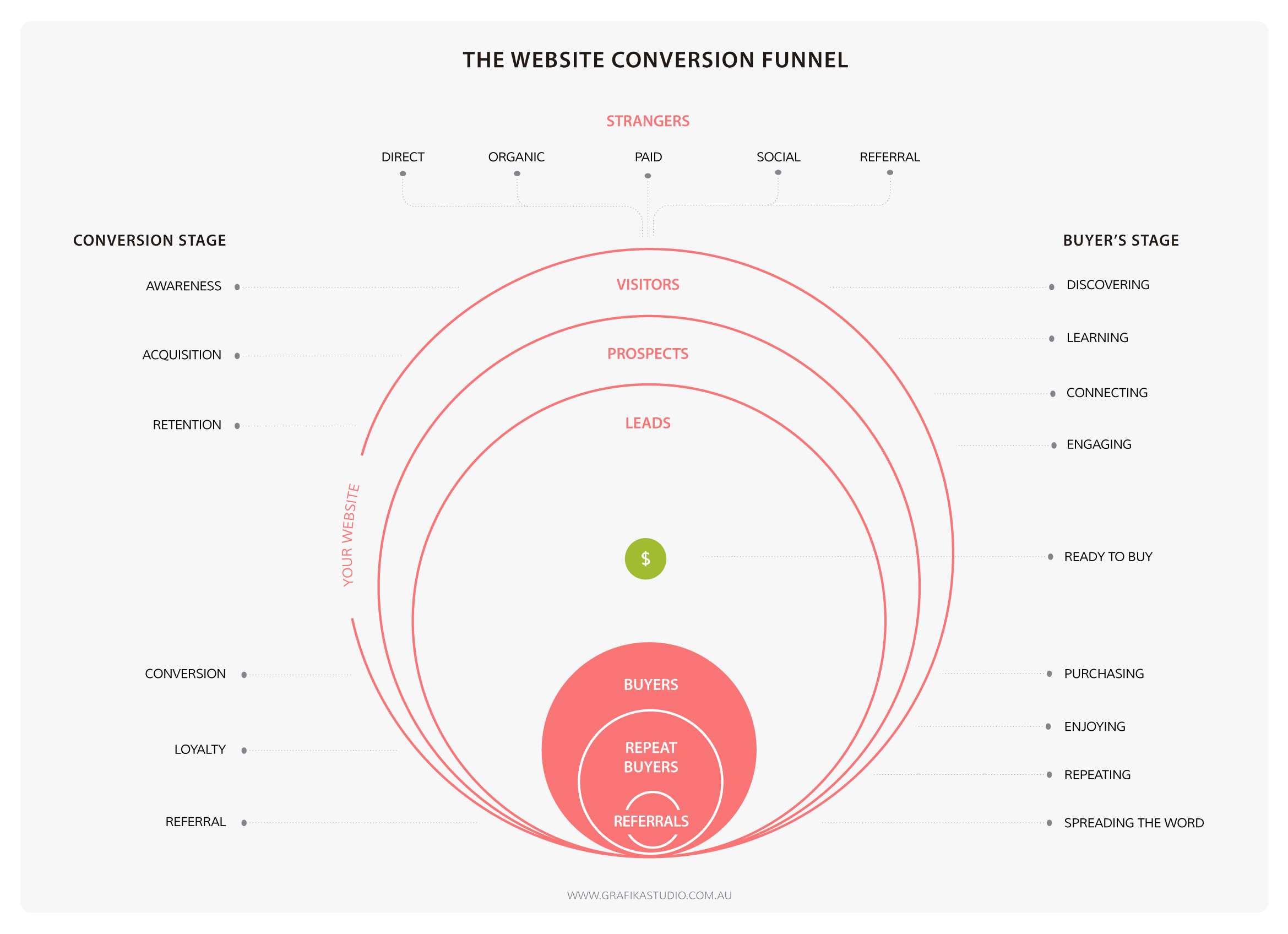
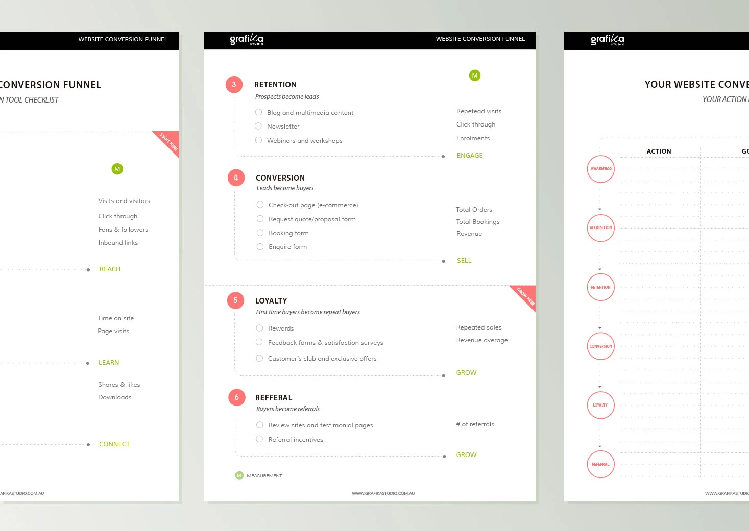
Infographic formats include timelines, flow charts, annotated maps, graphs, etc.

A good infographic is an excellent SEO tool that can generate high-quality natural back-links. A well-designed infographic on a hot topic can be also shared across many social media platforms.

How to produce your own infographics

If you don’t have design software such a Photoshop or Illustrator, or simply don’t have design skills, you can still create infographics with the help of some free web-based tools like Infogr.am or Easel.ly. In this post published by Creative Blog you can find other 10 free tools to make your own infographics.


2.    Podcasts

They are audio-content that your visitors can download and listen in their own time. For many internet users, podcasts are a more convenient way to consume your content, as they can be listened while the user is performing another task, like driving, walking, commuting to work, etc.

Podcasts are a more dynamic way to present educational content or blog interviews. The interview can also be transcribed or summarised in a post.

How to produce your Own podcast

A great tool to produce podcasts is Audacity, an open-source editing and recording program that’s compatible with most operating systems and works well for beginners. To find out more about how to use podcasts to grow your business read this other article by Digital Trends:


3.    Video

Video formats are another way to produce visual and interactive content for your blog and website. Studies have shown that posts with videos attract 3 times more inbound links than plain text posts.

They are great ways to present how-to and DIY posts or tutorials.

Within the video formats, you can also find webinars. These are live, interactive online meetings. Viewers can attend live sessions and participate by asking questions or can watch recorded video after the session at anytime.

How to produce your own video-tutorials and webinars

Although this option seems difficult to produce, current technologies allow everyone to easily record videos from any device (including smart phones) and upload them on to YouTube. Also, screen-recording tools, like Camtasia, can help you easily produce video-tutorials on software or digital tools.

Here is also another great post on How to Do a Webinar Using Free or Inexpensive Tools, published by Right Mix Marketing.

4.    Slideshows

Online presentations are another way to share knowledge in a visual way. The advantages of using online presentations are:

  1. Any company produces presentations on regular-basis, so they may be a material that is already done and you just need put it online.
  2. They explain a topic in-depth combining text, images, charts, embedded videos, sounds and other interactive elements.

How to produce and share your slideshows

MS Powerpoint is the most popular tool to create slideshow and pretty much everyone who knows how to use a computer, know how to use this tool. Another alternative to create presentation is Prizie (from $10/month)

Once your presentation has been created, platforms like SlideShare allow users to easily upload and share their presentations and PDF documents.
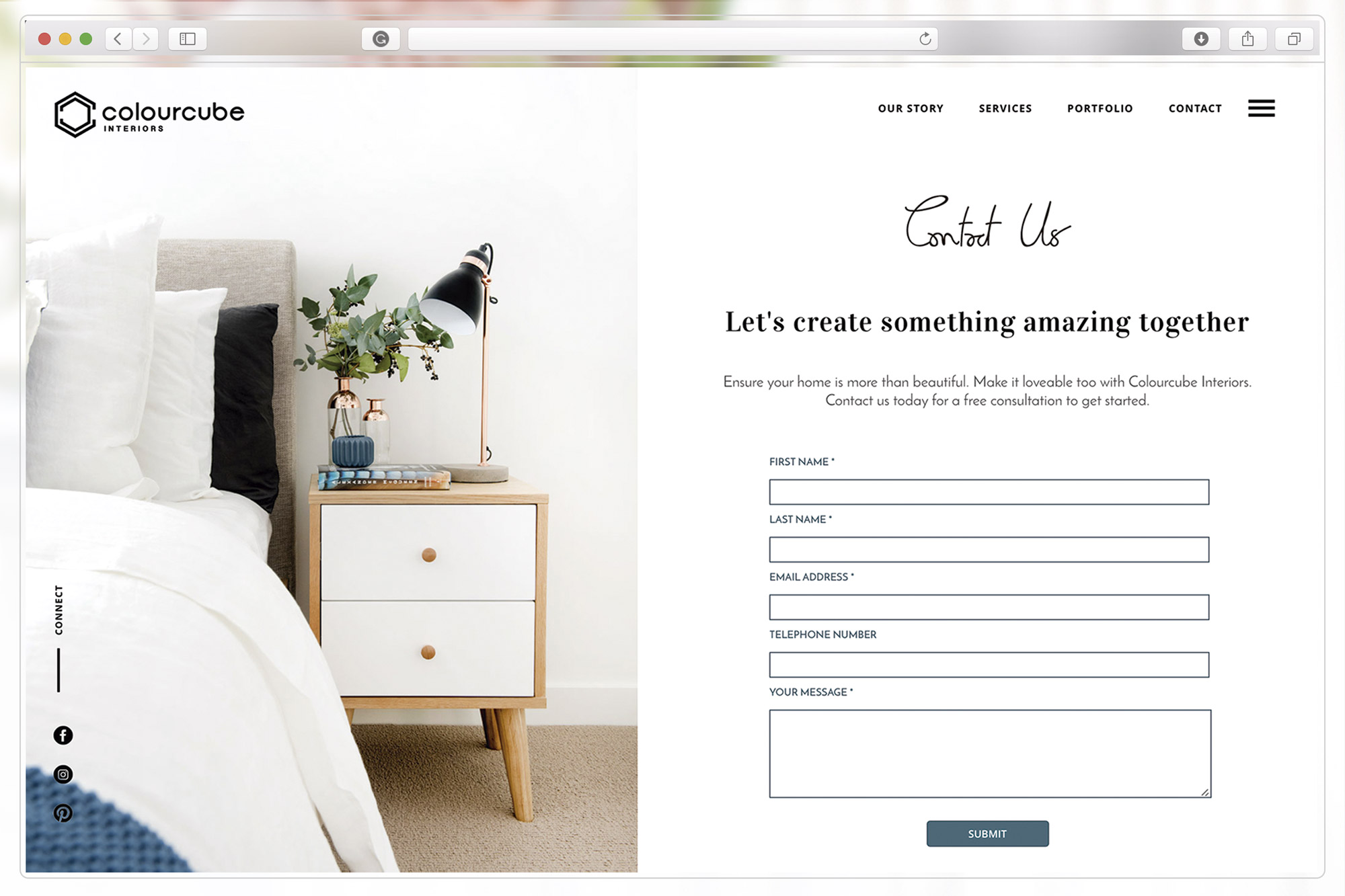
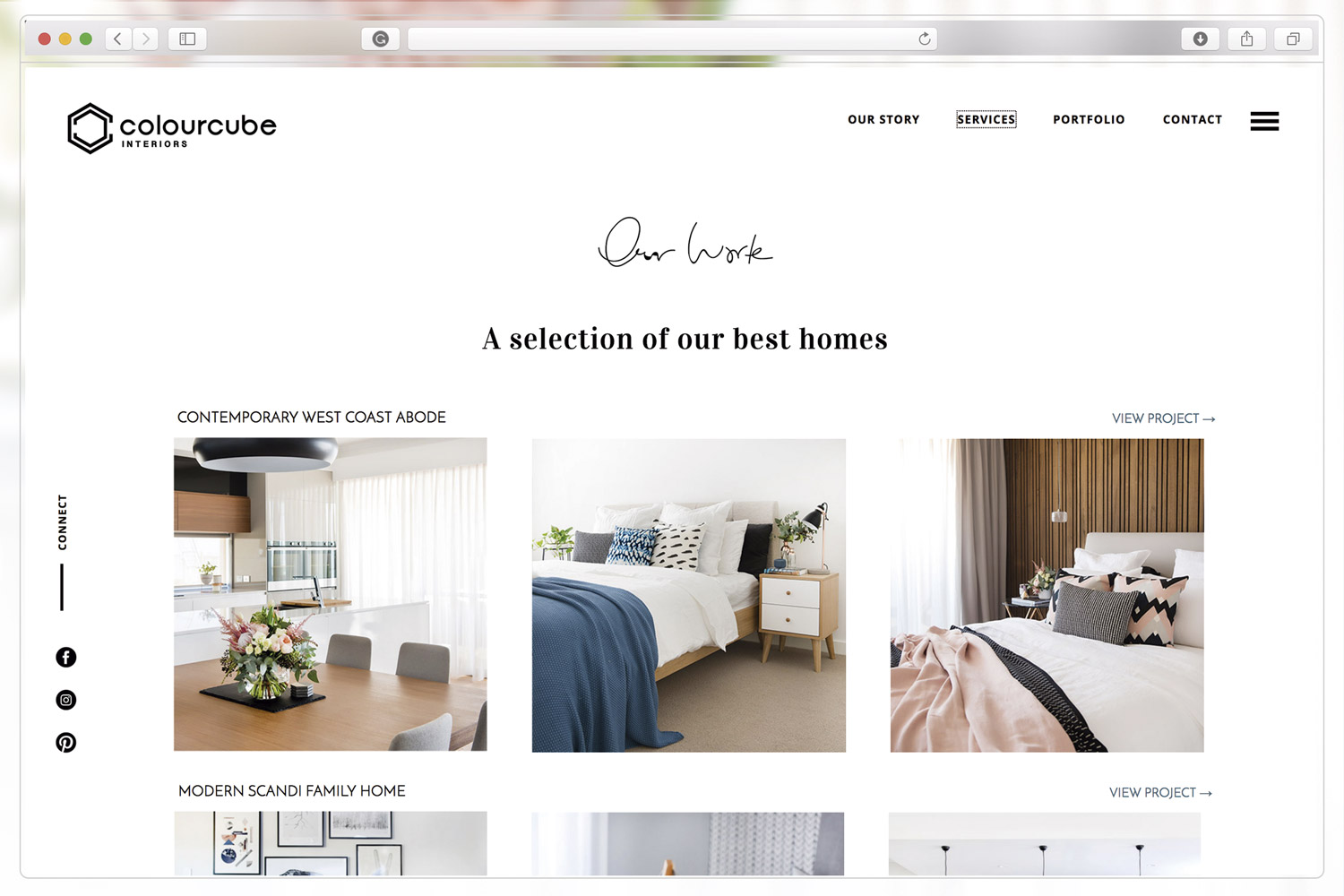

5.    Case studies

Case studies are short explanations of a project your business has worked on for a client. They describe a problem, show how you implemented a solution and detail the achieved results.

Case studies are a very effective piece of content marketing, as well as a great way to build your business credibility and position yourself as an industry expert. They allow your business to share its success and prove potential clients that you have experience resolving their problem.

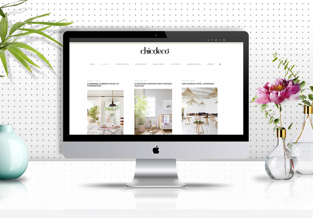
Case studies can be presented in a dedicated blog post or web page, like I do in the Featured Projects of my website, or in a PDF document than people can download, print and read on paper. The length of the case study will determine the format. If it contains more than 1500 words is better to put it on a PDF document.


6.    White papers

White papers are reports on one specific topic to sum up research done by your company on the topic, discoveries from a customer survey, or statistic information collected by digital tools or technology.

White papers are typically short in length, and people can download them from your website in PDF format.

White papers are great to create back-links. Also industry publications or any other media outlets could be interested in publishing your work, which would give your company an excellent free promotion.

How to produce your Own white papers

A white paper usually a very professional document that has to be created with design software such as Photoshop, Illustrator or InDesign. To know more about how to how to write an effective white papers and use it to promote your business also read this other article by OC Search.


7.    EBooks

eBooks are an essential part of any successful inbound marketing program. However they can be also time-consuming and more difficult to produce. eBooks are more extensive in length, and not only they need good content, but also a good design. For that reason, they are not usually available for free.

However, when they are given away as a freebie, they are a great way to build your email list. To do this, ask the visitor to subscribe to your list before downloading the document.

How to produce your Own eBooks

If you have a collection of interesting articles or blog posts on a similar topic, you can compile them in an eBook. To format your document you can use MS Word, but if you intend to sell the eBook I’d recommend leaving the layout and formatting to a designer, who can professionally do it with InDesign.


8.    Downloadable templates and free tools

When you write a how-to post, it could be a good idea to give your readers a downloadable template to put into practice what they just learned in your blog.

Like ebooks they are also a great way to grow your email list, by asking the reader to subscribe your newsletter to download the template.

In this other post on how to create a professional style guide for your blog or website you can see an example of downloadable workbook or template to implement what the post explains.

How to produce templates

Depending on the template they can be simply created in MS Word or PowerPoint, or professionally done in Photoshop, Illustrator, InDesign, etc.
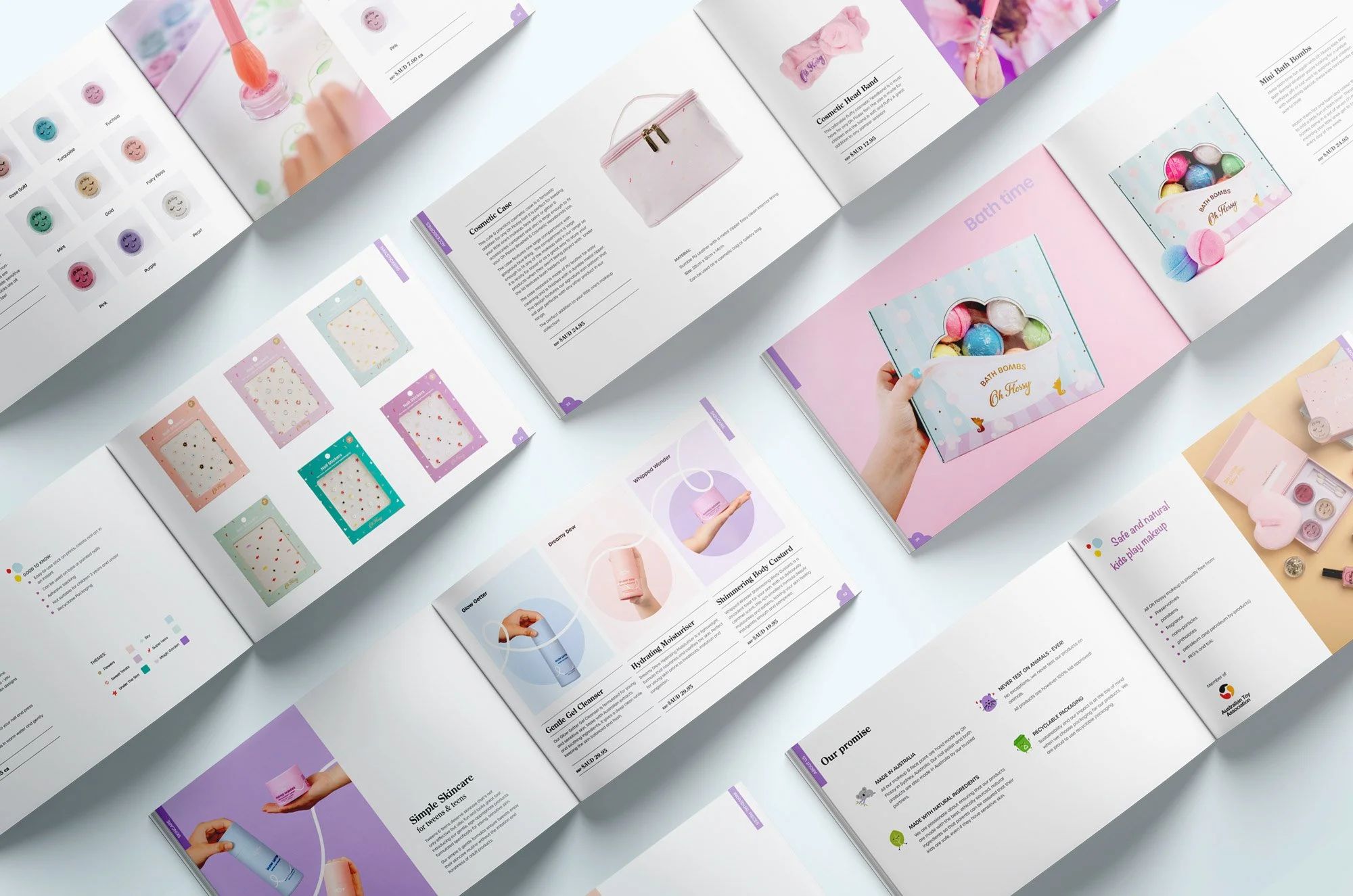


Your turn

When visiting a blog, what's your favourite way to access the content?


How To Save Money In Design Services
Photo: Finance Planner by Grafika Studio

Photo: Finance Planner by Grafika Studio


Design services are something that every business needs, but they’re not always a priority in tight small business budgets. When the budget is very limited knowing where you can save money without compromising quality can make a huge difference in the final result of your design project.

In today’s post, I share some tips to maximize your design budget, whether you want to build a website by yourself or hiring a professional designer to do the job.


Plan your design project carefully

The first step of any design project is a good planning.

Having a project plan will give you a clear understanding of how much everything can cost and how much time each part of the project will take.

For example... if you need to build a website, you can:

  • Make a list of every task/item that your project requires: domain, hosting, email services, website builders, design software, etc.
  • Research solutions and prices for each of them.
  •  Write down what is included in the price, as different provides offer different things in their packages.
  • Compare prices and read reviews.

Then, you can take your project plan to a designer and discuss your budget. Your designer may be able to adjust the budget by taking off unnecessary things or adding others that you may have overlooked. A designer can also give you an estimate on time and cost to complete your design project so that you can compare.

This exercise will help you decide whether you want to do everything by yourself or it’s worthy to hire a designer.


Use web templates

If you are building the website yourself, web templates will make your life much easier. If you are hiring a web designer, a template will also make your total website cost more affordable.

Bespoke web design is a lot more expensive than building a website from a pre-made template. Web templates speed up the process of building a website allowing the designer to complete your project quicker. In the business world time is money so, the less hours the designer has to dedicate to build your website the more money you save.

The hard thing is to find the right template to suit your needs. Finding a template requires a lot of research and a good understanding of all different web components included. Wordpress catalogue is so large that finding what you are looking for can take you a long time. Squarespace gives less choices but this can actually save you time finding a template for your website.

Some web templates can be edited to suit your specific needs, but then again customisation comes at a cost. You will need to hire a web developer to edit your template, adding an extra cost on your website budget.


Buy ready-to-use graphic components

Like templates, ready-to-use components not only can help you build your website quicker but can also save you money as your designer doesn’t have to create every graphic element from scratch.

For example…

If your website needs photographs, it’s a lot cheaper to buy stock images than hiring a photographer to take photos. In the same way, it’s cheaper to buy a ready-made icon set than designing one specifically for your website.

Some great places to find ready-to-use design assets are:

  • creativemarket.com
  • envato.com
  • graphicburger.com


Choose flexible and scalable solutions

If you are building your first website, you may want to do it in two or three different stages. By dividing your project in stages you can launch a basic website and then add new features and functionalities as your business grows.

For example…

If you want to sell products online, you can start selling through third party websites and have a basic website for your business. Then, if your products sell online, in a few months time you may want to add a shop and sell your products directly from your own website, saving money in third party commissions.

To upgrade your existing website, you probably don't need a complete new site. Your current website could be redesigned or extended with new features. However, depending on the website, the platform in which is being built and the number of changes required, it might be cheaper to build an entire new website that re-designing and upgrading your existing one.

For example…

If you have a shop in your Squarespace website and want to add a wish-list feature, unfortunately Squarespace doesn’t have this functionality just yet. For that reason, your entire website would have to be migrated to Wordpress to be able incorporate that feature.

This is also why good planning is important, if the wish-list was in your add-on feature list for future stages, Squarespace wouldn't have been the chosen solution in first place.


Negotiate design packages

Many designers offer their services in packages at a discount rate. By working with the same designer in different design projects you can get packages and discounts that can also save you some money.

For example…

If you are looking to have a new brand and website designed, ask your designer if there is any specific package that combines both projects.


Hire a design consultant

If you feel confident enough to build your own website, you might want to consider hiring a designer as a ‘consultant’ to can give you some guidance along the way. As your designer doesn’t have to build your website from scratch you can save some money by doing it yourself. But your designer can still help you with:

  • Reviewing your budget to make sure that you haven’t overlooked any important cost and advising on areas where you should spend a bit more and others where you could save some dollars.
  • Giving you access to discounts and special rates from providers. Designers usually go shopping around comparing solutions and prices from different providers, negotiate prices and get discounts for bringing repeating business.
  • Training you on the relevant website builders and giving you a hand if you get stuck while building your own website.
  • Identifying and avoiding mistakes that can incur unnecessary costs. For example, you may find a fantastic hosting offer and grab it. Then you find out this offer has hidden fees and end up paying more with that provider than with others.


Wrap-Up

In summary, a good designer is someone who understands people’s budget constraints and maximize the money available according to the client’s business objectives. If your budget is tight, your designer can research and find the best solution for your design project to suit your budget.

Here is a checklist of important questions to ask your designer before starting a website project, as they will have a critical impact on your design budget.

  1. Do you offer a free first consultation to discuss my project requirements?
  2. How much does the annual hosting and domain registration of my website cost?
  3. Do you custom design or use templates?
  4. Do you charge by the hour or by the project?
  5. Can my project be split in two or more stages?
  6. Can additional add-ons and optional functions be quoted separately?
  7. How much does it cost to update my website post sign off?
  8. Do you offer a monthly maintenance option?
  9. Do you offer free CMS training?
  10. Do you offer design packages?
  11. Do you offer consulting services? (in case you want to build the website yourself)
  12. What are the ongoing charges after my website is completed?

Your turn

  • How much do you think is reasonable for a small business to spend in building a website?
  • Would you build a website yourself to save your business that cost or are design services a necessary investment?


Why My Website Is Not Converting

One common question that many clients and potential clients frequently ask is “why my website is not converting visitors into customers/clients?”

The conversion problem has a lot to do with your message, the way in which you deliver it through your website and its impact on your audience.

In today’s post I explain some of the most common reasons why many websites don’t convert properly and how to fix those issues by using the example of one of my latest website projects: WA Mortgage Advice Website.

why-my-wEbsitE-is-not-convErting

Too much copywriting, too difficult to read

Your website must offer relevant information about your business. But too much information is overwhelming and will make visitors feel intimidate and leave without reading your webpage.

Writing for the web is completely different than writing an essay or a paper. Website copy must be scannable, actionable and shareable.

  • Scannable means that your visitors understand your key messages by just glancing at your web page.
  • Actionable means that your content encourages people to take action.
  • Shareable means that your visitors find your content useful and will share it so that others can also benefit from it.

For example…

My latest project is a mortgage broking website. The financial industry has a complex language with a lot of jargon. A clear and easy-to-read copywriting was an essential part of this website project:

WA-Mortgage-Advice-home-page

For more tips on how to write for the Internet also read this article from Enchanting Marketing: Writing For The Web Vs Print .


Important information hidden below the fold

Not only it’s important how you present the information, but also where you place it. Information positioned in the upper half of a web page and so visible without scrolling down the page is what we call above the fold. Everything else is below the fold.

If visitors have to scroll down to find important details in your website, chances are that they leave without even noticing them.

Analyse your web copy and extract one key idea per page only. That idea must be positioned at the top of the web page. Further information and details can be placed after.

What are those key ideas?

  • Your unique selling proposition
  • Your key benefits
  • Call to actions like ‘book’, ‘enquire’, ‘call’, ‘download’…
  • Contact details

Tip: banners and header images should not take more than half of the screen; otherwise they will be hiding important ideas below them and below the fold.


Lack of credibility

Your website may not be encouraging trust among your visitors. Some reasons may be:

  • Visually unappealing design - it’s all about creating a good first impression. A clean and well organized website design speaks about your professionalism and how much you care and invest in your business and clients.

Avoid too many colours, graphic elements or call to actions that can cause distractions and make your visitors get lost.

  • Lack of contact information – for many people who search for a product/service in the Internet, location convenience is important. For many others working with people who are accessible and easy to reach when they need them is essential.

Your business address, direct phone numbers and email addresses or even an online chat app can help you gain credibility and trust among your audience.

  • Lack of social proof – social media followers, reviews and client testimonials can help you build credibility in the Internet. Focus your marketing efforts on connecting to people through social media and getting feedbacks from clients and industry experts.


Lack of direction

When visitors land in your website, they don’t know what they have to do. You have to show them the path, indicate what comes next and what they should do while visiting your site. How? With call to actions. 

A call to action is an invitation to interact with your site by:

  • Signing up for a newsletter
  • Downloading information
  • Making appointments/bookings
  • Getting a quote
  • Etc…

The more they interact with your website the better will get to know your business.

call-to-action-examples


Lack of attraction and engagement

Relationships are key for any business success, and especially to sell services. Visitors who are in need of your services want to know you first before hiring you.

How do you build a relationship in the Internet? Engaging your visitors through social media, newsletter sign-up forms, blog and comments and everything else that allows you to keep conversations and communicate with your visitors after leaving your site.

In this other post I explain how to grow your business by building relationships.

Tip: proof you’re willing to help not just to sell, but by answering questions in social media and blog posts, and offering free tips, free first consultations, etc.


Wrong message, wrong keywords

Another common reason of poor conversion is often the message itself. Being too generic, trying to appeal a broad audience or offering too many services can confuse the audience or make them leave your website with the feel that you are just ‘another one’.

But being too generic and too broad also has another consequence: poor keyword strategy. If your keywords are too wide, you may be leading a lot of traffic to your site, but only a small percentage of those visitors are actually potential clients.

To avoid this you must:

  • Find what makes you different and unique and highlight this differentiation in your home page, above the fold.
  • Be specific, target a niche and narrow your offer to only those services that you know best.
  • Focus on long tail keywords that are more specific and have less competition in search engines.

For example, if my client, a mortgage broking business, focused on generic keywords like ‘mortgage’, there is so much competition already for that word that chances are that he will never get noticed. Instead we focused on long tail keywords like ‘First home loan advice’.

Wrap-Up

In conclusion, conversion rates have a lot to do with your website copywriting. Learning to write for the Internet can improve significantly your leads and opportunities obtained through your website.


Grafika Projects: Inside A Designer's Website
Client: Collected Interiors
Project: Art Direction, Photo Editing, UI/UX, Web Design and Development
Date: Launched in September, 2014

Collected Interiors website designed by Grafika Studio

I am a big fan of Perth interior designers Collected Interiors, so when I was asked to re-designed their website I immediately felt excited about this project.

The briefing was to create a sleek and modern new website, to display bigger images and to incorporate some interactive tools.

I created a custom-made design – no templates were used here – carefully thought to let the images shine. Full screen images in almost every page allow the visitor to get a taste of the designers' talent before even visiting their portfolio.

The design is simple and clean so that visitors can enjoy the beautiful photographs with no distractions. Condense typography, combined with serif fonts for a classy elegant touch, and a lot of white empty space achieve a modern and professional look & feel.


INSIDE A RESPONSIVE DESIGN

One of the major improvements made on this website was the responsive layout. The full-screen images made a fluid design necessary, so that they could automatically adjust to every screen size without being deformed.

The portfolio pages have a responsive slider with an advanced touch / swipe support built-in to facilitate the navigation from image to image on small devices.


THE USER EXPERIENCE

Every image was edited to achieve the perfect lighting in each interior space, and carefully selected so that the internal pages could flow from one to the other keeping a consistent feel across the entire website.

Every image gives a sense of tranquility to make the visitor want to stay longer on the site. Link effects were also eased to reinforce that sense of calm aimed to retain visitors and let them visit the site with no rush.


THE RESULTS

After the new website was launched Collected Interiors experienced an overwhelming success in social media, getting more than 300 Instagram followers in less than 24hrs, or more than 100 Behance followers in less than 24hrs, and many other successful stories. A SEO friendly website along with a link building strategy put this site at the top of the search engine rankings, busting visits and customer enquires.

Working together was easy and fun. Rosa is an intuitive and highly professional designer, who always figured out how to translate our ideas into a digital experience.
— Lisa Ewart, Creative Director of Collected Interiors -


Five simple tips for designer websites

1. Invest in high quality images

Images are the most important piece of marketing for any designer, not just for web design, but also for press, link building strategies, social media marketing and much more. Style your photographs, hire a professional photographer with the right equipment – and experience – to photograph interiors, and edit every image to correct small imperfections and lighting.

2. Keep a simple colour palette

A minimalistic colour palette will achieve an elegant, sleek and modern look in your website. A clean look & feel will let your images speak about your work and the way in which you do business with no distractions.

3. Learn to love the white space

Let the space breathe. Against what many people think, empty space is not a lack of design, it's actually an important design element, essential to achieve a polished and professional look in any website.

4. Apply a visual storytelling to your website

The entire website must tell the visitor your story and every page must conceived as a chapter of that story. The storyline must flow through an intuitive navigation, powerful images and a compelling message. Every aspect of the website design should be carefully and consciously selected to help to support the thread of the story.

5. Create an emotional connection

Design is an emotional business and your prospects will only become clients if they connect emotionally with your brand. The challenge is to create that emotional connection in a few minute visit to your website.

Call to actions will get you newsletter subscribers, blog readers, social media followers, etc, that will stay connected to your business after visiting your website. Use all these platforms to continue working on that emotional connection with them. Many visitors won't get in touch in their first visit but will be ready to work with you after a few interactions with your brand.


Are you interested in working with me for the design of your brand and website? Visit my Branding and Web Design pages for more information on my process, design package and pricing, and my Contact page to get in touch!