Posts in Branding
Kids Packaging Design With Oh Flossy
Oh Flossy play make up boxes

Oh Flossy Mini Make-up Boxes


When Oh Flossy decided to take on a full brand transformation they put the packaging at the top of their list. Their existing play make-up boxes had been designed a few years ago and didn't match the new brand identity that the company had recently launched - also designed in this studio, and featured in my portfolio

The revamping of the existing packaging came with a clear brief to create attractive and engaging designs that capture the attention of children as well as their parents. The project goals were well-defined:

  1. Increasing visibility

    The new boxes should make Oh Flossy products stand out on the shelves and catch the attention of children and parents. Better visibility could also help increase brand awareness and make their products more memorable.

  2. Improving perceived value

    Oh Flossy wanted to move into more premium and sophisticated packaging to better present their high-quality products, making them more desirable.

  3. Enhancing brand identity

    The new packaging designs should be consistent with the new brand's identity, and help reinforce brand recognition, differentiating their products from competitors and communicating the brand's unique attributes.

  4. Improving customer experience

    The new box design would also make the product safer to transport, ensuring the goods were kept well-protected during shipping, easier to use for children and also easier to clean, making them reusable for many years to come. This would also impact customer satisfaction and brand loyalty.

Oh Flossy magnetic closure boxes were a game-changer. The range features 5 make-up boxes in gorgeous pastel colours to match their brand palette. 

 
Oh Flossy natural play make-up sets

Oh Flossy natural play make-up sets

The boxes were illustrated with hand-drawn patterns featuring different themes: make-up, sweets, sparkles, and costumes. Although each box has a different colour and theme, we achieved a coherent look and feel across all the designs by creating a base pattern of colourful sprinkles, white hearts and golden stars that was repeated on each box.


a look at the Pattern design process

 
Oh Flossy based pattern of sprinkles, hearts and stars

A | Base pattern design

Sweet Treats pattern design for Oh Flossy play make-up box

B | Sweet treats pattern illustrations

Oh Flossy Sweet treats box design

C | Final design combining base pattern and illustrations


The designs were finished off with a fine gold foil print over and an elegant matt embossed texture. Oh Flossy fans can collect the 5 boxes and use them as keepsakes for years, or match their designs with other products in their collection.

After the make-up sets launch, the pattern became a recurring design element in Oh Flossy packaging and stationery, and it would soon make its appearance on many other products of their collection. Here are just a few examples.

 
Adept Financial Services Rebranding
 

Adept Financial Services started their new brand identity journey with Grafika Studio in 2020. They wanted to expand their service portfolio and position themselves as a boutique accounting firm for medium size businesses in the Engineering, Building & Construction and Medical Service industries

To achieve this goal they were looking at transforming their existing brand identity and becoming a more modern brand with a fresh and vibrant visual communication style.

Grafika Studio participated in all aspects of defining the brand strategy and implementing a fully-fledged branding and website.

As a firm believer in the power of personalised customer service, the Adept team wanted to work with a new generation of professionals who valued the power of strategic partnerships to grow their business:

"We want to create an engaging experience that goes beyond the standard business support. We want to help clients to achieve results and grow their business through strategic advice" - they said.

The initial brief indicated that the logo should retain the existing triangular logomark - which had been with the company since 2011 - but convey the notion of positive transformation and business growth. So I focused on the typeface and the colours to convey these ideas.

 
Adept Financial Services New Logo
 

I selected a new font for the logotype, bolder and slanted to create a sense of movement. I also changed the uppercase original font style with a lowercase for a more approachable look.

The slanted font style also allowed me to align the typography with the angles of the logo mark.

The strapline was changed from bookkeeping to financial services, as the company expanded their service offerings.

The old brand identity colour was green. I replaced the main colour with navy blue, a more suitable choice for professional business services, as it's often associated with authority, professionalism, and trustworthiness.

However, navy blue is also often considered to be a “conservative” colour, while the company was after a more approachable and friendly look and feel. For this reason, navy blue was used here to add depth and sophistication to the brand but splashed with vibrant hues of red, purple and yellow.


Finally, the brand was complemented with gradients usually displayed inside triangular shapes, to match the logo and reinforce the idea of transformation and expansion.

Common branding mistakes start-ups make
Living 3D brand identity designed by Grafika Studio

Living 3D brand identity designed by Grafika Studio

Every new business needs a new brand. It’s one of the first things that we put on our list of to-do’s when we just get started. But many new businesses get branded too soon.

Branding your business requires having a clear idea of who you are, what you want to be and how you are different to many others in your industry.  

Your brand is something that you want to get right from the beginning, as branding mistakes can cost a lot of money to your business down the track.

Take some time to set the foundations of your business model and avoid these common mistakes that many start-ups typically make (and I include myself here)


Mistake #1 | Not knowing who your ideal client is

Although you could potentially help anyone in your market, your business will be a better fit for some people rather than others.

Your brand must be relevant to your potential clients and create an emotional connection with them. Knowing who they are and what aspirations, challenges and needs they have can help you create a brand that will easily connect with your market, grab their attention and create a positive perception of your business in their minds.

Attracting the wrong type of clients can lead to client’s complaints, frustrations, bad publicity and online negative reviews that can seriously damage your brand image.

In this other post I also shared some tips and hints to find your ideal niche.


Mistake #2 | Lack of focus

Many start-ups think if they niche down their service offer they may lose business opportunities. Try to sell anything to anyone and you will end up selling nothing to no one.

You cannot be an expert on everything. You should only offer those services that you know best and for a type of client that you have worked before.

A focus or specialisation will give you the confidence to explain to your potential clients what qualifies you to help them with their problem better that many others in your industry, and how many people you have already helped with a similar problem.

This focus will also bring clarity to your brand, establishing a clear differentiation between who you are and how you can help your clients best.


Mistake #3 | Imitating other businesses

Looking at what others do and try to do the same is natural when you just get started. We want to demonstrate that we can be as good as them. However, in business being ‘as good as’ is not enough, you have to be better or be different.

Researching your competition is a necessary step to start a new business and build a new brand. But don’t compromise your authenticity by building a brand identity that follows trends or imitates others.

The market is full of professionals like you – or products like yours -, and it’s very difficult to get noticed. People want to know how they should choose your over everyone else.


Mistake #4 | Failing to find a differentiation

Your differentiation will give people a legitimate reason to choose you over other similar businesses in your industry.

There are no two identical businesses, so you must explore and find what makes you unique and different. Understanding your own distinctness is the first step to build a memorable brand that stands out the crowd.

As I explained in this other post on Lessons Learnt From My First Year In Business finding my own differentiation was one of the hardest things for me.


Mistake #5 | Not having a clear mission and vision

Branding is the art of aligning who you are, who you want to be and who people perceive you to be. Your mission defines who you are and what you do. Your vision determines who you want to be in the future.

A meaningful brand is not a brand that just looks pretty; it’s a brand with a strong personality and a clear purpose. Without personality, your brand is superficial, without purpose, you're bound to get lost along the way.

Having a clear brand vision and mission will help you identify where your business is headed, as well as what you need to prioritise to get there and what you have to say no to.


Mistake #6 |  Thinking your brand is just a logo

The worse thing about this belief is that many startups don’t see justified to spend more than a few dollars in their brand. They think all they need is just a logo - and that a clipart logo will do the job -, but a brand is much more than that.

Everything that your clients see from you speaks volumes about how much you care about your business and how much you've invested in it. That includes yourself, how you look and how you act. You're an extension of your brand.

In this other post on personal branding I shared 10 easy steps to craft your personal brand.


Mistake #7 | Not choosing the right professional to build your brands

Many clients come to me with a logo that a friend has designed for them, and I can usually tell straight away when it's been the case. If your logo looks amateurish, then so will your business.

Many of these logos don’t follow basic design principles, such a proportion and balance, are very difficult to scale down - as they have too many details – and don’t properly reflex the business essence.

Your brand must communicate confidence and professionalism, and inspire trust. A well-designed brand is the result of many hours of research and work, plus a lot of rounds of revision and feedback by the client.

I shared my own process for designing an effective logo in this other post.


Mistake #8 | Not investing in branding

Having a well-design brand is not the end of the road in your brand journey. You also need to brand your communications. Business cards, email signatures, website, social media platforms, etc, anything will give you an opportunity to make a positive impression in your potential and actual clients, and create an excellent perception of your business.

Make sure all your brand elements are well coordinated across every channel and your message is clear and consistent. Invest in professional photos, quality printing and a professional designer to make your brand true reflection of your business quality standards.


Ready to brand your business?

Before developing a new brand I always take my clients through a brand discovery process to ensure both, my client and I have a clear idea of the business vision, mission and direction, their target market and their distinctiveness. This is a necessary step to build a memorable brand to represent their businesses for years to come.

The process is slower than what many clients initially thought it would be, but the time and money invested in building a professional brand is well-worth to avoid more expensive problems in future.


Grafika Projects: State 28 rebranding
Client: State 28
Project: Rebranding, Business Stationary, Web Design and Development
Date: Launched in September, 2015
State 28 New Brand and Website designed by Grafika Studio

State 28 New Brand and Website designed by Grafika Studio

State 28 is an interior design company based in Perth, WA, with a strong focus on commercial design and office spaces. I'm very passionate of interior design, and I was thrilled to be chosen as their designer to re-brand their business and build a brand new website.

The new brand was completed in August and the new website launched in September this year. Today I'm sharing a bit of the logo conceptualisation process for this client, as this is a great example of how a simple icon can be full of meaning and significance, becoming the heart and soul of a brand.


The concept

I started working with Miriam, State 28 Director, and her team around June this year. Over the first couple of weeks I spent time getting to know the company personality, vision and values, as well as understanding how they wanted to be perceived by their clients and prospects.

They wanted a modern, fun and elegant new brand. My first ideas revolved around vibrant colours and curved lines to reflect the fun side of the company personality. But as many of their clients were corporate organisations I thought we should also look for a minimal and geometric style to connect with that market and communicate professionalism and reliability.

I came up with a few concepts first, no luck (see below). I sketched for hours, did lot and lot of visual research, and came up with a few more concepts. Still no luck.


After two rounds of concepts, I went back to their office and met with the team again to get a deeper understanding on the business personality, vision and core values.

In this second meeting I got to know more about each individual behind the scenes of State 28. I learned interesting things about them, like that Miriam had spent many years living in Texas, the State 28, and hereby, the company name.

Back at home, a map of Texas gave me a final clue: why not creating a logo that speaks about that emotional connection with Texas? The company director certainly had a strong connection with this place, and this could be a great concept to play with.

I created a more abstract idea of the map of Texas that had that geometrical and minimal look that I was going for.

They loved the concept! So, did I. Not only it was a meaningful concept for the company owner, but also talked about its origin and history.


The brand mood board

To create this mood board I used some images of their recent projects mixed with some bi-dimensional and tri-dimensional patterns, curved and straight lines and contrasts.

The colour scheme has a base of black and white to communicate sophistication. To give the brand a fresh look I added shades of silvery blues and some metallic finishes.

A bright aqua blue achieves a relaxed mood in line with the team personality, breaking the formality of the black and silver blue.

State 28 Interiors brand mood board

State 28 Interiors brand mood board


The typography

A sans serif font style was the perfect match for the straight lines of the geometric logo. We love the Epitet family with plenty of styles to choose from (regular, light, bold, ultra-light, italic, etc).

By increasing the tracking (the space between characters) I added a sense of sophistication to the final logo design.


State 28 team suggested to combine the Epitet family with a hand-writing font (Bad Script) to break the formality of the straight lines. We loved the final result.


Icons and patterns

The brand identity was completed with a set of outline icons for the website to match the hand-writing font style.

The logo triangles also inspired the patterns for their business stationary, which is currently under development.

To see how this new brand came together online, you can visit their website at www.state28interiors.com.au.


10 Steps To Craft Your Personal Brand
Brand-discovery-process

Personal branding is the art of aligning what you want people to think about you with what they actually think about you. Although you cannot control what people think, say or feel about you, you can influence the perception that they have of you in a positive way.

Brand perceptions usually relate to businesses and organisations, but they can also refer to individuals, especially in the professional service space. These perceptions will be key for winning more/better clients or creating professional opportunities for an individual or a business.

Personal branding is not just for CEOs or corporate executives. Independent consultants, designers and many other freelance professionals also need to build credibility and a positive image of themselves to expand their business.

Crafting your personal brand involves a self-discovery process that covers three different aspects of branding: vision, voice and visuals (the three Vs).


CREATING YOUR PERSONAL BRAND VISION

Your brand vision is what you want to be known for. It starts with a soul-searching journey in which you will discover who you actually are and how you can build a better version of yourself.

1.    Know yourself

  • List your personal attributes – describe yourself, from they way you look to your personal qualities and weaknesses. You can start by writing down a bio that covers both, professional and personal aspects of your life. Then make a word cloud of key words that summarise your story.
  • Get external feedback - ask family and friends how they see you, to look at yourself from an outsider’s point of view.

To help you with this self-discovery process you can take this template from my Brand Discovery Workbook, which enables you to gather data regarding your personal attributes. You can also share this template with family and friends to request feedback from others.


2. Find your essence

  • Identify your core values – these are the things that are most important to you and drive your decisions in life.
  • Discover your passions - things that you love doing, you are best at and bring more happiness to your life.
  • Find your differentiation – what makes you unique and different to others, why people will choose to work with you over everyone else. If you can’t think of any differentiation specialised yourself in an area of expertise or a skill that is relevant to your field.


3. Determine your vision

Think about what your aspirations are, what you want to accomplish in life, and where you want to be in a few years time. Compare this with where you are at today and formulate an action plan to get to that point.


FINDING YOUR PERSONAL BRAND VOICE

Once your vision is clear you can now articulate your message and the tone in which you speak to and connect with your audience. Your brand voice will embody and express your personality and set of values.

4. Find your target market

Figure out who is your ideal client, who needs your services and is willing to pay for them, and learn as much as you can about them. The more you know about your market the easier will be to select the right channels and the appropriate messages to communicate with them.

Your target audience goes beyond your potential clients or customers. They are also bloggers, influencers, local community, and anyone else who can contribute to your business or your career success.

Find out more about who your stakeholders are in this other previous post on Key Relationships For Small Businesses.


5. Articulate your message

  • Craft your personal brand statement - an elevator pitch that expresses your essence in a sentence.
  • Create a style guide - Put in writing your tone of voice, copywriting style and guidelines.


6. Implement a personal communication plan

  • Find the right channels to connect to your audience – Make a list of every channel that you will need to deliver your message (website, blogs, social media, emailing, events etc)
  • Determine the social media platform that is right for you – you don’t need to be everywhere. Select the social media channel that helps you connect easier with your target market and find out how to communicate with them through that platform. To identify the social media channel that is right for you also read this other post on Social Media Platforms For Small Business.
  • Build industry credibility – press articles, blog features, client testimonials, costumers reviews, social media followers, etc. will build credibility in your business. In this other post, I explain some Simple Ways To Build Online Credibility.
  • Follow the 3 Cs of Branding - clarity, consistency, and constancy.


BUILDING YOUR PERSONAL BRAND VISUALS

Everything that people sees from you speaks about the way in which you do business and how much you invest in every client and every project. To complete your personal brand, you can create a visual identity that brings clarity and consistency to your style.

7. Define your visual style

Have a logo and a visual identity system with a specific colour scheme, typography, design elements, etc. and ensure consistency by creating a visual style guide. You can learn how to create this guide and download a template in this other post on How To Create A Brand Style Guide For Your Business Or Blog.

Start by putting together a brand mood board, with a collage of images that represent your personal and professional style. From fashion images that inspire your wardrobe, to products or brands that usually fill your bag or your desk, as well as colours, people, and places that you love.

For many designers and creative professionals is also important to have a signature style that can be showcased through a portfolio.


8. Build your online presence

In today's digital world, Internet will be the first place where people will go to know more about you, who you are, what you do, how you do it, who your clients are, etc.

  • Website – It must tell your story and showcase your expertise through a portfolio, case studies, etc.
  • Blog – research and write about different topics in your area of expertise, which will increase your industry knowledge and position yourself as an expert in your field. A blog will also help you connect with your audiences through blog comments and guest posts.
  • Email signature – it’s your business card in the digital world. In this other previous post, I explain How To Create An HTML Email Signature.
  • Social media channels - follow and start conversations with your stakeholders, engage your followers with interesting content and drive traffic to your blog and website
  • Emails and enewsletters – develop a mailing list and reward your subscribers by offering exclusive content, offers and specials, etc.


9. Create your offline brand assets

While businesses usually rely on digital communications and materials to promote themselves in the Internet, the textural beauty of printed collateral can set you apart from everyone else in the real world.

  • Business cards and stationary – From beautiful designs to high-quality paper or emboss, foil or letterpress finishes, everything talks about you and your personal style.
  • Professional photographs – invest in a professional photographer to take headshots, and hire a stylist to produce your portfolio or catalogue images, to ensure a professional result.
  • Presentations and marketing collateral – every document (online or printed) that you put in front of your clients must be properly branded and have a professional look.


10. Embody your brand essence

The way you speak, what you wear, how you network, everything will impact in that brand perception that others have of yourself as a professional. Make your wardrobe consistent with your brand visual style, what you say in-line with your brand voice and act according to your core values and vision. Make yourself the main vehicle of your personal brand.


How to Make Marketing That People Love
Gift from Sugar Paper and desk accessories from Kikki.k

Gift from Sugar Paper and desk accessories from Kikki.k

Marketing has a lovable problem. People don’t like marketing. We feel annoyed when our favourite TV show is interrupted by an ad, we delete any commercial email in our inbox and get furious when we answer the phone to just a telemarketing call.

If consumers hate your marketing, how are they supposed to like your brand? The big challenge companies and marketing professional have always faced is to make marketing that people love.

The digital era has changed the traditional ways to make marketing, becoming more valuable, appropriate and personalised for each individual.

Modern marketing in the digital age is not just about numbers and processes.
— Jon Miller VP and co-founder at Marketo

In today’s post, I’m sharing some tips to make marketing that people love. If your audience love your marketing they will engage with your brand. By creating emotional connections with your audience, you increase your chances to find new clients and leverage existing ones.


1.    Know your customer/client

Any business trying to connect with a certain type of customer needs to create a comprehensive profile of exactly who that person is. This is what in marketing is called ‘buyer persona’.

Buyer personas are fictional, generalised representations of your ideal customers. By having a detailed knowledge of your buyer persona, you’ll be able to tailor your content, messages, products and services to meet their specific needs and address their concerns and challenges.

Some effective – and free – ways to craft buyer personas are:

  • Through your web analytics, you can get geographical and demographical information.
  • Through their social media activity and engagement
  • Through interviews or surveys
  • Through market research and public reports

This other article by Emily Winsauer explains in more detail how to create buyer personas.


2.    Create valuable content

Once you have a clear idea of who your ideal customer is, you can produce content that is relevant to them.

Your clients want to see that you understand their concerns before working with you, so your content must be around what really matters to them:

  1. Solutions to their problems or answers to concerns.
  2. Tools and tips to help them achieve their goals and aspirations.
  3. Articles to entertain and make them laugh

Produce content that help people enhance their lives and make it easier or happier somehow. You can find some ideas:

  • Through your clients and prospects conversations
  • Through questions and comments in social media groups and forums
  • Through Google Trends to know what people search for in Google

In this other post published previously in my blog you can read my simple formula to write engaging content.


3.    Deliver the content in different formats

Traditional marketing used to be disrupting, and that’s one of the reasons why most people hated it. The audience is now in control.

By delivering content in different formats, your audience can decide when it’s the right time to consume it and how, whether it’s reading a blog post, attending a webinar or listening to a podcast while they’re driving.

In this other post, I give you 8 ideas to present your content in different formats (with infographic)


4.    Personalise your messages

Knowing your client also allows you to personalise your communications, by using their names in emails, etc.

Understanding individual interests and needs also will allow you to produce more specific content and send to each individual content around only those topics that they are genuinely interested in.

  • Personalise emails with each individual’s name so that they don't look like an automated bulk email.
  • Create a private client area in your website with a personalise welcome message.
  • Send email alerts based on each subscriber’s specific interests. By checking content topics of their interest in the registration form you can create different email groups based on those interests.


5.    Align your marketing to the buyers’ journey.

Every buying cycle has four steps: awareness, research, comparison and purchase. Your marketing messages will be different for those who are just discovering your brand, versus those who have already bought from you.

By creating different marketing actions for each of these four stages, you will be able to deliver more relevant messages to each group, making your marketing communications more effective.


6.    Make your clients/customers feel special

Your business success depends on our capacity to build long-lasting and positive relationships with different groups of interest. Buyers are the most obvious group of interest, as it’s easier selling a second product to an existing customer – or being hired again by the same client – than finding a new one.

To make your customers feel special always give them a bonus after purchasing from you. For example, give them a discount for their next purchase or a gift for loyal clients.

Other groups of interest are your suppliers, your local community, your social media followers, your blog readers, newsletter subscribers, bloggers and influencers, etc. Think about what bonuses you can offer to each of these groups.

For example, give your newsletter subscribers free downloadable content, offer your blog readers a free ebook or invite your local community and bloggers to an exclusive event.

To know more about how to build relationships with these different groups of interest read my previous post on Key Relationships For Small Businesses.


Wrap up

Making a lovable marketing is about marketing people as you like to be marketed yourself. Think about what value you are offering to your audience and whether it will be beneficial for them somehow.

Are you a small business owner? What are your tips to make your marketing loveable? What do you offer that people love?


Do's & Don’ts To Make Your Website Trustworthy

It takes only a few seconds for a visitor to decide whether they like you, and want to work with / shop from you, or just leave your website and go to the next site on their list.

Since a visitor lands on your home page for the first time until they become clients or customers there is a long process of instilling trust in between. This process starts in your website.

As explained in this other post ‘Why My Website Is Not Converting?’ the lack of credibility is one of the main reasons why a website doesn't convert visitors into consumers/clients.

In today’s post, I bring a checklist of things that you should do – and some others that you shouldn’t – to instil trust among your visitors and convert them into loyal customers or regular clients.

There are four areas in your website where you can immediately instill a sense of trust in your business or miss the opportunity to earn a new client:


1.    DESIGN & CONTENT

A visually appealing website, with concise content, is your first chance to create a good impression. Your website is a reflection of how you do business and how much you care about every project, product or client.

Do invest in good design – websites rely on design to deliver a positive message to their visitors. A poor design can give a careless impression and make you miss opportunities to earn visitor trust.
Don’t clutter your website - Do keep your layout simple and clean. Use a subtle colour palette. Avoid pop-ups and banners that may cause distractions.
Don’t make your website too hard to navigate - Users shouldn’t have to learn how to navigate every site they visit. They should be able to find your information quickly.
Do proofread your content - avoid poor grammar and spelling errors.
Do update your content regularly – re-read and update your web pages at least once at a month, and if you have a blog, post quite regularly.
Do check for broken links – test your links or use Google Webmasters to find possible broken links.
Do invest in a professional photographer – avoid using stock images, or even worse, photos taken by yourself. Hire a photographer and get professional images of your products.
Do provide a complete product description – manage expectations and avoid disappointments, complaints, and negative reviews by providing as much information as possible about your products.


2.    TRANSPARENCY

People don’t hire brands they hire people. They want to know who is behind a business and whether they will make a great team working together. People also want to be able to reach you easily if they need it.

Don’t hide behind your business name – humanise your business by letting people know who is behind your brand. Have an ‘About’ page with information about yourself.
Do include pictures of you – let people put a face to your business. Hire a professional photographer to get photos of you and your team and ensure quality and consistency.
Do make it easy to contact you – include your phone, email, and any other contact details. Customers want to know you will be available to answer any questions or resolve any issues they may have.
Don’t use free alias email accounts – Have an email address with your domain name and avoid using free email services for your business, like yourname@freeemailprovider.com.
Don’t use PO Box – instead have your physical address in your website. If you work from home, use an email forwarding service.


3.    REPUTATION

It refers to the collective opinion on the business ability to deliver positive results, based on previous customer’s experiences or expert’s opinions.

Do use social media proof – having a big number of followers in social media is a great way to build trust. Have a widget to show your followers and latest posts in social media pages.
Do include media features – create a “Press” page and upload every article or mention in the press that you or your company have.
Do publish certifications and memberships – show that you are connected to respected business associations.
Don’t be shy and show your awards – they are also a great way to instill trust into your customers
Do include client testimonials – show what others think about your product and give your visitors an outsider’s opinion.
Don’t delete negative reviews - a site with a few negative reviews and lots of positive ones is more trustworthy than a site with only positive reviews.
Do have authoritative content – position yourself like an expert by writing relevant content in your blog, publishing white papers or business cases.
Do highlight your notable clients – if you provide services and have big company names among your clients, add their logos to your website to let everyone know who has already worked with you.
Do quantify your experience – your experience can be quantified by the number of clients served or by the number of years of industry experience.
Do have links to review sites – as those reviews and ratings are usually more credible than the ones in your site.


4.    ASSURANCE

With the possibility of phishing scams and malware, security and privacy are increasingly a key concern for consumers in the digital world. Provide guarantees that you care about your customers and they are in good hands.

Do provide guarantees – such as money back guarantee, return policies, etc. They will make your customers feel more comfortable purchasing from you.
Do follow the shipping process – if you sell products online, display your shipping information in your product pages and keep your buyers updated on the transaction process. Send an order confirmation, a tracking number from the shipping company and a follow-up email to ensure the buyer got the goods in a perfect condition and is satisfied with the purchase.
Do have a privacy policy – critical if you collect visitor's contact details through registration or contact forms.
Do use an SSL certificate- Make sure you offer your customers secure purchases. With an SSL certificate your payment page’s URL will start with “https” and will have a padlock in the URL box as well.
Do have payment security symbols – to show you care about their safety. Companies like McAfee, TRUSTe or VeriSign offer anti-malware seals that you can buy along with an SSL certificate.

Conclusion

There are four key factors to build trust in your website. A trustworthy website is the first step to convert visitors into loyal customers or clients.


How To Create A Professional Email Signature
Email-signature-tutorial

One of the first steps in any branding process is creating a branded email signature. In today’s digital world, an email signature is also the first brand element that any business owner needs.

They are your digital business card in the virtual space, and your chance to create a good first impression. A poorly designed email signature can make your business look unprofessional.

Along with business cards, email signatures are the most requested item in my brand design services. Creating a professional email signature is not too difficult, and if the design is not too ambitious, you could do it yourself. Today, I bring a step-by-step guide to creating a professional signature for your business email.

The wrong approach

Attaching the image of your email signature at the bottom of your email isn’t the right way to do it. The main reasons are:
  • You cannot click on any link in images. You are losing opportunities to lead traffic to your site and social media pages.
  • Some email providers have default settings that block images in emails. Therefore, many recipients won’t be able to see your signature.

The right approach

The best way to add a signature to your email is by creating an HTML signature with links so that the recipient can find more information about you and your business.


How to create a professional email signature?

Step 1 | Filling the information

If you don’t know how to use professional software like Dreamweaver to create your email signature, then the easiest way to do it is with WordPress.

Open a new page in WordPress and add the text in the visual editor. Write down information such:

  1. Name and job title
  2. Company name and physical address
  3. Contact details (phone, mobile, email, fax, etc)
  4. Link to your website and social media pages

Keep it short, four or five lines are enough. You can separate information in each line with pipes (|). Lines shouldn’t be too long either; otherwise they will be cut in small devices.

About Legal disclaimers
Only companies that usually manage sensitive information need a legal disclaimer in their email signatures. Avoid including it unless it’s necessary to your business.
Clean-and-simple-email-signature-example


Step 2 | Formatting your signature

In the visual editor of Wordpress, you can easily add links and change colours, fonts, etc, as you usually would do in your pages and posts.

Safe CSS properties
Full support by: Outlook 2003-2010, Windows Mail, Apple Mail, Entourage 2004-2008, Thunderbird 2, Yahoo! Mail, Yahoo Classic, Google Mail, MobileMe, iPhone, Android, Palm.
  • background-colour
  • border
  • colour
  • font
  • font-family
  • font-style
  • font-variant
  • font-size
  • font-weight
  • letter-spacing
  • line-height
  • margin
  • padding
  • table-layout
  • text-align
  • text-decoration
  • text-indent
  • text-transform

When choosing a family font for your email signature make sure it’s an email safe font. These are those who most systems (Windows or Apple) have installed by default. Although you can use any font in your email signature, if you want to ensure your recipient can view your email with no alterations, it’s best to use email safe fonts only.

Safe email fonts
Full support by: Outlook 2003-2010, Windows Mail, Apple Mail, Entourage 2004-2008, Thunderbird 2, Yahoo! Mail, Yahoo Classic, Google Mail, MobileMe, iPhone, Android, Palm.
  • Arial
  • Currier
  • Georgia
  • Helvetica
  • Lucila
  • Palatino
  • Tahoma
  • Verdana
  • Times New Roman
  • Trebuchet

Tips to get the signature formatting right:

  • Font sizing: use point size (pt) rather than pixels (px) to set your font sizes
  • Bullets points: Bullet points can look pretty different from client to client, so it’s best to avoid them.


Step 3 | Coding your signature

Now technical part… Click on the Text tag, next to the Visual tag in WordPress. You will be able to see some CSS styles in your code already (those set in step 2). However, there will be other styles that you will need to write directly here. Some of those styles may be font-size, letter-spacing, font-style, text-decoration, etc…

Email-signature-tutorial-coding

For example…

  • If you don’t want your signature links underlined use the text-decoration property:

<a style="text-decoration:none;"href=mailto:youremail@yourdomain.com>youremail@yourdomain.com</a>

  • If you don’t want a double space between two lines replace <p></p> by <span></span> and separate both lines with <br/>

<span style="font-size: medium; color: #666666;">Your Name</span> <br/><span style="font-size: small; color: #333333;">Your Job Title</span>

There are two important things to avoid when coding an email signature: external CSS files and floating <div> tags. It means that email signatures require some old-school HTML formatting.

Safe CSS styles
Linked CSS files don’t work in many email clients. For that reason, all your CSS styles must be inlined. These inline styles are defined within the HTML tags in the body of the document (not in the header).

For example…

Instead of having a CSS file with the following:
p {
font-size= medium;
font-family=sans-serif;
letter-spacing= 1px;
color= #666666;
}

… have this:

<span style="font-size: medium; font-family:sans-serif; letter-spacing: 1px; color: #666666;">Your Name</span><br/><span>...</span>

Safe email layouts
Floating div tags should also be avoided, as they don't work in several email clients. Instead, you can use almost universally supported tables.

You can download the HTML code of the email signature above and simply replace the text in red with your own information.

Step 4 | Adding images

Your email signature is the only branded item that doesn’t require your logo. Instead you can simply use your business name.

But if you want to add your logo, social media icons, accreditation, etc, to your email signature, remember that images shouldn’t be embedded, and not every client will be able to see them.

Instead, they should be uploaded onto your server and linked from your email signature. To do this, simply upload the images and add them to your signature as you would do with any other page or post in WordPress.

Click on the Text tag and find your image code, which should look something similar to this: <img src="http://www.yourdomain.com/wp-content/uploads/images.gif"/>

There are three things that you can do to optimise your images for email signatures:

  1. Always use alt text behind your images – so that the recipient doesn’t see a blank box if your image is blocked by their email client.
  2. Prevent image borders by setting the border attribute to “none” – IE automatically adds an ugly blue border to any linked image.
  3. Prevent images appearing as attachments by using “nosend” attribute.*

Your final code should look like something like this:

<img src="http://www.yourdomain.com/yourimage.gif" nosend="1" border="none" width="21" height="17" alt="Like us in Facebook">

*Note: Wordpress automatically removes <br/> and the “nosend” attribute, so this has to be added directly in your email client signature settings.


Step 5 | Installing your signature

Once you have created your email signature in HTML, you can select the code (CTR + A), copy (CTR + C) go to your email client, find Signatures in your settings. Paste your HTML code (CTR + V) and save.

However, some web email clients like GMail, don’t allow embedding HTML signatures. Instead, GMail has a rich text editor to compose email signatures but there are some things that cannot be accomplished like tables or some extra inline CSS styles.

Before starting to code your email signature, ensure your client email allows you to add custom HTML to your signature.

Once you have installed your email signature, test it with as many email clients and devices as you can, especially if you use HTML.


Sources:

OPEN FOR ENROLLMENT: THE CREATIVE BUSINESS E-COURSE

A 6 module program jam-packed will everything you need to run a successful creative business.

NEXT PROGRAM STARTING IN OCTOBER 2016. 12 SPOTS ONLY!

Find out more →


Skip the overwhelming feeling of doing business on your own!

Looking for a designer?

I'd love to hear about your project
Request a Quote →

Starting a new business?

Join The Creative Business School
Find out more →


How To Deal With A Negative Review Online
How-to-deal-with-negative-reviews.jpg

Negative reviews are one of the most sensitive topics of branding. Unfortunately many business owners, especially growing businesses, will have to face a negative review at some point of their business life.

While some customers will provide feedback to the business owner in a constructive and private way, others will go on a mission of letting everyone know about their negative experience publicly in the Internet.

When a negative review has been placed in a third-party website, there is nothing you can do to take it down. This negative review can financially impact on the business, and emotionally on the owner.

A few weeks ago I got my first negative review in my Etsy shop. And it sucks.

As any passionate business owner I want to have great products, be way ahead of my competitors and make people’s lives a bit happier or easier with them. For that reason, I put so much work, effort and care in my products. And I had so many positive reviews so far… And all of a sudden, an unhappy customer spoke up.

In today’s post I’m sharing some lessons learned from this experience on how to minimise the risk of having a public negative review in the Internet and how to deal with it if it happens.


HOW TO AVOID NEGATIVE REVIEWS

To avoid negative reviews, you must identify sensitive areas of your business that could cause stress, frustrations or disappointments to customers.

The most obvious one is there may be a problem with your product.

However, when the product is not right, buyers usually go back to the seller to resolve the issue. This is a great opportunity to know what and how you can improve.

The first thing I learned from my own experience is that when a customer leaves a negative review online it’s not always because there is something wrong with the product. Problems with the product are usually resolved offline.

There are other reasons that make a buyer go from a constructive private feedback to a negative public review.


1 | The buying experience

Complicated online shopping processes, delays or long waiting times or poor post-sale service, are some reasons that can piss off buyers in a very bad way. To avoid unhappy clients that go to complain online you can:

1. Ask for private feedback - A follow-up email, a client satisfaction survey or a simple phone call can give the buyer the opportunity to tell you about their experience. The business owner will also have the chance to apologise, find a solution or compensate the buyer. If the buyer has been heard and helped they will normally forget their negative experience and won’t take the issue to the public space.

These feedbacks will also help you to identify and rectify problems in the sale circle and implement solutions to avoid headaches of future customers.

2. Have a great post-sale service - your product may have some issues, be in bad condition or damaged during delivery. Put in place an action plan for any possible scenario, by having return policies, money-back warranties, etc. A customer helpline is also another great way to help clients with their issues and make amendments.


2 | The communication

Sometimes your pre-sale information (on listings, brochures, website, etc ) can mislead the buyer or create false expectations. Some things you can do to avoid this are:

1. Provide plenty of information – every piece of information that you can provide to potential buyers before they buy your product, will help manage expectations and avoid disappointments:

  • Clear and complete descriptions on your product, including measurements, technical specifications, materials, etc.
  • Images of the product and other graphic information, or previews for digital products
  • Video-demos to showcase your product or teach how to use it.

2. Use plain language to avoid confusion. Avoid technical terms or jargon.

3. Answer questions that potential buyers may have, fill in the blanks, and clarify any doubt on the product and its use.


3 | The Marketing Strategy

Your product is not right for everyone. As Len Markidan, head of Marketing at Groove, explains in this other article:

"Often, a bad review simply comes from a customer discovering that your product is not the right fit for them."

Here is where there is a highest risk of getting an online negative review. Rebecca White, co-director of Tourism eSchool, explains in this other article on 5 ways to get a Tripadvisor negative review that the simplest way to get a negative review is to attract the wrong customer.

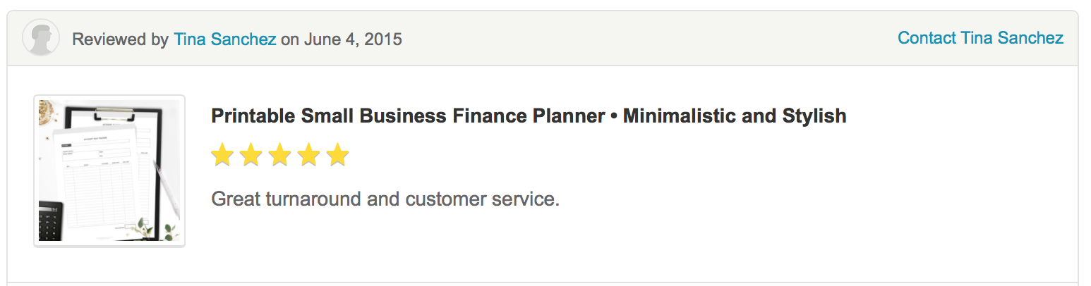
This was my negative review:

“Really disappointed with these blog planner printables. They seemed promising in the pictures and the description but there's so much stuff included which you don't really NEED yet there's a lot missing from it that would be extremely handy to have.

It would be great if the pages were slightly editable at least... especially for the checklists.”

She was right. My product was designed to be a comprehensive organisational tool for bloggers, whether they’re new bloggers or professional ones with very successful blogs. But what was wrong with that?

If the blogger buys a planner with 40 templates and only uses 10 she will feel she’s wasting her money on a product when only will be using 25% of it. But if the blogger pays the same amount for a 12 pages planner and uses 10 she will feel that the product was very useful and ended up utilising 83% of the content.

It’s not about the product, it’s not about the service or the misleading information, it’s about how suitable the product is to meet the client’s specific needs.

The problem here was that I was trying to appeal every type of blogger with a very comprehensive product. However, some bloggers could feel overwhelmed.

Some lessons learned from this:

  1. Narrow your niche – As explained in this other post on Most Common Challenges of Marketing Design Services, the wider your niche is the more confusing your business gets. Narrow your niche and study their motivations, common problems and specific needs. That’s the base of your marketing.
  2. Specialise your products – create products or services carefully thought to satisfied small groups (niche) specific needs. For example, instead of having a thick planner with 40 templates aimed to any type of blogger, I created two planners with half of the templates aimed to two different groups of bloggers: starters and professionals.


WHAT TO DO WHEN YOU GET AN ONLINE NEGATIVE REVIEW

1 | Contact the buyer offline

Show them that you care, hear their part of the story, show empathy and understanding, apologise even if it’s not your fault and try to resolve the issue in the private space.If you can resolve the issue or compensate the buyer, they may be willing to change the review or even remove it.

2 | Reply online

If the buyer doesn’t respond, then you should reply the online review in the most positive and professional way. When handled right a bad review can become an opportunity to create a positive image of your business.

The response should be also the same: show empathy, apologise and offer help to resolve the issue if the buyer gets in touch.

3 |  Dilute the negative review with positive ones

Even if you got one negative review, many potential buyers won’t see that as an issue if you have hundreds of positive reviews.

For example…

Every time I get a feedback or a suggestion for improvement from any of my buyers I update my planners and resend them to those who bought the product in the last 12 months. I noticed that this ‘free-update’ brings a good amount of positive reviews to my shop.

So as soon as I got this bad review I proactively updated and re-send the products to my buyers to hit a few more high scores.

Buyers may not give you 5 stars for a good product but they will for a good post-sale service.
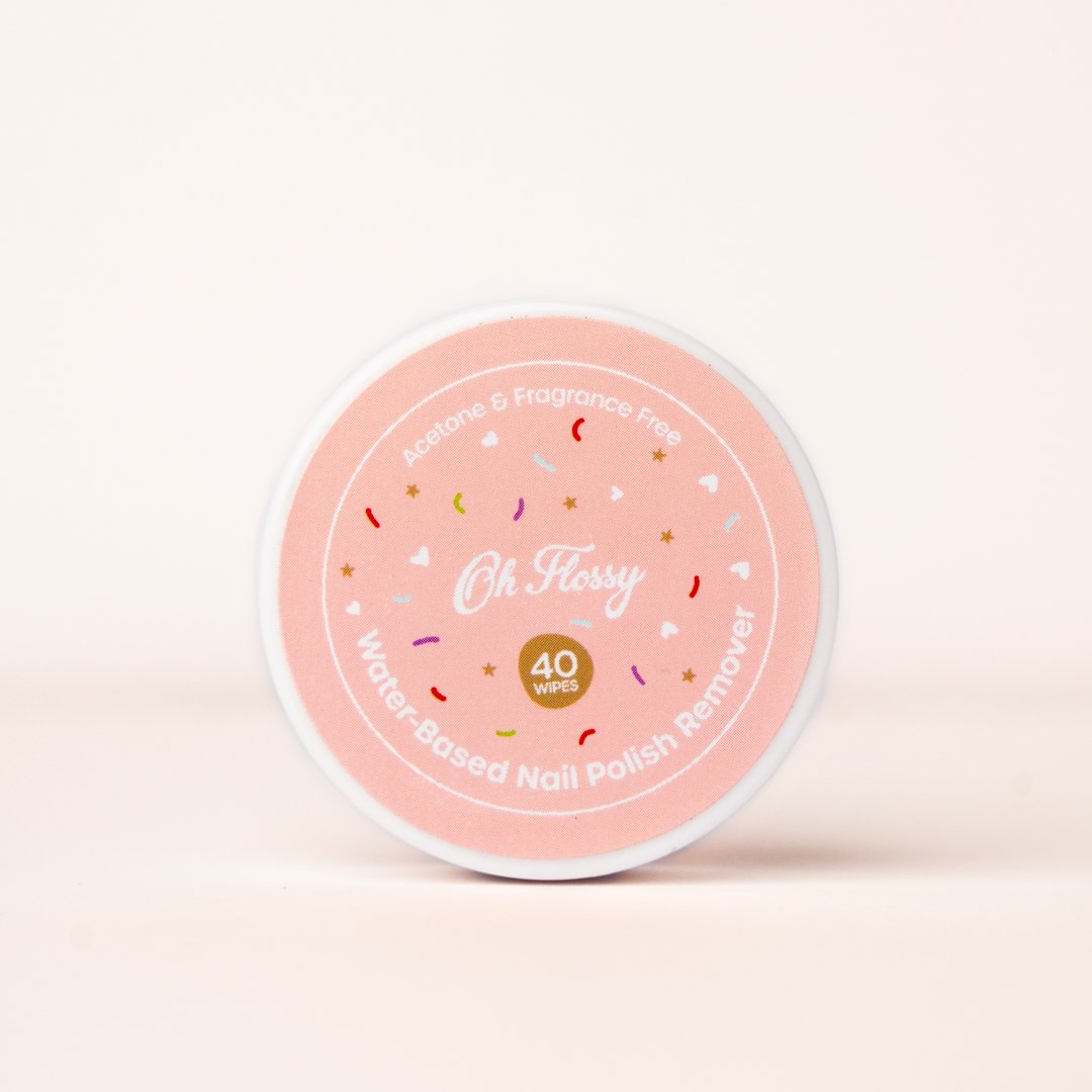
4 | Learn and Move on

A negative review is not the end of the world. It would be very naive to think that everyone will always love your products. If you get a bad review, learn from it and keep on working on your business excellence.


One last note…

False or inappropriate reviews can be removed. Contact the site to explain the case and if they agree that the review is malicious, dishonest or completely irrelevant they will eliminate it.


Your Turn

Have you ever have an online negative review? What was about? What did you do to deal with it? Share your experience!


How To Create A Brand Style Guide For Your Website Or Blog

A brand style guide is a document that contains a set of rules and visual guidelines to ensure consistency across every piece of marketing material that a company produces.

Every company should have a visual style guide with brand use instructions for different media, including websites. Big corporations usually have a comprehensive brand style guide that covers many aspects of the company brand strategy, from mission, vision and core values to brand usage and implementation.

However, in the small business field, many are online businesses and blogs, or rely mainly on the Internet to promote themselves. For this reason, the brand style guides are usually reduced to website style guides that contains web-specific rules and guidelines.

In today’s post, I’ll be focusing on website style guides, as small business owners will probably find these ones more useful and relevant to their business needs. I’ll take you through the process of creating a visual style guide for your website or blog with the help of a template that you can download at the end of this post.

This exercise will take you less than 30 minutes but will save you a lot of time and headaches in future website updates and expansions.

A website style guide might seem unnecessary for a small business. Some common questions that may come to your mind are:

“Why is a consistent visual style so important to my business?”

Your website is a reflection of the way in which you do business. It shows the amount of attention, dedication and care that you put on what you do and the quality standards that your business has.

A consistent style shows professionalism and builds credibility among your market.

“Why do I need a visual style guide? Aren’t the styles specified in the .ccs file?”

Yes, they are. However the visual style guide will present every rule in an organised way making it easier to find. It also gives you instructions for exactly how things should be done, and sometimes even insight into why, making it also easier to understand.

“My designer created the styles and already knows every rule, do I still need a visual style guide?”

Yes, you do. You might need to work with a different designer one day, and this document would save him/her a lot of learning time by giving clear instructions on how things must be done in your website.

If your don’t have an in-house designer, he/she may be working with different clients at the same time, thus having a style guide will make their lives much easier.

“I designed my own website and I know every style by heart, do I still need a style guide?”

Yes, you do, because after a few months you may have already forgotten the hex code of your colours, the font family for subtitles, or how many pixels you left between two elements. Then again the style guide will save you a lot of time.

It’s usually the web designer’s job to create this document, but if your designer didn’t facilitate it to you, or you designed your own website, a style guide is also quite easy to produce by yourself.

To explain each of the components that should be included in your website style guide I’ll use one of my recent jobs as example: the redesign of the lifestyle blog ChicDeco.

1. Colour

The website colour palette can be divided in two groups:

  1. Primary colours - usually black or grey and another colour
  2. Secondary colours - other colours that could be used when a variety of tones is required, for example charts.
ChicDeco blog primary and secundary colour palette with Hex codes and RGB

Web colour are expressed in Hex codes, a six-digit number used in HTML, CSS, SVG to represent colours. Your website visual style guide won't need CMYK or Pantone specifications.

Tip: don’t choose too many secondary colours, instead play with saturation, tint and shade.


2. Typography

This section will specify which web font families were chosen for type of text in your website, as well as font weights, sizes and colours. Web fonts can usually be found in Google Fonts, which has the biggest open source directory of web fonts.

The most common written elements in website are:

  • Headings and subheadings ( <h1>,<h2>, <h3>,... )
  • Menus
  • Body copy ( <p> )
  • Text links ( <a> )
  • Button text
  • Quotes and boxes ( <blockquote> )
  • Image captions
TYPOGRAPHY-01-01.png
ChicDeco blog typography specifications including font family, sizes, weight and colours


3. Buttons

Buttons are common in forms, but are also a good way to call to action with words like “subscribe”, “download”, “book”, “shop”, etc. They are usually use to draw the attention to those part of your website that encourage the visitor to interact with the site.

Your website may have 2 or 3 different button styles with two versions of each, one off and another one for mouse-over functions.

Social media icons could also fall into this category. They usually are an invitation to follow your page or share your content in their social media profiles.

Apart from buttons, you may also want to specify here styles for input fields, used in contact forms, sign-up boxes, blog comments, and any other interactive elements.

Buttons.jpg
ChicDeco blog text buttons (active and hover), back-to-top buttons (active and hover), social media icons and icon buttons.


4. Iconography

A pictographic library of vector icons, totally free and customisable with CSS, can be found in Font Awesome.  But if your website requires more specific icons, a icon set should be also specified in the website style guide.

ChicDeco blog icon examples


5. Infographics and charts

Infographics are commonly used to summarise the content of a blog post or a web page in a visual way, to make the content easy to understand, sharable and visually appealing.

Charts also help to present data in a visual way and make complex content easy to understand.

Although not every website or blog may need charts and infographics, if yours it's content heavy, and talk about technical issues, industry data or other complex topics you should also have some rules and guide lines for infographics.


6. Imagery

Having a well-defined image style can help your blog or website deliver your message, create an emotional connection with your visitors or readers, or just make your content more visually appealing.  

Defining an image style will bring clarity and visual consistency to your blog or website. You can also specify other image related aspects like, minimum image sizes in post images to avoid pixilation, image borders, image caption positions or even board layouts.

ChicDeco blog food styling board example
 
ee3cb024677793840c8a39a9363d9755.jpg
ChicDeco blog product boards

With image s you could also define some pattern styles for backgrounds, if your blog or website will need them.


7. Header

If the header in the first thing that your visitors will be when visit your website or blog, why did I left this one for the end? Because, web and blog headers usually combine some of the elements mentioned above.

If you don’t have a brand style guide, your logo specs can fall into this section. Your header might contain images, typography and other graphic elements.

In this section you can also specify logo variations for social media avatars and favicons or header style for your social media pages or email newsletters.

ChicDeco blog header with logo, responsive menu (letf), search button (right) and social media icons (top-right)

8. other visual elements

Although the elements above are the most common ones in a visual style guide for a website or a blog, you may also want to complete your guide with a few more specification on:

  • Advertising banners
  • Sidebar titles and elements
  • Social media styles
  • Menus and submenus

Your Turn

Along the years that I spend working as brand manager for one of the Big Four, the brand style guide was the most utilise document in day-to-day job. It used to be a thick document that covered all possible uses of the brand to ensure consistency across the world.

Today I tried to produce a simple workbook that you can utilise in your day-to-day website editing and updates, keeping it simple and functional. You can download this document by clicking on the button below and fill it with the relevant information or use it as a guide to create you own visual style guide from scratch.

 
Designing An Effective Logo

A logo always seems like an easy thing to do for any designer. However, although a good logo may be simple in its construction, it’s not in it's concept. Behind every professional logo there are many hours of research, sketching and testing. Understanding the process behind a logo design can help small business owners to know:

  • what makes a good logo and what doesn’t
  • what to expect from your designer when they design a logo for your business

I’ve been recently working on a logo design for a new business in Perth, WA Mortgage Advice (website coming soon) and I thought this work could be a perfect opportunity to take you through my logo design process.

My logo design process has five stages:

1.    Discovery

The first step of any design work is getting as much information as possible about the client’s business. This information can be obtained through a conversation with the client, through a design brief questionnaire and by researching their market.

By way of example, my latest client is a mortgage broking business, a completely unfamiliar professional field for me. Learning as much as possible about my client’s business was my first mission. To do this I first held a one-to-one meeting with my client.

During the meeting I gave my client a list of descriptive words to select the three that best describe the business personality and core values. My client used words like trust, knowledge and honesty that would give me some clues of what design elements I should consider to visually describe this business.

I get the information I need from a few carefully crafted questions in my design brief questionnaire. This questionnaire helps structure my meetings and formalise the information gathered in a document. When I cannot meet the client face-to-face, I send the questionnaire by email. I could skip the meeting if necessary, but I cannot skip the design brief questionnaire.

A good brief cannot just rely on the information obtained from the client; you also need to research their market. This is always a good chance for me to do visual research, reviewing logo designs of my client’s competitors and seeing how their brands look.  
 

2.    Sketching

During this phase I sketch dozens and dozens of logos. I start conceptualising the business in a few simple ideas, then I play with the business name or the acronyms, and mix ideas and concepts with letters and shapes.

logo-sketching

When someone talks about “mortgage broking” you immediately think of homes, banks, and approval processes. But my client highlighted ideas like offering guidance and giving clarity, security and confidence to people to make lifetime decisions. Listening and understanding clients to give this advice was one of the core values of this business, what gave me the idea of using speech bubbles in one of my logo designs.


3.    Designing

After a few hours sketching concepts, I eventually picked the three best concepts that I came up with and drew them in Illustrator. Why only three concepts after sketching dozens of them? Because something I learned about clients is that the more ideas you present the more difficult is for them to make decisions.

At this stage I don’t add colours or anything else just yet. I present the logos to the client in black and white to focus on the concept rather than on the style.

Here are the three concepts presented to this particular client:


4.    Polishing

This is my favourite part: the client picked the concept, so now I could go back to Illustrator and refine my logo design. I measured every distance; made every size proportional and every angle identical.

wa-mortgage-advice-logo.jpg


5.    Development

Now that the logo is finalised I can complete the entire visual identity with colours, fonts, logo variations, etc. To do these final selections I can go back to my design brief and use the descriptors that the client gave me.

wa-mortgage-advice-logo-variations.png


For WA Mortgage Advice I picked a light orange as the primary colour. The client highlighted the importance to communicate a very genuine intention of helping people in the best professional way. According to studies on the emotional meaning of colours, orange is the most suitable colour to communicate friendliness and client care. Orange also would give the brand a modern, young and energetic edge.


wa-mortgage-advice-logo.jpg
 

During the development phase it's important to test the logo in different media. To do this I create a few mock-ups of business stationary, advertising or other marketing materials that the client may produce in the future. This way I can see how the logo will look and whether it's necessary to make any final changes.

wa-mortgage-advice-business-cards.jpg

The objective of my design process is to ensure my logos always meet the five principles of any logo design: simplicity, memorability, versatility, timelessness and appropriation.

Now, that you know the different steps involve in a professional logo design and what makes an effective logo, you can put your own logo under test.


Is your logo right for your business?

1. Is your logo simple?

Good logos are uncomplicated. The more detail a logo has, the more information the viewer has to process and retain. Simplicity will make a logo easy to recognise and to remember.

As explained in stage 3 (Sketching) I design my logos just with a pencil first, in black and white, to ensure effectiveness in its simplest form. Colour should be left to the end of the design process.

2. Is your logo memorable?

A good logo is easy to describe. What's difficult to describe, is also difficult to remember. Recognition brings familiarity, which assists in building trust and loyalty in your brand.

3. Is your logo versatile?

As I mentioned in stage 5 (Development) a well-design logo will translate well across different mediums. When printed in small sizes, a complex design will lose detail, making it harder to recognise. A good logo must be simple in order to reproduce well on small scales, such as favicons.

For this reason, logos should be always designed in vector format, that is Adobe Illustrator, never Photoshop.

4. Is your logo timeless?

An effective logo should endure the test of time. A good logo designer doesn’t follow any design trend. Trends come and go and ultimately turn into cliches.

5. Is your logo appropriate?

A good logo design will be relevant to your industry, clientele and target market. Even though your logo doesn’t have to describe what your company does, it has to reflect your business essence and values (as I illustrated in stage 3, Sketching).  


Sources:


Five Simple Tips To Build A Unique Brand

Your brand is the soul of your business. It's what identifies and differentiates your business from others. It's what makes you unique and special. Branding a business is not just about creating a logo, it's about creating perceptions in people's minds and love in customer's hearts.

A brand is represented by the branding, that is, all those visual elements that allow people to identify a product or a company. This can include the logo, colour scheme, typeface and other elements, and can be formalised in a document called style guide. Below is an example of my style guide.

Grafika-Studio-Style-guide.jpg

It's difficult to describe the entire process to build a brand. It starts with soul searching: find your strengths, your passions your vision and your personal style. Then set a sole goal: to get paid for doing what you love. And finally come up with a step-by-step plan to make it real. Start small but dream big.

Here are my five tips to build a unique, memorable, and timeless brand that reflects your style and represents you and your business for years to come:


1. Find Your Own Unique Brand Style

There are no two identical businesses, so you must explore and find what makes you different. Understanding your own distinctness is the first step to build memorable brands. Once you find it, write down your brand statement, that is a short sentence that states your uniqueness.

I found my own distinctness in the concepts of beauty, simplicity and style. They define what I do and how I do it, and I have summarised this in my brand statement: beautiful brands, stylist websites.


2. Deliver a Consistent Message

Letterheads, invoices, business cards, everything talks about you and the way in which you deliver your work. It's important that all your brand elements are well-coordinated across every channel and that message is clear and consistent. The style guide helps you achieve that consistency.


3. Build Brand Name Recognition

People must know who you are and what you stand for before becoming customers. Just delivering a consistent message won't be enough, make sure everyone "gets it". In a world that’s overloaded with information, only creative, unique and special brands can stand out and be easily recognised and remembered.


4. Invest In Brand Quality

Quality is a reflection of your business personality and how much you care about every project, every product and every client. Make sure your brand also reflexes your quality standards. Invest in professional photos, print in high-quality paper and proofread everything that you write, even if it's on your blog or social media pages. 


5. Communicate your brand and brand your communications

Take your brand online and communicate with your people, ask and answer questions, and participate in conversations that help you build the emotional connection with everyone in your market