
Monument Advisory business cards, by Grafika Studio
I love working with professional service businesses as they take me back to my years working as brand manager for EY. When the director of Perth-based financial advising company, Monument Advisory, approached to me in September last year to design their brand identity I immediately felt excited about this new project.
The brand was aimed to a high-end market, and needed a corporate professional and smart look and feel... No problem, elegant and stylish design is my specialty!
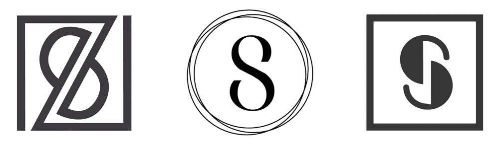
I designed a mighty and solid logo that suggested confidence and professionalism, combining an M, for Monument, and A, for Advisory in the same mark. Then we selected a sans serif font to give the brand a modern and clean look.
To break the formality of corporate logos with straight lines, I intentionally broke the symmetry in the logo to make it look a bit more casual, but still professional.
One of the requirements in the brief was to combine two colours in the logo, blue and silver, so that we could add a foil finish when printing the business stationary and marketing collateral. So I reserved the triangular area inside the logo and the word 'Advisory' to add a subtle touch of silver foil.
Below, Monument Advisory logo from the Illustrator drawings to the final print with embedded silver foil.
The logo was also designed to bleed in printing materials, when used only with the mark and without the typography below, as it was used in the email signatures (below)

The business stationary combines white paper with dark blue elements and a touch of silver foil wherever was possible to incorporate. The result is a clean and smart brand identity with a luxurious touch of silver.

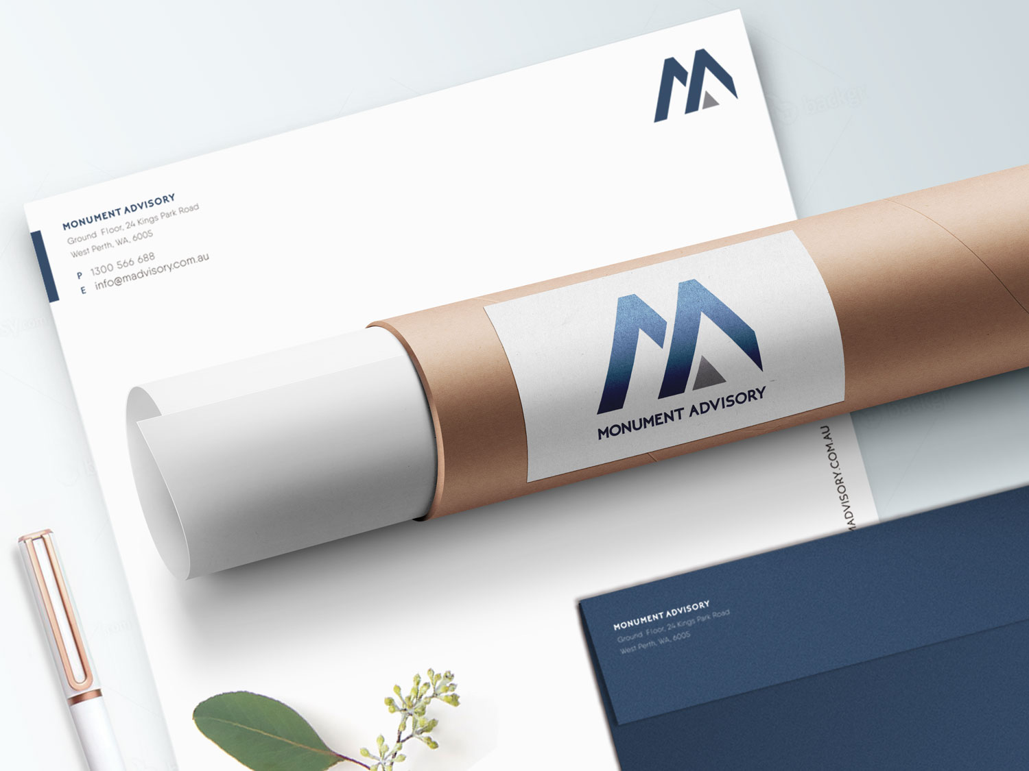
Monument Advisory business stationary, by Grafika Studio