Posts tagged Web Copy
How To Write A Great About Page

Your About Us page is one of the most important pages on your website. If you take a look at your statistics, I’m pretty sure you’ll find your About page within the 3 most popular content of your site.

Your About page is where your business takes a human shape and reveals a personal story, aspirations, and dreams. It’s where you can create an emotional connection with your visitors by showing that behind your brand there is a real person just like them.

But you must refrain from the temptation to your make it just about yourself.

Picture yourself going on a date with someone who can only talk about him/herself. You wouldn’t want to see that person again.

So how should you approach your visitors on your About page? Well, let’s start from the beginning, who visits your About page and why?


Why do people visit your About page

People visit your About page because they want to know if they like you, can trust you, and decide whether you would make a great team working together.

Why would you go on a date in the first place? Same, because you want to know if you like the guy and whether you could potentially have a relationship together.

So if they are already visiting your About page it's because they are probably considering working with you. Take this opportunity to tell them why they should choose you over everyone else out there.

One of the main challenges small businesses have to face to get clients is building trust among their market. People don’t know you, don’t know whether they can trust you and let’s be honest, there are a lot of weeds out there, so people are right to mistrust.

But they’ve seen your portfolio, and your catalogue or have read your blog and like what you do, so they surf your website looking for signs of trust. The first place where they go to look for these signs is your About page.

Understanding what inspires trust in your visitors is the first step to writing a compelling about page.

Then, the style, tone, language and design of your About page should be determined by the type of people you want to target, and how you want to make them feel when visiting your site: inspired? Understood? Empowered?


Anatomy of a great About page

Every great About page has the following elements:

1.    Opening statement

This is the headline of your business. It should highlight your distinctiveness, the main value that you can provide to your clients, and what your company stands for.

It’s a hook to capture the attention of your visitors, incite curiosity and make them want to know more.

For example, one of my clients State 28 use the following opening statement:

Strategic approach, innovative outcomes

Interior environments should enhance the lives of their inhabitants. Creating spaces that make people smile is our passion


Another example by designer Breanna Rose of Rowan Made:

This is Rowan Made,
A small design studio with a knack for simplicity + story telling

2. Introduction

This is a short paragraph to briefly answer the main 5W questions that your potential clients always want to know about you.

  • Who you are – they want to know if you are a small or medium size company, a family operated business, etc.

  • What you do – they want to know your specialisation

  • Where you are located – they want to know your physical proximity, as this can be highly value for many potential clients.

  • Since When you’ve been doing this – they want to know your experience and years in the job

  • Who your services are aimed at – they want to know if they belong here.

Another great example, Julia Kostreva says in her About page:

Julia Kostreva is an art director and designer in California with a love for art and culture.
In 2013 Julia founded this creative studio and shop - a place for work and play


3.    Your WHY

This is the most important part of your About page: your WHY.  Why do you do what you do? What’s your vision? How do you want to make a positive impact in people’s lives?

In the words of Simon Sinek:

People don’t buy what you do; they buy why you do it. And what you do simply proves what you believe
— Simon Sinek, Start With Why


This section is an opportunity to explain what problems you solve and what benefits you can provide. Describe your capabilities and why you’re uniquely qualified to offer this service.

You can also do this by incorporating your company mission or tapping into people’s beliefs by sharing your core values.


4.    Provide social proof

Third party endorsements are a great tool to build credibility.

Demonstrate that it’s not just that you are saying it, there are a lot of people out there who love what you do. My favourite ways to demonstrate social proof are:

  1. A list of big brands that have already worked with you

  2. A list of links to media features

  3. Awards

  4. A rate (ie, 5 stars, etc) by industry experts

  5. A huge amount of social media followers

I personality don’t like to use testimonials here. They need some context and should always go with your projects or products.


5.    Your bio

Ok, now you can talk about you, but don’t go on too long, just explain the professional journey that brought you here today. Be short and sweet. Make it as visual as possible by adding photos of yourself, a timeline or other visual resources.

Your life story, qualification and career achievements will bolster your credibility and credentials.

This is also a great opportunity to create a personal connection with your readers. Think about the aspects of your story that they can relate with, such as humble beginnings, career mum’s struggles, etc.

You can take a look at mine here.


Do’s and dont’s for a great About page

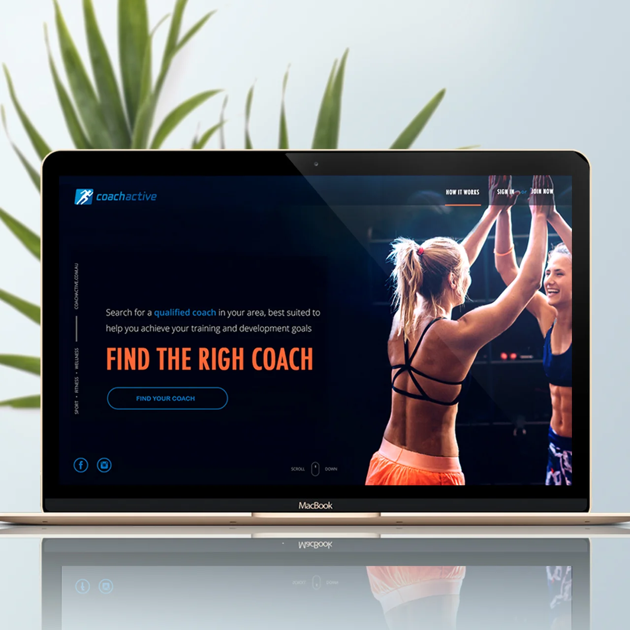
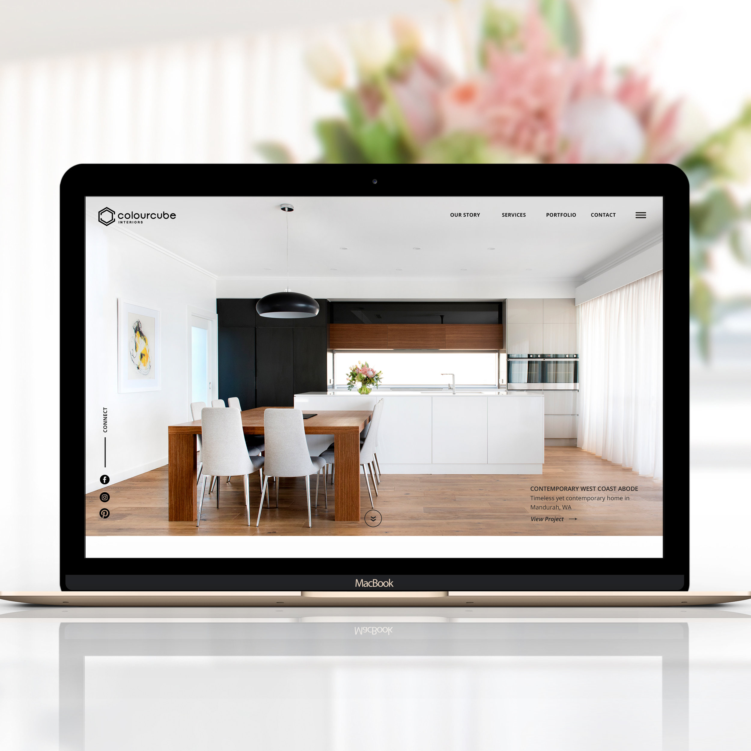
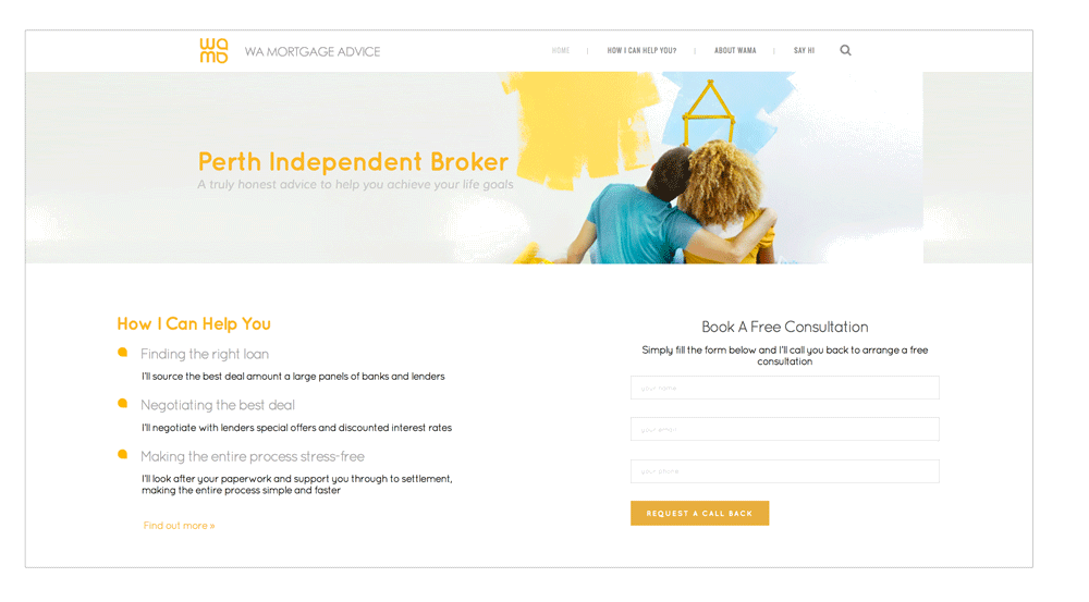
Do include a photo of you – headshots or photos of you in your workplace are great in this section. .
Don’t use stock photos – they are impersonal and don’t bring any value to your About page.
Do invest in high-quality photographs - hire a professional photographer to do this job.
Don’t write in the third person - be conversational and use a friendly tone to make you more likable.
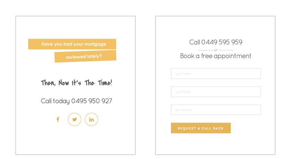
Do include ways to connect – such as email and links to your social media pages.
Do link with internal content - invite visitors to see examples of your work in your portfolio, take a closer look at your services offer or read your blog.
Do use a professional but casual tone - it will make you approachable
Don’t forget to update it regularly.

How To Write The Perfect Call To Action In 5 Simple Steps
call-to-actions

A call to action (CTA) is any text or graphic that provides a clear link to the next action. Its purpose is to provoke the reader/visitor/consumer (I will be using the term consumer) to perform a specific action.

Common actions include:

  • Signing up to a newsletter or e-course
  • Calling an organisation
  • Sending a message
  • Viewing a demo
  • Using an interactive tool

Whether it’s placed on your website, social media page or email, a CTA can be an excellent way to increase inbound traffic, leads and give your small business an advantage over your competitors. With so many reasons to utilise CTAs, it’s interesting to note only “47% of websites have a clear call-to-action button that takes users 3 seconds or less to see” (Go-Globe) and “70% don’t display clear calls-to-action for anything on their home pages” (Online Marketing Coach).

So why are CTAs so misused? Perhaps it’s due to a lack of understanding of their significance and purpose they serve, or perhaps it’s because people are unsure how to go about writing and applying CTAs.

No matter what your issues you’ve face with CTAs in the past, it’s time to put them behind you and start fresh with these 5 easy steps which will have you creating enticing and engaging CTAs in no time!


Step 1. Pick The Right Action Word (Verbs)

As the purpose of a CTA is to have the consumer perform a specific action, it is important to make the desired action clear. The use and effective placement of verbs is one of the simplest way to do so.

Select a verb:

  • If you would like your consumer to join your email course you can use verbs such as “subscribe”, “enrol”, or “email”

With a verb in mind, the next step is to locate it effectively within your CTA. Studies have shown the first and last few words of any copy (written material) stand out to most people. To take advantage of this simply place the verb at the very beginning of your CTA.

Place your verb where it’s most effective:

  • Instead of your CTA reading: “I’m ready - Sign me up”, modify the order of the words to read: “Sign me up - I’m ready”.

By switching the order of the wording used in the CTA, your consumers attention will be immediately drawn to the action you would like them to complete.


Step 2. Apply First-Person

The significance of using first person in a CTA is revealed in a study conducted by Unbounce. The study tests the engagement consumers has with two CTA buttons. The buttons were identical in every way with the exception of one being written in first person whilst the other was written in the more common third person. The result, “when [sic] tested live on the website, it turned out that the treatment with “Your” performed significantly worse than the control copy that made use of “My” – 24.95% worse to be more precise”.

Further to this test, another was conducted using the CTAs “Start your free 30 day trial” and “Start my 30 day free trial”. The CTA button using “my” showed a 90% increase in the click through rate over that of the “your” button. Such a strong result showcases the power a single word can have in a CTA.

By introducing first person terminology such as “me” in place of “your” you are encouraging your consumer to place ownership on the reward they will receive upon completing the action

Reframe your CTA:

  • Instead of stating “Get your free guide today”, reframe your CTA to state “Claim my free guide today”.
  • Instead of using the phrase “Sign up”, reframe your CTA to state “Sign me up”.
  • Instead of using “Join now”, reframe the CTA to state “Enrol me now”.

By reframing your CTA in this manner you will also be to avoiding a CTA that demands an action from your consumer. Yes, that’s right, the saying “you can catch more flies with honey than with vinegar” holds true in relation to CTAs. By reframing your CTA to be a demand from your consumer rather than one from your business allows you to clearly convey the benefit your consumer (not you) will obtain through their action.

This approach is a great deal more likely to engage your consumer and see them follow through with the intended action.


Step 3. Be Crystal Clear

Consumer uncertainty, doubt and fear are the ultimate action killers. If your consumer is uncertain of what will occur when they act upon your CTA, it is very unlikely they will follow through with the action due to fear and doubt.

The word “send” is the perfect example of a frequently misused term as it can be interpreted in many ways. To some, the word may imply mail via post, whilst to others it may imply email.

People have a tendency to assume their personal interpretation of a word will be that which is commonly accepted by others, yet this is not always the case. By placing assumptions upon the words you chose to use you risk consumer uncertainty which and therefore consumer inaction.

Please note, if you choose to use a word such as “send” in your CTA button for any reason, ensure you have made it extremely clear elsewhere in the CTA what this meant by the word “send”.

Clarify the meaning of your CTA:

  • By stating “Teach me how to write great copy in 3 weeks” you do not clarify what will happen when your consumer clicks on the button. While they may be eager to learn more about writing copy, they are unlikely to click due to a lack of clarity.

This CTA does not explain what your consumer will receive when they act, the method in which the information will be received, the commitment required or the cost. With so many unknowns surrounding what will occur after actioning the CTA your consumer is likely to experience fear and uncertainty leading to inaction.

  • By stating “Sign me up to the free 3-week Writing Perfect Copy email course” you make clear the way in which your consumer will learn how to write great copy.

There can be no doubt what will occur when your consumer clicks on the button. This CTA expresses what your consumer will be receiving when they respond, the method in which the information will be received, the length of time they can expect to receive the information and the cost.


Step 4. Keep It Short

Though it may be tempting to cram as much information as possible into a CTA, it is best to approach your CTA with the KISS principle in mind – Keep It Simple Stupid.

According to studies, readers only take in the first and last 3 words of any copy. This suggests the ideal length for a CTA is 6 words which can be a big challenge if you’ve never written a CTA before. To make writing an effective CTA easier, I recommend aiming for 10 or less words and ensuring the more critical information is positioned at the beginning, followed by the end of the CTA.

How to write a short CTA:

  • Write what you wish to say, ignoring the length
  • Identify the keywords which cannot be removed
  • If some of your keywords are particularly long, seek out shorter synonyms
  • Go through removing and shifting around words, ensuring the meaning is not lost


Shorten your CTA:

  • Though “Sign me up for this email course on how I can learn to increase my Twitter traffic by 30% in 4 weeks” may appear to provide your consumers with more information, research shows they are likely to ignore any information containing in the middle of the sentence.
  • By shortening the CTA to “Increase Twitter traffic by 30% in 4 weeks”, the consumer is more likely to clearly comprehend and receive all of the necessary information provided.

Once you start cutting your CTAs short it can be hard to stop, but it is important to remember cutting for the sake of cutting isn’t recommended. It is more important to convey your message than to use a shorter CTA which lacks clarity and information.


Step 5. Revise Your CTA

Congratulations! If you’ve followed my 4 previous steps you should now have a wonderfully written CTA in front of you and it’s time for the final step. Revising your CTA from the Point-Of-View (POV) of the consumer is crucial as it allows you to gain a new perspective and additional insight into how your CTA is likely to be received by your consumer.

Look at your CTA and ask yourself:

  • “Will this take long?”

If the answer is unclear or the response is yes, you will need to make some changes to your CTA and/or the action itself.
 

  • “Is this worth my time?”

If your CTA does not clearly express the benefit/s your consumer will receive, the answer is likely to be no and you will need to make some amendments to your CTA.
 

  • “Will this be simple?”

If your consumer is unsure how long the process will take, or it is evident it will require some time e.g. filling out complex forms, your consumer is unlikely to follow through with the action and you will need to make some changes to your CTA and/or the action itself.
 

  • “Is this something others are doing?”

If your consumer is left questioning whether they are likely to be the only person acting upon your CTA they may begin to fear the prospect of being ‘suckered in’ and feeling foolish. If this type of questioning arises from your CTA consider incorporating a numerical count or statement which shows your consumers that others have previously acted upon the CTA.
 

  • “Will this involve providing my credit card details?”

If your CTA requests credit card details it is likely to be extremely off putting to any consumer. Often your consumer will have their card away from them and question the possibility of future monetary costs and commitments which may apply. For this reason it is often best to leave any financial commitment to another time and place.

By following these 5 simple steps you can write engaging an effective CTAs for any copy. So give CTAs a go and include one in your next blog post, website update or social media post, and of course, comment or email me to let me know how it goes.


About The Author
Eva Niedzwiedz is a communications consultant and Director of Pickled Pineapple Public Relations based in Perth, Western Australia. Her mission is to help small business owners take advantage of their unique marketing potential through the creation and implementation of original content, tailored communications and social media services.

8 Formats To Produce Highly Engaging Web Content

Yes, we know… blogging is extremely useful for expanding your brand presence, improving your visibility in search engines and growing your web traffic. There is also a strong correlation between blog post frequency and customer acquisition.

However, with the big amount of blogs populating the blogosphere, it’s getting harder and harder to make your blog stand out the crowd. So the question is how small business owners can produce high-quality content for their blogs and websites to differentiate themselves? And how can they produce this content in an inexpensive way?

When we talk about producing high-quality posts, written content is not the only way to deliver your message. There are other dynamic and creative ways to present your web content that will engage your readers much better and make your blog or website stand out.

As I explained in this other post on how to write for blogs, the process to write a good blog post can be summarised in three simple steps:

  1. Identifying a common struggle of your target market (choosing the topic)
  2. Writing about a possible solution to that problem (crafting the content)
  3. Presenting this solution in the most visually appealing way (adding value)

In today’s post I’ll focus on this third step, by introducing 8 different ways to create highly engaging content to add value to your blog. By utilising any of these web content formats you will give your readers something to take with them - to save, print or share - after visiting your website and reading your posts.

1.    Infographics

They are a visual representation of information or data. They can be very useful to explain technical information or to quickly convey the key points behind complex data. Infographics can make your post more visually appealing and easier to understand.

Infographic formats include timelines, flow charts, annotated maps, graphs, etc.

A good infographic is an excellent SEO tool that can generate high-quality natural back-links. A well-designed infographic on a hot topic can be also shared across many social media platforms.

How to produce your own infographics

If you don’t have design software such a Photoshop or Illustrator, or simply don’t have design skills, you can still create infographics with the help of some free web-based tools like Infogr.am or Easel.ly. In this post published by Creative Blog you can find other 10 free tools to make your own infographics.


2.    Podcasts

They are audio-content that your visitors can download and listen in their own time. For many internet users, podcasts are a more convenient way to consume your content, as they can be listened while the user is performing another task, like driving, walking, commuting to work, etc.

Podcasts are a more dynamic way to present educational content or blog interviews. The interview can also be transcribed or summarised in a post.

How to produce your Own podcast

A great tool to produce podcasts is Audacity, an open-source editing and recording program that’s compatible with most operating systems and works well for beginners. To find out more about how to use podcasts to grow your business read this other article by Digital Trends:


3.    Video

Video formats are another way to produce visual and interactive content for your blog and website. Studies have shown that posts with videos attract 3 times more inbound links than plain text posts.

They are great ways to present how-to and DIY posts or tutorials.

Within the video formats, you can also find webinars. These are live, interactive online meetings. Viewers can attend live sessions and participate by asking questions or can watch recorded video after the session at anytime.

How to produce your own video-tutorials and webinars

Although this option seems difficult to produce, current technologies allow everyone to easily record videos from any device (including smart phones) and upload them on to YouTube. Also, screen-recording tools, like Camtasia, can help you easily produce video-tutorials on software or digital tools.

Here is also another great post on How to Do a Webinar Using Free or Inexpensive Tools, published by Right Mix Marketing.

4.    Slideshows

Online presentations are another way to share knowledge in a visual way. The advantages of using online presentations are:

  1. Any company produces presentations on regular-basis, so they may be a material that is already done and you just need put it online.
  2. They explain a topic in-depth combining text, images, charts, embedded videos, sounds and other interactive elements.

How to produce and share your slideshows

MS Powerpoint is the most popular tool to create slideshow and pretty much everyone who knows how to use a computer, know how to use this tool. Another alternative to create presentation is Prizie (from $10/month)

Once your presentation has been created, platforms like SlideShare allow users to easily upload and share their presentations and PDF documents.


5.    Case studies

Case studies are short explanations of a project your business has worked on for a client. They describe a problem, show how you implemented a solution and detail the achieved results.

Case studies are a very effective piece of content marketing, as well as a great way to build your business credibility and position yourself as an industry expert. They allow your business to share its success and prove potential clients that you have experience resolving their problem.

Case studies can be presented in a dedicated blog post or web page, like I do in the Featured Projects of my website, or in a PDF document than people can download, print and read on paper. The length of the case study will determine the format. If it contains more than 1500 words is better to put it on a PDF document.


6.    White papers

White papers are reports on one specific topic to sum up research done by your company on the topic, discoveries from a customer survey, or statistic information collected by digital tools or technology.

White papers are typically short in length, and people can download them from your website in PDF format.

White papers are great to create back-links. Also industry publications or any other media outlets could be interested in publishing your work, which would give your company an excellent free promotion.

How to produce your Own white papers

A white paper usually a very professional document that has to be created with design software such as Photoshop, Illustrator or InDesign. To know more about how to how to write an effective white papers and use it to promote your business also read this other article by OC Search.


7.    EBooks

eBooks are an essential part of any successful inbound marketing program. However they can be also time-consuming and more difficult to produce. eBooks are more extensive in length, and not only they need good content, but also a good design. For that reason, they are not usually available for free.

However, when they are given away as a freebie, they are a great way to build your email list. To do this, ask the visitor to subscribe to your list before downloading the document.

How to produce your Own eBooks

If you have a collection of interesting articles or blog posts on a similar topic, you can compile them in an eBook. To format your document you can use MS Word, but if you intend to sell the eBook I’d recommend leaving the layout and formatting to a designer, who can professionally do it with InDesign.


8.    Downloadable templates and free tools

When you write a how-to post, it could be a good idea to give your readers a downloadable template to put into practice what they just learned in your blog.

Like ebooks they are also a great way to grow your email list, by asking the reader to subscribe your newsletter to download the template.

In this other post on how to create a professional style guide for your blog or website you can see an example of downloadable workbook or template to implement what the post explains.

How to produce templates

Depending on the template they can be simply created in MS Word or PowerPoint, or professionally done in Photoshop, Illustrator, InDesign, etc.


Your turn

When visiting a blog, what's your favourite way to access the content?


Why My Website Is Not Converting

One common question that many clients and potential clients frequently ask is “why my website is not converting visitors into customers/clients?”

The conversion problem has a lot to do with your message, the way in which you deliver it through your website and its impact on your audience.

In today’s post I explain some of the most common reasons why many websites don’t convert properly and how to fix those issues by using the example of one of my latest website projects: WA Mortgage Advice Website.

why-my-wEbsitE-is-not-convErting

Too much copywriting, too difficult to read

Your website must offer relevant information about your business. But too much information is overwhelming and will make visitors feel intimidate and leave without reading your webpage.

Writing for the web is completely different than writing an essay or a paper. Website copy must be scannable, actionable and shareable.

  • Scannable means that your visitors understand your key messages by just glancing at your web page.
  • Actionable means that your content encourages people to take action.
  • Shareable means that your visitors find your content useful and will share it so that others can also benefit from it.

For example…

My latest project is a mortgage broking website. The financial industry has a complex language with a lot of jargon. A clear and easy-to-read copywriting was an essential part of this website project:

WA-Mortgage-Advice-home-page

For more tips on how to write for the Internet also read this article from Enchanting Marketing: Writing For The Web Vs Print .


Important information hidden below the fold

Not only it’s important how you present the information, but also where you place it. Information positioned in the upper half of a web page and so visible without scrolling down the page is what we call above the fold. Everything else is below the fold.

If visitors have to scroll down to find important details in your website, chances are that they leave without even noticing them.

Analyse your web copy and extract one key idea per page only. That idea must be positioned at the top of the web page. Further information and details can be placed after.

What are those key ideas?

  • Your unique selling proposition
  • Your key benefits
  • Call to actions like ‘book’, ‘enquire’, ‘call’, ‘download’…
  • Contact details

Tip: banners and header images should not take more than half of the screen; otherwise they will be hiding important ideas below them and below the fold.


Lack of credibility

Your website may not be encouraging trust among your visitors. Some reasons may be:

  • Visually unappealing design - it’s all about creating a good first impression. A clean and well organized website design speaks about your professionalism and how much you care and invest in your business and clients.

Avoid too many colours, graphic elements or call to actions that can cause distractions and make your visitors get lost.

  • Lack of contact information – for many people who search for a product/service in the Internet, location convenience is important. For many others working with people who are accessible and easy to reach when they need them is essential.

Your business address, direct phone numbers and email addresses or even an online chat app can help you gain credibility and trust among your audience.

  • Lack of social proof – social media followers, reviews and client testimonials can help you build credibility in the Internet. Focus your marketing efforts on connecting to people through social media and getting feedbacks from clients and industry experts.


Lack of direction

When visitors land in your website, they don’t know what they have to do. You have to show them the path, indicate what comes next and what they should do while visiting your site. How? With call to actions. 

A call to action is an invitation to interact with your site by:

  • Signing up for a newsletter
  • Downloading information
  • Making appointments/bookings
  • Getting a quote
  • Etc…

The more they interact with your website the better will get to know your business.

call-to-action-examples


Lack of attraction and engagement

Relationships are key for any business success, and especially to sell services. Visitors who are in need of your services want to know you first before hiring you.

How do you build a relationship in the Internet? Engaging your visitors through social media, newsletter sign-up forms, blog and comments and everything else that allows you to keep conversations and communicate with your visitors after leaving your site.

In this other post I explain how to grow your business by building relationships.

Tip: proof you’re willing to help not just to sell, but by answering questions in social media and blog posts, and offering free tips, free first consultations, etc.


Wrong message, wrong keywords

Another common reason of poor conversion is often the message itself. Being too generic, trying to appeal a broad audience or offering too many services can confuse the audience or make them leave your website with the feel that you are just ‘another one’.

But being too generic and too broad also has another consequence: poor keyword strategy. If your keywords are too wide, you may be leading a lot of traffic to your site, but only a small percentage of those visitors are actually potential clients.

To avoid this you must:

  • Find what makes you different and unique and highlight this differentiation in your home page, above the fold.
  • Be specific, target a niche and narrow your offer to only those services that you know best.
  • Focus on long tail keywords that are more specific and have less competition in search engines.

For example, if my client, a mortgage broking business, focused on generic keywords like ‘mortgage’, there is so much competition already for that word that chances are that he will never get noticed. Instead we focused on long tail keywords like ‘First home loan advice’.

Wrap-Up

In conclusion, conversion rates have a lot to do with your website copywriting. Learning to write for the Internet can improve significantly your leads and opportunities obtained through your website.