Posts in Design
Is A Single Page Website Right For You?

It’s traditional to create websites using multiple pages — designed to resemble print media, with chapters and contents. But single page websites are an increasingly popular choice for business sites, and there are a few reasons why.

Single page sites rely on scrolling down a page rather than navigating via links and menu tabs. This reduces the time spent moving around the site trying to find the correct page. On the other hand, this may not work as well for sites with a lot of content due to the amount of scrolling required — although incorporating anchors can quickly take the user to the correct point of the page if they do not want to scroll.

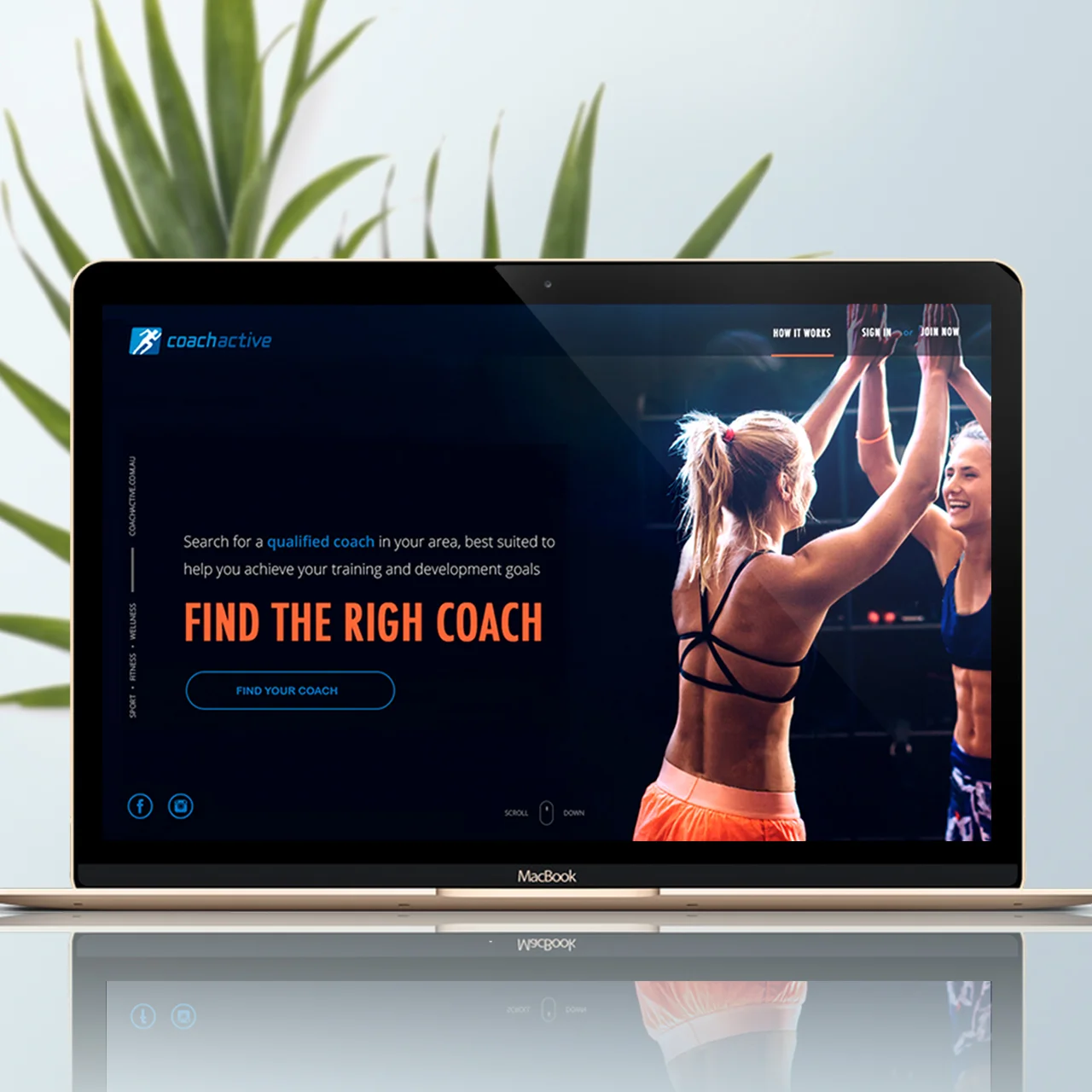
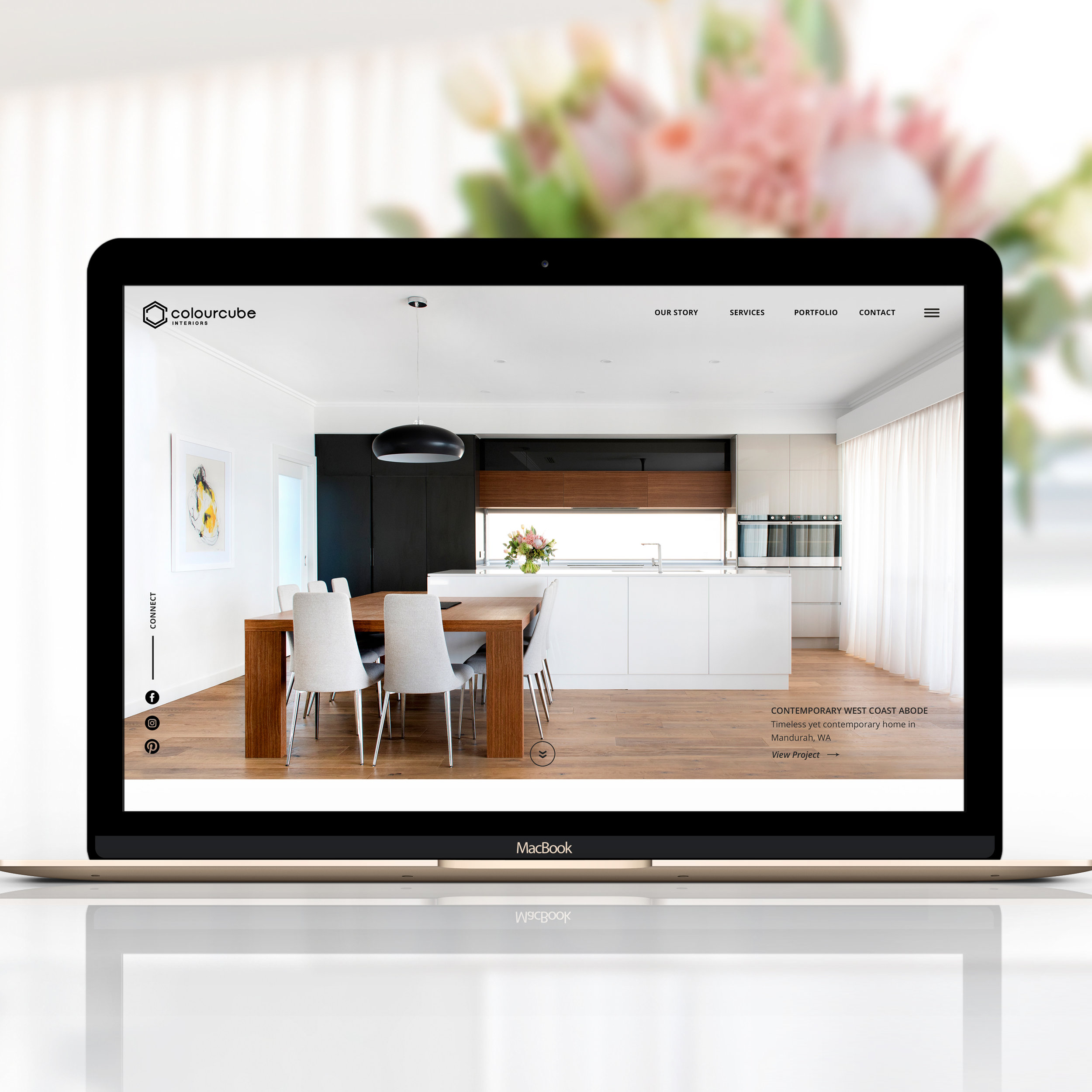
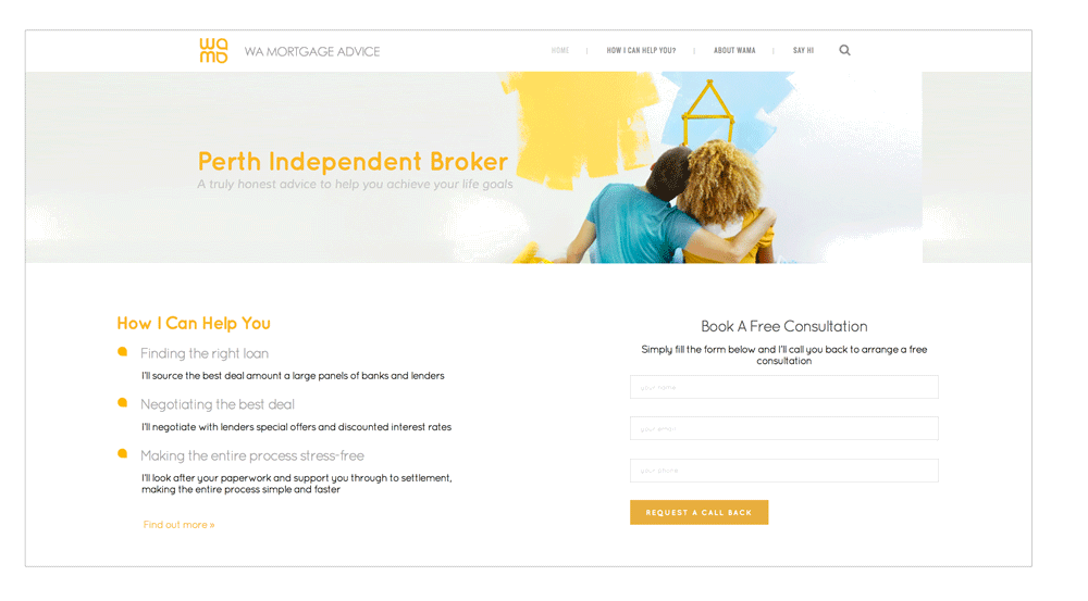
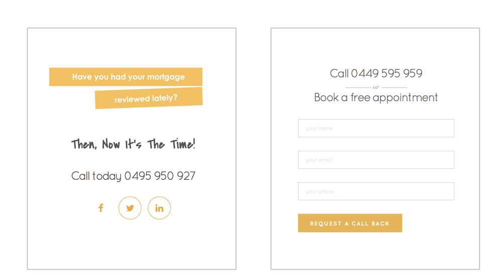
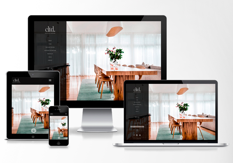
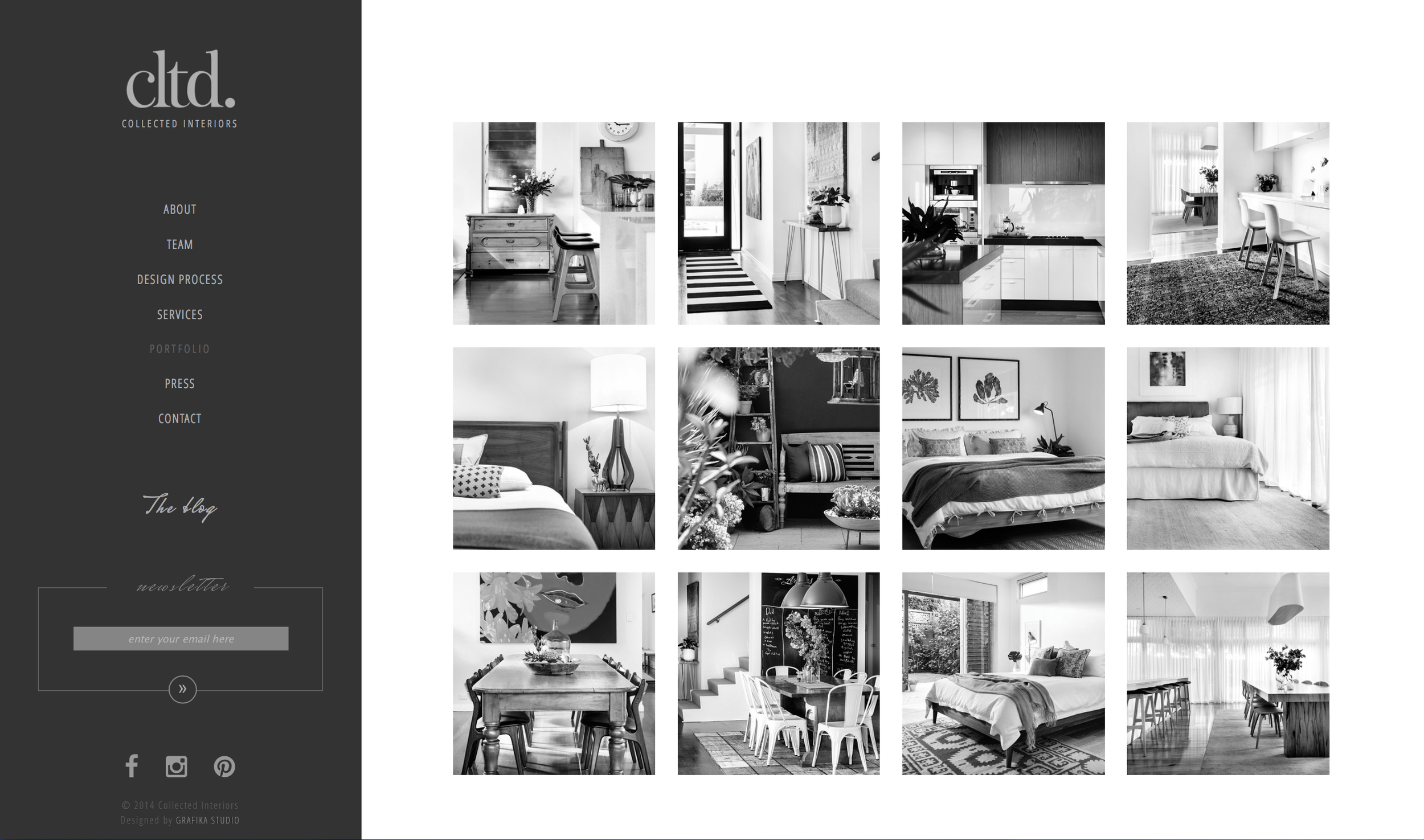
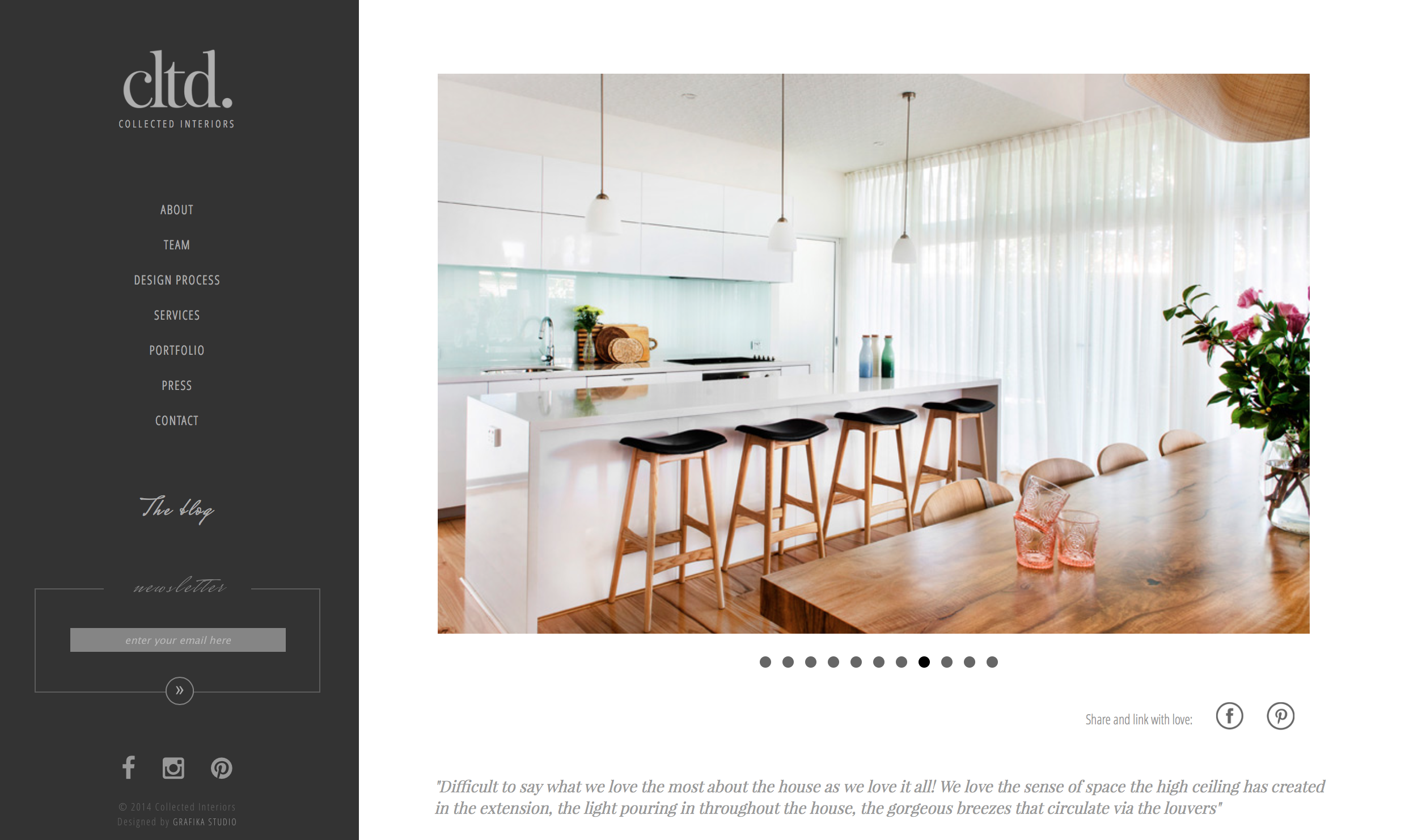
Far more than multipage sites, a single page website is designed for storytelling. Scrolling through the various stages of the page can create a unique and engaging experience, drawing the user in through narrative and graphic design. And single page sites, with their uncomplicated linear layout, really lend themselves to responsive design for mobile devices.  

There are a few things to consider before deciding to use this layout:

  • Will a single page website, with all the graphics on one page, increase load time?
  • Will SEO suffer if you only have one URL?

While a well executed single page site can be truly striking, and a great brand-builder for business based on visual impact — such as design or fashion — for other businesses a more conventional layout may provide a better user experience.  


how do you choose which is right for you?

Both have their strengths and weaknesses:

Short Pages

Conventional wisdom used to favour short screens: it was thought continuing content past the bottom of the screen (or ‘below the fold’) meant users would overlook it, or would resist scrolling down for long pages.

Time has proved this wisdom wrong: Facebook and Twitter show that users don’t mind scrolling through long pages, and long pages are more amenable to responsive design — a big plus in these days of mobile internet access.

But short page design still has its strong points:

  • Makes Information Easier To Find - It’s ideal for users who want something specific and want to go straight to it. If your navigation is well designed, users know up front what they’re getting, what they can get on other pages, and how to get there and back again with a single click and minimal scrolling.
  • Reduces load times - If your site is heavy on graphics, spreading them over more pages cuts load time per page.
  • Multiplies advertising space - If you host paid advertising, more pages equals more advertising space.
  • Boosts your SEO - by increasing both the number of page URLs and the number of page views — assuming users click through.

Most important, though, is what you want your site to communicate.

  • If you need a site with the content in ‘chunks’ (like a catalogue with a category or product per page), then page-per-screen may be right for you.
  • If you offer a lot of services you may want to think twice about a site that makes users scroll patiently to find what they’re looking for — users with patience are a rare breed.


Long Scroll

What about the benefits of single page or ‘long scroll’ design?

  • Reduces load time - If your site doesn’t rely on a lot of graphics, long scroll actually reduces load time —because you only have to load one page (or at least fewer pages).
  • Needs less maintenance - as you need fewer links across your site/
  • More printer friendly.
  • Lends itself to responsive design — your vertical layout on computer will mirror mobile device layout.                                                                                        

And like screen-per-page, long scroll design enhances certain kinds of content:

  • If your site has long sections of text, a long page avoids interrupting the flow of your story.
  • Even if your content isn’t text heavy, long scroll layout invites users into your narrative; you can put your call to action, about page, contact details and more all on one page as part of a single story.
  • And on a purely aesthetic note — long scroll pages offer a much larger canvas for really beautiful web design, for repetition and contrast, continuity and gradation.

But whether it’s click or scroll – once you’ve decided which is right for you, you need to make sure you do it right.


long vs short scroll design: objectives

With long scroll design, it’s all about getting users to the bottom — they have to want to keep scrolling. To achieve this:

  • Create a sense of flow that always continues past what the user sees on the screen — whether through easy-to-read text creating a story effect, or rich visual design that leads the eye ‘below the fold’.
  • Mirror standard navigation - Most users are conditioned to expect a certain navigational flow (Home, About, Services, Questions, Contact), so you might consider mirroring this on a long page.
  • Make your page more user-friendly by providing ‘back-to-top’ links at regular intervals.
  • Avoid visual ‘end’ markers. Some design elements (ad units, horizontal lines, blank sections) resemble traditional footer layout and leave users thinking the page is finished.

For short screen design, it’s all about getting users to where they want to go. To achieve this:

  • Create a clear navigation — it should be intuitive to use and should anticipate what users want from your site. The great advantage of short screen design is being able to skip content you don’t want to read and get quickly to content you do.
  • Navigation should be two-way — since users can’t just scroll back up the page, you need breadcrumbs or other backward links to let them retrace their steps. Never, ever make users go offsite to come back in — most of them won’t.
  • Page content should be tightly focused to aid navigation - each page should have a single theme or message, which you can then expand through links to other pages.

Wrap Up

To work out what’s best for your needs, speak to a website designer — but don’t let any designer tell you short pages are old fashioned, or long pages aren’t user friendly. Good web design isn’t about which layout is right or wrong, but which is right or wrong for the job. Think about what you want your website to do, have a look at some examples of each, weigh up the pros and cons — and choose the one that feels right for your online brand.


ABOUT THE AUTHOR
Amanda Sidebotham is the owner/operator of Juice Creative Web Design, a Canberra based design studio. When she is not working on her latest web design projects or writing a blog article, she can be found at home with her two gorgeous children and a block of chocolate.


How To Optimise Images For Web

Websites with beautiful photographs and full-screen images are one of the favourite current trends in web design. Uploading images to your website or blog is a pretty simple process, but if it isn’t done correctly it can seriously compromise your conversions, sales and search engine optimisation.

If your load time is slow, frustrated visitors will quickly abandon your page. Google also uses page load times as a factor in their ranking algorithm. Thus, optimising images for web is a critical part of web design.

Image optimisation is not just for web designers. To ensure the right performance of any website, bloggers and small business owners who usually upload images onto their sites must also learn to properly optimise images for web.

how-to-optimise-images-for-web


What does optimising images for web mean?

Optimising images for web refers to:

  1. Reducing the size of the original image file without impacting on its quality, to reduce page load time.
  2. Adding the appropriate meta-information, to make the image easy to find by search engines.


5 simple steps to optimise your images for web


STEP 1 | Ask first: Does the graphic need to be an image?

Many simple shapes and animations can be achieved with CSS or Javascript, which requires a lot fewer bytes than images. Those XML-based generated images are called Scalable Vector Graphics (SVG) and are supported by all modern browsers.

Example polygon - star


For example, this simple green star has been created with CSS by using the code below.


<svg width="8cm" height="3cm" viewBox="0 0 1200 400"
     xmlns="http://www.w3.org/2000/svg" version="1.1">
  <desc>Example polygon - star</desc>

  <polygon fill="#dff494" stroke="#dff494" stroke-width="50"
            points="350,75  379,161 469,161 397,215
                    423,301 350,250 277,301 303,215
                    231,161 321,161" />
</svg>

Years ago, if web designers wanted to incorporate fancy fonts into the web design we had to utilise images. Today we can use web fonts instead, which are specially tuned fonts for use on websites using the CSS @font-face declaration.

Web fonts enable the use of beautiful typefaces while preserving the ability to select, search, and resize text, improving the usability of the website. You can find an entire library of open source web fonts at Google.com/fonts.

Font icons are fonts consisting of symbols and glyphs, which can instantly be customised in size, color, drop shadow, etc, with CSS. My favourite open source icon toolkit for websites is Font Awesome.

Although many basic graphic elements can be achieved with CSS, complex visual elements and high-detail images - like photographs or artwork - will require the use of raster images.


STEP 2 | Select the right image format

A computer can create 2 types of graphics:

  1. Vector images – they use mathematical equations to represent paths, shapes and lines. They can be scaled up and down as much as needed without affecting their resolution.
  2. Raster images – they use bitmaps or a grid of pixels to represent an image. They’re suitable for web but they need to be optimised before uploading onto the server. As opposite as vector images, raster images cannot be sized up.
I'M A VECTOR IMAGE (SVG)
Example polygon01 - star and hexagon
I'M THE SAME VECTOR IMAGE SCALED-UP


Example polygon01 - star and hexagon
I'M A RASTER IMAGE (GIF)
I'M THE SAME RASTER IMAGE SCALED-UP
Star.gif

A raster image can have different formats, such as GIF, PNG, JPEG, or one of the newer formats like JPEG-XR and WebP.

Us, web designers decide on an image’s ideal file format by factoring in aspects like colours, size, density of information and others. This flowchart can easily help you decide the right format for your web image.

how-to-choose-the-right-raster-image-format

As a general rule, the most common format for web images is JPEG. But JPEG files lose a bit of information in their compression and don’t support transparencies or animations, in which case you need to use PNG or GIF images.

JPEG files can be loaded in two different ways:

  • Baseline JPEG - it has only one layer containing the whole image. When requested, the entire image is loaded at one go.
  • Progressive JPEGs - the image is composed with multiple layers. When requested, the image is loaded layer by layer, which gradually increases in quality.

To ensure your images are loaded progressively, check the “Progressive” checkbox in the Save For Web screen (see below).


STEP 3 | Reduce the image size

Saving an image with the highest quality isn’t right for web. The higher the quality is, the heavier the image gets. By reducing the file size, you are improving your site’s loading speed.

The best way to optimize an image for web is by using the Save for Web command in Adobe Photoshop. This tool gives you a preview of how an image will look after compressed. You can also get an idea of how much it will weigh and how fast it will download.

NOTE:&nbsp; Save For Web feature has been removed from its usual location in Photoshop CC 2015, but it is still available under File &gt; Export menu.&nbsp;Adobe Generator will be the new platform for exporting image assets from Photoshop. Read more…

NOTE:  Save For Web feature has been removed from its usual location in Photoshop CC 2015, but it is still available under File > Export menu. Adobe Generator will be the new platform for exporting image assets from Photoshop. Read more here.

If you don’t have Photoshop, Adobe has a free online image editing application at photoshop.com. Alternately you can use GIMP, an open-source image editing software application, same than Photoshop but Free!

Other tools to reduce the size of your images are:

  • TinyPNG (online): for PNG or JPG images.
  • ImageOptim: For Mac users ONLY. You will have to download this app to your Mac computer in order to use it.


STEP 4 | Name your images descriptively

Use keywords in your image names to help search engines categorise your pictures on image search engine results.

When naming your image files, be as descriptive as possible without using too many characters and keywords to avoid search engines penalisations for over-optimisation.

Separate words with dashes ( - ). Never leave spaces between words (they will be replaced by %20) or use underscores ( _ ) to separate words. Search engines interpret the underscore as a separate character.

For example, to name the flowchart above I've used the following file name: "how-to-choose-the-right-raster-image-format.jpg"


STEP 5 | Add Meta-information

By associating the right keywords with images, you will help your website to achieve better rankings. This association can be achieved through:

  • Titles and descriptions, which help search engines understand your site better, improving your SEO ranking.
  • Alt tags, which are a text alternative to images used when a browser can't properly render them. The alt attribute also adds SEO value to your website. Don't use alt tags for decorative images, as search engines may penalise you for over-optimisation.


Image optimisation for mobile devices

Your site may be responsive, but it doesn’t mean your images also are. The same images that are served to desktop screens are also served to small devices. However, mobile websites don’t require such large images.

To optimise images for mobile devices use media queries to conditionally hide the larger images and display a smaller version of the same image.

For example, this is how I would display a background image in different devices (by serving three 3 different images with media queries):


<style>
@media (max-width:600px) {
   .image {
      background-image: url(mobile-image.jpg);
   }
}
@media (min-width:600px) and (max-width:960px)  {
   .image {
      background-image: url(tablet-and-ipad-image.jpg);
   }
}
@media (min-width:960px)  {
   .image {
      background-image: url(desktop-and-laptop-image.jpg);
   }
}

</style>

<div class="image"></div>

If your website is built in Wordpress, the mobile optimisation is much easier. WordPress automatically resizes every image into multiple versions – Thumbnail, Medium, Full Size, etc.


Wrap-up

Although, image optimisation can consume a bit of time, this process is an essential part of your website/blog success and key aspect of your search engine marketing.

To know more about image optimisation also read:


How To Create A Brand Style Guide For Your Website Or Blog

A brand style guide is a document that contains a set of rules and visual guidelines to ensure consistency across every piece of marketing material that a company produces.

Every company should have a visual style guide with brand use instructions for different media, including websites. Big corporations usually have a comprehensive brand style guide that covers many aspects of the company brand strategy, from mission, vision and core values to brand usage and implementation.

However, in the small business field, many are online businesses and blogs, or rely mainly on the Internet to promote themselves. For this reason, the brand style guides are usually reduced to website style guides that contains web-specific rules and guidelines.

In today’s post, I’ll be focusing on website style guides, as small business owners will probably find these ones more useful and relevant to their business needs. I’ll take you through the process of creating a visual style guide for your website or blog with the help of a template that you can download at the end of this post.

This exercise will take you less than 30 minutes but will save you a lot of time and headaches in future website updates and expansions.

A website style guide might seem unnecessary for a small business. Some common questions that may come to your mind are:

“Why is a consistent visual style so important to my business?”

Your website is a reflection of the way in which you do business. It shows the amount of attention, dedication and care that you put on what you do and the quality standards that your business has.

A consistent style shows professionalism and builds credibility among your market.

“Why do I need a visual style guide? Aren’t the styles specified in the .ccs file?”

Yes, they are. However the visual style guide will present every rule in an organised way making it easier to find. It also gives you instructions for exactly how things should be done, and sometimes even insight into why, making it also easier to understand.

“My designer created the styles and already knows every rule, do I still need a visual style guide?”

Yes, you do. You might need to work with a different designer one day, and this document would save him/her a lot of learning time by giving clear instructions on how things must be done in your website.

If your don’t have an in-house designer, he/she may be working with different clients at the same time, thus having a style guide will make their lives much easier.

“I designed my own website and I know every style by heart, do I still need a style guide?”

Yes, you do, because after a few months you may have already forgotten the hex code of your colours, the font family for subtitles, or how many pixels you left between two elements. Then again the style guide will save you a lot of time.

It’s usually the web designer’s job to create this document, but if your designer didn’t facilitate it to you, or you designed your own website, a style guide is also quite easy to produce by yourself.

To explain each of the components that should be included in your website style guide I’ll use one of my recent jobs as example: the redesign of the lifestyle blog ChicDeco.

1. Colour

The website colour palette can be divided in two groups:

  1. Primary colours - usually black or grey and another colour
  2. Secondary colours - other colours that could be used when a variety of tones is required, for example charts.
ChicDeco blog primary and secundary colour palette with Hex codes and RGB

Web colour are expressed in Hex codes, a six-digit number used in HTML, CSS, SVG to represent colours. Your website visual style guide won't need CMYK or Pantone specifications.

Tip: don’t choose too many secondary colours, instead play with saturation, tint and shade.


2. Typography

This section will specify which web font families were chosen for type of text in your website, as well as font weights, sizes and colours. Web fonts can usually be found in Google Fonts, which has the biggest open source directory of web fonts.

The most common written elements in website are:

  • Headings and subheadings ( <h1>,<h2>, <h3>,... )
  • Menus
  • Body copy ( <p> )
  • Text links ( <a> )
  • Button text
  • Quotes and boxes ( <blockquote> )
  • Image captions
TYPOGRAPHY-01-01.png
ChicDeco blog typography specifications including font family, sizes, weight and colours


3. Buttons

Buttons are common in forms, but are also a good way to call to action with words like “subscribe”, “download”, “book”, “shop”, etc. They are usually use to draw the attention to those part of your website that encourage the visitor to interact with the site.

Your website may have 2 or 3 different button styles with two versions of each, one off and another one for mouse-over functions.

Social media icons could also fall into this category. They usually are an invitation to follow your page or share your content in their social media profiles.

Apart from buttons, you may also want to specify here styles for input fields, used in contact forms, sign-up boxes, blog comments, and any other interactive elements.

Buttons.jpg
ChicDeco blog text buttons (active and hover), back-to-top buttons (active and hover), social media icons and icon buttons.


4. Iconography

A pictographic library of vector icons, totally free and customisable with CSS, can be found in Font Awesome.  But if your website requires more specific icons, a icon set should be also specified in the website style guide.

ChicDeco blog icon examples


5. Infographics and charts

Infographics are commonly used to summarise the content of a blog post or a web page in a visual way, to make the content easy to understand, sharable and visually appealing.

Charts also help to present data in a visual way and make complex content easy to understand.

Although not every website or blog may need charts and infographics, if yours it's content heavy, and talk about technical issues, industry data or other complex topics you should also have some rules and guide lines for infographics.


6. Imagery

Having a well-defined image style can help your blog or website deliver your message, create an emotional connection with your visitors or readers, or just make your content more visually appealing.  

Defining an image style will bring clarity and visual consistency to your blog or website. You can also specify other image related aspects like, minimum image sizes in post images to avoid pixilation, image borders, image caption positions or even board layouts.

ChicDeco blog food styling board example
 
ee3cb024677793840c8a39a9363d9755.jpg
ChicDeco blog product boards

With image s you could also define some pattern styles for backgrounds, if your blog or website will need them.


7. Header

If the header in the first thing that your visitors will be when visit your website or blog, why did I left this one for the end? Because, web and blog headers usually combine some of the elements mentioned above.

If you don’t have a brand style guide, your logo specs can fall into this section. Your header might contain images, typography and other graphic elements.

In this section you can also specify logo variations for social media avatars and favicons or header style for your social media pages or email newsletters.

ChicDeco blog header with logo, responsive menu (letf), search button (right) and social media icons (top-right)

8. other visual elements

Although the elements above are the most common ones in a visual style guide for a website or a blog, you may also want to complete your guide with a few more specification on:

  • Advertising banners
  • Sidebar titles and elements
  • Social media styles
  • Menus and submenus

Your Turn

Along the years that I spend working as brand manager for one of the Big Four, the brand style guide was the most utilise document in day-to-day job. It used to be a thick document that covered all possible uses of the brand to ensure consistency across the world.

Today I tried to produce a simple workbook that you can utilise in your day-to-day website editing and updates, keeping it simple and functional. You can download this document by clicking on the button below and fill it with the relevant information or use it as a guide to create you own visual style guide from scratch.

 
How To Save Money In Design Services
Photo: Finance Planner by Grafika Studio

Photo: Finance Planner by Grafika Studio


Design services are something that every business needs, but they’re not always a priority in tight small business budgets. When the budget is very limited knowing where you can save money without compromising quality can make a huge difference in the final result of your design project.

In today’s post, I share some tips to maximize your design budget, whether you want to build a website by yourself or hiring a professional designer to do the job.


Plan your design project carefully

The first step of any design project is a good planning.

Having a project plan will give you a clear understanding of how much everything can cost and how much time each part of the project will take.

For example... if you need to build a website, you can:

  • Make a list of every task/item that your project requires: domain, hosting, email services, website builders, design software, etc.
  • Research solutions and prices for each of them.
  •  Write down what is included in the price, as different provides offer different things in their packages.
  • Compare prices and read reviews.

Then, you can take your project plan to a designer and discuss your budget. Your designer may be able to adjust the budget by taking off unnecessary things or adding others that you may have overlooked. A designer can also give you an estimate on time and cost to complete your design project so that you can compare.

This exercise will help you decide whether you want to do everything by yourself or it’s worthy to hire a designer.


Use web templates

If you are building the website yourself, web templates will make your life much easier. If you are hiring a web designer, a template will also make your total website cost more affordable.

Bespoke web design is a lot more expensive than building a website from a pre-made template. Web templates speed up the process of building a website allowing the designer to complete your project quicker. In the business world time is money so, the less hours the designer has to dedicate to build your website the more money you save.

The hard thing is to find the right template to suit your needs. Finding a template requires a lot of research and a good understanding of all different web components included. Wordpress catalogue is so large that finding what you are looking for can take you a long time. Squarespace gives less choices but this can actually save you time finding a template for your website.

Some web templates can be edited to suit your specific needs, but then again customisation comes at a cost. You will need to hire a web developer to edit your template, adding an extra cost on your website budget.


Buy ready-to-use graphic components

Like templates, ready-to-use components not only can help you build your website quicker but can also save you money as your designer doesn’t have to create every graphic element from scratch.

For example…

If your website needs photographs, it’s a lot cheaper to buy stock images than hiring a photographer to take photos. In the same way, it’s cheaper to buy a ready-made icon set than designing one specifically for your website.

Some great places to find ready-to-use design assets are:

  • creativemarket.com
  • envato.com
  • graphicburger.com


Choose flexible and scalable solutions

If you are building your first website, you may want to do it in two or three different stages. By dividing your project in stages you can launch a basic website and then add new features and functionalities as your business grows.

For example…

If you want to sell products online, you can start selling through third party websites and have a basic website for your business. Then, if your products sell online, in a few months time you may want to add a shop and sell your products directly from your own website, saving money in third party commissions.

To upgrade your existing website, you probably don't need a complete new site. Your current website could be redesigned or extended with new features. However, depending on the website, the platform in which is being built and the number of changes required, it might be cheaper to build an entire new website that re-designing and upgrading your existing one.

For example…

If you have a shop in your Squarespace website and want to add a wish-list feature, unfortunately Squarespace doesn’t have this functionality just yet. For that reason, your entire website would have to be migrated to Wordpress to be able incorporate that feature.

This is also why good planning is important, if the wish-list was in your add-on feature list for future stages, Squarespace wouldn't have been the chosen solution in first place.


Negotiate design packages

Many designers offer their services in packages at a discount rate. By working with the same designer in different design projects you can get packages and discounts that can also save you some money.

For example…

If you are looking to have a new brand and website designed, ask your designer if there is any specific package that combines both projects.


Hire a design consultant

If you feel confident enough to build your own website, you might want to consider hiring a designer as a ‘consultant’ to can give you some guidance along the way. As your designer doesn’t have to build your website from scratch you can save some money by doing it yourself. But your designer can still help you with:

  • Reviewing your budget to make sure that you haven’t overlooked any important cost and advising on areas where you should spend a bit more and others where you could save some dollars.
  • Giving you access to discounts and special rates from providers. Designers usually go shopping around comparing solutions and prices from different providers, negotiate prices and get discounts for bringing repeating business.
  • Training you on the relevant website builders and giving you a hand if you get stuck while building your own website.
  • Identifying and avoiding mistakes that can incur unnecessary costs. For example, you may find a fantastic hosting offer and grab it. Then you find out this offer has hidden fees and end up paying more with that provider than with others.


Wrap-Up

In summary, a good designer is someone who understands people’s budget constraints and maximize the money available according to the client’s business objectives. If your budget is tight, your designer can research and find the best solution for your design project to suit your budget.

Here is a checklist of important questions to ask your designer before starting a website project, as they will have a critical impact on your design budget.

  1. Do you offer a free first consultation to discuss my project requirements?
  2. How much does the annual hosting and domain registration of my website cost?
  3. Do you custom design or use templates?
  4. Do you charge by the hour or by the project?
  5. Can my project be split in two or more stages?
  6. Can additional add-ons and optional functions be quoted separately?
  7. How much does it cost to update my website post sign off?
  8. Do you offer a monthly maintenance option?
  9. Do you offer free CMS training?
  10. Do you offer design packages?
  11. Do you offer consulting services? (in case you want to build the website yourself)
  12. What are the ongoing charges after my website is completed?

Your turn

  • How much do you think is reasonable for a small business to spend in building a website?
  • Would you build a website yourself to save your business that cost or are design services a necessary investment?


Why My Website Is Not Converting

One common question that many clients and potential clients frequently ask is “why my website is not converting visitors into customers/clients?”

The conversion problem has a lot to do with your message, the way in which you deliver it through your website and its impact on your audience.

In today’s post I explain some of the most common reasons why many websites don’t convert properly and how to fix those issues by using the example of one of my latest website projects: WA Mortgage Advice Website.

why-my-wEbsitE-is-not-convErting

Too much copywriting, too difficult to read

Your website must offer relevant information about your business. But too much information is overwhelming and will make visitors feel intimidate and leave without reading your webpage.

Writing for the web is completely different than writing an essay or a paper. Website copy must be scannable, actionable and shareable.

  • Scannable means that your visitors understand your key messages by just glancing at your web page.
  • Actionable means that your content encourages people to take action.
  • Shareable means that your visitors find your content useful and will share it so that others can also benefit from it.

For example…

My latest project is a mortgage broking website. The financial industry has a complex language with a lot of jargon. A clear and easy-to-read copywriting was an essential part of this website project:

WA-Mortgage-Advice-home-page

For more tips on how to write for the Internet also read this article from Enchanting Marketing: Writing For The Web Vs Print .


Important information hidden below the fold

Not only it’s important how you present the information, but also where you place it. Information positioned in the upper half of a web page and so visible without scrolling down the page is what we call above the fold. Everything else is below the fold.

If visitors have to scroll down to find important details in your website, chances are that they leave without even noticing them.

Analyse your web copy and extract one key idea per page only. That idea must be positioned at the top of the web page. Further information and details can be placed after.

What are those key ideas?

  • Your unique selling proposition
  • Your key benefits
  • Call to actions like ‘book’, ‘enquire’, ‘call’, ‘download’…
  • Contact details

Tip: banners and header images should not take more than half of the screen; otherwise they will be hiding important ideas below them and below the fold.


Lack of credibility

Your website may not be encouraging trust among your visitors. Some reasons may be:

  • Visually unappealing design - it’s all about creating a good first impression. A clean and well organized website design speaks about your professionalism and how much you care and invest in your business and clients.

Avoid too many colours, graphic elements or call to actions that can cause distractions and make your visitors get lost.

  • Lack of contact information – for many people who search for a product/service in the Internet, location convenience is important. For many others working with people who are accessible and easy to reach when they need them is essential.

Your business address, direct phone numbers and email addresses or even an online chat app can help you gain credibility and trust among your audience.

  • Lack of social proof – social media followers, reviews and client testimonials can help you build credibility in the Internet. Focus your marketing efforts on connecting to people through social media and getting feedbacks from clients and industry experts.


Lack of direction

When visitors land in your website, they don’t know what they have to do. You have to show them the path, indicate what comes next and what they should do while visiting your site. How? With call to actions. 

A call to action is an invitation to interact with your site by:

  • Signing up for a newsletter
  • Downloading information
  • Making appointments/bookings
  • Getting a quote
  • Etc…

The more they interact with your website the better will get to know your business.

call-to-action-examples


Lack of attraction and engagement

Relationships are key for any business success, and especially to sell services. Visitors who are in need of your services want to know you first before hiring you.

How do you build a relationship in the Internet? Engaging your visitors through social media, newsletter sign-up forms, blog and comments and everything else that allows you to keep conversations and communicate with your visitors after leaving your site.

In this other post I explain how to grow your business by building relationships.

Tip: proof you’re willing to help not just to sell, but by answering questions in social media and blog posts, and offering free tips, free first consultations, etc.


Wrong message, wrong keywords

Another common reason of poor conversion is often the message itself. Being too generic, trying to appeal a broad audience or offering too many services can confuse the audience or make them leave your website with the feel that you are just ‘another one’.

But being too generic and too broad also has another consequence: poor keyword strategy. If your keywords are too wide, you may be leading a lot of traffic to your site, but only a small percentage of those visitors are actually potential clients.

To avoid this you must:

  • Find what makes you different and unique and highlight this differentiation in your home page, above the fold.
  • Be specific, target a niche and narrow your offer to only those services that you know best.
  • Focus on long tail keywords that are more specific and have less competition in search engines.

For example, if my client, a mortgage broking business, focused on generic keywords like ‘mortgage’, there is so much competition already for that word that chances are that he will never get noticed. Instead we focused on long tail keywords like ‘First home loan advice’.

Wrap-Up

In conclusion, conversion rates have a lot to do with your website copywriting. Learning to write for the Internet can improve significantly your leads and opportunities obtained through your website.


Grafika Projects: Inside A Designer's Website
Client: Collected Interiors
Project: Art Direction, Photo Editing, UI/UX, Web Design and Development
Date: Launched in September, 2014

Collected Interiors website designed by Grafika Studio

I am a big fan of Perth interior designers Collected Interiors, so when I was asked to re-designed their website I immediately felt excited about this project.

The briefing was to create a sleek and modern new website, to display bigger images and to incorporate some interactive tools.

I created a custom-made design – no templates were used here – carefully thought to let the images shine. Full screen images in almost every page allow the visitor to get a taste of the designers' talent before even visiting their portfolio.

The design is simple and clean so that visitors can enjoy the beautiful photographs with no distractions. Condense typography, combined with serif fonts for a classy elegant touch, and a lot of white empty space achieve a modern and professional look & feel.


INSIDE A RESPONSIVE DESIGN

One of the major improvements made on this website was the responsive layout. The full-screen images made a fluid design necessary, so that they could automatically adjust to every screen size without being deformed.

The portfolio pages have a responsive slider with an advanced touch / swipe support built-in to facilitate the navigation from image to image on small devices.


THE USER EXPERIENCE

Every image was edited to achieve the perfect lighting in each interior space, and carefully selected so that the internal pages could flow from one to the other keeping a consistent feel across the entire website.

Every image gives a sense of tranquility to make the visitor want to stay longer on the site. Link effects were also eased to reinforce that sense of calm aimed to retain visitors and let them visit the site with no rush.


THE RESULTS

After the new website was launched Collected Interiors experienced an overwhelming success in social media, getting more than 300 Instagram followers in less than 24hrs, or more than 100 Behance followers in less than 24hrs, and many other successful stories. A SEO friendly website along with a link building strategy put this site at the top of the search engine rankings, busting visits and customer enquires.

Working together was easy and fun. Rosa is an intuitive and highly professional designer, who always figured out how to translate our ideas into a digital experience.
— Lisa Ewart, Creative Director of Collected Interiors -


Five simple tips for designer websites

1. Invest in high quality images

Images are the most important piece of marketing for any designer, not just for web design, but also for press, link building strategies, social media marketing and much more. Style your photographs, hire a professional photographer with the right equipment – and experience – to photograph interiors, and edit every image to correct small imperfections and lighting.

2. Keep a simple colour palette

A minimalistic colour palette will achieve an elegant, sleek and modern look in your website. A clean look & feel will let your images speak about your work and the way in which you do business with no distractions.

3. Learn to love the white space

Let the space breathe. Against what many people think, empty space is not a lack of design, it's actually an important design element, essential to achieve a polished and professional look in any website.

4. Apply a visual storytelling to your website

The entire website must tell the visitor your story and every page must conceived as a chapter of that story. The storyline must flow through an intuitive navigation, powerful images and a compelling message. Every aspect of the website design should be carefully and consciously selected to help to support the thread of the story.

5. Create an emotional connection

Design is an emotional business and your prospects will only become clients if they connect emotionally with your brand. The challenge is to create that emotional connection in a few minute visit to your website.

Call to actions will get you newsletter subscribers, blog readers, social media followers, etc, that will stay connected to your business after visiting your website. Use all these platforms to continue working on that emotional connection with them. Many visitors won't get in touch in their first visit but will be ready to work with you after a few interactions with your brand.


Are you interested in working with me for the design of your brand and website? Visit my Branding and Web Design pages for more information on my process, design package and pricing, and my Contact page to get in touch!