Posts in Design
Kids Packaging Design With Oh Flossy
Oh Flossy play make up boxes

Oh Flossy Mini Make-up Boxes


When Oh Flossy decided to take on a full brand transformation they put the packaging at the top of their list. Their existing play make-up boxes had been designed a few years ago and didn't match the new brand identity that the company had recently launched - also designed in this studio, and featured in my portfolio

The revamping of the existing packaging came with a clear brief to create attractive and engaging designs that capture the attention of children as well as their parents. The project goals were well-defined:

  1. Increasing visibility

    The new boxes should make Oh Flossy products stand out on the shelves and catch the attention of children and parents. Better visibility could also help increase brand awareness and make their products more memorable.

  2. Improving perceived value

    Oh Flossy wanted to move into more premium and sophisticated packaging to better present their high-quality products, making them more desirable.

  3. Enhancing brand identity

    The new packaging designs should be consistent with the new brand's identity, and help reinforce brand recognition, differentiating their products from competitors and communicating the brand's unique attributes.

  4. Improving customer experience

    The new box design would also make the product safer to transport, ensuring the goods were kept well-protected during shipping, easier to use for children and also easier to clean, making them reusable for many years to come. This would also impact customer satisfaction and brand loyalty.

Oh Flossy magnetic closure boxes were a game-changer. The range features 5 make-up boxes in gorgeous pastel colours to match their brand palette. 

 
Oh Flossy natural play make-up sets

Oh Flossy natural play make-up sets

The boxes were illustrated with hand-drawn patterns featuring different themes: make-up, sweets, sparkles, and costumes. Although each box has a different colour and theme, we achieved a coherent look and feel across all the designs by creating a base pattern of colourful sprinkles, white hearts and golden stars that was repeated on each box.


a look at the Pattern design process

 
Oh Flossy based pattern of sprinkles, hearts and stars

A | Base pattern design

Sweet Treats pattern design for Oh Flossy play make-up box

B | Sweet treats pattern illustrations

Oh Flossy Sweet treats box design

C | Final design combining base pattern and illustrations


The designs were finished off with a fine gold foil print over and an elegant matt embossed texture. Oh Flossy fans can collect the 5 boxes and use them as keepsakes for years, or match their designs with other products in their collection.

After the make-up sets launch, the pattern became a recurring design element in Oh Flossy packaging and stationery, and it would soon make its appearance on many other products of their collection. Here are just a few examples.

 
How To Write A Great About Page

Your About Us page is one of the most important pages on your website. If you take a look at your statistics, I’m pretty sure you’ll find your About page within the 3 most popular content of your site.

Your About page is where your business takes a human shape and reveals a personal story, aspirations, and dreams. It’s where you can create an emotional connection with your visitors by showing that behind your brand there is a real person just like them.

But you must refrain from the temptation to your make it just about yourself.

Picture yourself going on a date with someone who can only talk about him/herself. You wouldn’t want to see that person again.

So how should you approach your visitors on your About page? Well, let’s start from the beginning, who visits your About page and why?


Why do people visit your About page

People visit your About page because they want to know if they like you, can trust you, and decide whether you would make a great team working together.

Why would you go on a date in the first place? Same, because you want to know if you like the guy and whether you could potentially have a relationship together.

So if they are already visiting your About page it's because they are probably considering working with you. Take this opportunity to tell them why they should choose you over everyone else out there.

One of the main challenges small businesses have to face to get clients is building trust among their market. People don’t know you, don’t know whether they can trust you and let’s be honest, there are a lot of weeds out there, so people are right to mistrust.

But they’ve seen your portfolio, and your catalogue or have read your blog and like what you do, so they surf your website looking for signs of trust. The first place where they go to look for these signs is your About page.

Understanding what inspires trust in your visitors is the first step to writing a compelling about page.

Then, the style, tone, language and design of your About page should be determined by the type of people you want to target, and how you want to make them feel when visiting your site: inspired? Understood? Empowered?


Anatomy of a great About page

Every great About page has the following elements:

1.    Opening statement

This is the headline of your business. It should highlight your distinctiveness, the main value that you can provide to your clients, and what your company stands for.

It’s a hook to capture the attention of your visitors, incite curiosity and make them want to know more.

For example, one of my clients State 28 use the following opening statement:

Strategic approach, innovative outcomes

Interior environments should enhance the lives of their inhabitants. Creating spaces that make people smile is our passion


Another example by designer Breanna Rose of Rowan Made:

This is Rowan Made,
A small design studio with a knack for simplicity + story telling

2. Introduction

This is a short paragraph to briefly answer the main 5W questions that your potential clients always want to know about you.

  • Who you are – they want to know if you are a small or medium size company, a family operated business, etc.

  • What you do – they want to know your specialisation

  • Where you are located – they want to know your physical proximity, as this can be highly value for many potential clients.

  • Since When you’ve been doing this – they want to know your experience and years in the job

  • Who your services are aimed at – they want to know if they belong here.

Another great example, Julia Kostreva says in her About page:

Julia Kostreva is an art director and designer in California with a love for art and culture.
In 2013 Julia founded this creative studio and shop - a place for work and play


3.    Your WHY

This is the most important part of your About page: your WHY.  Why do you do what you do? What’s your vision? How do you want to make a positive impact in people’s lives?

In the words of Simon Sinek:

People don’t buy what you do; they buy why you do it. And what you do simply proves what you believe
— Simon Sinek, Start With Why


This section is an opportunity to explain what problems you solve and what benefits you can provide. Describe your capabilities and why you’re uniquely qualified to offer this service.

You can also do this by incorporating your company mission or tapping into people’s beliefs by sharing your core values.


4.    Provide social proof

Third party endorsements are a great tool to build credibility.

Demonstrate that it’s not just that you are saying it, there are a lot of people out there who love what you do. My favourite ways to demonstrate social proof are:

  1. A list of big brands that have already worked with you

  2. A list of links to media features

  3. Awards

  4. A rate (ie, 5 stars, etc) by industry experts

  5. A huge amount of social media followers

I personality don’t like to use testimonials here. They need some context and should always go with your projects or products.


5.    Your bio

Ok, now you can talk about you, but don’t go on too long, just explain the professional journey that brought you here today. Be short and sweet. Make it as visual as possible by adding photos of yourself, a timeline or other visual resources.

Your life story, qualification and career achievements will bolster your credibility and credentials.

This is also a great opportunity to create a personal connection with your readers. Think about the aspects of your story that they can relate with, such as humble beginnings, career mum’s struggles, etc.

You can take a look at mine here.


Do’s and dont’s for a great About page

Do include a photo of you – headshots or photos of you in your workplace are great in this section. .
Don’t use stock photos – they are impersonal and don’t bring any value to your About page.
Do invest in high-quality photographs - hire a professional photographer to do this job.
Don’t write in the third person - be conversational and use a friendly tone to make you more likable.
Do include ways to connect – such as email and links to your social media pages.
Do link with internal content - invite visitors to see examples of your work in your portfolio, take a closer look at your services offer or read your blog.
Do use a professional but casual tone - it will make you approachable
Don’t forget to update it regularly.

Step By Step Guide To Design Your Website Like A Pro

The big amount of DIY website builders available today makes the website design process look too easy. Anyone with no design skills or tools can drag and drop elements into a web page, play with the layout and change basic styles.

However, designing a website is much more than just uploading images and content onto a server. It involves an entire visual communication process aimed to create an emotional connection with your audience, communicate your business purpose and achieve its ultimate goals.

Today I'm sharing my website design process. I won't go into the technical details of building a website to just focus on the steps that a professional web designer will typically take to design a website. Are you ready to design your own website like a Pro?


Step 1 | Define Your Intention

A good website design doesn’t start by choosing a template, deciding on the colour scheme or finding pretty images. It starts by clearly defining the website ultimate purpose.

There are three essential questions that you need to ask yourself before you start designing your website:

  • How should your visitors feel when they visit your site?

Do you what them to get inspired? Empowered? Curious? And why?

  • What do they need to know about your business?

How to book? How much will your services cost? What’s included in the service?

  • What would you like them to do on your website?

Make a purchase? Make an appointment? Visit your brick and mortar store? How are you going to make them take action?

Knowing the answers to these questions will help you decide what content, colours, graphic elements, etc your website needs.


Step 2 | Map Out Sections and Sub-sections

Now it's time to plan how you are going to structure your website by drawing a ‘tree diagram’. You can do this on a whiteboard, a spreadsheet program (such as Excel or Google Drive Spreadsheets), a word processor, etc.

This diagram will show the hierarchy of the website and how the various pages and sections relate to each other.

Tree diagram with information architecture and website structure by Grafika Studio

A well-thought site structure not only means a great user experience, but it will also give you better chances to rank higher in search engines.


Step 3 | Write compelling content

Once you have a clear structure of pages, develop content for each of them separately. Don’t worry about formatting just yet, write down anything that you think your visitors and potential clients want to know about your business, products or services.

Research your competitors' websites to see the key messages in their websites and how the information has been presented. Do this not to copy them but to put together something better that will stand out your competition.

Remember that writing for the Web is completely different than writing for print. Too much information is overwhelming and will make your visitors feel intimidate and leave without reading your message.

Find more tips on how to write a compelling website content in my previous post on Why My Website Is Not Converting.


Step 4 | Sketch The Layout With Wireframes

Now you know how many pages your website will have and what content you need to fit in each of them, it’s time to decide how the information is going to be presented on each page. You can do this with the help of wireframes.

A wireframe is a black and white representation of every webpage on your site, usually using boxes and buttons to show where each piece of information will be displayed.

The best way to do your wireframes is by hand sketching in a gridded sheet. Divide your grid horizontally into header, content and footer, and vertically into 2 or 3 columns to fit the content, with right and left margin and separation space between the columns.

Not only it’s important how you present the information, but also where you place it. Information positioned in the upper half of a webpage and visible without scrolling down the page is what we call above the fold. Everything else is below the fold.

If visitors have to scroll down to find important details on your website, chances are that they leave without even noticing them.

Analyse your web copy and extract one key idea per page only. This idea must be positioned at the top of the webpage (above the fold). Further information and details can be placed after.

Home page wireframe for a website project by Grafika Studio

Home page wireframe for a website project by Grafika Studio

Step 5 | Mock-up Your Website Design

Your wireframes can now be translated into visuals. This is a very important step for any website designer to communicate his ideas and present them to the client. It's also time to make some styling decisions, such as colours, image style, typography, etc.

To create a mock up of your website you will need the help of Photoshop, and therefore a bit of knowledge on this software.

Your website mock-ups will help you visualise how images look against your brand colours, typography and other graphic elements. It can also be helpful to design buttons, boxes and any other graphic element to establish a consistent visual language across your site.


Step 6 | Build Your Website

The website design process reaches here the end of the line. Now it's time to select your website builder (WordPress, Shopify, SquareSpace, etc) and find a suitable template or theme to build your website. A web developer can help you adapt your template to your design and customise your CSS to style up your website.


Wrap up

At the end of the day, it doesn't matter if you are using Helvetica or Open Sans on your website, or blush pink or iced blue, what really matters is that your website delivers a clear message on who you are, what you do and why people are going to love your products or working with you. This compelling message can only be achieved with a lot of planning and a good understanding of visual communications and UI (user interface) design.

Need a hand with your website project?

I'm your designer! Get in touch and request a quote for your project.


Photo Tutorial: Brightening Up Your Images
Photo credit Grafika Studio

Photo credit Grafika Studio

The Internet is becoming more aesthetic every day. Beautiful and well-styled images are your best shot to create an emotional connection with your audience through visual content, and make people fall in love with what you do and how you do it.

That's why we spend so much time sharing photos of our day-to-day work in social media, behind the scenes shots, sneak peeks of new products and a lot more, especially on Instagram or our blogs. Getting these shots right can make your business stand out.

I'm not a professional photographer, so all I've got to get good shots is my iPhone. But as much as I tried, I never got a shot with the perfect light exposure inside my home. Lucky, I got a not-so secret weapon to fix all my lighting issues: Photoshop*

Correcting light and colour with Photoshop is very easy. You just need to know a few quick tips to make the right image corrections. Today, I'm sharing my most common tips in this 3-step tutorial so that you can take your photos from 'meeeeh' to 'yay!' in just 10 minutes.

* NOTE: If you don't want to buy the software (AUD $11.99/mo) you can download the free app for small devices. This tutorial can only be done from the full version of Photoshop, tough.

Ok, so let's get started. I got this photo today by placing the fruit jelly box on top of a white cardboard and on a table next to the window. As you can see the light here is still 'meeehh'. Let's fix that.

Original photo from iPhone

Original photo from iPhone

Step 1 | Light correction

I open my photo in Photoshop and go to Image > Adjustment > Levels. With this tool I can make whites look whiter (rather than ugly greys) and blacks blacker. You usually know when whites and blacks are right by placing the controls just under the beginning of the curve in both sides.

Play with Levels to intensify whites and blacks

Play with Levels to intensify whites and blacks

You can also use the Dodge and Burn tools, in the Tools window (left side of the screen) to correct the light in specific points of the image.


STEP 2 | Lighting Mask

With just these quick adjustments the light is now looking a lot better and colours start to brighten up. However the image didn't have a uniform light (I just had my window as a light source). As a consequence of this, the light is too bright from one of the corners, making some jellies look too pale.

After correcting the lighting, there is part of the image that is now overexposed

After correcting the lighting, there is part of the image that is now overexposed

Solution: duplicate the image layer in Photoshop and apply a mask (see image below). Then go to the Gradient Tool in the Tools window (left side of the screen) and select the black and white gradient. Apply the gradient to the layer mask in the direction of the natural light, in this case from the top left corner to the right bottom side.

By doing this you just made half of the image transparent (hide the layers below to see the transparency). Now you can adjust separately the light in this over-exposed corner by playing again with the levels, as you did in Step 1.

Create a layer mask to correct light in just one part of the image

Create a layer mask to correct light in just one part of the image

Step 3 | Bending Layers

Finally, from your Layers tab, select your lighting mask layer and click on the bending mode drop-down menu (just on top of your layer list and next to the layer Opacity). It should be set to Normal. Change to Soft Light.

And voila! you just got a perfect lighting for your image!

Light is brighter and colours are more vibrant

Light is brighter and colours are more vibrant


The Journey From The First Visit To The First Sale: Converting Visitors Into Customers

The single fact of having a website won’t bring customers or clients to your door. Not even if you have a lot of traffic. The process to get a new client is usually slow and requires creating familiarity and some love in people’s hearts.

While some first-time visitors may be ready to make a purchase straight away, research has shown that the average visitor will have to engage with your brand, at least, seven times before they‘re ready to make the decision to purchase.

If you have a website, you need a plan to make your first-time visitors come back again and again and again… until they become buyers or paying clients. The journey taken by visitors until they become buyers is called the conversion funnel.

Website-conversion-funnel

The conversion funnel can differ from website to website, depending on the nature of the business, but it usually has four steps - plus two extra ones for repeat businesses or sales:

 Awareness Acquisition Retention Conversion Loyalty Advocacy


1. Awareness

Strangers become visitors

The first step in this journey is getting people to visit your website. No visitors means no chances to introduce your business and offering to others who may be interested in buying from you or working with you in future.

There are five ways to lead traffic to your website:

  1. Direct - people who find your website in your business stationary, off-line marketing collateral, or any other piece of printed material, and type the website address directly into the browser.
  2. Organic - people who find your website in the organic results (non-paid) of search engines.
  3. Paid - people who find your website in the paid results of search engines and advertising or paid links in third-party websites.
  4. Social - people who find your website through social media forums, chats, hashtags, etc.
  5. Referral - people who find your website in online media outlets, blogs or any other third party website that’s talking about your brand and includes a “non-paid” in-bound link to your website.

However, traffic is not always equal to sales. Many visitors may be just browsing the Internet, and visiting your website among another 20 competitor’s websites. Chances are that they forget your name as soon as they leave your website.


2.    Acquisition

Visitors become prospects

Every great relationship starts with a first date. Imagine one of your friends knows someone who thinks he or she could be a good match for you. You follow your friend’s advice and decide to go on a blind date. You’ll go to this first date with three goals in mind:

  1. Getting to know each other, your personalities, your interests, your hobbies, etc.
  2. Causing a great first impression and inspire trust.
  3. Getting her/his phone number to stay in touch

That’s exactly how your first visits work.

When visitors land in your website for the first time, you must set a good first impression and gain their trust. Good design and compelling content are your main tools here. In this other previous post, I shared some do's and dont's to make your website trustworthy.

After a positive first impression comes interest. Your visitors will be interested in knowing more about you and what your business has to offer. Your About page, Service or Product pages, portfolio or lookbook and other tools like videos, downloadable brochures, etc, will provide more information on who you are, what you do and how you can make a positive impact on their lives.  

Finally, if your visitors like your business and are interested in your offer, they may want to stay in touch. Make sure your website has links to your social media pages and opt-in forms to collect their email details.


3.    Retention

Prospects become leads

Your first date is over. It went well and you got your date’s phone number! She or he has even accepted your Facebook friend request. What’s next? You both want to see each other again!

Once your prospects have left your website you want to make sure they come back again. If they have connected through social media or email, you can now send them links to interesting content on your website that keep them hooked.

Now content marketing is key.

There are many ways to deliver your content: blog posts, newsletters, podcasts, webinars, etc. In this other post, I give you 8 ideas to produce highly engaging content.

Good content engages people and opens a communication channel with them, who may leave a comment on your blog, like or share a post in social media, attend a free webinar, etc.

The spark is there!

The problem with getting people’s email addresses though is that everyone has way too much in their inbox. It usually takes a bit more than a simple “Sign-up today” call to action to convince someone to give you an email address. You’ll have to give them a good reason for it, like accessing exclusive content, free downloads, etc.

To find out more about how to convert prospects into leads also read this other post, by Trent Dyrsmid, Founder at Groove Digital Marketing.


4.    Conversion

Leads become customers

Your visitor loves your brand and is now in need of your products or services, therefore, he or she is ready to hire you or purchase from you.

In e-commerce websites, the end of the journey is typically the purchase. In service websites, it may be to request a quote or proposal, book an obligation free consultation, make a booking or appointment, or enquire about your services by email or phone. That means that there is, at least, one more step to complete the conversion process.


5.    Loyalty

First-time buyers become repeat buyers

Someone has bought your product or hired your services, now is your opportunity to impress your clients with an outstanding service. Why? Because every satisfied customer or client will:

  • Hire you or buy from you again in future.
  • Recommend you to others

It’s also a lot easier to sell a new product or service to an existing client than taking any new visitor through the entire conversion funnel until he/she becomes a buyer.


6.    Advocacy

Customers become referrers

Many people won’t search in search engines, read review sites or blog posts if they already have a friend or family member who has made a recommendation to them. These “recommended” visitors are probably ready to hire your services or purchase your products on their first visit to your website.

The conversion funnel is not needed here. They become customers immediately because they trust someone’s advice, who is already one of your existing clients.


Your turn

Now you know the journey from your first visit to your first sale, you can implement this strategy directly into your website. Download my conversion funnel guide, with tool checklist and action plan, and lead the journey to your business growth.

Website-conversion-funnel-guide

How to streamline your process to impress your clients
clients-communications-workflow.jpg

Behind any design project, there are a few essential steps that set the basis for a successful - or disastrous - project or client relationship. Many of these steps are project documentation and administrative tasks, which are usually overlooked when you start working with your first clients. However, they can significantly impact on your work, your professional image and your business continuity and success.

Many freelancers and small business owners learn these lessons the hard way, and I include myself here.

Nobody taught me how I had to manage an entire client relationship when I first started this business. So I had to make a few mistakes along the way to learn how to do it properly.

Almost three years after starting my business I now have a clear communication process in place which saves me time and headaches along the project development and leverages my client’s experience.

Today I’m taking you through my entire client communication workflow to show you how to streamline your business to deliver a great client experience. This process can be useful to any service-based business.

So let’s start from the beginning…

With every new project I always have 3 objectives to accomplish:

  1. Creating an outstanding product to impress my client as well as other potential clients.
  2. Making the project as enjoyable as possible for both, the client and myself.
  3. Getting more business from the client in future, as well as new referrals.

With these 3 goals in mind, I have crafted a comprehensive communication process that starts with the client’s first email and ends with a very happy client and even happier designer!


1.    The first email

Getting an email from someone who is interested in working with you is very exciting. This email can be the beginning of a new amazing project. But the reality is that not everyone who contacts you becomes a client.

Many people are just shopping around. They have an idea in mind, and want to get a better understanding of possible costs and timeframes, but are not ready to get their project started just yet. In some cases, that idea will never go ahead.

Although getting a lot of expressions of interest is great, you want to minimise the time spent in answering emails and questions from people who ultimately won’t become a client.

The answers to those questions frequently asked in these first emails should be on your website. This way a potential client can find all the relevant information in your site before contacting you, and you can minimise the time spent answering those questions by email.

If you get a lot of emails that don’t convert into projects, make sure you have two important pieces of information on your website:

  • FAQs page (see mine here)
  • Pricing page (see mine here)

Yes, I know every client is different and the total cost of a project can vary a lot from one client to another. And I’m aware of how much information you need to collect first to properly quote a design. But you can give your potential client an idea of the project cost simply by packaging your services.

Put together the most common things that a standard project involves. Make 2 or 3 examples of standard projects, a.k.a. packages. Set a fixed price for each package and publish your packages and prices on your website. You will significantly reduce the amount of time spent replying emails.


2.    Welcome pack

When you get the first email from a potential client there are 2 important things that you can do next:

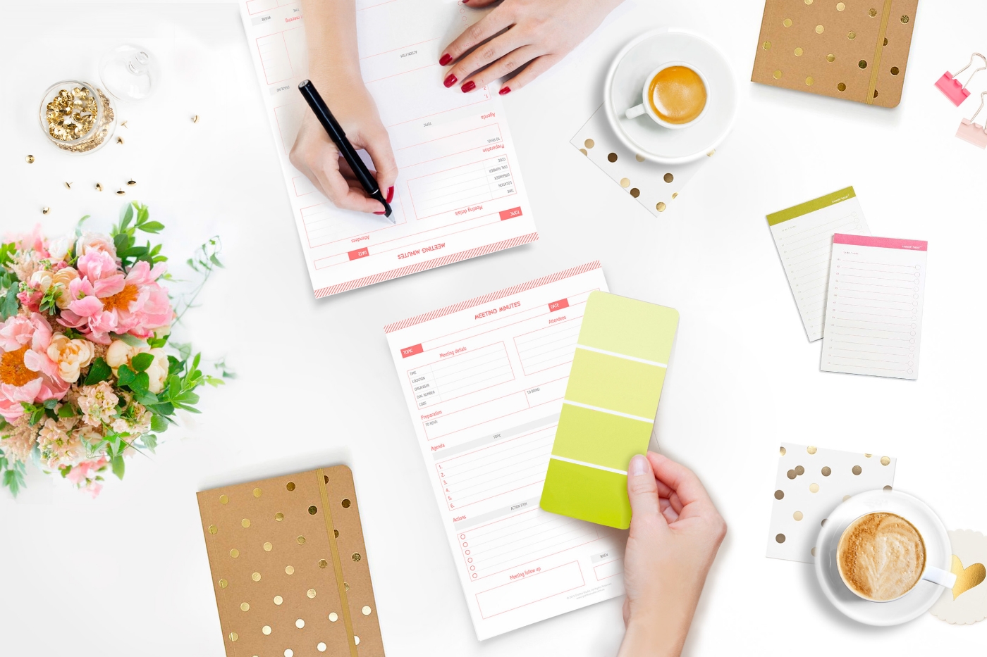
  • Collect more information about the project, to make sure you understand every possible requirement that can impact in the project cost. To do that, send the client a design brief questionnaire.
  • Offer more information about your process, your fee structure and payment conditions, etc. To do this, I have created a PDF brochure with all the relevant information for potential clients.

Take this opportunity to schedule an obligation free consultation with your potential client, face-to-face or via Skype, if the client is not local.


3.    First consultation

Every long-lasting relationship starts with a first date to decide whether you and the other person are a good fit.

Sometimes the project may be too big or too complex for you. Others may require someone with very specific technical skills that you don’t have. So this first meeting is key to understand what the project involves and whether you will be able to help your client.

If you aren’t the right person for the job, you can still offer assistance to source the right professional/s and liaise with them to facilitate the process for your client.

During this first consultation your client and yourself can:

  • Discuss the project brief and fill in the blanks to ensure you understand all the requirements.
  • Clarify what information the client needs to provide beforehand.
  • Explain what’s included and what’s not in your service to manage client’s expectations.

After the meeting you can send a quick email to thank them for his or her time and outline next steps to get the ball rolling.


4.    Secure the project

After your initial consultation, the client has agreed to start the project. But a design project can take weeks, sometimes months, to complete and a lot of things can happen along the way, including your client changing his or her mind about working with you.

For that reason NEVER start a project without formally securing the deal through a design contract and a non-refundable booking deposit.

Signing a design contract

This document ensures a fair business relationship for both parties. Some of the benefits of having a design contract in place are:

  • You will look more professional and have your clients taking you more seriously
  • You ensure the client reads and understands the terms and limitations of your service
  • It protects you in the case of project cancellation, payment issues, and copyright and intellectual property issues.

Paying a booking deposit

This upfront payment is the best way to ensure that you get paid even if the client changes his or her mind about the project, finds someone else to work with or simply gets stuck on their own projects and forgets about yours.


5.    Manage your project communications

During the design and development phase there are two essential documents that will ensure you and your client are always on the same page:

The Design Proposal

The most common questions that a client always has about their project are: “How much is it going to cost?” “What will I get for that price?” and “How long will it take?“. The best way to give a concise answer those questions is through a design proposal.

This document also helps you double-check and triple-check the project goals and specs with your client before getting hands with the design.

A design proposal contains a lot of information about the project and has to be customised for every client, so you would typically have a proposal template that can speed up the writing process.


Project Plan

The best way to work collaborative with your clients and other virtual teams on the same project is by using a live project management tool.

I personally love Freedcamp to manage multiple projects at the same time and work virtually with my clients and collaborators. The benefits of using a project management tool are:

  • You can get the project documentation organised in the same place
  • You will be less dependant on email by taking project conversations and discussions in this system
  • The client can follow-up the progress of their project reducing the number of “how is my project going?” emails.


6.    Thank You Pack

The Thank You pack marks the closure of the project. It’s a sweet way to clearly estate the project is over and every extra task that needs to be done from now on will be billed separately. But it’s also your last chance to make your client fall in love with you.

Don’t just say good-bye, take this opportunity to strength to your existing relationship with your client and leave the door open to work together in future projects, as well as get new referred work from them.

Some things you can include in your thank you pack - or good-bye pack - are:

  1. Thank you note and a gift – make the client feel special by thanking them for their business and giving them a small gift.
  2. Email subscription - stay in touch by adding their emails to your newsletter list.
  3. Free premium content - Give them free access to paid content and private Facebook groups.
  4. Referral discounts - Reward them for any new referral with discounts in future designer jobs.

Take action

Download my Client Communication Checklist to streamline your workflow and deliver a great client experience.

If you want to see some real examples of these documents mentioned above, learn how to write effective proposals or working with project plans, and download templates to create your own client communication workflow join my 6 weeks Creative Business e-course! You will find all of this information there and much more! Coming soon in March.

If this sounds interesting, sign up with your email address to receive updates and sneak peeks of this course.


How To Design A Storytelling Website

Throughout history, stories have been the most natural way to pass information among humans. Through storytelling, we share knowledge, express emotions and entertain others.

Stories have always been a primal form of communication…They connect us to a larger self and universal truths.
— Pamela B. Rutledge, The Psychological Power of Storytelling

While conventional website design commonly uses card-style layouts to organise the information in small units, narrative layouts can also be applied to websites.

In today's post I'll show you how you to create a storytelling website and some common techniques to make it engaging and interactive.


Why a storytelling website?

An effective storytelling website requires a lot of planning and excellent user interface design. But when it’s done right, it can establish a strong emotional connection between the brand and the visitor.

Every website has a story to tell, but not every website needs a storytelling layout. Sometimes a single image is enough to tell your story. Words, colours and other graphic elements also tell stories.

But when the website needs to deliver more complex messages, designers use a combination of two powerful communication tools:

  • Visuals
  • Storytelling layouts

In web design, storytelling needs to be visual. Visitors find text intimidating; they don’t like to read on the computer screen, so the story needs to be short and told in just a few words.


What makes a good story?

First of all, your story must have a purpose that changes visitors' views or believes, or influence somehow their decisions.

Your story also must engage your audience and encourage them to take some action at the end of it. To achieve this:

  • Make them participate in the story. You can achieve this through some of the interactive techniques described below.
  • Lead the visitor to a conclusion or a “moral” that makes them take some action. You can achieve this through call-to-actions.

As Jessica Moon says in her post30 Compelling Examples Of Visual Storytelling On The Web “Much like how we expect to see a moral at the end of a book, we expect to find a purpose at the end of a site with a storytelling experience”.


Creating a storytelling website

Every story has three parts or acts: setup, conflict and resolution. You can start by dividing your story into these three acts.

  1. Identify a hero and a villain.
  2. Create a setting where the action will take place
  3. Develop an action that contains a conflict
  4. Create surprise factor, with perfectly-timed surprises that visually engage and delight the user
  5. Add a moral or conclusion, and allow readers to think for themselves
  6. Keep the story short and sweet
Fracking-storytelling-website

A great example of story telling website is The Dangers Of Fracking. The website propose of the website is explain the concept of hydraulic fracturing.

  • Hero: the visitor
  • Villain: the hydraulic fracturing
  • Setting: sky city road → fracking site → pipes → sky
  • Conflict: several environmental, safety, and health hazards
  • Surprise factor: scroll-triggered effects
  • Moral: support the FRAC Act
  • CTA: sign up the petition


Website storytelling techniques

1. Long-scrolling website

While long-scrolling websites were something to avoid in web design a few years ago, today, they are the most common layout to tell a linear visual story. They usually combine a long background image with position fixed elements to create a sense of movement when scrolling.

A long-scrolling site can combine a variety of interactive techniques to engage, surprise and make the visitor participate in the story.

Apart from the example above, the hydraulic fracturing website, below are other two great examples of long-scrolling storytelling websites:

Example 1 | Vertical scrolling: Babel The King

Babel, the story main character, falls down from a cloud to the grass as you scroll down. I love the cute illustrations of this website, designed by its own author karim Maaloul, a Belgiam creative director and founder of interactive agency EPIC.

Babel-the-king-storytelling-website

Example 2 | Horizontal Scrolling: The Bright Future Of Car Sharing

A drive in a virtual car shows the social, economical and environmental benefits of sharing a car ride. The website has been designed as a big interactive infographic, with lot of information and data presented in a visual way.

The-bright-of-car-sharing-storytelling-website


2.     Scroll-triggered animations

The information makes its entrance from the sides or the bottom of the screen when scrolling down, throw subtle animations. This technique gives front-end developers the ability to create richer and more interactive web experiences.

Example 1: Reverend Danger

This digital agency explains their creative process through a clever interactive design.

reverand-danger-scroll-triggered-animations


Example 2: La Moulade

I love the visual simplicity of this almost hypnotising website,

La-moulade-scroll-triggered-animations


3.     Parallax scrolling

When the background images move slower (or remain static) than images in the foreground, creating the illusion of depth and immersion.

Although the parallax scrolling is growing in popularity across the Internet, the main problem of this technique is that not responsive and mobile-friendly.

Example 1: Case 3D

In this website the parallax scrolling has a clear purpose: it shows the transformation from sketches to amazing 3D visualisations.

Case-3D-parallax-website


Example 2: Beoplay

An excellent example of how sounds can also play an important role in storytelling websites. As you scroll down the sound gets louder as if it's slowly approaching to the visitor. The sound here is used to create a tridimensional illusion where elements can get closer or further in the distance. Open a new window browser on top of this website and see what happens...

beoplay-parallax-website


4.     Hover-to-reveal copy

If the website contains a lot of copywriting, the visitor will find the site too overwhelming and abandon it quickly. Hover effects are a clever way to hide some of the content making the site easy to scan. When you mouse over an element, other pieces of information are revealed.

This way to present the information is very interactive. The visitor explores the site searching for hidden content.

Example: Evoenergy

A great storytelling example with ecological message. Information is displayed as you hover over the different elements of the graphic, creating a very playful and engaging experience for the visitor.

Evoenergy-hover-to-reveal-website


Takeaway

A good storytelling website is a powerful communication tool that when is done correctly can:

  • Explain complex concepts or ideas in a simple way, easy to understand by the audience
  • Create an emotional connection with the visitors
  • Make the content more engaging and visually appealing
  • Provoke curiosity and encourage people to navigate through the entire page.
  • Persuade the visitor to take action in a more effective way

Do's and dont's before getting a new website

So you want to design a new website for your business. You have images, content and are all ready to get started. You want your website up and running in a few weeks. However, after meeting with your designer you realise it’s not going to happen so quickly.

Not just that, you also realise that some of the decisions you made on your own for your website weren’t quite right, which ends up wasting time and money.

To get a website design project right from the beginning it is important to know what you should do and what you shouldn’t, or at least not without consulting your web designer first.

Do focus on the main purpose of the site

The main purpose of any business website is growing the business, but the question is HOW. Do you want to improve your brand awareness? Or grow your sales? Do you want to give your existing customers better service?

By having a clear description of the main purpose of your website you will help your designer understand where the focus should be and make confident decisions along the design process.

Do sign a design contract

A design contract is the best way to ensure everyone understands and agrees with the terms of service. The contract should include basic terms and conditions on events such as contract termination, copyrights, licensing, payment conditions and service limitations.

I use the design contract provided by AIGA (The Professional Association For Design).

Do get an estimate in writing

Although a website project is very difficult to quote in its early stages, always ask for an estimate before paying any deposit to avoid unpleasant surprises.

Ensure you understand the billing method – hourly rate or fixed price –, what’s included in the price and what’s extra.

In this other post, I explain how I price my design services to make it as fair as possible for both, the client and myself.

Don’t buy hosting

Discuss the hosting options with your designer first. Some solutions cannot be hosted by anyone, like SquareSpace. Also in many cases, web designers and developers work with multi-hosting services and could host your website for free.

Do always choose open-source tools

Always request an open-source content management system (CMS) – like WordPress, Magneto, Shopify or Squarespace - so that any designer or developer can access it in the future.

Some design companies work with proprietary CMS. If that’s your case, you'll get stuck with the same company – and their fees - forever.

Don’t rely on the design brief only

One of the hardest things of a brief questionnaire is asking the appropriate questions in a way that the client can easily understand. For example, when a client says “I need a Wordpress website” quite often what they mean is “I need a Content Management System”, but Wordpress might not be the right solution for them.

After receiving the client brief, I always arrange a face-to-face meeting with them – or a virtual meeting if the client is not local – to fill the blanks and clarify the project requirements.

Do research your competition

To figure out what your website needs in terms of content, functionalities, etc, check out your competitors websites and make a list of all the features that you would like to incorporate into your site. This list will be really helpful to your designer later.

Do invest in beautiful photographs

The Internet is getting more and more aesthetic every day. Professional photographs beautifully styled can immediately build trust in your business, and create a quick emotional connection with your visitors.

Do not use photos taken by yourself in your website. A good image needs proper lighting, a good styling and quite often a lot of Photoshop editing and retouching too.

You can see an example of Photoshop retouching for one of the website I designed last year here in my portfolio.

Do involve your designer in the photography shooting

Not every image is suitable for a website. Your website photographs must have a consistent look and feel, an appropriate lighting and a specific format. A lot of white space in the background is also highly desired to add text to it.

Your designer can brief your photographer on what sort of images your website may need.

Do get your copywriting ready

Any website is designed around its content. To avoid delays during the design process, you can start working on your content beforehand, and have it ready in advance of the website design being started.

At this stage, you may want to engage a copywriter to help you compose a compelling message for your website.

Do carefully think about your page structure

Provide a logical order to your website content to make it easy for visitors to navigate. Organise your content in pages and connect pages through relevant links and call-to-actions (CTA).

Start by putting together a simple site map; fill every page with sections, and every section with subsections.

For some tips on How To Write The Perfect CTA visit this other post previously published here in my blog.

Don’t make the users think, wait or read

Having too much content will make your visitors feel overwhelmed and want to leave your site quicker.

Break your content into the smallest possible units to make it very easy to read. Add titles and subtitles and establish message hierarchies. Use icons, bullet points and numbered lists to make your content easy to scan.

Do think of ways to engage your audience

When someone visits your website she/he won’t be immediately ready to buy from you or hire your services. The conversion process is slow and takes time and a lot of interaction with the visitor to build trust before they are ready to make the purchase decision.

These interactions can be done through sign-up forms, downloads, blog comments, social media following and sharing tools, etc. They are supported by external platforms and tools that need to be set-up beforehand and are usually introduce by effective CTAs.

Discuss any possible interactive feature with your designer before getting the design process started.

Don’t assume your website needs everything

Not every website needs a blog, an email subscription box, or links to social media pages. Any of these features will involve a lot of time putting quality content together for your readers.

Having an abandoned blog or social media page will give your visitors the impression of carelessness, and they will lose trust in your business.

Don’t expect success overnight

The single fact of having a website online doesn’t mean that you’ll start getting visitors straight away, neither will you get customers or clients inmediately. Your website is just the beginning of the journey.

Be prepared to invest time and money in digital marketing to drive traffic to your website and increase the sale conversions.

Don’t try to do it yourself

I always believe in doing what I do best and leave everything else for those who are experts in everything else.

Behind any website design process, there are many things to take into consideration to create an effective business website.

Even if you feel confident building your own website, you may want to get some help and guidance from your designer through some mentoring sessions or design consultations.


Wrap-up

Good design takes time, and building a professional website can take a few months of work. If you are looking to build a professional website to grow your business, engage a website designer asap. Your designer will help you prepare the material, setting your website right front the beginning and ensuring you get the best return on investment for your business.


How I Overcome Creative Blocks
How-to-overcome-creative-blocks

Every designer experiences a creative block from time to time. It doesn’t mean you are a bad designer because of it, even the most experienced designers’ face creative blocks sometimes.

However, experienced designers know how to deal with creative blocks so that they cause the minimum delay in their projects. And they have learned this from having gone through a lot of creative blocks along their professional lives.

If you work in a creative field, you will also have to face create blocks from time to time, and must find the best ways to overcome them. Not every way will work the same for everyone, so you must identify what works well for you and what doesn’t.

Creativity is the ability to come up with new, unique and original solutions for existing problems. Creative thinking isn’t a natural gift, it’s something that can be taught and learned.

Today I’m sharing my own tips to grasp ideas to resolve creative challenges faster and avoid creative blocks. I’m also sharing some tips on how I overcome these blocks when they happen.


Causes of a creative block

Your inability to come up with good ideas could be caused by an external factor. If that’s the case, address the root problem of what’s blocking and preventing you from concentrating and focusing on your work. Here are some common reasons of creative blocks:

  • Too many distractions
  • The project is too big for the designer
  • Physical (or mental) health issues
  • Personal difficulties
  • Unsuitable client/project (the designer is not a good fit)
  • Stress or tireless
  • Boredom

Although quite often the cause of a creative block is an external issue that needs to be addressed, sometimes you simply run out of ideas.


Avoiding creative blocks

Knowledge is an important factor of creativity. The more you know about the problem the easier will be to find a solution. Being constantly consuming and retaining information is one of the best ways to avoid creative blocks. Here are some tips:

1.    Have a journal

Ideas come and go quickly. When they come try not to let them go. Find ways to store your ideas to be reused in future projects. This is how I do it:

  • I carry several journals in my bag: one for sketches, another for blog post ideas, other for resources, etc.
  • I also take photos of everything I find inspiring from my phone.
  • I have Pinterest boards for everything, and constantly pin images on them
  • I have hundred of lists in Trello to organise ideas in smaller groups.

2.    Stay curious

Having a list of learning resources will help you read, learn and be informed of the latest industry news and trends. This is what’s on my list:

  • books to read
  • industry magazines and e-courses I’m subscribed
  • blogs and podcasts I follow
  • event calendar of upcoming courses, seminars and webinars I want to attend.

3.    Surround yourself with creative people

Hanging out with other creative fellows and sharing ideas can be also a great way to learn and increase your industry knowledge. Here is how I do it:

  • Join meet-up groups
  • Attend networking event
  • Organise catch-up coffees with industry fellows

4.    Travel and explore the world

The more you travel, the more you experience and learn. Traveling and living abroad has been the most enriching life experience I’ve ever had. It took me out of my conform zone, made me forget about the traditional ways to do things and see the world from a new angle. All of this has significantly improved my ability to find uncommon solutions to given problems.


Overcoming creative blocks

Having a creative block is stressful and produces anxiety caused by the fear of failure. It’s a difficult situation that needs to be overcomed as quickly as possible. When I find myself in one of these creative blocks, this is what I do:

1.    Deconstruct the problem

When the problem is too big or too complex, divide the problem into smaller units and address one by one. For example, when designing a website I start with the simplest things: planning the sitemap, then the wireframes (layout), after that I design icons, boxes and other graphic elements and finally I design individual pages.

2.    Take breaks

Sometimes walking away from the computer for a while help you relax, rest and come back to the problem in a better state of mind. Working many hours with no rest will only get you overtired, impacting in your ability to focus and think straight. To avoid this situation I work on blocks of 2 or 3 hours and take an hour rest at least between blocks.

3.    Exercise

I never enjoyed exercise until I realised how much it stimulates my creativity. Going for a long walk in the evenings, a run on the beach early in the morning or 45 mins yoga class, can help your creative juices flow and bring ideas faster.

This other article on “The cognitive, emotional and neural correlates of creativity” by The University of Amsterdam, Netherlands shows how body movement helps overcome mental blocks and lack of inspiration.

4.    Have a nap

One of the best things about my Spanish heritage is the siesta. During my days as university student, I found out that waking up early in the morning and having a nap in the middle of the day helped me keep my focus on my studies for longer and retain information faster.

When I get stuck on a problem, a nap helps the brain to rest and reset so that I can have a fresh start after.

This other study by University of California, Berkeley, demonstrates that human memory develops during sleep time periods, which helps your mind access ideas hidden in the subconscious.

5.    Bring the client into the creative process

As a freelance designer, I don’t always have the input of a team to help me come up with ideas, but I can have my clients’ help. They’re usually happy to participate in the creative process, have plenty of information and knowledge on the problem that I’m trying to resolve, and together we can come up with amazing ideas after a brainstorming session.


Your turn

When you get stuck in a creative block, what do you do to get out of it? How do you reset yourself and overcome the creative block? How do you keep your creative juices flowing?


Grafika Projects: State 28 rebranding
Client: State 28
Project: Rebranding, Business Stationary, Web Design and Development
Date: Launched in September, 2015
State 28 New Brand and Website designed by Grafika Studio

State 28 New Brand and Website designed by Grafika Studio

State 28 is an interior design company based in Perth, WA, with a strong focus on commercial design and office spaces. I'm very passionate of interior design, and I was thrilled to be chosen as their designer to re-brand their business and build a brand new website.

The new brand was completed in August and the new website launched in September this year. Today I'm sharing a bit of the logo conceptualisation process for this client, as this is a great example of how a simple icon can be full of meaning and significance, becoming the heart and soul of a brand.


The concept

I started working with Miriam, State 28 Director, and her team around June this year. Over the first couple of weeks I spent time getting to know the company personality, vision and values, as well as understanding how they wanted to be perceived by their clients and prospects.

They wanted a modern, fun and elegant new brand. My first ideas revolved around vibrant colours and curved lines to reflect the fun side of the company personality. But as many of their clients were corporate organisations I thought we should also look for a minimal and geometric style to connect with that market and communicate professionalism and reliability.

I came up with a few concepts first, no luck (see below). I sketched for hours, did lot and lot of visual research, and came up with a few more concepts. Still no luck.


After two rounds of concepts, I went back to their office and met with the team again to get a deeper understanding on the business personality, vision and core values.

In this second meeting I got to know more about each individual behind the scenes of State 28. I learned interesting things about them, like that Miriam had spent many years living in Texas, the State 28, and hereby, the company name.

Back at home, a map of Texas gave me a final clue: why not creating a logo that speaks about that emotional connection with Texas? The company director certainly had a strong connection with this place, and this could be a great concept to play with.

I created a more abstract idea of the map of Texas that had that geometrical and minimal look that I was going for.

They loved the concept! So, did I. Not only it was a meaningful concept for the company owner, but also talked about its origin and history.


The brand mood board

To create this mood board I used some images of their recent projects mixed with some bi-dimensional and tri-dimensional patterns, curved and straight lines and contrasts.

The colour scheme has a base of black and white to communicate sophistication. To give the brand a fresh look I added shades of silvery blues and some metallic finishes.

A bright aqua blue achieves a relaxed mood in line with the team personality, breaking the formality of the black and silver blue.

State 28 Interiors brand mood board

State 28 Interiors brand mood board


The typography

A sans serif font style was the perfect match for the straight lines of the geometric logo. We love the Epitet family with plenty of styles to choose from (regular, light, bold, ultra-light, italic, etc).

By increasing the tracking (the space between characters) I added a sense of sophistication to the final logo design.


State 28 team suggested to combine the Epitet family with a hand-writing font (Bad Script) to break the formality of the straight lines. We loved the final result.


Icons and patterns

The brand identity was completed with a set of outline icons for the website to match the hand-writing font style.

The logo triangles also inspired the patterns for their business stationary, which is currently under development.

To see how this new brand came together online, you can visit their website at www.state28interiors.com.au.


My Formula To Price Design Services

Pricing design services is trickier than what it looks like. There are many factors that need to be taken into consideration to properly price a design project.

Design rates vary a lot depending on the designer’s physical location, experience, specialisation and demand. As Steven Snell, editor-in-chief of Vandelay Design, says in this other post on 12 Realities of Pricing Design Services:

The variety of prices is as wide as the variety of talent levels

Price has a big impact on your client’s perceptions and your business success. If you low-price your services, clients may think you must not be very skilled or experienced. On the other hand, with high prices also come high client expectations, that when they aren’t met lead to huge client disappointments and negative public reviews.
 
Putting price to my time and skills has been one of the most difficult parts of my job. However, this is an essential exercise for any designer. As just not only clients but also other designers usually ask about how I price my services and why I do it that way, today I’m sharing my pricing formula.


How do I charge my clients

There are typically two billing methods for design services:

  1. Hourly rate
  2. Fixed Price

Clients usually prefer the fixed price method, as they know up front the entire cost of the project, while charging per hour is favoured by many designers.

While an hourly rate method is usually easier for small projects, for large ones this pricing system could scare clients off. You never know how many hours it will take to complete a project, so the final invoice can be a nasty surprise for the client.

For that reason, my preference is to charge a set price for any project over 4-5 hours of work.

You can find out more about pricing creative services in this other post by The Design Trust with 15 different ways to price a create job.


How do I set fixed project prices

Not every project is the same. For example, there are simple websites and others with a lot of information and complex functionalities. So it would be unfair to charge the same for any website project. The same thing happens with any other piece of marketing material or design in general.

On the other hand, large projects usually involve many different tasks; each task requires different levels of specialisation or expertise, from design, art direction, coding or project management. Depending on the specialisation and complexity, every task usually has a different average hourly rate in the market.

To know how much I should charge for each task, I determine the market rate first. To do this, I check other competitors’ rates through freelance marketplaces. Some useful tools are:

When a potential client requests a quote, to ensure I have a clear understanding of the project requirements, I ask them to fill a project brief questionnaire. Once I get the information I need from them, I can calculate the project price with the help of own price calculator, which is basically an Excel file with a long list of project tasks and a separate price for each of them. The formula is:


{ Hourly rate (Expenses + Average Market Salary) x Estimated Time To Complete } x ComplexityLevel = Base Price

There are also some add-ons that will impact on the final cost of any project, like hosting services, SSL certificates, stock photos, photo editing and retouching, customised illustrations, customised coding and CSS, etc. Most of these added costs don’t usually go to the designer but to thirds party companies or subcontractors.

If you are a designer, below you can download my quote template in Excel for your reference and customise it with your own prices and creative services.


Minimising fixed price risks

The main risk of fixed pricing methods is that if the client ends up being a bit picker than expected, the designer will need a lot more extra hours to complete the project. If you bill all those hours, the client will receive an invoice ridiculously above your initial quote, if you don’t, you will end up working for free.

To make the flat rate billing system fair for everyone, it’s extremely important to clarify what is included in the price and what’s not, and therefore, it will be charged separately. For example, I include 3 rounds of revisions and every additional round of revisions and changes has a cost of AUD$75.

If you do this in a simple conversation, the client may forget quickly about it. If you put it in writing, they may never read it. So I do both, just to be safe. In our first face-to-face meeting I discuss the project budget, possible costs and what’s included on the price, and then I send them a contract to sign-up, that specifies:

  • How many rounds of revisions are included and cost of additional revisions
  • Payment methods and conditions
  • Cancellation policies
  • Additional fees if the project requires more work than expected
  • After sale support
  • Fees for payment delays
  • Etc


Structuring my payments

When I was a young designer I learned this the hard way. Some clients didn’t pay. So I always ask for payments upfront. It’s just a security that the client won’t easily go to another designer; change his/her mind in the middle of the process or will be just simply unwilling to pay.

My payment structure varies depending on the total cost of the project:

  • On small projects under $500 I require full payment upfront
  • On mid-size projects between $500 and $2,000 I ask for a $500 deposit and the balance prior to the release of production-ready files or to go live.
  • On larger projects with several stages of deliverables, I require 40% deposit prior to starting any work but break up the fee schedule based on deliverables.


Covering indirect costs

The total amount of phone calls, Internet bills, software, licenses, bank and PayPal fees and, of course, taxes, was an unpleasant surprise after my first year in business. These indirect costs are very difficult to charge to the client, and have too be part of your hourly rate. But at the end of the year, they are just too much to pay them out of your own pocket.

So I quickly learned that a freelance designer also needs a second source of revenue, in the form of passive income. In my case, selling pre-made design and digital products online has been a great way to generate extra cash flow, not just to increase my monthly revenue but also to cover all those indirect costs.


Packaging services

Most of my new businesses are referred by existing client’s. For that reason, great project outcome and excellent client service during and after their project is key to ensure the continuity of my business.

Rather than giving discounts to new clients I prefer to provide client value by creating service packages. The benefit of packaging my services is that I can offer some extra free-services or discounts to existing clients, aimed to build long-lasting relationships with them. As part of my service packages I include, for example:

  • Face-to-face meetings and free consultations for local clients
  • Free post-project technical support and trainings
  • Discounts for new business referrals
  • Free access to my small business resource library
  • Etc


Wrap Up

When it comes to price design services there is no right or wrong methods. Both hourly pricing and project-based fixed pricing have pros and cons. Every designer will have to identify the pricing method that works better for him/her.

Sometimes you will probably realise that you underestimated the amount of work that a project was involving, in which case, you will have to learn from the experience and calculate your price better next time.

Finally, do research the market, don't under-price or over-price yourself and make sure you always add value to your services to ensure repeated business and referrals.

If you are a designer or a client, your thoughts on this topic will be very appreciated.


How To Write The Perfect Call To Action In 5 Simple Steps
call-to-actions

A call to action (CTA) is any text or graphic that provides a clear link to the next action. Its purpose is to provoke the reader/visitor/consumer (I will be using the term consumer) to perform a specific action.

Common actions include:

  • Signing up to a newsletter or e-course
  • Calling an organisation
  • Sending a message
  • Viewing a demo
  • Using an interactive tool

Whether it’s placed on your website, social media page or email, a CTA can be an excellent way to increase inbound traffic, leads and give your small business an advantage over your competitors. With so many reasons to utilise CTAs, it’s interesting to note only “47% of websites have a clear call-to-action button that takes users 3 seconds or less to see” (Go-Globe) and “70% don’t display clear calls-to-action for anything on their home pages” (Online Marketing Coach).

So why are CTAs so misused? Perhaps it’s due to a lack of understanding of their significance and purpose they serve, or perhaps it’s because people are unsure how to go about writing and applying CTAs.

No matter what your issues you’ve face with CTAs in the past, it’s time to put them behind you and start fresh with these 5 easy steps which will have you creating enticing and engaging CTAs in no time!


Step 1. Pick The Right Action Word (Verbs)

As the purpose of a CTA is to have the consumer perform a specific action, it is important to make the desired action clear. The use and effective placement of verbs is one of the simplest way to do so.

Select a verb:

  • If you would like your consumer to join your email course you can use verbs such as “subscribe”, “enrol”, or “email”

With a verb in mind, the next step is to locate it effectively within your CTA. Studies have shown the first and last few words of any copy (written material) stand out to most people. To take advantage of this simply place the verb at the very beginning of your CTA.

Place your verb where it’s most effective:

  • Instead of your CTA reading: “I’m ready - Sign me up”, modify the order of the words to read: “Sign me up - I’m ready”.

By switching the order of the wording used in the CTA, your consumers attention will be immediately drawn to the action you would like them to complete.


Step 2. Apply First-Person

The significance of using first person in a CTA is revealed in a study conducted by Unbounce. The study tests the engagement consumers has with two CTA buttons. The buttons were identical in every way with the exception of one being written in first person whilst the other was written in the more common third person. The result, “when [sic] tested live on the website, it turned out that the treatment with “Your” performed significantly worse than the control copy that made use of “My” – 24.95% worse to be more precise”.

Further to this test, another was conducted using the CTAs “Start your free 30 day trial” and “Start my 30 day free trial”. The CTA button using “my” showed a 90% increase in the click through rate over that of the “your” button. Such a strong result showcases the power a single word can have in a CTA.

By introducing first person terminology such as “me” in place of “your” you are encouraging your consumer to place ownership on the reward they will receive upon completing the action

Reframe your CTA:

  • Instead of stating “Get your free guide today”, reframe your CTA to state “Claim my free guide today”.
  • Instead of using the phrase “Sign up”, reframe your CTA to state “Sign me up”.
  • Instead of using “Join now”, reframe the CTA to state “Enrol me now”.

By reframing your CTA in this manner you will also be to avoiding a CTA that demands an action from your consumer. Yes, that’s right, the saying “you can catch more flies with honey than with vinegar” holds true in relation to CTAs. By reframing your CTA to be a demand from your consumer rather than one from your business allows you to clearly convey the benefit your consumer (not you) will obtain through their action.

This approach is a great deal more likely to engage your consumer and see them follow through with the intended action.


Step 3. Be Crystal Clear

Consumer uncertainty, doubt and fear are the ultimate action killers. If your consumer is uncertain of what will occur when they act upon your CTA, it is very unlikely they will follow through with the action due to fear and doubt.

The word “send” is the perfect example of a frequently misused term as it can be interpreted in many ways. To some, the word may imply mail via post, whilst to others it may imply email.

People have a tendency to assume their personal interpretation of a word will be that which is commonly accepted by others, yet this is not always the case. By placing assumptions upon the words you chose to use you risk consumer uncertainty which and therefore consumer inaction.

Please note, if you choose to use a word such as “send” in your CTA button for any reason, ensure you have made it extremely clear elsewhere in the CTA what this meant by the word “send”.

Clarify the meaning of your CTA:

  • By stating “Teach me how to write great copy in 3 weeks” you do not clarify what will happen when your consumer clicks on the button. While they may be eager to learn more about writing copy, they are unlikely to click due to a lack of clarity.

This CTA does not explain what your consumer will receive when they act, the method in which the information will be received, the commitment required or the cost. With so many unknowns surrounding what will occur after actioning the CTA your consumer is likely to experience fear and uncertainty leading to inaction.

  • By stating “Sign me up to the free 3-week Writing Perfect Copy email course” you make clear the way in which your consumer will learn how to write great copy.

There can be no doubt what will occur when your consumer clicks on the button. This CTA expresses what your consumer will be receiving when they respond, the method in which the information will be received, the length of time they can expect to receive the information and the cost.


Step 4. Keep It Short

Though it may be tempting to cram as much information as possible into a CTA, it is best to approach your CTA with the KISS principle in mind – Keep It Simple Stupid.

According to studies, readers only take in the first and last 3 words of any copy. This suggests the ideal length for a CTA is 6 words which can be a big challenge if you’ve never written a CTA before. To make writing an effective CTA easier, I recommend aiming for 10 or less words and ensuring the more critical information is positioned at the beginning, followed by the end of the CTA.

How to write a short CTA:

  • Write what you wish to say, ignoring the length
  • Identify the keywords which cannot be removed
  • If some of your keywords are particularly long, seek out shorter synonyms
  • Go through removing and shifting around words, ensuring the meaning is not lost


Shorten your CTA:

  • Though “Sign me up for this email course on how I can learn to increase my Twitter traffic by 30% in 4 weeks” may appear to provide your consumers with more information, research shows they are likely to ignore any information containing in the middle of the sentence.
  • By shortening the CTA to “Increase Twitter traffic by 30% in 4 weeks”, the consumer is more likely to clearly comprehend and receive all of the necessary information provided.

Once you start cutting your CTAs short it can be hard to stop, but it is important to remember cutting for the sake of cutting isn’t recommended. It is more important to convey your message than to use a shorter CTA which lacks clarity and information.


Step 5. Revise Your CTA

Congratulations! If you’ve followed my 4 previous steps you should now have a wonderfully written CTA in front of you and it’s time for the final step. Revising your CTA from the Point-Of-View (POV) of the consumer is crucial as it allows you to gain a new perspective and additional insight into how your CTA is likely to be received by your consumer.

Look at your CTA and ask yourself:

  • “Will this take long?”

If the answer is unclear or the response is yes, you will need to make some changes to your CTA and/or the action itself.
 

  • “Is this worth my time?”

If your CTA does not clearly express the benefit/s your consumer will receive, the answer is likely to be no and you will need to make some amendments to your CTA.
 

  • “Will this be simple?”

If your consumer is unsure how long the process will take, or it is evident it will require some time e.g. filling out complex forms, your consumer is unlikely to follow through with the action and you will need to make some changes to your CTA and/or the action itself.
 

  • “Is this something others are doing?”

If your consumer is left questioning whether they are likely to be the only person acting upon your CTA they may begin to fear the prospect of being ‘suckered in’ and feeling foolish. If this type of questioning arises from your CTA consider incorporating a numerical count or statement which shows your consumers that others have previously acted upon the CTA.
 

  • “Will this involve providing my credit card details?”

If your CTA requests credit card details it is likely to be extremely off putting to any consumer. Often your consumer will have their card away from them and question the possibility of future monetary costs and commitments which may apply. For this reason it is often best to leave any financial commitment to another time and place.

By following these 5 simple steps you can write engaging an effective CTAs for any copy. So give CTAs a go and include one in your next blog post, website update or social media post, and of course, comment or email me to let me know how it goes.


About The Author
Eva Niedzwiedz is a communications consultant and Director of Pickled Pineapple Public Relations based in Perth, Western Australia. Her mission is to help small business owners take advantage of their unique marketing potential through the creation and implementation of original content, tailored communications and social media services.