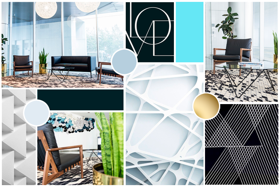

Mood board for ColourCube Interiors new brand, by Grafika Studio
It's always so exciting to share with you a new brand identity project. The one I'm sharing today was made last month for interior designer super-star Kristie Hill and her fast-growing business ColourCube Interiors.
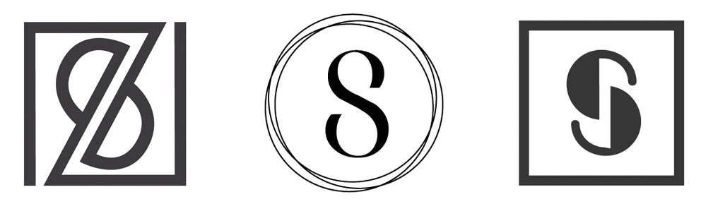
For her logo concept I played with geometric shapes, such as cubes or hexagons, and the double CC for 'Colour + Cube'. We wanted to achieve a simple and minimal logo to give the brand a contemporary edge, and to make it easy to identify and remember. The logo below made the final cut.

For her brand we wanted to create a clean but yet visually interesting identity with a lot of focus on textures and a feel of luxury. A concrete background gives the business stationary a textural feel, while touches of rose-gold add that sense of luxury.
The grey and rose palette was completed with a sage green to add an organic feel.
To create some contrast between the straight lines of the mark and the typography we chose a rounded sans serif font family.

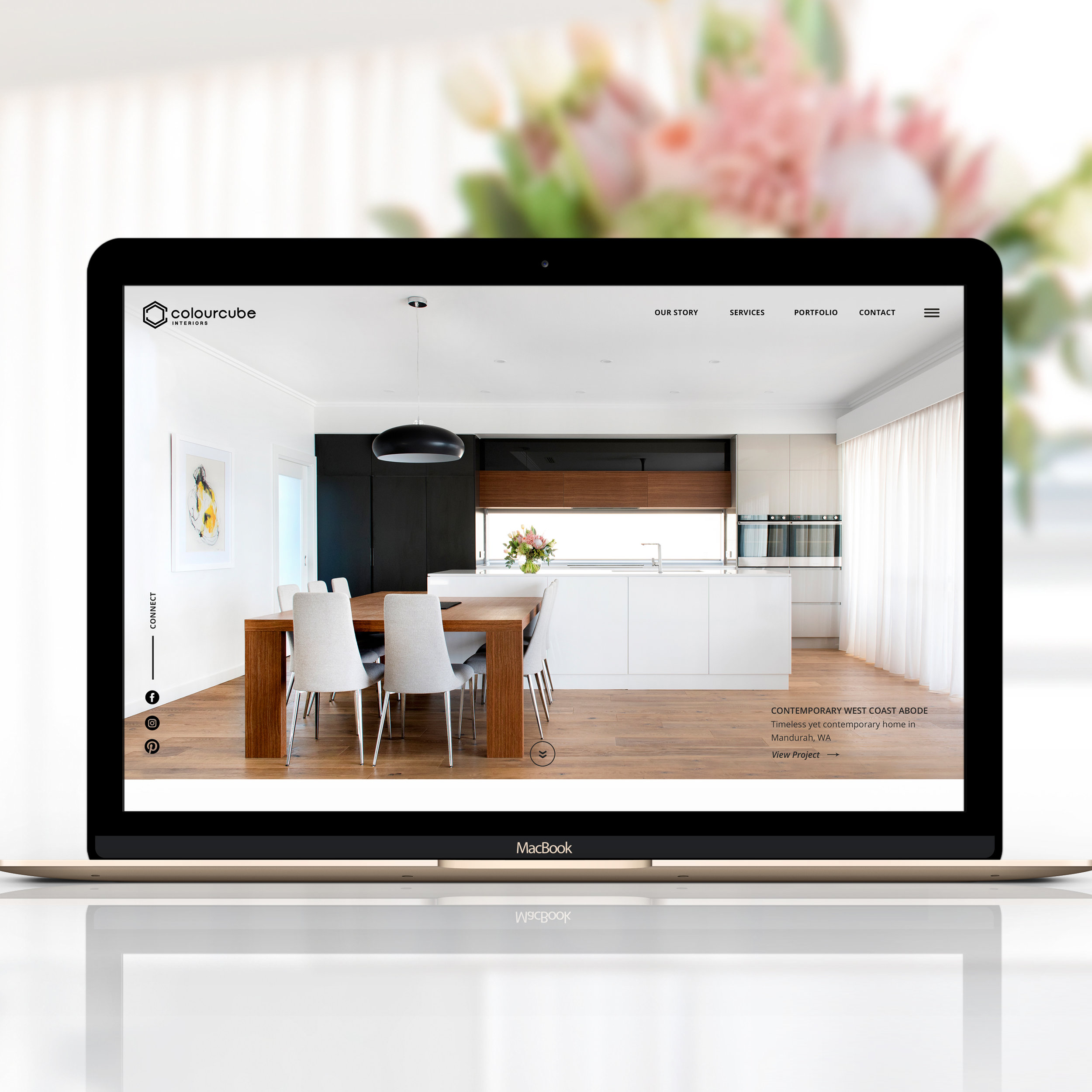
An entire set of business stationary is still under development but business cards are already printed and looking amazing! Her website will be online soon and I'll also share the project here in my blog.
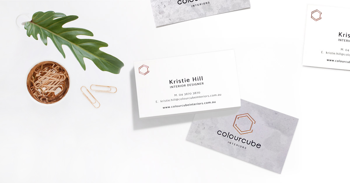
ColourCube Interiors business cards with concrete textures and rose-gold foil finish.