My 5 Professional Resolutions for the New Year
Top right corner. Beautiful Paper Lettering by Charlotte Smith

Top right corner. Beautiful Paper Lettering by Charlotte Smith

New Year means new starts, new beginnings. It’s a chance to start over and reinvent ourselves. Now is the time to start working on a better version of ourselves, happier, healthier and more successful.

As any small business owner, I have both personal and professional/business New Year's resolution lists. Both lists need to be in-sync and cannot work separately. If your business is healthy and successful you will be happier, if you’re a happy and healthy person your business will a have better chances to succeed.  


The Process

My process to set professional resolutions is quite simple:

STEP 1 | Business Clarity Questionnaire

First, I take some time to go through my business clarity questionnaire. This simple exercise helps me identify what worked well during the past year and what needs to be improved. You can download my questionnaire in the link below and put your business under review too.

STEP 2 | SMART Goal Setting

Once I know my areas for improvement I can set my business goals for 2016. The SMART Goal setting process is a great tool to ensure that every goal has clarity, is specific and can be measured.

STEP 2 | Action Planning

Finally, I create an action plan for each goal, so I know exactly what I have to do (or stop doing) to improve each area, and set time frames to review the progress and make sure I’m on track.


The resolutions

After taking this simple exercise I resolved the following for the New Year:

1. Improving my time management skills

When you love your job it’s easy to lose track of time. What is worse, you can end up working on things that don’t add any value to your business, or bring revenue. You work on those things just because you love it.

During 2015, I learned the importance of finding a good balance between client work and other tasks non-billable tasks, as well as prioritise revenue generation.

THE GOAL - Working 30 hrs. a week divided between 70% client work and 30% other.
THE PLAN - To accomplish this objective I’ve organised my week in blocks and set a limit of time to work on each block. The objective is to fill the week with 70% of client work and 30% of self-promotion, learning and development.


2.     Focusing on Client Care

88% of my new clients were referred by existing clients last year. So leveraging existing clients has become a priority in this New Year.

THE GOAL: to dedicate 8 hrs a month to client care.
THE PLAN - putting together an action plan with two main objectives:
  • Strengthening client relationships through informal coffee catch-ups, events invitations, etc.
  • Adding value to their service, though post-service technical support and a resource library for clients only.


3.     Finding Industry Mentors

We’re all aware of the importance of networking, especially with potential clients. But we often underestimate the power of networking with other industry fellows to grow our business.

Over the past year, I had the opportunity to meet other professional women whose conversations have impacted on my business significantly. So this area has also become a priority for my business this year.

THE GOAL - to meet 12 inspiring women in my industry, one professional woman a month
THE PLAN - I’m putting together a list of 12 women I’d like to meet face-to-face to get in touch and arrange a coffee with each of them. The plan is to exchange some industry insights and business tips that can help each other’s business.


4.     Expanding my Skill Set

In the current fast-changing world, technology is quickly outpacing. If we don’t skill up we can easily fall behind the industry requirements. So this year I resolve to leverage my profile and enrich my knowledge learning something new every week.

THE GOAL - to dedicate 8 hrs a month to self-development
THE PLAN - to expand my skill set this year I’ve created two essential tools:
  • a calendar of courses I want to take and seminars – or webinars - I want to attend.
  • a library of learning resources that includes industry magazines, ebooks, blogs and podcasts to read in my free time.
Podcasts are great to learn something new every day while you perform another task (like driving, ironing or going for a long walk to stay active).


5.     Finding awesome teammates

Since I’m planning to grow my business, I’m aware I cannot do this on my own. I need to find collaborators in some specific areas of expertise that I’m not an expert in, like copywriting or SEO, so that I can deliver more specialised jobs.

THE GOAL - to create a network of collaborators to team up
THE PLAN - I’ve created a Facebook Group called Design & Creative Business to connect with the local community of designers and marketers, explore their portfolios and explore collaboration opportunities.

Your turn

What are your New Year resolutions for 2016? Do you have any resolution that we can steal and add to our own lists?


Grafika Projects: State 28 rebranding
Client: State 28
Project: Rebranding, Business Stationary, Web Design and Development
Date: Launched in September, 2015
State 28 New Brand and Website designed by Grafika Studio

State 28 New Brand and Website designed by Grafika Studio

State 28 is an interior design company based in Perth, WA, with a strong focus on commercial design and office spaces. I'm very passionate of interior design, and I was thrilled to be chosen as their designer to re-brand their business and build a brand new website.

The new brand was completed in August and the new website launched in September this year. Today I'm sharing a bit of the logo conceptualisation process for this client, as this is a great example of how a simple icon can be full of meaning and significance, becoming the heart and soul of a brand.


The concept

I started working with Miriam, State 28 Director, and her team around June this year. Over the first couple of weeks I spent time getting to know the company personality, vision and values, as well as understanding how they wanted to be perceived by their clients and prospects.

They wanted a modern, fun and elegant new brand. My first ideas revolved around vibrant colours and curved lines to reflect the fun side of the company personality. But as many of their clients were corporate organisations I thought we should also look for a minimal and geometric style to connect with that market and communicate professionalism and reliability.

I came up with a few concepts first, no luck (see below). I sketched for hours, did lot and lot of visual research, and came up with a few more concepts. Still no luck.


After two rounds of concepts, I went back to their office and met with the team again to get a deeper understanding on the business personality, vision and core values.

In this second meeting I got to know more about each individual behind the scenes of State 28. I learned interesting things about them, like that Miriam had spent many years living in Texas, the State 28, and hereby, the company name.

Back at home, a map of Texas gave me a final clue: why not creating a logo that speaks about that emotional connection with Texas? The company director certainly had a strong connection with this place, and this could be a great concept to play with.

I created a more abstract idea of the map of Texas that had that geometrical and minimal look that I was going for.

They loved the concept! So, did I. Not only it was a meaningful concept for the company owner, but also talked about its origin and history.


The brand mood board

To create this mood board I used some images of their recent projects mixed with some bi-dimensional and tri-dimensional patterns, curved and straight lines and contrasts.

The colour scheme has a base of black and white to communicate sophistication. To give the brand a fresh look I added shades of silvery blues and some metallic finishes.

A bright aqua blue achieves a relaxed mood in line with the team personality, breaking the formality of the black and silver blue.

State 28 Interiors brand mood board

State 28 Interiors brand mood board


The typography

A sans serif font style was the perfect match for the straight lines of the geometric logo. We love the Epitet family with plenty of styles to choose from (regular, light, bold, ultra-light, italic, etc).

By increasing the tracking (the space between characters) I added a sense of sophistication to the final logo design.


State 28 team suggested to combine the Epitet family with a hand-writing font (Bad Script) to break the formality of the straight lines. We loved the final result.


Icons and patterns

The brand identity was completed with a set of outline icons for the website to match the hand-writing font style.

The logo triangles also inspired the patterns for their business stationary, which is currently under development.

To see how this new brand came together online, you can visit their website at www.state28interiors.com.au.


My Formula To Price Design Services

Pricing design services is trickier than what it looks like. There are many factors that need to be taken into consideration to properly price a design project.

Design rates vary a lot depending on the designer’s physical location, experience, specialisation and demand. As Steven Snell, editor-in-chief of Vandelay Design, says in this other post on 12 Realities of Pricing Design Services:

The variety of prices is as wide as the variety of talent levels

Price has a big impact on your client’s perceptions and your business success. If you low-price your services, clients may think you must not be very skilled or experienced. On the other hand, with high prices also come high client expectations, that when they aren’t met lead to huge client disappointments and negative public reviews.
 
Putting price to my time and skills has been one of the most difficult parts of my job. However, this is an essential exercise for any designer. As just not only clients but also other designers usually ask about how I price my services and why I do it that way, today I’m sharing my pricing formula.


How do I charge my clients

There are typically two billing methods for design services:

  1. Hourly rate
  2. Fixed Price

Clients usually prefer the fixed price method, as they know up front the entire cost of the project, while charging per hour is favoured by many designers.

While an hourly rate method is usually easier for small projects, for large ones this pricing system could scare clients off. You never know how many hours it will take to complete a project, so the final invoice can be a nasty surprise for the client.

For that reason, my preference is to charge a set price for any project over 4-5 hours of work.

You can find out more about pricing creative services in this other post by The Design Trust with 15 different ways to price a create job.


How do I set fixed project prices

Not every project is the same. For example, there are simple websites and others with a lot of information and complex functionalities. So it would be unfair to charge the same for any website project. The same thing happens with any other piece of marketing material or design in general.

On the other hand, large projects usually involve many different tasks; each task requires different levels of specialisation or expertise, from design, art direction, coding or project management. Depending on the specialisation and complexity, every task usually has a different average hourly rate in the market.

To know how much I should charge for each task, I determine the market rate first. To do this, I check other competitors’ rates through freelance marketplaces. Some useful tools are:

When a potential client requests a quote, to ensure I have a clear understanding of the project requirements, I ask them to fill a project brief questionnaire. Once I get the information I need from them, I can calculate the project price with the help of own price calculator, which is basically an Excel file with a long list of project tasks and a separate price for each of them. The formula is:


{ Hourly rate (Expenses + Average Market Salary) x Estimated Time To Complete } x ComplexityLevel = Base Price

There are also some add-ons that will impact on the final cost of any project, like hosting services, SSL certificates, stock photos, photo editing and retouching, customised illustrations, customised coding and CSS, etc. Most of these added costs don’t usually go to the designer but to thirds party companies or subcontractors.

If you are a designer, below you can download my quote template in Excel for your reference and customise it with your own prices and creative services.


Minimising fixed price risks

The main risk of fixed pricing methods is that if the client ends up being a bit picker than expected, the designer will need a lot more extra hours to complete the project. If you bill all those hours, the client will receive an invoice ridiculously above your initial quote, if you don’t, you will end up working for free.

To make the flat rate billing system fair for everyone, it’s extremely important to clarify what is included in the price and what’s not, and therefore, it will be charged separately. For example, I include 3 rounds of revisions and every additional round of revisions and changes has a cost of AUD$75.

If you do this in a simple conversation, the client may forget quickly about it. If you put it in writing, they may never read it. So I do both, just to be safe. In our first face-to-face meeting I discuss the project budget, possible costs and what’s included on the price, and then I send them a contract to sign-up, that specifies:

  • How many rounds of revisions are included and cost of additional revisions
  • Payment methods and conditions
  • Cancellation policies
  • Additional fees if the project requires more work than expected
  • After sale support
  • Fees for payment delays
  • Etc


Structuring my payments

When I was a young designer I learned this the hard way. Some clients didn’t pay. So I always ask for payments upfront. It’s just a security that the client won’t easily go to another designer; change his/her mind in the middle of the process or will be just simply unwilling to pay.

My payment structure varies depending on the total cost of the project:

  • On small projects under $500 I require full payment upfront
  • On mid-size projects between $500 and $2,000 I ask for a $500 deposit and the balance prior to the release of production-ready files or to go live.
  • On larger projects with several stages of deliverables, I require 40% deposit prior to starting any work but break up the fee schedule based on deliverables.


Covering indirect costs

The total amount of phone calls, Internet bills, software, licenses, bank and PayPal fees and, of course, taxes, was an unpleasant surprise after my first year in business. These indirect costs are very difficult to charge to the client, and have too be part of your hourly rate. But at the end of the year, they are just too much to pay them out of your own pocket.

So I quickly learned that a freelance designer also needs a second source of revenue, in the form of passive income. In my case, selling pre-made design and digital products online has been a great way to generate extra cash flow, not just to increase my monthly revenue but also to cover all those indirect costs.


Packaging services

Most of my new businesses are referred by existing client’s. For that reason, great project outcome and excellent client service during and after their project is key to ensure the continuity of my business.

Rather than giving discounts to new clients I prefer to provide client value by creating service packages. The benefit of packaging my services is that I can offer some extra free-services or discounts to existing clients, aimed to build long-lasting relationships with them. As part of my service packages I include, for example:

  • Face-to-face meetings and free consultations for local clients
  • Free post-project technical support and trainings
  • Discounts for new business referrals
  • Free access to my small business resource library
  • Etc


Wrap Up

When it comes to price design services there is no right or wrong methods. Both hourly pricing and project-based fixed pricing have pros and cons. Every designer will have to identify the pricing method that works better for him/her.

Sometimes you will probably realise that you underestimated the amount of work that a project was involving, in which case, you will have to learn from the experience and calculate your price better next time.

Finally, do research the market, don't under-price or over-price yourself and make sure you always add value to your services to ensure repeated business and referrals.

If you are a designer or a client, your thoughts on this topic will be very appreciated.


10 Steps To Craft Your Personal Brand
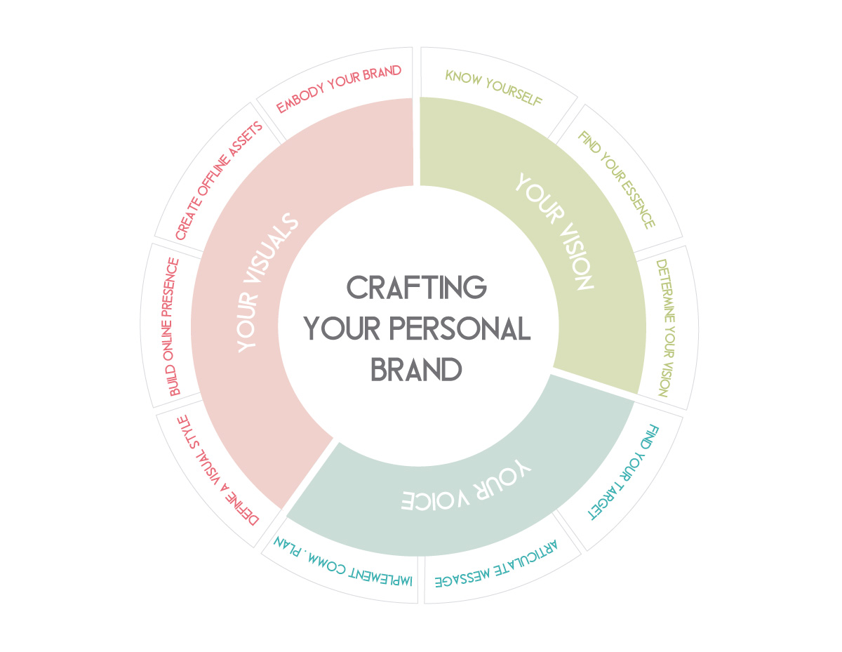
Brand-discovery-process

Personal branding is the art of aligning what you want people to think about you with what they actually think about you. Although you cannot control what people think, say or feel about you, you can influence the perception that they have of you in a positive way.

Brand perceptions usually relate to businesses and organisations, but they can also refer to individuals, especially in the professional service space. These perceptions will be key for winning more/better clients or creating professional opportunities for an individual or a business.

Personal branding is not just for CEOs or corporate executives. Independent consultants, designers and many other freelance professionals also need to build credibility and a positive image of themselves to expand their business.

Crafting your personal brand involves a self-discovery process that covers three different aspects of branding: vision, voice and visuals (the three Vs).


CREATING YOUR PERSONAL BRAND VISION

Your brand vision is what you want to be known for. It starts with a soul-searching journey in which you will discover who you actually are and how you can build a better version of yourself.

1.    Know yourself

  • List your personal attributes – describe yourself, from they way you look to your personal qualities and weaknesses. You can start by writing down a bio that covers both, professional and personal aspects of your life. Then make a word cloud of key words that summarise your story.
  • Get external feedback - ask family and friends how they see you, to look at yourself from an outsider’s point of view.

To help you with this self-discovery process you can take this template from my Brand Discovery Workbook, which enables you to gather data regarding your personal attributes. You can also share this template with family and friends to request feedback from others.


2. Find your essence

  • Identify your core values – these are the things that are most important to you and drive your decisions in life.
  • Discover your passions - things that you love doing, you are best at and bring more happiness to your life.
  • Find your differentiation – what makes you unique and different to others, why people will choose to work with you over everyone else. If you can’t think of any differentiation specialised yourself in an area of expertise or a skill that is relevant to your field.


3. Determine your vision

Think about what your aspirations are, what you want to accomplish in life, and where you want to be in a few years time. Compare this with where you are at today and formulate an action plan to get to that point.


FINDING YOUR PERSONAL BRAND VOICE

Once your vision is clear you can now articulate your message and the tone in which you speak to and connect with your audience. Your brand voice will embody and express your personality and set of values.

4. Find your target market

Figure out who is your ideal client, who needs your services and is willing to pay for them, and learn as much as you can about them. The more you know about your market the easier will be to select the right channels and the appropriate messages to communicate with them.

Your target audience goes beyond your potential clients or customers. They are also bloggers, influencers, local community, and anyone else who can contribute to your business or your career success.

Find out more about who your stakeholders are in this other previous post on Key Relationships For Small Businesses.


5. Articulate your message

  • Craft your personal brand statement - an elevator pitch that expresses your essence in a sentence.
  • Create a style guide - Put in writing your tone of voice, copywriting style and guidelines.


6. Implement a personal communication plan

  • Find the right channels to connect to your audience – Make a list of every channel that you will need to deliver your message (website, blogs, social media, emailing, events etc)
  • Determine the social media platform that is right for you – you don’t need to be everywhere. Select the social media channel that helps you connect easier with your target market and find out how to communicate with them through that platform. To identify the social media channel that is right for you also read this other post on Social Media Platforms For Small Business.
  • Build industry credibility – press articles, blog features, client testimonials, costumers reviews, social media followers, etc. will build credibility in your business. In this other post, I explain some Simple Ways To Build Online Credibility.
  • Follow the 3 Cs of Branding - clarity, consistency, and constancy.


BUILDING YOUR PERSONAL BRAND VISUALS

Everything that people sees from you speaks about the way in which you do business and how much you invest in every client and every project. To complete your personal brand, you can create a visual identity that brings clarity and consistency to your style.

7. Define your visual style

Have a logo and a visual identity system with a specific colour scheme, typography, design elements, etc. and ensure consistency by creating a visual style guide. You can learn how to create this guide and download a template in this other post on How To Create A Brand Style Guide For Your Business Or Blog.

Start by putting together a brand mood board, with a collage of images that represent your personal and professional style. From fashion images that inspire your wardrobe, to products or brands that usually fill your bag or your desk, as well as colours, people, and places that you love.

For many designers and creative professionals is also important to have a signature style that can be showcased through a portfolio.


8. Build your online presence

In today's digital world, Internet will be the first place where people will go to know more about you, who you are, what you do, how you do it, who your clients are, etc.

  • Website – It must tell your story and showcase your expertise through a portfolio, case studies, etc.
  • Blog – research and write about different topics in your area of expertise, which will increase your industry knowledge and position yourself as an expert in your field. A blog will also help you connect with your audiences through blog comments and guest posts.
  • Email signature – it’s your business card in the digital world. In this other previous post, I explain How To Create An HTML Email Signature.
  • Social media channels - follow and start conversations with your stakeholders, engage your followers with interesting content and drive traffic to your blog and website
  • Emails and enewsletters – develop a mailing list and reward your subscribers by offering exclusive content, offers and specials, etc.


9. Create your offline brand assets

While businesses usually rely on digital communications and materials to promote themselves in the Internet, the textural beauty of printed collateral can set you apart from everyone else in the real world.

  • Business cards and stationary – From beautiful designs to high-quality paper or emboss, foil or letterpress finishes, everything talks about you and your personal style.
  • Professional photographs – invest in a professional photographer to take headshots, and hire a stylist to produce your portfolio or catalogue images, to ensure a professional result.
  • Presentations and marketing collateral – every document (online or printed) that you put in front of your clients must be properly branded and have a professional look.


10. Embody your brand essence

The way you speak, what you wear, how you network, everything will impact in that brand perception that others have of yourself as a professional. Make your wardrobe consistent with your brand visual style, what you say in-line with your brand voice and act according to your core values and vision. Make yourself the main vehicle of your personal brand.


How To Write The Perfect Call To Action In 5 Simple Steps
call-to-actions

A call to action (CTA) is any text or graphic that provides a clear link to the next action. Its purpose is to provoke the reader/visitor/consumer (I will be using the term consumer) to perform a specific action.

Common actions include:

  • Signing up to a newsletter or e-course
  • Calling an organisation
  • Sending a message
  • Viewing a demo
  • Using an interactive tool

Whether it’s placed on your website, social media page or email, a CTA can be an excellent way to increase inbound traffic, leads and give your small business an advantage over your competitors. With so many reasons to utilise CTAs, it’s interesting to note only “47% of websites have a clear call-to-action button that takes users 3 seconds or less to see” (Go-Globe) and “70% don’t display clear calls-to-action for anything on their home pages” (Online Marketing Coach).

So why are CTAs so misused? Perhaps it’s due to a lack of understanding of their significance and purpose they serve, or perhaps it’s because people are unsure how to go about writing and applying CTAs.

No matter what your issues you’ve face with CTAs in the past, it’s time to put them behind you and start fresh with these 5 easy steps which will have you creating enticing and engaging CTAs in no time!


Step 1. Pick The Right Action Word (Verbs)

As the purpose of a CTA is to have the consumer perform a specific action, it is important to make the desired action clear. The use and effective placement of verbs is one of the simplest way to do so.

Select a verb:

  • If you would like your consumer to join your email course you can use verbs such as “subscribe”, “enrol”, or “email”

With a verb in mind, the next step is to locate it effectively within your CTA. Studies have shown the first and last few words of any copy (written material) stand out to most people. To take advantage of this simply place the verb at the very beginning of your CTA.

Place your verb where it’s most effective:

  • Instead of your CTA reading: “I’m ready - Sign me up”, modify the order of the words to read: “Sign me up - I’m ready”.

By switching the order of the wording used in the CTA, your consumers attention will be immediately drawn to the action you would like them to complete.


Step 2. Apply First-Person

The significance of using first person in a CTA is revealed in a study conducted by Unbounce. The study tests the engagement consumers has with two CTA buttons. The buttons were identical in every way with the exception of one being written in first person whilst the other was written in the more common third person. The result, “when [sic] tested live on the website, it turned out that the treatment with “Your” performed significantly worse than the control copy that made use of “My” – 24.95% worse to be more precise”.

Further to this test, another was conducted using the CTAs “Start your free 30 day trial” and “Start my 30 day free trial”. The CTA button using “my” showed a 90% increase in the click through rate over that of the “your” button. Such a strong result showcases the power a single word can have in a CTA.

By introducing first person terminology such as “me” in place of “your” you are encouraging your consumer to place ownership on the reward they will receive upon completing the action

Reframe your CTA:

  • Instead of stating “Get your free guide today”, reframe your CTA to state “Claim my free guide today”.
  • Instead of using the phrase “Sign up”, reframe your CTA to state “Sign me up”.
  • Instead of using “Join now”, reframe the CTA to state “Enrol me now”.

By reframing your CTA in this manner you will also be to avoiding a CTA that demands an action from your consumer. Yes, that’s right, the saying “you can catch more flies with honey than with vinegar” holds true in relation to CTAs. By reframing your CTA to be a demand from your consumer rather than one from your business allows you to clearly convey the benefit your consumer (not you) will obtain through their action.

This approach is a great deal more likely to engage your consumer and see them follow through with the intended action.


Step 3. Be Crystal Clear

Consumer uncertainty, doubt and fear are the ultimate action killers. If your consumer is uncertain of what will occur when they act upon your CTA, it is very unlikely they will follow through with the action due to fear and doubt.

The word “send” is the perfect example of a frequently misused term as it can be interpreted in many ways. To some, the word may imply mail via post, whilst to others it may imply email.

People have a tendency to assume their personal interpretation of a word will be that which is commonly accepted by others, yet this is not always the case. By placing assumptions upon the words you chose to use you risk consumer uncertainty which and therefore consumer inaction.

Please note, if you choose to use a word such as “send” in your CTA button for any reason, ensure you have made it extremely clear elsewhere in the CTA what this meant by the word “send”.

Clarify the meaning of your CTA:

  • By stating “Teach me how to write great copy in 3 weeks” you do not clarify what will happen when your consumer clicks on the button. While they may be eager to learn more about writing copy, they are unlikely to click due to a lack of clarity.

This CTA does not explain what your consumer will receive when they act, the method in which the information will be received, the commitment required or the cost. With so many unknowns surrounding what will occur after actioning the CTA your consumer is likely to experience fear and uncertainty leading to inaction.

  • By stating “Sign me up to the free 3-week Writing Perfect Copy email course” you make clear the way in which your consumer will learn how to write great copy.

There can be no doubt what will occur when your consumer clicks on the button. This CTA expresses what your consumer will be receiving when they respond, the method in which the information will be received, the length of time they can expect to receive the information and the cost.


Step 4. Keep It Short

Though it may be tempting to cram as much information as possible into a CTA, it is best to approach your CTA with the KISS principle in mind – Keep It Simple Stupid.

According to studies, readers only take in the first and last 3 words of any copy. This suggests the ideal length for a CTA is 6 words which can be a big challenge if you’ve never written a CTA before. To make writing an effective CTA easier, I recommend aiming for 10 or less words and ensuring the more critical information is positioned at the beginning, followed by the end of the CTA.

How to write a short CTA:

  • Write what you wish to say, ignoring the length
  • Identify the keywords which cannot be removed
  • If some of your keywords are particularly long, seek out shorter synonyms
  • Go through removing and shifting around words, ensuring the meaning is not lost


Shorten your CTA:

  • Though “Sign me up for this email course on how I can learn to increase my Twitter traffic by 30% in 4 weeks” may appear to provide your consumers with more information, research shows they are likely to ignore any information containing in the middle of the sentence.
  • By shortening the CTA to “Increase Twitter traffic by 30% in 4 weeks”, the consumer is more likely to clearly comprehend and receive all of the necessary information provided.

Once you start cutting your CTAs short it can be hard to stop, but it is important to remember cutting for the sake of cutting isn’t recommended. It is more important to convey your message than to use a shorter CTA which lacks clarity and information.


Step 5. Revise Your CTA

Congratulations! If you’ve followed my 4 previous steps you should now have a wonderfully written CTA in front of you and it’s time for the final step. Revising your CTA from the Point-Of-View (POV) of the consumer is crucial as it allows you to gain a new perspective and additional insight into how your CTA is likely to be received by your consumer.

Look at your CTA and ask yourself:

  • “Will this take long?”

If the answer is unclear or the response is yes, you will need to make some changes to your CTA and/or the action itself.
 

  • “Is this worth my time?”

If your CTA does not clearly express the benefit/s your consumer will receive, the answer is likely to be no and you will need to make some amendments to your CTA.
 

  • “Will this be simple?”

If your consumer is unsure how long the process will take, or it is evident it will require some time e.g. filling out complex forms, your consumer is unlikely to follow through with the action and you will need to make some changes to your CTA and/or the action itself.
 

  • “Is this something others are doing?”

If your consumer is left questioning whether they are likely to be the only person acting upon your CTA they may begin to fear the prospect of being ‘suckered in’ and feeling foolish. If this type of questioning arises from your CTA consider incorporating a numerical count or statement which shows your consumers that others have previously acted upon the CTA.
 

  • “Will this involve providing my credit card details?”

If your CTA requests credit card details it is likely to be extremely off putting to any consumer. Often your consumer will have their card away from them and question the possibility of future monetary costs and commitments which may apply. For this reason it is often best to leave any financial commitment to another time and place.

By following these 5 simple steps you can write engaging an effective CTAs for any copy. So give CTAs a go and include one in your next blog post, website update or social media post, and of course, comment or email me to let me know how it goes.

About The Author
Eva Niedzwiedz is a communications consultant and Director of Pickled Pineapple Public Relations based in Perth, Western Australia. Her mission is to help small business owners take advantage of their unique marketing potential through the creation and implementation of original content, tailored communications and social media services.

Christmas Marketing Champaign for Small Businesses

Christmas is just around the corner and we are all getting excited. It will be time to celebrate, to share and give, to thank and especially to spend… a lot! Which it's good news for any business.

Brands around the world spend lots of money and efforts in holiday marketing campaigns. If you are a small business owner, you won’t want to miss the opportunities that the holiday season can bring to your business too.

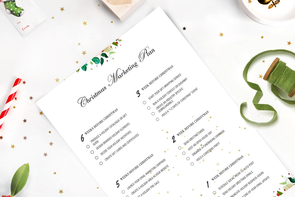
Aware of the fact that a small business cannot invest as much as a big brand in their marketing campaigns, today I’m bringing a 6-week marketing plan for small businesses, with over 22 low-cost or inexpensive actions that you can implement this holiday season.

“ The entire point of Christmas Marketing is to broadcast the Christmas Spirit while explaining what your business has to offer”
Christmas Marketing Ideas For Small Business, by Transition Marketing.


WEEK 6 - Planning

This week is all about planning your marketing campaign. Think about every relevant marketing material that will be used during this holiday season and work with your designer to create your marketing collateral and branded elements.

Produce a holiday catalogue and/or gift guide – design and print (or just online) catalogue with product recommendations and gift ideas. You can also look for opportunities to get listed in bloggers’ holiday gift guides.
Design branded holiday elements – your designer can create unique branded designs for shopping bags, wrapping paper, gift tags, greeting cards and more.
Decide your holiday incentives – everyone looks for deals and ways to save more during this time of year. Incentives can be free shipping, discounts, free promotional items or buy-one, get-one-free deals.
Create gift cards and certificates – when people don’t know what to buy for someone else, gift cards are a lifesaver. Make sure you have plenty of gift cards ready for the holiday season.


WEEK 5 - Communicating

This week is all about starting to communicate your deals via email marketing, social media channels, your website and your brick-and-mortar store.

Launch your email marketing campaign – email your catalogues, gift guides, offers and special discounts to your subscribers.
Create a seasonal area in your website - add holiday related products or services and make the announcement in your home page and social media channels.
Host a Holiday Pre-Sale – promote your Christmas specials by offering a sneak peak of your seasonal sales.


WEEK 4 - DECORATING

This week is all about getting into the Christmas spirit by bringing your decorations out and dressing up your business for the holiday season.

Dress up your shop - If you have a window and a storefront create a Christmas window display. If you're in an office setting, some Christmas-inspired floral arrangement will look professional and ultra-stylish.
Start a Christmas Countdown – build the excitement and create a sense of urgency in your potential buyers by starting a countdown in your website and adding some tweets and Facebook posts.
Add festive graphics to your website, your e-newsletter, your social media pages and your email signature.


WEEK 3 – GIVING AWAY


This week is all about spreading Christmas cheers by giving away things to thanks your buyers for choosing your business and attract new potential customers.

Start your gift-wrapping service — Christmas is a busy time for everyone and gift-wrapping services can be a great add-on or complementary service to offer in your store, as they can save a lot of time to your buyers.
Run a holiday contest or giveaway – The prize can be a great opportunity to showcase your products or services. For example, the prize can be a hamper with some of your products or vouchers to try your services for free.
Create a free (industry specific) downloadable – A holiday survival guide, a downloadable craft template, a Christmas recipe ebook, or any other piece of content that can be valuable to your customers and show your industry expertise.
Hold a “12 Days of Christmas” event - Offer a different discounted product on each of the 12 days in the lead up to Christmas or team up with other business to give away something every day during the 12 days.


WEEK 2 – GIVING BACK


This week can be dedicated to showing appreciation to those who have contributed to your business success along the year.

Send greeting cards – acknowledge clients and suppliers by sending greeting cards. Decide if you will be sending e-Cards, paper cards or a special gift.
Host an Open House day - If you have a brick-and-mortar shop, consider having an open house to celebrate the season. Treat your visitors with free samples, cookies, beverages, candy or hot chocolate, and organise a raffle.
Organise a fundraising campaign - Choose a cause that matters to you and makes sense for your brand. Get your customers involved and make them part of the cause. Some ideas are:
  • donate goods and services to charity
  • volunteer for a charitable cause
  • offer discounts or free gifts for customers who volunteer to a charity
  • donate a percentage of each sale to a charitable cause
  • host a gift-giving tree to collect gifts for underprivileged kids
Hold a Christmas party - celebrate your success over the past year with your staff, special clients and suppliers.


WEEK 1 - Scheduling communications


During this week, you can focus on scheduling the last pieces of your marketing campaign to make sure that the last minute communications go out while you enjoy a stress-free Christmas week with your family and friends.

Schedule social media to auto-post - Use services such as Buffer or Hootsuite to auto-post your holiday greeting for Christmas and New Year in social media.
Send holiday greetings emails – and wish Merry Christmas your email list subscribers by email.
Communicate your holiday business hours – update your website with an announcement that includes your holiday business hours and closing days, as well as your holiday delivery deadlines for the following week.
Schedule an end-of-year email update – You surely have big plans for 2016 and want to share them with everyone in your email list! The firsts days of 2016 are a great opportunity to wish a happy New Year to your email list and let them know all your exciting plans for the New Year.

Wrap-up

The holiday season offers a great opportunity to burst your sales and increase your revenue as well as strength existing relationships and expand your brand awareness. No small business should miss these opportunities as they only come once a year.

Just remember, the key to a successful Christmas marketing campaign is planning ahead.


Grafika Projects: Pre-made Brand & Business Stationary Sets
brand-business-stationary-set

This week Grafika Studio is launching a new collection of pre-made brand & stationary sets for small businesses and new start-ups. It’s what I’ve called prêt-à-porter  - or ready-to-wear - design.

Let’s imagine that you are getting married and are looking for wedding dresses. You have two options: one, get a bespoke wedding dress completely tailored to you, or two, get a prêt-à-porter design and make small alterations to fit your body shape and height.

Although, a bespoke design is probably the dream of many brides, it’s also a much more expensive option than the ready-to-wear design.

In the graphic and web design industry, a bespoke brand design requires many hours of research, conceptualisation and design, as well as many revisions and changes by the client. It’s the result of a long implementation process and a close collaboration between client and designer. It isn’t often an affordable solution for small businesses with limited budgets.

Another limitation is that in the early stages a new business doesn’t usually have a mature brand aesthetic, which makes it difficult to translate into a visual language.

As Grafika Studio was born with the vision of helping small businesses and new start-ups build professional brand systems, and aware of their budget restrains, I designed this solution that allows my clients to build sleek and professional brand systems with a minimum investment.


Benefits of pre-designed brand systems

Although a pre-made brand may not be an ideal solution for a business with a few years of experience in their market and a clear business personality, they can be an excellent solution for many start-ups, and here are some reasons:

  • Personalised design – Every set, though pre-made, is customised with the client’s business name and contact information, as well as colour scheme and fonts, making it more unique.
  • Cohesive brand - Each element has been designed to work as one cohesive piece, to create a strong brand presence and identity at the fraction of the cost of a full brand design.
  • Limited availability – every brand and stationary set will only be sold a maximum of 5 times.
  • Quick turnaround - customisations are done within 2 business days. After that, my clients get a complete professional brand and stationary set to get your business started in a simple and stress-free design process.
  • Full control of your brand – Once the customisation has been done, clients receive the editable files for future changes or brand extensions.
brand-business-stationary-set

The pre-designed business stationary set above is the first design of my collection still in progress. It includes all the essential items that any small business may need to get started: logo, business cards, letterheads, envelope seals, with compliment slips, thank you cards and notepads.

This set is now available at my shop! Visit its listing here for further information and purchases.


How to Make Marketing That People Love
Gift from Sugar Paper and desk accessories from Kikki.k

Gift from Sugar Paper and desk accessories from Kikki.k

Marketing has a lovable problem. People don’t like marketing. We feel annoyed when our favourite TV show is interrupted by an ad, we delete any commercial email in our inbox and get furious when we answer the phone to just a telemarketing call.

If consumers hate your marketing, how are they supposed to like your brand? The big challenge companies and marketing professional have always faced is to make marketing that people love.

The digital era has changed the traditional ways to make marketing, becoming more valuable, appropriate and personalised for each individual.

Modern marketing in the digital age is not just about numbers and processes.
— Jon Miller VP and co-founder at Marketo

In today’s post, I’m sharing some tips to make marketing that people love. If your audience love your marketing they will engage with your brand. By creating emotional connections with your audience, you increase your chances to find new clients and leverage existing ones.


1.    Know your customer/client

Any business trying to connect with a certain type of customer needs to create a comprehensive profile of exactly who that person is. This is what in marketing is called ‘buyer persona’.

Buyer personas are fictional, generalised representations of your ideal customers. By having a detailed knowledge of your buyer persona, you’ll be able to tailor your content, messages, products and services to meet their specific needs and address their concerns and challenges.

Some effective – and free – ways to craft buyer personas are:

  • Through your web analytics, you can get geographical and demographical information.
  • Through their social media activity and engagement
  • Through interviews or surveys
  • Through market research and public reports

This other article by Emily Winsauer explains in more detail how to create buyer personas.


2.    Create valuable content

Once you have a clear idea of who your ideal customer is, you can produce content that is relevant to them.

Your clients want to see that you understand their concerns before working with you, so your content must be around what really matters to them:

  1. Solutions to their problems or answers to concerns.
  2. Tools and tips to help them achieve their goals and aspirations.
  3. Articles to entertain and make them laugh

Produce content that help people enhance their lives and make it easier or happier somehow. You can find some ideas:

  • Through your clients and prospects conversations
  • Through questions and comments in social media groups and forums
  • Through Google Trends to know what people search for in Google

In this other post published previously in my blog you can read my simple formula to write engaging content.


3.    Deliver the content in different formats

Traditional marketing used to be disrupting, and that’s one of the reasons why most people hated it. The audience is now in control.

By delivering content in different formats, your audience can decide when it’s the right time to consume it and how, whether it’s reading a blog post, attending a webinar or listening to a podcast while they’re driving.

In this other post, I give you 8 ideas to present your content in different formats (with infographic)


4.    Personalise your messages

Knowing your client also allows you to personalise your communications, by using their names in emails, etc.

Understanding individual interests and needs also will allow you to produce more specific content and send to each individual content around only those topics that they are genuinely interested in.

  • Personalise emails with each individual’s name so that they don't look like an automated bulk email.
  • Create a private client area in your website with a personalise welcome message.
  • Send email alerts based on each subscriber’s specific interests. By checking content topics of their interest in the registration form you can create different email groups based on those interests.


5.    Align your marketing to the buyers’ journey.

Every buying cycle has four steps: awareness, research, comparison and purchase. Your marketing messages will be different for those who are just discovering your brand, versus those who have already bought from you.

By creating different marketing actions for each of these four stages, you will be able to deliver more relevant messages to each group, making your marketing communications more effective.


6.    Make your clients/customers feel special

Your business success depends on our capacity to build long-lasting and positive relationships with different groups of interest. Buyers are the most obvious group of interest, as it’s easier selling a second product to an existing customer – or being hired again by the same client – than finding a new one.

To make your customers feel special always give them a bonus after purchasing from you. For example, give them a discount for their next purchase or a gift for loyal clients.

Other groups of interest are your suppliers, your local community, your social media followers, your blog readers, newsletter subscribers, bloggers and influencers, etc. Think about what bonuses you can offer to each of these groups.

For example, give your newsletter subscribers free downloadable content, offer your blog readers a free ebook or invite your local community and bloggers to an exclusive event.

To know more about how to build relationships with these different groups of interest read my previous post on Key Relationships For Small Businesses.


Wrap up

Making a lovable marketing is about marketing people as you like to be marketed yourself. Think about what value you are offering to your audience and whether it will be beneficial for them somehow.

Are you a small business owner? What are your tips to make your marketing loveable? What do you offer that people love?


Is A Single Page Website Right For You?

It’s traditional to create websites using multiple pages — designed to resemble print media, with chapters and contents. But single page websites are an increasingly popular choice for business sites, and there are a few reasons why.

Single page sites rely on scrolling down a page rather than navigating via links and menu tabs. This reduces the time spent moving around the site trying to find the correct page. On the other hand, this may not work as well for sites with a lot of content due to the amount of scrolling required — although incorporating anchors can quickly take the user to the correct point of the page if they do not want to scroll.

Far more than multipage sites, a single page website is designed for storytelling. Scrolling through the various stages of the page can create a unique and engaging experience, drawing the user in through narrative and graphic design. And single page sites, with their uncomplicated linear layout, really lend themselves to responsive design for mobile devices.  

There are a few things to consider before deciding to use this layout:

  • Will a single page website, with all the graphics on one page, increase load time?
  • Will SEO suffer if you only have one URL?

While a well executed single page site can be truly striking, and a great brand-builder for business based on visual impact — such as design or fashion — for other businesses a more conventional layout may provide a better user experience.  


how do you choose which is right for you?

Both have their strengths and weaknesses:

Short Pages

Conventional wisdom used to favour short screens: it was thought continuing content past the bottom of the screen (or ‘below the fold’) meant users would overlook it, or would resist scrolling down for long pages.

Time has proved this wisdom wrong: Facebook and Twitter show that users don’t mind scrolling through long pages, and long pages are more amenable to responsive design — a big plus in these days of mobile internet access.

But short page design still has its strong points:

  • Makes Information Easier To Find - It’s ideal for users who want something specific and want to go straight to it. If your navigation is well designed, users know up front what they’re getting, what they can get on other pages, and how to get there and back again with a single click and minimal scrolling.
  • Reduces load times - If your site is heavy on graphics, spreading them over more pages cuts load time per page.
  • Multiplies advertising space - If you host paid advertising, more pages equals more advertising space.
  • Boosts your SEO - by increasing both the number of page URLs and the number of page views — assuming users click through.

Most important, though, is what you want your site to communicate.

  • If you need a site with the content in ‘chunks’ (like a catalogue with a category or product per page), then page-per-screen may be right for you.
  • If you offer a lot of services you may want to think twice about a site that makes users scroll patiently to find what they’re looking for — users with patience are a rare breed.


Long Scroll

What about the benefits of single page or ‘long scroll’ design?

  • Reduces load time - If your site doesn’t rely on a lot of graphics, long scroll actually reduces load time —because you only have to load one page (or at least fewer pages).
  • Needs less maintenance - as you need fewer links across your site/
  • More printer friendly.
  • Lends itself to responsive design — your vertical layout on computer will mirror mobile device layout.                                                                                        

And like screen-per-page, long scroll design enhances certain kinds of content:

  • If your site has long sections of text, a long page avoids interrupting the flow of your story.
  • Even if your content isn’t text heavy, long scroll layout invites users into your narrative; you can put your call to action, about page, contact details and more all on one page as part of a single story.
  • And on a purely aesthetic note — long scroll pages offer a much larger canvas for really beautiful web design, for repetition and contrast, continuity and gradation.

But whether it’s click or scroll – once you’ve decided which is right for you, you need to make sure you do it right.


long vs short scroll design: objectives

With long scroll design, it’s all about getting users to the bottom — they have to want to keep scrolling. To achieve this:

  • Create a sense of flow that always continues past what the user sees on the screen — whether through easy-to-read text creating a story effect, or rich visual design that leads the eye ‘below the fold’.
  • Mirror standard navigation - Most users are conditioned to expect a certain navigational flow (Home, About, Services, Questions, Contact), so you might consider mirroring this on a long page.
  • Make your page more user-friendly by providing ‘back-to-top’ links at regular intervals.
  • Avoid visual ‘end’ markers. Some design elements (ad units, horizontal lines, blank sections) resemble traditional footer layout and leave users thinking the page is finished.

For short screen design, it’s all about getting users to where they want to go. To achieve this:

  • Create a clear navigation — it should be intuitive to use and should anticipate what users want from your site. The great advantage of short screen design is being able to skip content you don’t want to read and get quickly to content you do.
  • Navigation should be two-way — since users can’t just scroll back up the page, you need breadcrumbs or other backward links to let them retrace their steps. Never, ever make users go offsite to come back in — most of them won’t.
  • Page content should be tightly focused to aid navigation - each page should have a single theme or message, which you can then expand through links to other pages.

Wrap Up

To work out what’s best for your needs, speak to a website designer — but don’t let any designer tell you short pages are old fashioned, or long pages aren’t user friendly. Good web design isn’t about which layout is right or wrong, but which is right or wrong for the job. Think about what you want your website to do, have a look at some examples of each, weigh up the pros and cons — and choose the one that feels right for your online brand.


ABOUT THE AUTHOR
Amanda Sidebotham is the owner/operator of Juice Creative Web Design, a Canberra based design studio. When she is not working on her latest web design projects or writing a blog article, she can be found at home with her two gorgeous children and a block of chocolate.


How To Optimise Images For Web

Websites with beautiful photographs and full-screen images are one of the favourite current trends in web design. Uploading images to your website or blog is a pretty simple process, but if it isn’t done correctly it can seriously compromise your conversions, sales and search engine optimisation.

If your load time is slow, frustrated visitors will quickly abandon your page. Google also uses page load times as a factor in their ranking algorithm. Thus, optimising images for web is a critical part of web design.

Image optimisation is not just for web designers. To ensure the right performance of any website, bloggers and small business owners who usually upload images onto their sites must also learn to properly optimise images for web.

how-to-optimise-images-for-web


What does optimising images for web mean?

Optimising images for web refers to:

  1. Reducing the size of the original image file without impacting on its quality, to reduce page load time.
  2. Adding the appropriate meta-information, to make the image easy to find by search engines.


5 simple steps to optimise your images for web


STEP 1 | Ask first: Does the graphic need to be an image?

Many simple shapes and animations can be achieved with CSS or Javascript, which requires a lot fewer bytes than images. Those XML-based generated images are called Scalable Vector Graphics (SVG) and are supported by all modern browsers.

Example polygon - star


For example, this simple green star has been created with CSS by using the code below.


<svg width="8cm" height="3cm" viewBox="0 0 1200 400"
     xmlns="http://www.w3.org/2000/svg" version="1.1">
  <desc>Example polygon - star</desc>

  <polygon fill="#dff494" stroke="#dff494" stroke-width="50"
            points="350,75  379,161 469,161 397,215
                    423,301 350,250 277,301 303,215
                    231,161 321,161" />
</svg>

Years ago, if web designers wanted to incorporate fancy fonts into the web design we had to utilise images. Today we can use web fonts instead, which are specially tuned fonts for use on websites using the CSS @font-face declaration.

Web fonts enable the use of beautiful typefaces while preserving the ability to select, search, and resize text, improving the usability of the website. You can find an entire library of open source web fonts at Google.com/fonts.

Font icons are fonts consisting of symbols and glyphs, which can instantly be customised in size, color, drop shadow, etc, with CSS. My favourite open source icon toolkit for websites is Font Awesome.

Although many basic graphic elements can be achieved with CSS, complex visual elements and high-detail images - like photographs or artwork - will require the use of raster images.


STEP 2 | Select the right image format

A computer can create 2 types of graphics:

  1. Vector images – they use mathematical equations to represent paths, shapes and lines. They can be scaled up and down as much as needed without affecting their resolution.
  2. Raster images – they use bitmaps or a grid of pixels to represent an image. They’re suitable for web but they need to be optimised before uploading onto the server. As opposite as vector images, raster images cannot be sized up.
I'M A VECTOR IMAGE (SVG)
Example polygon01 - star and hexagon
I'M THE SAME VECTOR IMAGE SCALED-UP


Example polygon01 - star and hexagon
I'M A RASTER IMAGE (GIF)
I'M THE SAME RASTER IMAGE SCALED-UP
Star.gif

A raster image can have different formats, such as GIF, PNG, JPEG, or one of the newer formats like JPEG-XR and WebP.

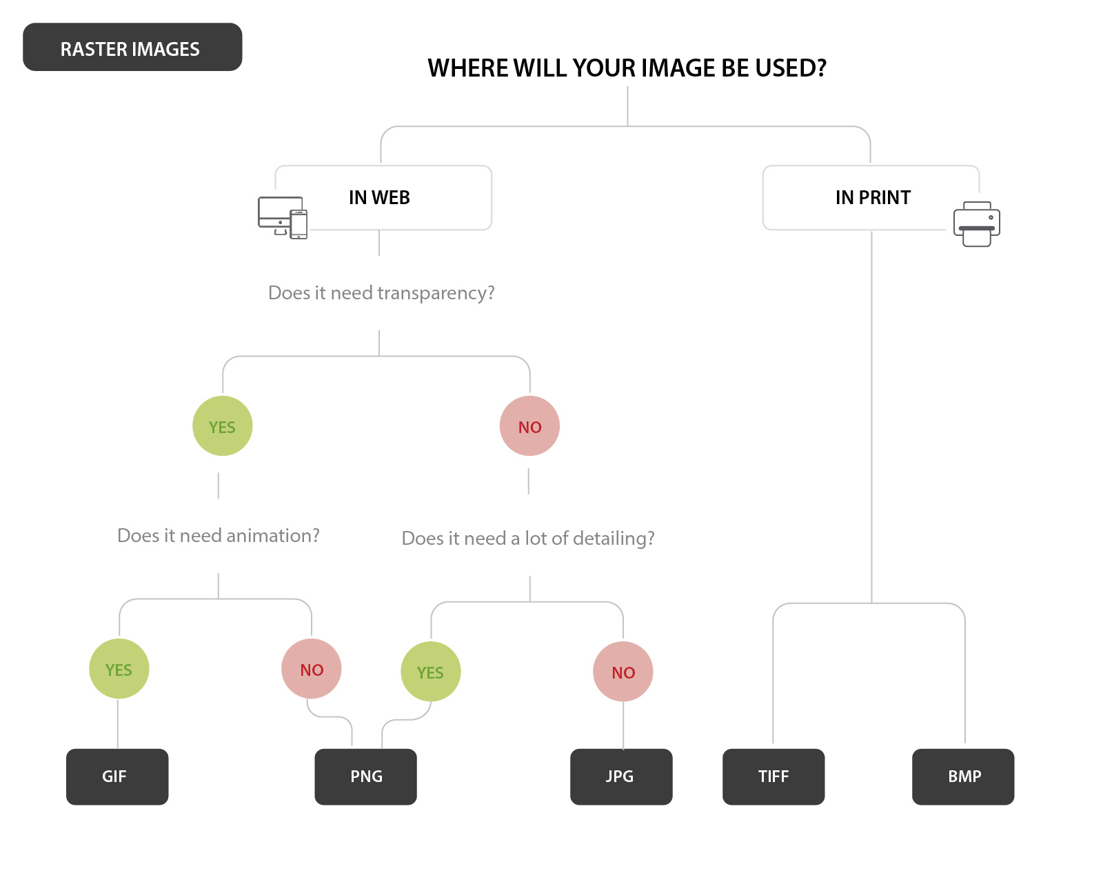
Us, web designers decide on an image’s ideal file format by factoring in aspects like colours, size, density of information and others. This flowchart can easily help you decide the right format for your web image.

how-to-choose-the-right-raster-image-format

As a general rule, the most common format for web images is JPEG. But JPEG files lose a bit of information in their compression and don’t support transparencies or animations, in which case you need to use PNG or GIF images.

JPEG files can be loaded in two different ways:

  • Baseline JPEG - it has only one layer containing the whole image. When requested, the entire image is loaded at one go.
  • Progressive JPEGs - the image is composed with multiple layers. When requested, the image is loaded layer by layer, which gradually increases in quality.

To ensure your images are loaded progressively, check the “Progressive” checkbox in the Save For Web screen (see below).


STEP 3 | Reduce the image size

Saving an image with the highest quality isn’t right for web. The higher the quality is, the heavier the image gets. By reducing the file size, you are improving your site’s loading speed.

The best way to optimize an image for web is by using the Save for Web command in Adobe Photoshop. This tool gives you a preview of how an image will look after compressed. You can also get an idea of how much it will weigh and how fast it will download.

NOTE:&nbsp; Save For Web feature has been removed from its usual location in Photoshop CC 2015, but it is still available under File &gt; Export menu.&nbsp;Adobe Generator will be the new platform for exporting image assets from Photoshop. Read more…

NOTE:  Save For Web feature has been removed from its usual location in Photoshop CC 2015, but it is still available under File > Export menu. Adobe Generator will be the new platform for exporting image assets from Photoshop. Read more here.

If you don’t have Photoshop, Adobe has a free online image editing application at photoshop.com. Alternately you can use GIMP, an open-source image editing software application, same than Photoshop but Free!

Other tools to reduce the size of your images are:

  • TinyPNG (online): for PNG or JPG images.
  • ImageOptim: For Mac users ONLY. You will have to download this app to your Mac computer in order to use it.


STEP 4 | Name your images descriptively

Use keywords in your image names to help search engines categorise your pictures on image search engine results.

When naming your image files, be as descriptive as possible without using too many characters and keywords to avoid search engines penalisations for over-optimisation.

Separate words with dashes ( - ). Never leave spaces between words (they will be replaced by %20) or use underscores ( _ ) to separate words. Search engines interpret the underscore as a separate character.

For example, to name the flowchart above I've used the following file name: "how-to-choose-the-right-raster-image-format.jpg"


STEP 5 | Add Meta-information

By associating the right keywords with images, you will help your website to achieve better rankings. This association can be achieved through:

  • Titles and descriptions, which help search engines understand your site better, improving your SEO ranking.
  • Alt tags, which are a text alternative to images used when a browser can't properly render them. The alt attribute also adds SEO value to your website. Don't use alt tags for decorative images, as search engines may penalise you for over-optimisation.


Image optimisation for mobile devices

Your site may be responsive, but it doesn’t mean your images also are. The same images that are served to desktop screens are also served to small devices. However, mobile websites don’t require such large images.

To optimise images for mobile devices use media queries to conditionally hide the larger images and display a smaller version of the same image.

For example, this is how I would display a background image in different devices (by serving three 3 different images with media queries):


<style>
@media (max-width:600px) {
   .image {
      background-image: url(mobile-image.jpg);
   }
}
@media (min-width:600px) and (max-width:960px)  {
   .image {
      background-image: url(tablet-and-ipad-image.jpg);
   }
}
@media (min-width:960px)  {
   .image {
      background-image: url(desktop-and-laptop-image.jpg);
   }
}

</style>

<div class="image"></div>

If your website is built in Wordpress, the mobile optimisation is much easier. WordPress automatically resizes every image into multiple versions – Thumbnail, Medium, Full Size, etc.


Wrap-up

Although, image optimisation can consume a bit of time, this process is an essential part of your website/blog success and key aspect of your search engine marketing.

To know more about image optimisation also read:


Do's & Don’ts To Make Your Website Trustworthy

It takes only a few seconds for a visitor to decide whether they like you, and want to work with / shop from you, or just leave your website and go to the next site on their list.

Since a visitor lands on your home page for the first time until they become clients or customers there is a long process of instilling trust in between. This process starts in your website.

As explained in this other post ‘Why My Website Is Not Converting?’ the lack of credibility is one of the main reasons why a website doesn't convert visitors into consumers/clients.

In today’s post, I bring a checklist of things that you should do – and some others that you shouldn’t – to instil trust among your visitors and convert them into loyal customers or regular clients.

There are four areas in your website where you can immediately instill a sense of trust in your business or miss the opportunity to earn a new client:


1.    DESIGN & CONTENT

A visually appealing website, with concise content, is your first chance to create a good impression. Your website is a reflection of how you do business and how much you care about every project, product or client.

Do invest in good design – websites rely on design to deliver a positive message to their visitors. A poor design can give a careless impression and make you miss opportunities to earn visitor trust.
Don’t clutter your website - Do keep your layout simple and clean. Use a subtle colour palette. Avoid pop-ups and banners that may cause distractions.
Don’t make your website too hard to navigate - Users shouldn’t have to learn how to navigate every site they visit. They should be able to find your information quickly.
Do proofread your content - avoid poor grammar and spelling errors.
Do update your content regularly – re-read and update your web pages at least once at a month, and if you have a blog, post quite regularly.
Do check for broken links – test your links or use Google Webmasters to find possible broken links.
Do invest in a professional photographer – avoid using stock images, or even worse, photos taken by yourself. Hire a photographer and get professional images of your products.
Do provide a complete product description – manage expectations and avoid disappointments, complaints, and negative reviews by providing as much information as possible about your products.


2.    TRANSPARENCY

People don’t hire brands they hire people. They want to know who is behind a business and whether they will make a great team working together. People also want to be able to reach you easily if they need it.

Don’t hide behind your business name – humanise your business by letting people know who is behind your brand. Have an ‘About’ page with information about yourself.
Do include pictures of you – let people put a face to your business. Hire a professional photographer to get photos of you and your team and ensure quality and consistency.
Do make it easy to contact you – include your phone, email, and any other contact details. Customers want to know you will be available to answer any questions or resolve any issues they may have.
Don’t use free alias email accounts – Have an email address with your domain name and avoid using free email services for your business, like yourname@freeemailprovider.com.
Don’t use PO Box – instead have your physical address in your website. If you work from home, use an email forwarding service.


3.    REPUTATION

It refers to the collective opinion on the business ability to deliver positive results, based on previous customer’s experiences or expert’s opinions.

Do use social media proof – having a big number of followers in social media is a great way to build trust. Have a widget to show your followers and latest posts in social media pages.
Do include media features – create a “Press” page and upload every article or mention in the press that you or your company have.
Do publish certifications and memberships – show that you are connected to respected business associations.
Don’t be shy and show your awards – they are also a great way to instill trust into your customers
Do include client testimonials – show what others think about your product and give your visitors an outsider’s opinion.
Don’t delete negative reviews - a site with a few negative reviews and lots of positive ones is more trustworthy than a site with only positive reviews.
Do have authoritative content – position yourself like an expert by writing relevant content in your blog, publishing white papers or business cases.
Do highlight your notable clients – if you provide services and have big company names among your clients, add their logos to your website to let everyone know who has already worked with you.
Do quantify your experience – your experience can be quantified by the number of clients served or by the number of years of industry experience.
Do have links to review sites – as those reviews and ratings are usually more credible than the ones in your site.


4.    ASSURANCE

With the possibility of phishing scams and malware, security and privacy are increasingly a key concern for consumers in the digital world. Provide guarantees that you care about your customers and they are in good hands.

Do provide guarantees – such as money back guarantee, return policies, etc. They will make your customers feel more comfortable purchasing from you.
Do follow the shipping process – if you sell products online, display your shipping information in your product pages and keep your buyers updated on the transaction process. Send an order confirmation, a tracking number from the shipping company and a follow-up email to ensure the buyer got the goods in a perfect condition and is satisfied with the purchase.
Do have a privacy policy – critical if you collect visitor's contact details through registration or contact forms.
Do use an SSL certificate- Make sure you offer your customers secure purchases. With an SSL certificate your payment page’s URL will start with “https” and will have a padlock in the URL box as well.
Do have payment security symbols – to show you care about their safety. Companies like McAfee, TRUSTe or VeriSign offer anti-malware seals that you can buy along with an SSL certificate.

Conclusion

There are four key factors to build trust in your website. A trustworthy website is the first step to convert visitors into loyal customers or clients.


How To Create A Professional Email Signature
Email-signature-tutorial

One of the first steps in any branding process is creating a branded email signature. In today’s digital world, an email signature is also the first brand element that any business owner needs.

They are your digital business card in the virtual space, and your chance to create a good first impression. A poorly designed email signature can make your business look unprofessional.

Along with business cards, email signatures are the most requested item in my brand design services. Creating a professional email signature is not too difficult, and if the design is not too ambitious, you could do it yourself. Today, I bring a step-by-step guide to creating a professional signature for your business email.

The wrong approach

Attaching the image of your email signature at the bottom of your email isn’t the right way to do it. The main reasons are:
  • You cannot click on any link in images. You are losing opportunities to lead traffic to your site and social media pages.
  • Some email providers have default settings that block images in emails. Therefore, many recipients won’t be able to see your signature.

The right approach

The best way to add a signature to your email is by creating an HTML signature with links so that the recipient can find more information about you and your business.


How to create a professional email signature?

Step 1 | Filling the information

If you don’t know how to use professional software like Dreamweaver to create your email signature, then the easiest way to do it is with WordPress.

Open a new page in WordPress and add the text in the visual editor. Write down information such:

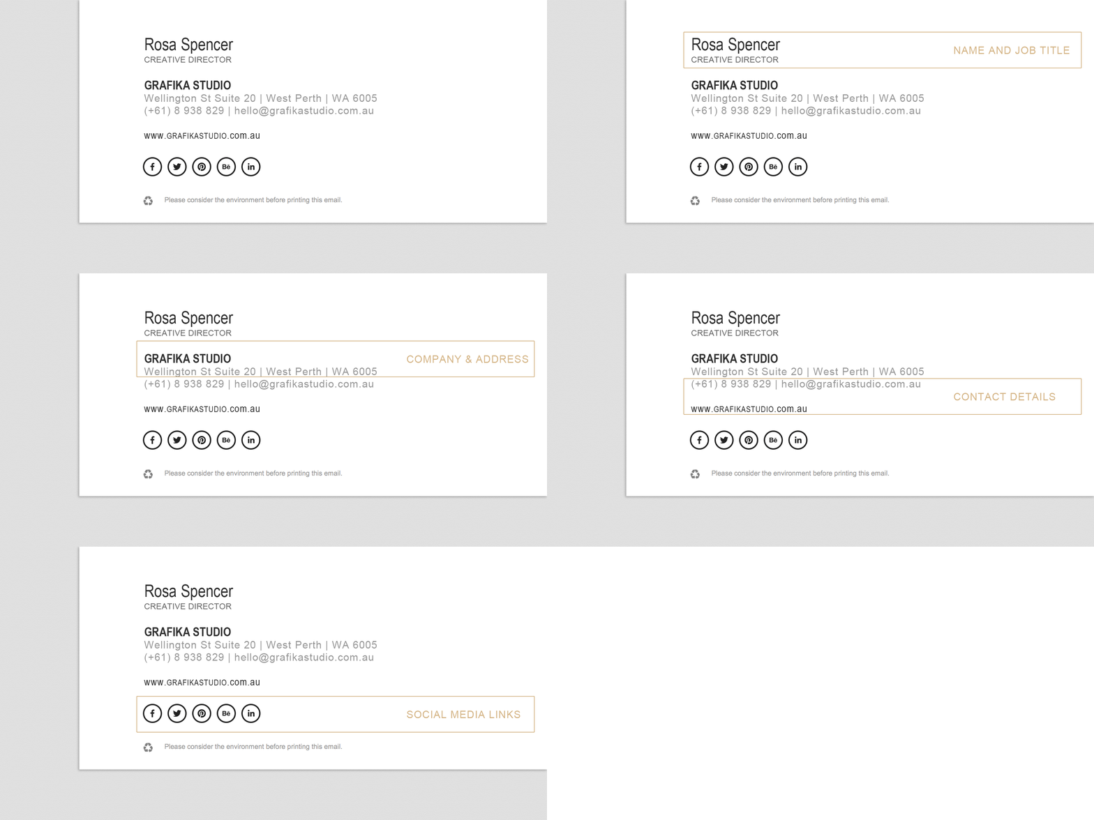
  1. Name and job title
  2. Company name and physical address
  3. Contact details (phone, mobile, email, fax, etc)
  4. Link to your website and social media pages

Keep it short, four or five lines are enough. You can separate information in each line with pipes (|). Lines shouldn’t be too long either; otherwise they will be cut in small devices.

About Legal disclaimers
Only companies that usually manage sensitive information need a legal disclaimer in their email signatures. Avoid including it unless it’s necessary to your business.
Clean-and-simple-email-signature-example


Step 2 | Formatting your signature

In the visual editor of Wordpress, you can easily add links and change colours, fonts, etc, as you usually would do in your pages and posts.

Safe CSS properties
Full support by: Outlook 2003-2010, Windows Mail, Apple Mail, Entourage 2004-2008, Thunderbird 2, Yahoo! Mail, Yahoo Classic, Google Mail, MobileMe, iPhone, Android, Palm.
  • background-colour
  • border
  • colour
  • font
  • font-family
  • font-style
  • font-variant
  • font-size
  • font-weight
  • letter-spacing
  • line-height
  • margin
  • padding
  • table-layout
  • text-align
  • text-decoration
  • text-indent
  • text-transform

When choosing a family font for your email signature make sure it’s an email safe font. These are those who most systems (Windows or Apple) have installed by default. Although you can use any font in your email signature, if you want to ensure your recipient can view your email with no alterations, it’s best to use email safe fonts only.

Safe email fonts
Full support by: Outlook 2003-2010, Windows Mail, Apple Mail, Entourage 2004-2008, Thunderbird 2, Yahoo! Mail, Yahoo Classic, Google Mail, MobileMe, iPhone, Android, Palm.
  • Arial
  • Currier
  • Georgia
  • Helvetica
  • Lucila
  • Palatino
  • Tahoma
  • Verdana
  • Times New Roman
  • Trebuchet

Tips to get the signature formatting right:

  • Font sizing: use point size (pt) rather than pixels (px) to set your font sizes
  • Bullets points: Bullet points can look pretty different from client to client, so it’s best to avoid them.


Step 3 | Coding your signature

Now technical part… Click on the Text tag, next to the Visual tag in WordPress. You will be able to see some CSS styles in your code already (those set in step 2). However, there will be other styles that you will need to write directly here. Some of those styles may be font-size, letter-spacing, font-style, text-decoration, etc…

Email-signature-tutorial-coding

For example…

  • If you don’t want your signature links underlined use the text-decoration property:

<a style="text-decoration:none;"href=mailto:youremail@yourdomain.com>youremail@yourdomain.com</a>

  • If you don’t want a double space between two lines replace <p></p> by <span></span> and separate both lines with <br/>

<span style="font-size: medium; color: #666666;">Your Name</span> <br/><span style="font-size: small; color: #333333;">Your Job Title</span>

There are two important things to avoid when coding an email signature: external CSS files and floating <div> tags. It means that email signatures require some old-school HTML formatting.

Safe CSS styles
Linked CSS files don’t work in many email clients. For that reason, all your CSS styles must be inlined. These inline styles are defined within the HTML tags in the body of the document (not in the header).

For example…

Instead of having a CSS file with the following:
p {
font-size= medium;
font-family=sans-serif;
letter-spacing= 1px;
color= #666666;
}

… have this:

<span style="font-size: medium; font-family:sans-serif; letter-spacing: 1px; color: #666666;">Your Name</span><br/><span>...</span>

Safe email layouts
Floating div tags should also be avoided, as they don't work in several email clients. Instead, you can use almost universally supported tables.

You can download the HTML code of the email signature above and simply replace the text in red with your own information.

Step 4 | Adding images

Your email signature is the only branded item that doesn’t require your logo. Instead you can simply use your business name.

But if you want to add your logo, social media icons, accreditation, etc, to your email signature, remember that images shouldn’t be embedded, and not every client will be able to see them.

Instead, they should be uploaded onto your server and linked from your email signature. To do this, simply upload the images and add them to your signature as you would do with any other page or post in WordPress.

Click on the Text tag and find your image code, which should look something similar to this: <img src="http://www.yourdomain.com/wp-content/uploads/images.gif"/>

There are three things that you can do to optimise your images for email signatures:

  1. Always use alt text behind your images – so that the recipient doesn’t see a blank box if your image is blocked by their email client.
  2. Prevent image borders by setting the border attribute to “none” – IE automatically adds an ugly blue border to any linked image.
  3. Prevent images appearing as attachments by using “nosend” attribute.*

Your final code should look like something like this:

<img src="http://www.yourdomain.com/yourimage.gif" nosend="1" border="none" width="21" height="17" alt="Like us in Facebook">

*Note: Wordpress automatically removes <br/> and the “nosend” attribute, so this has to be added directly in your email client signature settings.


Step 5 | Installing your signature

Once you have created your email signature in HTML, you can select the code (CTR + A), copy (CTR + C) go to your email client, find Signatures in your settings. Paste your HTML code (CTR + V) and save.

However, some web email clients like GMail, don’t allow embedding HTML signatures. Instead, GMail has a rich text editor to compose email signatures but there are some things that cannot be accomplished like tables or some extra inline CSS styles.

Before starting to code your email signature, ensure your client email allows you to add custom HTML to your signature.

Once you have installed your email signature, test it with as many email clients and devices as you can, especially if you use HTML.


Sources:

OPEN FOR ENROLLMENT: THE CREATIVE BUSINESS E-COURSE

A 6 module program jam-packed will everything you need to run a successful creative business.

NEXT PROGRAM STARTING IN OCTOBER 2016. 12 SPOTS ONLY!

Find out more →


Skip the overwhelming feeling of doing business on your own!

Looking for a designer?

I'd love to hear about your project
Request a Quote →

Starting a new business?

Join The Creative Business School
Find out more →